| » Forum Index » The Friday Challenge » Topic: Contest 189: A better use of space |
|
Posted on 19/03/08 08:09:48 AM |
|
Nick Curtain
Model Master Posts: 1768 Reply |
Re: Contest 189: A better use of space
Gavin, I love the idea and the way you've created the atmosphere with the mist. Nick |
Posted on 19/03/08 12:55:36 PM |
|
tooquilos
Wizard of Oz Posts: 2805 Reply |
Re: Contest 189: A better use of space
Gosh theres some great work this week. James, your animation is terrific. Vibeke the dolls house is a great idea, well done. |
Posted on 19/03/08 5:43:20 PM |
|
vicho
Ingenious Inca Posts: 248 Reply  |
Re: Contest 189: A better use of space
ancient buildings...=) 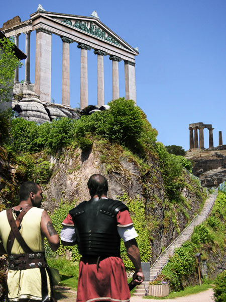 |
Posted on 19/03/08 5:57:01 PM |
|
Deborah Morley
Makeover Magician Posts: 1319 Reply |
Re: Contest 189: A better use of space
Well, mine is a bit dull. But, it was a challenge 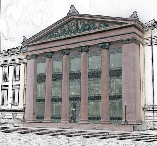 |
Posted on 19/03/08 8:31:51 PM |
|
james
Surreal Spoofer Posts: 1194 Reply |
Re: Contest 189: A better use of space
Thank you Anna! The forum just gets better. Deborah calls her entry dull, I find it fascinating, and its got me wondering about the technique. |
Posted on 20/03/08 10:20:13 AM |
|
Deborah Morley
Makeover Magician Posts: 1319 Reply |
Re: Contest 189: A better use of space
I agree great work this week. Thank you James, I just duplicated the main layer, Filter, Find Edges, De saturated, then put a layer mask on, painted in black over the building and then applied a large gaussian blur so the colour bled. And I've just realised I missed the reflection in one of the windows, Ah well! |
Posted on 20/03/08 11:27:23 AM |
|
GKB
Magical Montagist Posts: 3733 Reply |
Re: Contest 189: A better use of space
Deborah, I hate it when I have gone over an image for ages with a fine toothcomb to look for any mistakes and then they immediately leap out at you when you post the image. Gordon |
Posted on 20/03/08 11:53:39 AM |
|
Meltonian
Highlight Hermit Posts: 90 Reply |
Re: Contest 189: A better use of space
 |
Posted on 20/03/08 2:44:35 PM |
|
james
Surreal Spoofer Posts: 1194 Reply |
Re: Contest 189: A better use of space
A great thing about this forum is the willingness of contributors to share their knowledge and skills with us lesser able, thank you Deborah, I shall have a little play. I discovered way back, the best method of checking an entry is to post it. You are right Gordon, its enraging. Graham, Rolls Royce should give you a bonus for that one. |
Posted on 20/03/08 10:22:39 PM |
|
Meltonian
Highlight Hermit Posts: 90 Reply |
Re: Contest 189: A better use of space
Thanks James. If anyone from Rolls Royce is reading this, I'm available for test driving. |
Posted on 21/03/08 00:31:13 AM |
|
dave.cox
Marquee Master Posts: 518 Reply  |
Re: Contest 189: A better use of space
I love the Rolls Royce, Graham. |
Posted on 21/03/08 00:38:05 AM |
|
chris berry
Overhead Overlord Posts: 724 Reply  |
Re: Contest 189: A better use of space
Hi Meltonian Rolls Royce - great idea and really well executed. I'm a bit scared! Chris |
Posted on 21/03/08 10:05:30 AM |
|
David Asch
Tech Support Posts: 1913 Reply |
Re: Contest 189: A better use of space
Great entries as usual, all. Steve will be back on Tuesday to do his summary - if he can bear to return from the sunshine. _________________ It must be Thursday, I never could get the hang of Thursdays |
Posted on 21/03/08 11:30:39 AM |
|
katew
Virtual Virtuoso Posts: 676 Reply |
Re: Contest 189: A better use of space
I thought the arts division of Wilkey International could do with a branch in Oslo ... architect's drawing attached.  |
Posted on 24/03/08 11:01:56 PM |
|
kmorgan
* Posts: 8 Reply |
Re: Contest 189: A better use of space
sorry.... see next post |
Posted on 24/03/08 11:07:07 PM |
|
kmorgan
* Posts: 8 Reply |
Re: Contest 189: A better use of space
Look at all the stars!  |
Posted on 25/03/08 1:24:42 PM |
|
Steve Caplin
Administrator Posts: 6842 Reply |
Re: Contest 189: A better use of space
Many spectacular entries to this Challenge - and some vary varied and entertaining approaches. First to don the masonic apron was Mick Malkemus, with a shiny glass-walled affair. The space inside the pillars has been more or less filled with a statue, but I cant make out who it is. Should we know this one? And is this really a valid use of academic funds in the 21st Century? A great second entry, but you need to watch the angles of view: were looking straight into the arcade, but the building is still at an angle. Love the third entry - but why are some of those columns so high? I liked tooquilos apartment block approach, although I do find the image rather gloomy. More lights in the windows, perhaps? Very consistent matching of the stone, but watch that engraved title: the text should be sheared, not rotated! Steve Mac has very neatly built right up against the columns, clearly greatly increasing the available classroom space. Excellent added students, as well, they really give it the sense of an architects impression. A novel approach from Nick Curtain, whos cunningly shortened the pillars to slot in a couple of floors above. This seems to me to be exactly the sort of approach an academic institution might have taken in the 1970s - except theyd have forgotten to put the capitals back on the columns. Whales rampant form a new crest in James entry, with a guitar-wielding student saving to his friends before sliding inside. Verygood angles on the glass, although the door looks a little rough in comparison. Glad to see the Stationary Shop has stopped moving about. Does it sell stationery? A dramatically modern approach from dave.cox, whos swept away those columns altogether. Good clean lines here - and the shadow at the top and side are neat additions. I laughed out loud at Neil Os entry - the screw topped columns, with hex nut bases. What a great idea! Why has no-one done this before? This is the second week in a row that michael sinclair has stayed on-topic, with a glorious Roman revival (love the gilded frieze and capitals). And the new Great Court at the British Museum makes a splendid addition. Minor point, though: those windows on the far left dont appear to have rooms behind them. Otherwise, excellent! Beautiful work from Eva Roth, with the jungle bursting through the remaining pillars. Its a spectacular scene, but there are a couple of minor issues. First, great shadows from the people and the bush - but why none from the buildings? And the rays from the sun are rather too thin and well defined: they give a rather cartoony flavour to the image. I havent heard of Amr Diab, but he must be something special to judge from TaTa_MoStWaNteDs entry. Good night view, and an excellent curtain. But is Amr Diab enormous? Thats the hand of a giant! Welcome to the forum, Tariq. An airport terminal is the solution offered by BigVern -and it does slot rather neatly into that space. You need to watch the bases of those columns, though: were now viewing them from the wrong angle, as the one on the far left clearly shows. The top of the base should follow the same line as the stripes on the wall behind it. So the question is: did Vibeke make that Lego interior specially, or did she get the kids to do it for her? An excellent idea, and it looks like a rather wonderful model! An interesting hand drawn approach from Ellen, which shows the remodelled windows rather well. It does have that blueprint feel that looks appealing. My Norwegian isnt up to translating that inscription on the pediment, though - any takers for this one? Gorgeous work from brewell, with fantastic matching of perspectives in his shopping mall. This is thoroughly convincing stuff, beautifully achieved. Excellent! A thoroughly novel approach from RichSchneider, whos turned the whole building into a giant vending machine. Beautifully done, with a great glass effect; and the selection panel and coin slots on the right are perfect. This is really great stuff, Rich! Ben Mills has achieved the impossible, and turned the building right round to face us. A huge amount of work involved here, with some ingenious choices: chopping the backs of the capitals off, flipping half the frieze horizontally, flattening out the column bases. Very sensitively done. Shame the people inside are so huge, though - I think a different interior shot would really have helped here. A gorgeous entry from Gavin: the gorilla fits perfectly behind the columns, and I like his head just poking out between them. THe shadow on his body is a great touch, as are the animal head masks either side. Perfectly rendered lettering, and the foggy effect is intriguing. This is great work, Gavin - congratulations! A really funny entry from GKB, with the classical portico being demolished to make way for Londons Millennium Dome. Beautifully done, especially the shadow from the leaning column - I really enjoyed this one. Another new member this week: and Majavis has come up with a great car park approach. The new ceiling fits well inside there, at just the right angle. But theres an odd angle of view on the interior shot: its head on, and doesnt match the angled view of the building itself. Tricky one, this perspective! Welcome to the forum, Alec. A great idea from Vicho, transplanting the building to a Roman mountain top - and an expertly changed perspective, as well. That must have taken a lot of thought! And the Roman soldiers add a good sense of perspective to the piece. A very neat office block approach from Deborah Morley: I especially like the way the rest of the scene has been rendered as a pencil sketch. Surely a building of this stature could do with a rather more impressive front door, though? I cant tell if these windows are photographed or hand made, and thats certainly a compliment. Clever stuff from Meltonian - keeping the frieze and wrapping it around the Rolls Royce logo is a neat idea. Shame to lose those capitals, though! Are you expecting a little kickback for product placement? I like katews art gallery approach, and the extra touches like the sketch effect and RIBA panel add greatly to the effect. But - huge art, huge door, tiny people! Look at all the stars! says kmorgan, and I can see the connection: the classical columns certainly bring to mind the closing scenes of 2001, from which the quote is taken. One solution to our space problem! Sorry this has been so late this week. Excellent work! |
Posted on 25/03/08 1:39:31 PM |
|
katew
Virtual Virtuoso Posts: 676 Reply |
Re: Contest 189: A better use of space
Thanks Steve! I'm hopeless at getting people the right size! I actually modelled them on the one that was originally there. |
Posted on 25/03/08 2:20:52 PM |
|
Nick Curtain
Model Master Posts: 1768 Reply |
Re: Contest 189: A better use of space
Cheers Steve. I was really stuck for ideas with this one, so opted for the sensible 'keeping in character' approach. I adjusted the verticals and added 'find edges' to give the drawing effect. Hope you had a great Easter. Nick |
Posted on 25/03/08 2:59:04 PM |
|
Mick Malkemus
Meticulous Manipulator Posts: 91 Reply |
Re: Contest 189: A better use of space
Thanks for the feedback Steve, it's what we live for.  |
| page: 1 2 3 4 last |