
| » Forum Index » The Friday Challenge » Topic: Challenge 798: The King's Arms |
|
Posted on 26/03/20 11:59:20 AM |
|
josephine harvatt
Gag Gadgeteer Posts: 2596 Reply |
Re: Challenge 798: The King's Arms
 _________________ I'm not really bad - I just draw that way |
Posted on 26/03/20 5:41:44 PM |
|
DavidMac
Director of Photoshop Posts: 4939 Reply  |
Re: Challenge 798: The King's Arms
The Ostrich! Ha Ha. Took me a moment to catch on. Nice sketch effect. _________________ The subtlety and conviction of any Photoshop effect is invariably inversely proportional to the number of knobs on it ....... |
Posted on 27/03/20 01:12:48 AM |
|
tooquilos
Wizard of Oz Posts: 2800 Reply |
Re: Challenge 798: The King's Arms
Beautifully done Michael. The day image is fabulous. _________________ Dorothy: Toto, I've a feeling we're not in Kansas anymore |
Posted on 27/03/20 05:01:16 AM |
|
srawland
Pixel Perfectionist Posts: 885 Reply |
Re: Challenge 798: The King's Arms
Josephine, Thanks for the gallows humor. My cat is doing better, or perhaps isn't doing any worse. Focusing on him is distracting me from what's going on with COVID-19. For the record. I am staying inside. 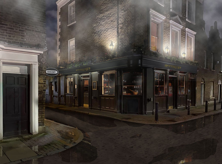 _________________ I'm still learning. |
Posted on 27/03/20 06:43:15 AM |
|
DavidMac
Director of Photoshop Posts: 4939 Reply |
Re: Challenge 798: The King's Arms
Sara. I think that is one of the best I haxe seen from you. 'Very impressive. _________________ The subtlety and conviction of any Photoshop effect is invariably inversely proportional to the number of knobs on it ....... |
Posted on 27/03/20 09:29:44 AM |
|
Steve Caplin
Administrator Posts: 6835 Reply |
Re: Challenge 798: The King's Arms
First to Victorianise this weeks street was GKB, with plenty of period features, and a welcome return for the bier from a couple of weeks ago. The wet cobbled road has splendid reflections, and that pothole makes a good foreground feature. I like the change of road name, and the weathering of the wooden door on the left. Atmospheric fog from DavidMac, with a neatly cobbled street and a fine cast of toffs and no-so-toffs. I like how youve extended the street to the right, and the way youve recreated the road names. Best of all, though, is the conversion from electric to gas lighting, not only above the pub and in the street lamp but in the windows too. Beautifully done, David. A muggy pea-souper from Frank, with urchins aplenty and a fine example of a penny farthing (and I hope you found that already cut out). Good work changing the road names; and really, really good work closing the pub - not just taking the light out of the windows, but from the name over the doors and the wall above. Youve done such a good job I almost overlooked it. A deserted street from tooquilos, with an equally empty pub. Good new lighting, with the electric lights on the pub neatly removed. A really funny animated version, with a fun toy theatre intro. Couple of points about speech bubbles: why are Victoria and Albert talking out of their knees? And if you want people to read Victorias speech first, you have to put it on the left - or, at least, higher than Alberts. I like the rolling wheels on the bier, and the cast of Victorian notables. A sepia entry from Ben Boardman, with a cobbled street and a large cast of characters - with Isambard Kingdom Brunel searching his pockets for his missing chains. I like the lamp lighter, and the new road names; good work taking the lighting off the pub, and turning the corner window into a door. The new gas lighting works particularly well. Entertaining work from michael sinclair, despite setting a new record for going off-topic - this one doesnt bear even the slightest relevance to the subject. Its OK, Michael, but why post it in the Friday Challenge section of the Forum? It was at our last Christmas lunch, I think, that Gordon suggested a night-to-day challenge. I said I thought it was impossible. But Mariner's entry this week has proved me wrong: this is astonishingly well done, with the sunlight effect particularly appealing. The shadow of the pub sign is an eye-catching feature, the new foliage over the reconstructed pub sign is excellent, as is the lettering - the falling T is a treat. Seriously, Michael, this is one of your best pieces yet. However, since you seem to like me nitpicking, a couple of minor issues: 1. The sun is a very long way away. So shadows cast by the sun are always crisp: its only close-up light that casts soft-edged shadows. 2. The horse and carriage look as if theyre floating. I think that beneath them, as theres not only no sunlight but no reflected ambient light, the shadow should be somewhat deeper. 3. Watch the wiggles! Its easy to misalign when using the Clone tool. The left of the three windows on the right hand wall, and the sign below it. 4. Dont overdo perspective. The road sign above the pub is too strongly in perspective. It can be tricky to match when the object is so small; a good solution is to make a larger rectangular selection around the layer, which makes it much easier to align the transformation: 
Hard to adjust Free Transform handles 
Make a larger selection around the sign first 
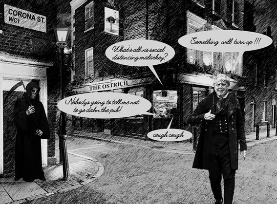
then its easier to align with the brickwork. Social satire from Josephine Harvatt, with a Victorian Boris promising that something will turn up, Micawber-style, on Corona Street. Nicely done, and some good gags. Watch that your choice of font doesnt become illegible at small sizes, though! A beautiful entry from srawland, with excellent puddles and reflections. The neatly emptied pub is immaculately done. I like the conversion of the electric lights into gas lights, although given the design of the lamp Id question the fact that theyre still casting their light upwards. Cant read the name of the pub, Im afraid. Great to see you fully engaged once more, Sara. _________________ This has been a splendid week for the Forum, with as high a quality of entries as Ive yet seen. You may have noticed my plug for a possible virtual meet next week. Id been going to suggest that those of you without webcams find an Internet cafe - but of course all the cafes are closed, at least in the UK. A real shame. It would have been a great way to celebrate the 800th Friday Challenge. |
Posted on 27/03/20 10:23:07 AM |
|
josephine harvatt
Gag Gadgeteer Posts: 2596 Reply |
Re: Challenge 798: The King's Arms
For some reason the computer made me reduce the image far more than normal to get it down to the required MB limit - not sure why - which resulted in pixellation although if you are talking about the handwriting font it is quite tricky to read anyway but I wanted something roughly in keeping Thats my excuse anyway _________________ I'm not really bad - I just draw that way |
Posted on 27/03/20 10:25:30 AM |
|
Mariner
Renaissance Mariner Posts: 2820 Reply |
Re: Challenge 798: The King's Arms
Thanks Steve, it is definitely one of my better efforts.
Now I don't know why but I have never noticed that before. I shall be looking more at shadows from now on.
Of course! Why didn't I see that?
Yes, I missed that.
Thanks for that hot tip and examples. I was having trouble with that sign. The perspective tool made it not enough or too much. |
Posted on 27/03/20 12:36:54 PM |
|
DavidMac
Director of Photoshop Posts: 4939 Reply |
Re: Challenge 798: The King's Arms
Thanks Steve. I really enjoyed myself doing this one.
Now that's a neat tip Steve! Thanks Stay safe everyone. _________________ The subtlety and conviction of any Photoshop effect is invariably inversely proportional to the number of knobs on it ....... |
Posted on 27/03/20 2:56:27 PM |
|
Steve Caplin
Administrator Posts: 6835 Reply |
Re: Challenge 798: The King's Arms
It's all that bitty rain. Should have waited for a clear night! |
Posted on 27/03/20 3:10:21 PM |
|
GKB
Magical Montagist Posts: 3726 Reply |
Re: Challenge 798: The King's Arms
Thanks Steve. Great work from everyone. _________________  |
Posted on 27/03/20 5:08:18 PM |
|
srawland
Pixel Perfectionist Posts: 885 Reply |
Re: Challenge 798: The King's Arms
Thank you, Steve. _________________ I'm still learning. |
Posted on 27/03/20 5:10:47 PM |
|
srawland
Pixel Perfectionist Posts: 885 Reply |
Re: Challenge 798: The King's Arms
Thank you David. It was nice to have the distraction from recent events. _________________ I'm still learning. |
Posted on 27/03/20 8:02:26 PM |
|
Frank
Eager Beaver Posts: 1576 Reply |
Re: Challenge 798: The King's Arms
Thanks Steve, yes I did cut out the penny farthing - that's what comes with house arrest I guess. Stay Safe! |
| page: 1 2 3 last |