
| » Forum Index » The Friday Challenge » Topic: Challenge 323: Land of liberty |
|
Posted on 26/10/10 9:46:21 PM |
|
Helen S
* Posts: 6 Reply |
Re: Challenge 323: Land of liberty
This is awesome ....   |
Posted on 27/10/10 1:20:56 PM |
|
micky47
* Posts: 37 Reply |
Re: Challenge 323: Land of liberty
With my little knowlege, my best shot is here: 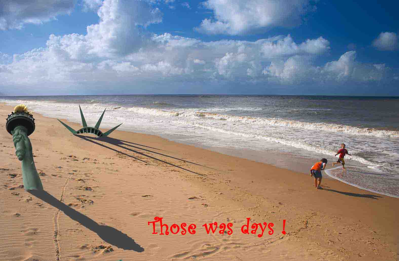 |
Posted on 27/10/10 5:37:08 PM |
|
Deborah Morley
Makeover Magician Posts: 1319 Reply |
Re: Challenge 323: Land of liberty
Great images everyone. 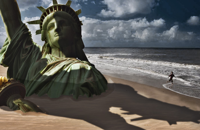 |
Posted on 27/10/10 5:53:21 PM |
|
Sophie
Political Parodist Posts: 595 Reply |
Re: Challenge 323: Land of liberty
Thanks Josephine, a combination of layer mask and some cloning with a scratchy brush. BTW, I love that sonnet by Shelley, takes me back a bit! Great idea for your FC rendering this week. |
Posted on 27/10/10 7:31:46 PM |
|
micky47
* Posts: 37 Reply |
Re: Challenge 323: Land of liberty
Hi Gordon ! the work with the rusty bits it's great |
Posted on 27/10/10 8:13:33 PM |
|
Sophie
Political Parodist Posts: 595 Reply |
Re: Challenge 323: Land of liberty
Great idea and welcome to the forum! |
Posted on 27/10/10 10:14:28 PM |
|
GKB
Magical Montagist Posts: 3732 Reply |
Re: Challenge 323: Land of liberty
Well thank you Micky. As a matter of interest do we call you Pollak or Gabi? Some really excellent work from everyone this week. Thanks to Andrew for the images and to Nick for suggesting this as a Friday Challenge. _________________ Why isn't 'phonetic' spelled the way it sounds? |
Posted on 28/10/10 10:33:17 AM |
|
james
Surreal Spoofer Posts: 1194 Reply |
Re: Challenge 323: Land of liberty
http://i153.photobucket.com/albums/s211/fungismith/beach-1.gif |
Posted on 28/10/10 11:31:59 AM |
|
dejá_vu
Guest Reply |
Re: Challenge 323: Land of liberty
Oh James, I really love that final hug! hahaha, very tender animation  _________________ There are men who fight one day, and are good men. There are men who fight a year, and they are better. There are men who fight many years, and they are very good. But there are men who fight all over their lifes. Those are the indispensable. Bertold Brecht |
Posted on 28/10/10 11:36:22 AM |
|
dejá_vu
Guest Reply |
Re: Challenge 323: Land of liberty
I'm really impressed about the craquelures all over the statue and the perfect weed over the arm... how did you achieve that? _________________ There are men who fight one day, and are good men. There are men who fight a year, and they are better. There are men who fight many years, and they are very good. But there are men who fight all over their lifes. Those are the indispensable. Bertold Brecht |
Posted on 28/10/10 11:38:42 AM |
|
dejá_vu
Guest Reply |
Re: Challenge 323: Land of liberty
Welcome to the jungle (nice jungle, in fact)
_________________ There are men who fight one day, and are good men. There are men who fight a year, and they are better. There are men who fight many years, and they are very good. But there are men who fight all over their lifes. Those are the indispensable. Bertold Brecht |
Posted on 28/10/10 9:59:30 PM |
|
Emil
KAFKAsFRIEND Posts: 413 Reply |
Re: Challenge 323: Land of liberty
I am not sure about eye-level because we are looking down, so I am wonder what Steve will say about this: _________________ There are most happy who have no story to tell. - Anthony Trollope. |
Posted on 28/10/10 10:09:57 PM |
|
Emil
KAFKAsFRIEND Posts: 413 Reply |
Re: Challenge 323: Land of liberty
_________________ I have the true feeling of myself only when I am unbearably unhappy. - Franz Kafka |
Posted on 28/10/10 10:31:25 PM |
|
Emil
KAFKAsFRIEND Posts: 413 Reply |
Re: Challenge 323: Land of liberty
Here it is: 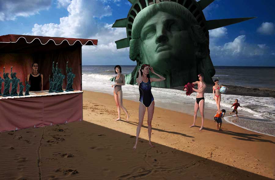 _________________ I have the true feeling of myself only when I am unbearably unhappy. - Franz Kafka |
Posted on 28/10/10 10:36:02 PM |
|
Luis
Six-String Synthesist Posts: 236 Reply  |
Re: Challenge 323: Land of liberty
The sea weed is just two pictures that I found and placed it over the arm. The cracks were created by painting lines and just added an inner shadow and bevel and Emboss. Luis |
Posted on 28/10/10 11:41:37 PM |
|
dejá_vu
Guest Reply |
Re: Challenge 323: Land of liberty
A lot of patience painting every crack, but really does have a reward . And about the sea weeds, I only have one thing to say: what a wonderful work on making the selection. Bravo!
_________________ There are men who fight one day, and are good men. There are men who fight a year, and they are better. There are men who fight many years, and they are very good. But there are men who fight all over their lifes. Those are the indispensable. Bertold Brecht |
Posted on 29/10/10 00:23:10 AM |
|
Sophie
Political Parodist Posts: 595 Reply |
Re: Challenge 323: Land of liberty
Just seen your entry Stefano, very clever idea and well executed. Mi piace molto. |
Posted on 29/10/10 02:10:27 AM |
|
LonnieK
Diorama Dreamer Posts: 238 Reply  |
Re: Challenge 323: Land of liberty
 _________________ Lonnie |
Posted on 29/10/10 09:36:38 AM |
|
Steve Caplin
Administrator Posts: 6838 Reply |
Re: Challenge 323: Land of liberty
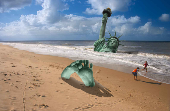
Excellent entries this week. Good to see the elongated shadow exercise we did a few weeks back has found a practical purpose! First onto the beach this week was Gerard, with a nicely angled statue and a good attempt at the shadow. Removing the kids from the beach makes a certain sense; not sure about the recolouring of the sea and sky - although it does make for an attractive composition. I like the added shading on tomiloi's entry, matching the angle of the light that casts those long shadows. If we're going for size accuracy, the statue would need to be large enough for people to stand within the crown - so very much larger than it is here. I do find the added seagull rather distracting, though, since it's impossible to place depth-wise within the scene and it makes the scale issue more confusing. I like the way Eggbox has pushed the sand contour in and out of the folds on the robes - although perhaps a slight softening of the edges would be needed, maybe with a brush set to Dissolve? Watch the angle of the shadow, Ted: it does need to match that from the kids on the beach. A very funny second entry - especially the subtlety of the dark stain around the arm , and the faintest indentation in the sand. Very dramatic shadows from Carlo Alessandro Della Valle, highlighting the drama of the scene. I like the broken spikes on the crown - perhaps one or two of them could be sticking out of the sand? I really like the way you've made the kids so much smaller, it makes the statue look far more impressive. A new member this week - and nix has shrunk the statue right down, and placed it between the kids so it looks as if one of them has just discovered it on the beach. A very neat solution! With such strong shadows, though, the statue really needs to have more shading directly on it: it's rather too well-lit at present. Welcome to the forum! A glorious scene of destruction from Luis, with seaweed and other plant life growing over the statue. Separating the arm and moving it to the foreground was an excellent idea: bringing it so far to the front that the boy is standing right on it is a stroke of genius. I like the fact that he's peering down into the hole, and the fact that you've taken the trouble to build the interior, complete with structural supports - fantastic work, Luis! A terrific image. I think this must be the funniest ever piece from gaoxiguo - it brings to mind all those family holidays where Dad is buried on the beach by his kids. A really clever idea, beautifully made. Excellent! Josephine Harvatt has come over all poetic this week, inspired by that terrific poem by Percy Bysshe Shelley - it's been a favourite of mind since I first had to learn it at school. I like the idea of the name painted in graffiti on the arm - a fitting end! Given the depth of the burial, though, perhaps a little destruction needed on those delicate spikes? It was a good idea of GKB to place the additional child in the scene, looking up at the statue. I far, far prefer the version with the rust! What's with the white highlight on the face, though? Can't see what's going on there. I like the angle and position of the arm in the background - it seems to lie so naturally in the surf. I love the Liberty sandcastle in the second entry - very nicely achieved. Shame the lighting on your statue is from the opposite direction, though: flipping the background would have fixed this. An interesting change of shadow direction from Ben Mills, with a corresponding shift in the time of day. Except that you've set this scene clearly in the evening, whereas the position of the shadow indicates a sun almost directly overhead. A very novel way of burying the statue! A nicely made political poster from Dejá_vu, which gets its point across well. I really like the perspective of the lettering, very neatly integrated into the scene. One small point here: if you're going to use Layer Styles to add a stroke, you really need to rasterize the style (turn it into a regular layer by expanding the styles) before you apply the distortion. You need the stroke to be thinner where the lettering is further away from us. The first reference to the original film comes from BigVern - and a neatly styled poster, with the big faces in the background aping (ha ha) the faces of movie stars on posters. I like the construction of the lettering, which has a good feeling of awkward disjuncture to it. Good work. A dramatic, stark sepia-tinted image from tooquilos - I like the way the statue is tucked behind the rock, which gives a half-hidden feeling to it, and the added cliffs build on the sense of solitude here. A most entertaining animated entry, too. I always wonder what soundtracks you're going to come up with, and had forgotten all about that brilliant Simpsons parody... clever work! Very clever work from Sophie, with sand creeping into the folds of Liberty's robes - really, beautifully achieved. The shadow is from a slightly awkward angle, as you suggest: it would have been easier to move the shadows on the kids to match it. A somewhat outsize seagull though, wouldn't you say? A strong moonlit picture from Nick Curtain (and I see the kids have long gone home to bed). Beautifully subtle lighting on the side of Liberty: this is a really, really difficult technique to master, and I think you've got the light on the arm - particularly around the base of the lamp and the arm - exactly right. The whole image is a little too dark to see clearly, though, and Save for Web can do that sometimes: do check it out after you've posted! A great postcard from brewell, with a gawky tourist wearing a cheap replica of Liberty's crown. It's such a neat idea, you dont really notice how well Liberty has been integrated into the beach scene. Great sense of scale, very nice work! I like the added buildings in Vibeke's entry, which add greatly to the drama of the scene. Perhaps a little more destruction on the buildings? If the arm is that much further into the distance, it should also be rather smaller than you have it. And, er, watch those shadows! If the sun is on the left of the statue, the shadow wouldn't be anything like the same shape as when viewed from the front! Clever work from Stefano Giacomuzzi, who has sliced through the statue to produce a neat cutout. Wouldn't we expect to see some structural support, or even staircases, within the head? I like the sand resting inside the hole in the arm, and the shading throughout is very neat. Could do with more shadows on the sand, though. A very strong entry from Zuney, who has cleverly extended the sky upwards using an interesting technique: copying the sky, flipping it horizontally, then stretching it to fit. A clever idea, but wouldn't it have been easier simply to stretch the existing sky without flipping it? A very nicely buried statue, I like the added sand on it. Our second new member this week is kenjironimo, with a really clever entry - Liberty engulfing her face with dripping ice cream. I'm most interested in the bending technique you used on that arm, Ken: Image Warp? If you have CS5, Puppet Warp would have been the perfect tool for that. The shadows need to be longer, but otherwise this is very funny stuff. Welcome to the forum! A real movie homage from Daniel, with excellent apes and soldiers. Are these done in Poser? Or cut from a video game? I like the helicopters in the background, although I would have brought the head closer to avoid it being right on the horizon line... and would that searchlight beam be visible in daylight? Beautiful degradation from aschiewe, who used a displacement map to roughen the edges of the head. No matter that this wasn't intentional: I often find the most surprising techniques are those we discover by accident, and this certainly has the right effect. Very fine addition of all that seaweed, and the long shadow works well. Excellent work, Andrew. I like the way Jota120's statue appears in the misty distance - a very nice rendering of sea haze there. What is that strong shadow in the foreground, though? Too subtle for me, Trevor! A deeply buried statue from micky47 - but what excellent shadows! A perfect match to the kids' shadows, evening running in perspective along the beach. Great work! I like the gloomy feel to Deborah Morley's entry, with a neatly broken-off hand and a solitary child on the beach - very emotive. Is the shadow on the face too stark, though? Perhaps a slightly softer edge to it? James's idea to make the boy run along the beach is an inspired one - along with the clever ruse of having him run off to the side, before coming back on in the opposite direction. I'd like to see him grow in size as he comes from the background, though - but would this involve too many additional layers? The real genius here is so subtle we almost miss it on first viewing - the way the surf comes in and out. And, of course, the trademark flying bird that comes in and out of shot. Very tasty. A clever beach scene from Emil, with the head turned into a tourist attraction - complete with a stall selling miniatures of the statue. I like the shadow, particularly the deep shadow from the stall, but I will take issue with the placement of your people: eyelines on the horizon, please! The viewer is, after all, standing on the beach, and it barely slopes away at all. A slightly distorted Liberty from LonnieK: wouldn't it have been easier to extend the picture vertically? But as always, there's a depth of texture here that you always seem to achieve - its almost like HDR photography, but with added glow. A beautiful scene, and the added beach ball and seagulls are a great addition. Great shadows! Amazingly good work this week. Many congratulations to all of you. |
Posted on 29/10/10 10:26:29 AM |
|
dejá_vu
Guest Reply |
Re: Challenge 323: Land of liberty
Oops...  ... ...
Thanks a lot, Steve, for your advices. Actually these are the things that make an image appear consistent to the point of making us doubt whether it is real or not, even though we know it is a photomontage. My challenge is to make you doubt, one day, because one of my images. _________________ There are men who fight one day, and are good men. There are men who fight a year, and they are better. There are men who fight many years, and they are very good. But there are men who fight all over their lifes. Those are the indispensable. Bertold Brecht |
| page: 1 2 3 4 5 6 last |

 or so I keep telling myself .... I also love the powdery sand effect - I tried that on an earlier attempt but mine was nowhere near as convincing.

