
| » Forum Index » Problems and solutions » Topic: Brochure Concept |
|
Posted on 30/10/08 01:05:10 AM |
|
tank172
ThreeDee Thriller Posts: 692 Reply |
Brochure Concept
Hi everyone! Haven't posted for some time, but I've still been lurching the forums  Hope all is going well with you guys! Hope all is going well with you guys!
I've been working on this brochure for a family member that is starting this new company. It seems to me that it's missing that little extra 'pop' in the design, but I'm having trouble pinpointing just what should be done/changed. I'm still not happy with the color combinations on the front&back covers Please disregard the trim lines, and the stock photography hasn't been approved for purchase yet so they're still watermarked from Stock Expert. The clipping masks are also very rough. 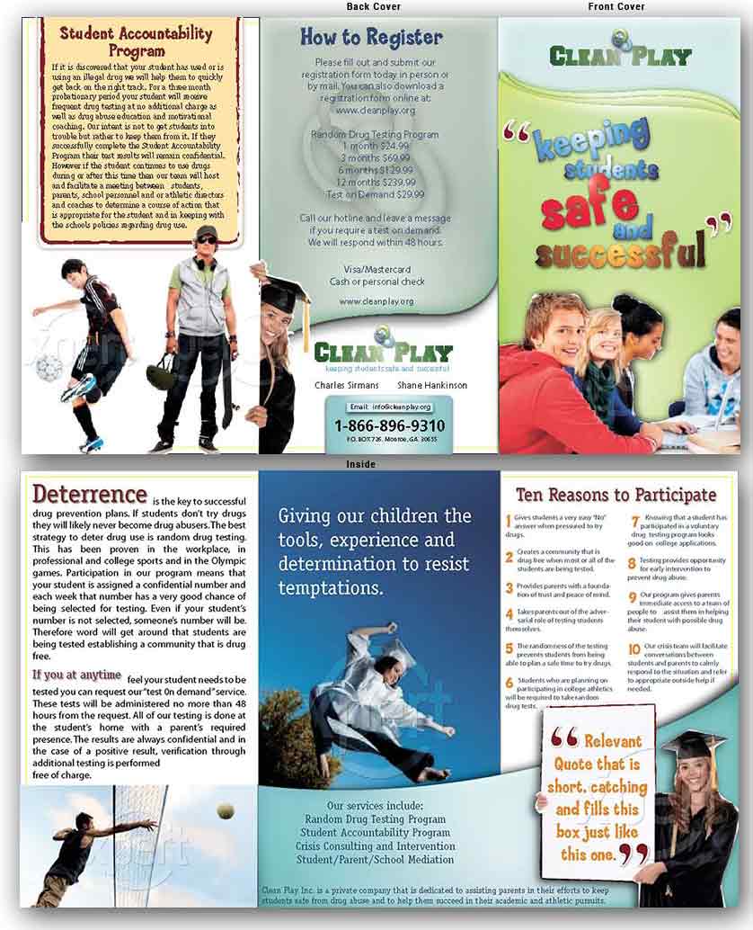
|
Posted on 30/10/08 09:10:40 AM |
|
Nick Curtain
Model Master Posts: 1791 Reply |
Re: Brochure Concept
Hi Chris My view is that the design is very eye catching - good job. I'm not sure what you would want to do to improve this. Nick |
Posted on 30/10/08 2:59:22 PM |
|
David Asch
Tech Support Posts: 1913 Reply |
Re: Brochure Concept
I agree with Nick, very nicely done. If I had to point anything out it would be to shift the baseline down on the intro of the second paragraph on the second side. _________________ It must be Thursday, I never could get the hang of Thursdays |
Posted on 30/10/08 3:03:52 PM |
|
cy98
** Posts: 104 Reply |
Re: Brochure Concept
If you are trying to grab the interest of a casual browser then there is too much wordage on this sheet. The upper right corner shot is good as letters are big, colorful and simple. The middle bottom is OK too as it is short and to the point. The font is large so easily read even as small part of screen. Same with girl holding sign board. The other panels have long lists to read with small font and most people will have their eyes glaze over so won't take time to read message. These more detailed panels should be on page 2 under "more information". Edit - I just looked closer at the page and see it is supposed to be folded and different pages, so disregard my comments. |
Posted on 03/11/08 05:26:18 AM |
|
tank172
ThreeDee Thriller Posts: 692 Reply |
Re: Brochure Concept
Thanks everyone for the replies! Here's some changes they've asked to make. David, yeah I saw that one, but was too lazy to change the text wrap settings before export... 
Thanks, cy98. All too often, most small companies demand to incorporate as much copy as possible in as little space as possible. Not much I can do to change the amount of copy, but the best I can do is make it as legible as I can. At the moment, the design is 14"wide by 8.5"tall, so it should work out well. But they've also requested to make the layout dimensions smaller... 
Here's the revised, almost approved version with the finally approved stock photography. 
|
Posted on 03/11/08 05:36:20 AM |
|
tank172
ThreeDee Thriller Posts: 692 Reply |
Re: Brochure Concept
They wanted some pretty big changes to the cover. Although I prefer the first concept... 
|
Posted on 06/11/08 10:15:47 PM |
|
videoC
* Posts: 3 Reply |
Re: Brochure Concept
I agree with you - I liked your first version, the colour palette was more balanced - but hey - the customer is always right! |