
| » Forum Index » Problems and solutions » Topic: Lest We Forget |
|
Posted on 05/07/09 07:40:12 AM |
|
its_me
* Posts: 9 Reply |
Lest We Forget
Steve, on the far left of page 296 in chapter 10 that says lest we forget how was that image created, could you tell me the steps. ive tried but i can't seem to get it. could you help me |
Posted on 08/07/09 07:34:00 AM |
|
Steve Caplin
Administrator Posts: 7129 Reply |
Re: Lest We Forget
I created the lettering for that image using Illustrator to extrude the 3D words. It would be tricky to create this entirely in Photoshop - although you could approximate it using the "Adding Depth to Flat Artwork" technique at the beginning of the 3D chapter. Be sure to show us your results! Steve |
Posted on 08/07/09 08:41:35 AM |
|
its_me
* Posts: 9 Reply |
Re: Lest We Forget
what about the other pictures, lettering,color, foliage, base, texture and lighting effects could you give me some specifics on those, and could you give some specifics on how the extrusion was done in illustrator
|
Posted on 09/07/09 07:40:52 AM |
|
Steve Caplin
Administrator Posts: 7129 Reply |
Re: Lest We Forget
The extrusion was done using Illustrator's 3D filter - but if you don't know how to use this, I really can't tell you here! Everything else was added using techniques described elsewhere in the book. Other than the lettering, there's really nothing specifically tricky about this illustration. Why don't you have a go, and see what you can come up with. |
Posted on 16/07/09 07:39:28 AM |
|
its_me
* Posts: 9 Reply |
Re: Lest We Forget
i've tried but it always turns out solid black to the point where it dosent look like words this is as far as ive gotten so far because it always turns out solid and it's supposed to say Born in the USA
 |
Posted on 16/07/09 08:22:57 AM |
|
Pete
Body Booster Posts: 121 Reply |
Re: Lest We Forget
If you are doing this in illustrator it looks like you've got the shading colour set to black. Change the shading properties (highlighted below). hope this helps. 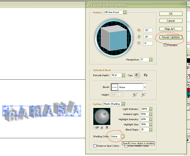
|
Posted on 18/07/09 03:53:24 AM |
|
its_me
* Posts: 9 Reply |
Re: Lest We Forget
That Definantley helped thank you i will post my results in a few days or as soon as its finished thank you
|
Posted on 21/07/09 10:54:07 AM |
|
its_me
* Posts: 9 Reply |
Re: Lest We Forget
Steve how was the plinth created in illustrator or what chapter or page of the book covers the technique
[/quoted] [/quoted] |
Posted on 21/07/09 10:57:44 AM |
|
Steve Caplin
Administrator Posts: 7129 Reply |
Re: Lest We Forget
That looks good so far! The plinth was created by defining the edge as a custom bevel - you do this by drawing the shape, then adding it to the default Illustrator startup document (it will be in your Illustrator folder). You'll need to restart Illustrator after doing this, but then you'll be able to extrude a simple rectangle and apply the new bevel within the 3D Effects dialog. |
Posted on 22/07/09 12:29:36 PM |
|
its_me
* Posts: 9 Reply |
Re: Lest We Forget
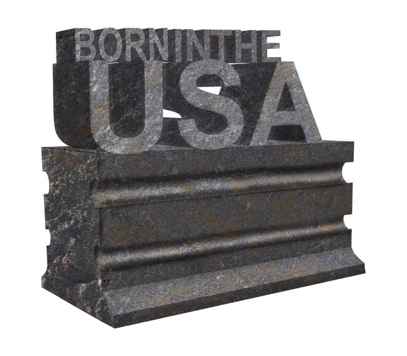
this is how far i've gotten but it still dosent look right the perspective on USA is off even though it is the same as the rest and it still looks more 2dimensional than it should i 'm not sure how to fix this could someone help me Steve Caplin wrote: That looks good so far! The plinth was created by defining the edge as a custom bevel - you do this by drawing the shape, then adding it to the default Illustrator startup document (it will be in your Illustrator folder). You'll need to restart Illustrator after doing this, but then you'll be able to extrude a simple rectangle and apply the new bevel within the 3D Effects dialog. [/quoted]  |
Posted on 22/07/09 1:53:09 PM |
|
Steve Caplin
Administrator Posts: 7129 Reply |
Re: Lest We Forget
Looking good! I recommend the following steps: 1. Increase the perspective in Illustrator. You can do this in the 3D dialog, and it will make it look more realistic. 2. Use a smaller stone texture. 3. For the lettering, it would be best to select the front faces and make a new layer from them, then you'll be able to add more shading to the sides. 4. Just a question about the arrangement. It doesn't read as Born in the USA when it's arranged like this! Are you sure it has to be this way around? |
Posted on 23/07/09 09:14:48 AM |
|
its_me
* Posts: 9 Reply |
Re: Lest We Forget
|
Posted on 23/07/09 10:42:22 AM |
|
its_me
* Posts: 9 Reply |
Re: Lest We Forget
 |
Posted on 23/07/09 12:01:07 PM |
|
Steve Caplin
Administrator Posts: 7129 Reply |
Re: Lest We Forget
Yes, that's looking much better. My only problem here is with the fact that the 'Born in the' lettering appears to be floating. You can't do this in stone! A better option might be to set all the lettering in upper case, placing the characters closer together so they look like they're carved from a single piece of rock. |
Posted on 24/07/09 07:46:45 AM |
|
its_me
* Posts: 9 Reply |
Re: Lest We Forget
 |
Posted on 27/07/09 6:02:28 PM |
|
Steve Caplin
Administrator Posts: 7129 Reply |
Re: Lest We Forget
Yes! |