
| » Forum Index » Problems and solutions » Topic: Need some Design suggestions |
|
Posted on 16/12/11 00:19:16 AM |
|
Jono
** Posts: 112 Reply |
Need some Design suggestions
Hey guys, been a while since I been on here, mainly due to coursework, but I just wanted to ask for some technical advice on Designing in Photoshop. Basically I've been placed in a company based around YouTube, and I usually get asked to help with the YouTube themes, but the thing is, it lowers my confidence when I come back to look at it a week later and see that it's been completely changed because of amendments. I know this is completely normal, as the client is the one who's paying and has every right to ask for amendments, or someone else trying to impress the client, or whatever. Point is, I don't feel like I'm doing a good enough job, my designs seem all over the place, and all I end up doing because of my rubbish skill in creativity is just filling in the blank sections like profile and uploads with blending options and making a funky looking rectangle, then I'd add the company logo and maybe a strip in the background to make it look cool. I just don't feel creative though, I just can't seem to think outside the box, could someone give me some advice on design? If you've ever worked with YouTube and know the layout before they recently changed it, I'd deeply appreciate it, because it's sort-of making me depressed because I don't feel good enough. In-fact, Steve if you're reading this mate, do you have anything in 100% Photoshop or How to Cheat in Photoshop CS5, or Art and Design in Photoshop (I'm a big fan, yes) on how to become awesome with blending properties? I just feel a bit jealous of this guy when he's making awesome glass textures with nothing but gradient. |
Posted on 16/12/11 08:15:53 AM |
|
Steve Caplin
Administrator Posts: 7178 Reply |
Re: Need some Design suggestions
Jonathan, Well, this is a tricky one. Design is something you're either taught or, in my case, pick up through trial and error. A lot of it comes down to that old standby, experience. It's hard to tell what you're doing wrong without seeing what you're doing. Can you post some examples of work you've created, along with amended versions that the client asked for? Then I might be able to offer some suggestions on why the changes were requested. Often, it's a matter of keeping things simple, not over-decorating fonts, for example. Clients may be a pain, but they're a necessary pain. When I used to do a lot of advertising work, I got the habit of always making two deliberate mistakes in my montages. They'll always want to change something, to show they're in control, so if you give them something to change they'll feel fulfilled and they won't tinker with the stuff that really matters. As for glass textures... again, can you post some examples of the kind of effect you want to achieve? Then perhaps I can figure out how it was done. Alternatively, if you're ever in London, drop me a line and I'll give you a couple of hours to show you how Layer Effects work. |
Posted on 16/12/11 09:17:44 AM |
|
Deborah Morley
Makeover Magician Posts: 1319 Reply |
Re: Need some Design suggestions
Hi Jonathan, In addition to what Steve said, I think you may have got a bit skewed in your thinking. (Not meaning to be rude). The company would not have taken you on if they thought you were rubbish (placement or otherwise). What work did they see in order to take you on? Look at that and start building on that. Re creativity: take your camera and take shots of bits of buildings, strange shadows, anything that you find interesting and then have a play. Go to museums and art galleries and again see what interests you; it might be the building itself. And look up at buildings, they tend to be original without the horrible plastic facades, brickwork, windows, old guttering even! I'm sure Steve would agree that the worst thing you can do is sit and look at a blank screen. Take some images, cut them up paste them together and see if you end up with something to build on, even if you think it is crap it is a starting point. |
Posted on 16/12/11 09:38:35 AM |
|
GKB
Magical Montagist Posts: 4176 Reply |
Re: Need some Design suggestions
Good morning Jonathan, I think everyone often has this kind of experience. One of the problems is that you can get too close to a piece of work and end up not 'seeing' it objectively. This is where having someone who knows what they are talking about look over your work with a critical eye can be a great help. Don't ask your mum - you'll get the wrong answer! If that first critical review is with the client then, yes, it may feel uncomfortable but that is all part of how a design evolves. Just remember that they are not thinking 'this guy is rubbish', they are thinking 'hey, great idea. How can we improve on this?'. As an example I have been having exactly the same problem writing up a rather large report over the last three weeks. Fortunately the team I am working with gets to review everyone's work before it goes to the client. This 'sanity check' is highly useful because it removes things that I just don't see because I am so close to the report. The same applies to the other guys on the team. It is always a good idea, assuming you have the time to be able to do it, to leave it for a while and do something else then come back to it with a fresh, critical eye. Don't let it get you down but do, always, think 'This is a great piece of work ... now what is wrong with it?. Gordon _________________ You do not need a parachute to skydive. You only need a parachute to skydive twice. |
Posted on 16/12/11 10:39:49 AM |
|
Jota120
Ingenious Inventor Posts: 2615 Reply |
Re: Need some Design suggestions
Jonathan, in addition to other comments, I suggest do not be too self critical. I've done it and very good at it, but it it ends in a spiral and eventually nothing comes out. Exercise and meeting people really works for me. Plus music. I love the classics too, but much more. Try rock climbing or skiing really starts to scare me, everything becomes clear then. I don't think I would like someone changing my work too much. When I work in a international environment, we are all contributing in a constructive way. If I am the rapporteur, we need to have consensus. Bright minds give bright ideas and creative solutions, just look here for example with everyone's solutions. Bright. The converse is dull ..... , but I love dull days too .... guess this might make little sense, but hey ...... I'd just carry on, get your right contacts, means have to socialise a bit, understand what is in their minds, it won't be necessarily the same as you, but there are intersections ... Just a thought. Trevor |
Posted on 17/12/11 00:57:27 AM |
|
Jono
** Posts: 112 Reply |
Re: Need some Design suggestions
Thanks for the suggestions guys, but yeah I guess I forgot to give examples. I'll show my example, but I'll only show parts of the glass and stuff, worried they'll be able to lock it down somehow and ask why I'm showing other people their stuff, I'm paranoid like that, my college can do it! They scan assignments and compare it to every website in the UK.. Anyway.. Here's a first design I spent a little time on for a website called Vets4Pets which I had to base a YouTube theme on, which I was allowed to copy and paste for this:- 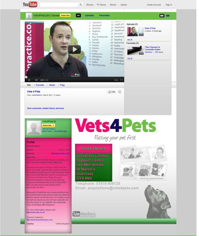
Here's it now: http://www.youtube.com/vets4petsltd Apparently it was an important job, but this is it now:- http://www.myvetpractice.co.uk/ As for the glass, that's on the computer where I work, and it's a style so I can't really change anything, so let's forget the glass bit for now. Website was a little different when I was doing a Theme for it, but basically those pictures of the animals were part of the website. Another example.. In the same order.. 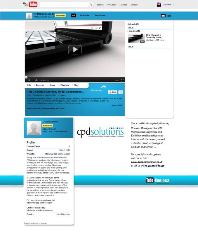
http://www.youtube.com/CPDsolutionsLtd - The only definitive amendment I can see is the logo to something else, I wasn't told about that, See the pattern though? This is 10x more creative than me. |
Posted on 19/12/11 08:06:50 AM |
|
Steve Caplin
Administrator Posts: 7178 Reply |
Re: Need some Design suggestions
Thanks for the examples. This really helps us to see what's going on. Your main problem seems to be dealing with text. In the Vets4Pets example, you placed a large chunk of text in black on a dark pink background. Placing text on a colour always makes it harder to read, and in this case the pink is so strong it would have been off-putting for the readers, who just wouldn't have bothered with it. Also in the V4P example, you set the postal details in pink text, with a drop shadow, on a green background. Pink and green are opposite colours, which means they give a dazzle effect when viewed; and while a drop shadow maybe OK for a word or two in a headline, it's an absolute no-no for body text. A very common mistake made by those new to design is to pile on the colours and effects - and the result is that it looks amateurish. You also have to consider the relative importance of the text. The postal address is of minimal importance on a website - after all, who's going to write to them by snail mail? If it's a how-to-find-us address, then it should link to a Google map. Either way, it's information that in no way deserves the pride of place you've given it. The CPD website you designed is largely untouched, and that's because it's much more clean and professional. But look at what was changed: the headlines beneath the main video, and other essential information, have been set in white, rather than the black you used. It's perhaps surprising, but when you set text on a strong colour, white is almost always very much clearer to read (at least in large sizes) than black. You're definitely working on the right lines. Don't lose heart! This stuff isn't easy! |
Posted on 19/12/11 10:53:03 PM |
|
Jota120
Ingenious Inventor Posts: 2615 Reply |
Re: Need some Design suggestions
you have some superb feedback there I think from Steve IMHO. He is very good at this. And thanks for sharing Steve. I will mention his book Art & Design in Photoshop, its very good e.g http://www.amazon.co.uk/Art-Design-Photoshop-simulate-anything/dp/0240811097 I might only add the overlapping window make an interesting effect....... not sure how to do that, but can do most things |
Posted on 21/12/11 11:24:05 PM |
|
Jono
** Posts: 112 Reply |
Re: Need some Design suggestions
Thanks for the replies Steve and Jota. 
Steve, if I may make bullet points.. - Chill out with the effects, specially on text as it will keep things looking processional - Consider how easy it is to read, and avoid the dazzle effect given by opposite colours. Is that right Steve? And Jota, yeah I have Art & Design in Photoshop, became distracted by coursework, and felt like I needed a dreaded graphic tablet to be good with it. |
Posted on 22/12/11 07:54:53 AM |
|
Steve Caplin
Administrator Posts: 7178 Reply |
Re: Need some Design suggestions
Exactly right. You should aim to keep text as simple as possible, so it's fully readable. As it's nearly Christmas, perhaps you should treat yourself to a graphics tablet! |
Posted on 22/12/11 8:09:26 PM |
|
Jono
** Posts: 112 Reply |
Re: Need some Design suggestions
Haha I have one mate, just don't use it much, I'm just not sure how it's meant to help to be honest other than artwork |
Posted on 23/12/11 07:25:58 AM |
|
Steve Caplin
Administrator Posts: 7178 Reply |
Re: Need some Design suggestions
You'll hate using the tablet for the first couple of weeks, but stick with it. Suddenly it will become second nature. |