
| » Forum Index » Readers' gallery » Topic: Curtain Up On Murder |
|
Posted on 19/02/08 10:46:43 PM |
|
chris berry
Overhead Overlord Posts: 724 Reply  |
Curtain Up On Murder
Our latest theatre production - any feedback more than welcome. Chris 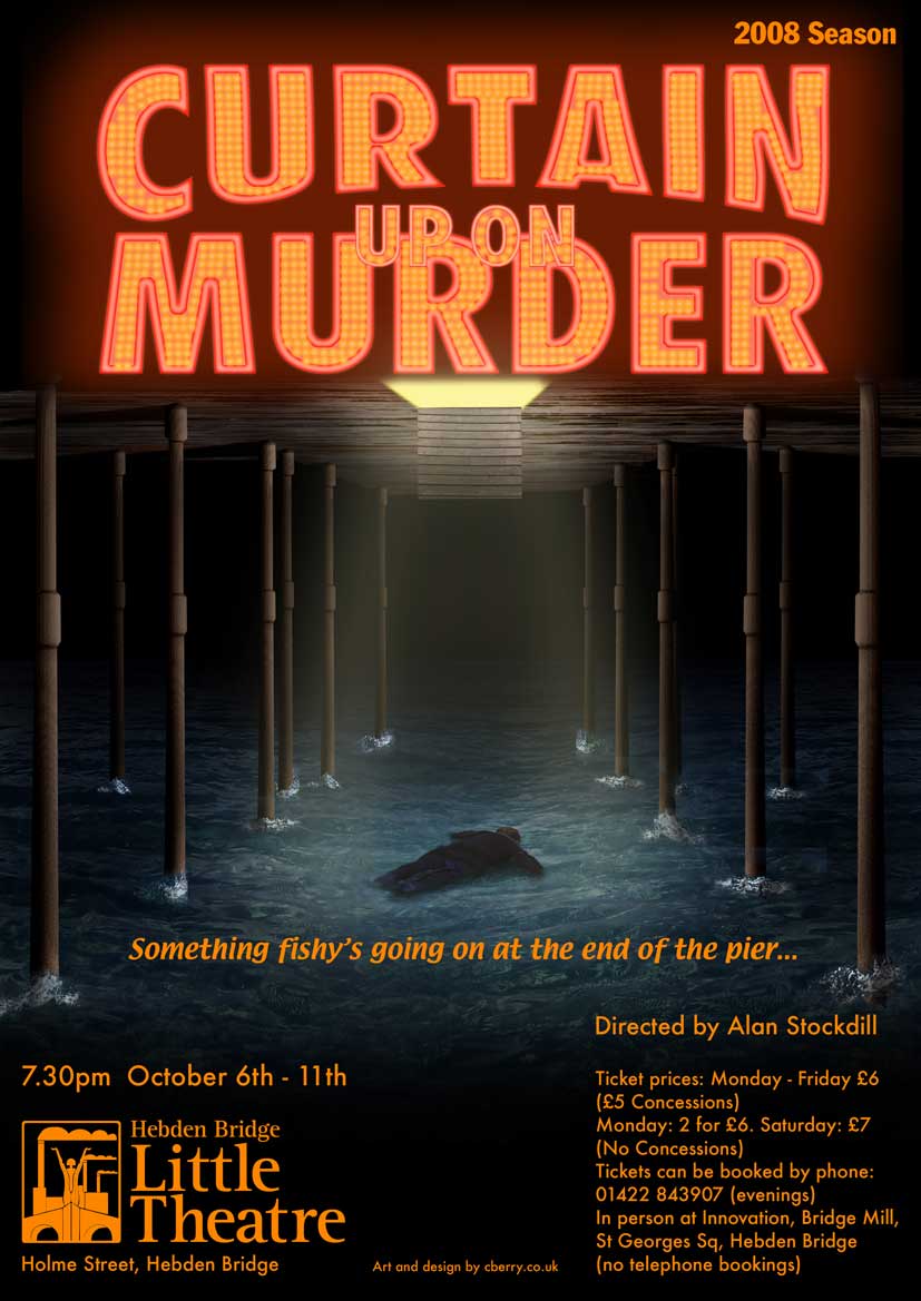 |
Posted on 20/02/08 00:22:32 AM |
|
David Asch
Tech Support Posts: 1913 Reply |
Re: Curtain Up On Murder
The main image is great. I'm not keen on the title, though. The overlapping text gets lost in the whole thing. Space it out so the 'on the' sits in the middle between the other two words. _________________ It must be Thursday, I never could get the hang of Thursdays |
Posted on 20/02/08 08:09:24 AM |
|
Steve Caplin
Administrator Posts: 7178 Reply |
Re: Curtain Up On Murder
Yes, I agree... if you're going to use the lit-up text effect, you really can't then overlap the words or you'll break the illusion. If you are thinking of changing the text - unless this has already had final approval - then a couple more suggestions. First, the N of CURTAIN has a wiggle to it, which may be intended to represent a billowing curtain. But clearer and neater, I think, to keep it with straight sides. Are you using Image Warp to distort this lettering? Text Warp would be rather more controllable, I think. Also, I think the way the words are split up could be improved for clarity. I'd recommend CURTAIN UP on the top line, a smaller ON, then MURDER. That's the way the phrase splits naturally, and it would give you more space to play with for the ON. A great image, though - the trap door makes perfect sense, and the pillars with foam around the bases work beautifully. Perhaps a small iron ring for a handle on the trap door to make it clearer? |
Posted on 20/02/08 08:37:55 AM |
|
chris berry
Overhead Overlord Posts: 724 Reply |
Re: Curtain Up On Murder
Hi both Thanks for the suggestions, I'm not a designer by trade so I'm still getting to grips with type. I'm just happy you like the image!! All changes can be done, no problem. The ring on the trapdoor will be a great touch, especially as it will reflect the light from above. Type is a different matter. I think your ideas are much better, but it will mean starting over, with each individual bulb, so it might be a while before I re-post it! I'd had the same concern about the overlapping type, so I should have changed it. Thanks again for the advice. Really appreciated. Chris |
Posted on 20/02/08 10:24:52 AM |
|
Steve Caplin
Administrator Posts: 7178 Reply |
Re: Curtain Up On Murder
If you're going to start over and place all the bulbs again by hand, then maybe this will help: use fewer bulbs! A single line of bulbs through each letter will be much more convincing than three lines. |
Posted on 20/02/08 10:35:13 AM |
|
chris berry
Overhead Overlord Posts: 724 Reply |
Re: Curtain Up On Murder
What if it was more like this - in 2 lines and 1 line for the thin bits?  |
Posted on 20/02/08 12:20:20 PM |
|
Steve Caplin
Administrator Posts: 7178 Reply |
Re: Curtain Up On Murder
Yes, that does look good. But remember that you're not creating the real thing, but rather a representation of it. The simpler the style of the text, the quicker the readers will get the message. |
Posted on 20/02/08 9:17:12 PM |
|
chris berry
Overhead Overlord Posts: 724 Reply |
Re: Curtain Up On Murder
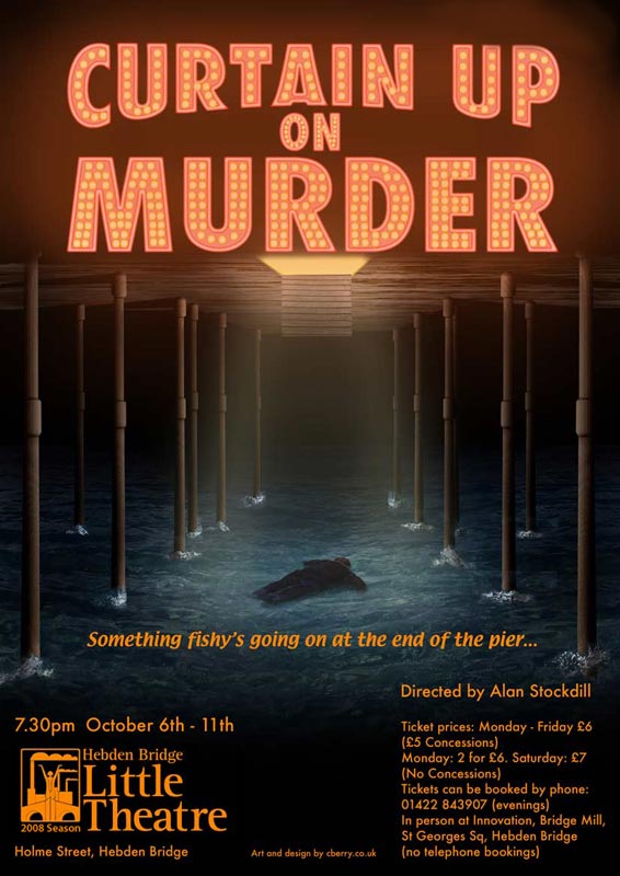
Hi Is this better? 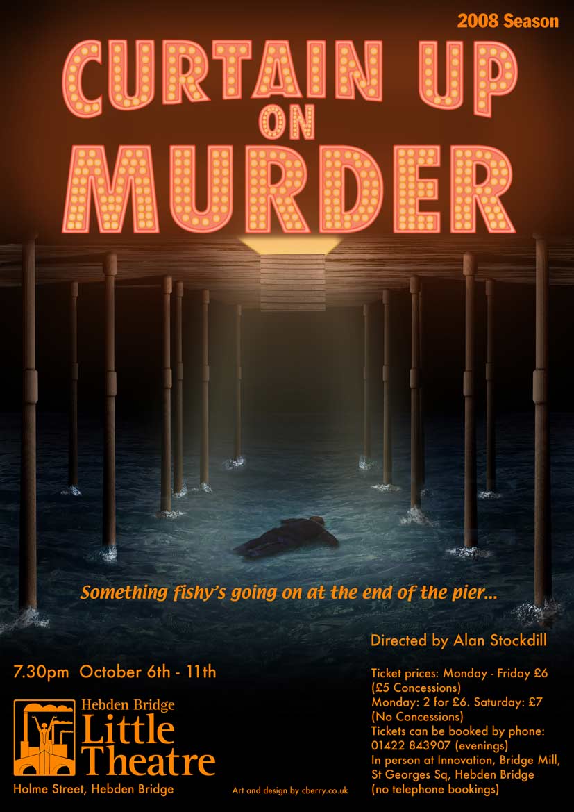 |
Posted on 20/02/08 10:14:51 PM |
|
David Asch
Tech Support Posts: 1913 Reply |
Re: Curtain Up On Murder
The heading is much clearer. Is it a requirement to have 2008 Season in the corner. It's a little distracting. Perhaps place it somewhere in the bottom left instead; it's the theatre's season, not the show's, after all. _________________ Leap and the net will appear |
Posted on 20/02/08 11:01:20 PM |
|
chris berry
Overhead Overlord Posts: 724 Reply |
Re: Curtain Up On Murder
Thanks Dave Not sure where else the 2008 line would go - any suggestions greatly appreciated! Chris |
Posted on 21/02/08 08:11:20 AM |
|
Steve Caplin
Administrator Posts: 7178 Reply |
Re: Curtain Up On Murder
To my mind, yes - that's much cleaner. If I can make one further suggestion: on the layer with the bulbs, try adding an inner glow (centre, not edges) of pure white, to add a little sparkle to them. And what's the technique you've used for the outer edges of the lettering? I'd increase the contrast there, if possible. |
Posted on 21/02/08 08:37:13 AM |
|
David Asch
Tech Support Posts: 1913 Reply |
Re: Curtain Up On Murder
I thought it could perhaps be incorporated into the theatre's logo, with their consent, naturally.
 _________________ Leap and the net will appear |
Posted on 21/02/08 09:18:16 AM |
|
chris berry
Overhead Overlord Posts: 724 Reply |
Re: Curtain Up On Murder
Neat idea. Cheers Dave, thanks for the help. Chris |
Posted on 21/02/08 09:43:11 AM |
|
chris berry
Overhead Overlord Posts: 724 Reply |
Re: Curtain Up On Murder
I'd had the same idea about an inner glow on the bulbs. The outer edges were quite bright, but then I put a glow over them and it's killed the effect, so I'll tweak that and repost! Thanks Steve Chris |
Posted on 21/02/08 7:45:33 PM |
|
chris berry
Overhead Overlord Posts: 724 Reply |
Re: Curtain Up On Murder
And here it is - comments welcome. Chris 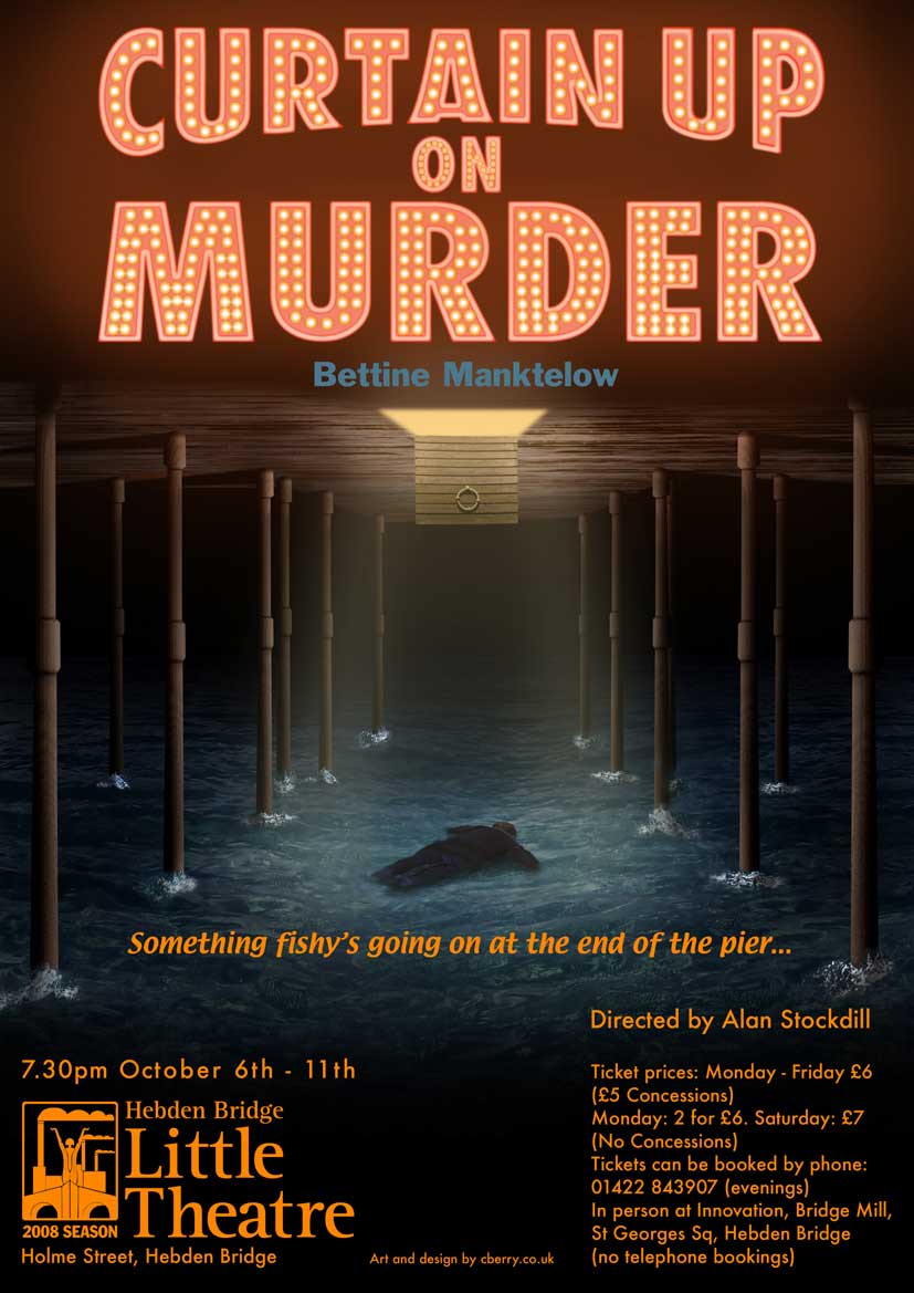 |
Posted on 21/02/08 10:41:02 PM |
|
Steve Caplin
Administrator Posts: 7178 Reply |
Re: Curtain Up On Murder
Fantastic! |
Posted on 22/02/08 07:39:34 AM |
|
Deborah Morley
Makeover Magician Posts: 1319 Reply |
Re: Curtain Up On Murder
Another great poster Chris. I really don't think you can say you are not a designer. Well done. |
Posted on 22/02/08 09:22:46 AM |
|
chris berry
Overhead Overlord Posts: 724 Reply |
Re: Curtain Up On Murder
Thanks! As ever, it's the advice you get from folk that can often make something better. Yours has been invaluable - can't tell you how much I appreciate it. Thanks for the compliment Deborah - always appreciated! Til the next one. Chris |