
| » Forum Index » Readers' gallery » Topic: In for the kill |
|
Posted on 12/03/08 10:11:30 PM |
|
chris berry
Overhead Overlord Posts: 724 Reply  |
In for the kill
Hi Steve This is the idea I was talking about the other week - about the knife slashing the throat in the photograph, as opposed to a real one! Excuse colours on type - they haven't translated well into Save For Web for some reason. Chris 
|
Posted on 13/03/08 08:38:47 AM |
|
Steve Caplin
Administrator Posts: 7152 Reply |
Re: In for the kill
Yes, that makes sense. It's still a rather gruesome idea for a poster, though! And you need to make that blood look less like HP Sauce... |
Posted on 13/03/08 4:27:43 PM |
|
GKB
Magical Montagist Posts: 4137 Reply |
Re: In for the kill
Hi Chris, Just thought it might look slightly better with the 'FOR THE' lined up with the two uprights of the Ls rather than the full width. Maybe even some of that ketchup dripping down the letters? Just a thought. Gordon 
|
Posted on 13/03/08 9:31:25 PM |
|
chris berry
Overhead Overlord Posts: 724 Reply |
Re: In for the kill
Hi Gordon Tried your version first and I thought it was a wee bit too small. Feel free to try another tho' - always looking for alternatives! Chris |
Posted on 13/03/08 9:38:10 PM |
|
chris berry
Overhead Overlord Posts: 724 Reply |
Re: In for the kill
Hi Steve Is it the colour that's wrong on the blood, or the overall look/consistency? If it's just the colour, it's a lot more dark reddish on the original than this jpeg. As for gruesome, I take your point, but it's going to be a stage prop for a darkly comic play (a poster on the wall of the writer's study) so it needs to match the tone of the production. Of course, I've been working on it for a while now so I might have lost perspective. If you still think it's too gruesome, I'll change it. Any advice welcome! Chris |
Posted on 13/03/08 10:34:42 PM |
|
Steve Caplin
Administrator Posts: 7152 Reply |
Re: In for the kill
I think it's the drips - too many of them, too thick, too regular in length. But, if it's a prop on stage, as you say, it needs to be very immediate - and visible from a distance. In which case I'd recommend no texture and bright red. Fixed your avatar, by the way. |
Posted on 13/03/08 10:59:46 PM |
|
chris berry
Overhead Overlord Posts: 724 Reply |
Re: In for the kill
Hi Steve I want to get it right, so I'll play around some more and try and nail the bugger. Tricky stuff, this blood. I've been trying to fix that avatar!! |
Posted on 14/03/08 02:09:55 AM |
|
tooquilos
Wizard of Oz Posts: 2969 Reply |
Re: In for the kill
Hey Chris, just an idea here...with the blood...you can download free brushes which are various blood stains. Ive got a few myself which I can send you but if you do a Google search you may be able to find some suitable ones. Then just fiddle with the layer effects and see if you can come up with the desired effect. Hope this helps. Anna |
Posted on 14/03/08 1:29:29 PM |
|
GKB
Magical Montagist Posts: 4137 Reply |
Re: In for the kill
Chris, Woke up in the middle of last night and for strange idea this idea popped into my head. It's a bit long and narrow but might give you some other ideas. I really must get a life! Gordon  |
Posted on 14/03/08 1:43:14 PM |
|
chris berry
Overhead Overlord Posts: 724 Reply |
Re: In for the kill
It's driving you bonkers this one, isn't it? I like the idea of the IN crushing FOR THE, but it's the wrong shape for the layout (that's me being lazy because I can't be bothered to change it). If you come up with something similar for the existing shape I'll certainly use it... but don't lose any sleep over it!! Thanks for your efforts on it. Chris |
Posted on 14/03/08 1:45:40 PM |
|
chris berry
Overhead Overlord Posts: 724 Reply |
Re: In for the kill
Hi Steve. Is this blood better? 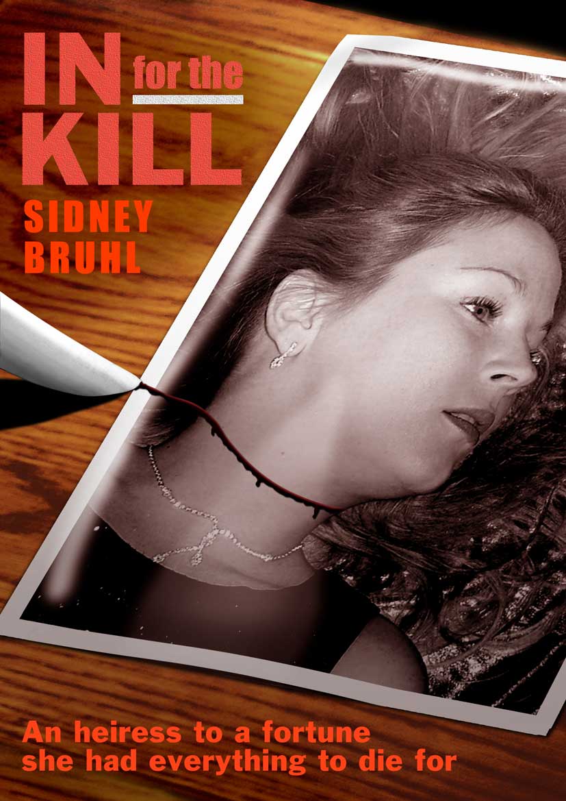 |
Posted on 14/03/08 1:54:01 PM |
|
Steve Caplin
Administrator Posts: 7152 Reply |
Re: In for the kill
I'd say that's still too dark. It has to be seen right across the stage - so make it bright red! |
Posted on 14/03/08 2:54:45 PM |
|
chris berry
Overhead Overlord Posts: 724 Reply |
Re: In for the kill
Hi Steve How's this?  |
Posted on 14/03/08 3:14:38 PM |
|
Steve Caplin
Administrator Posts: 7152 Reply |
Re: In for the kill
Yes, much better. Perhaps a lot thicker, too? More blood altogether? |
Posted on 14/03/08 4:49:51 PM |
|
chris berry
Overhead Overlord Posts: 724 Reply |
Re: In for the kill
Hi Steve What do you think (sorry if this is dragging out, just want to get it right)  |
Posted on 14/03/08 4:58:46 PM |
|
Steve Caplin
Administrator Posts: 7152 Reply |
Re: In for the kill
Yes! |
Posted on 14/03/08 7:32:27 PM |
|
chris berry
Overhead Overlord Posts: 724 Reply |
Re: In for the kill
Excellent! Thanks Steve |