
| » Forum Index » Readers' gallery » Topic: Murderer's Child |
|
Posted on 20/03/08 1:04:44 PM |
|
chris berry
Overhead Overlord Posts: 724 Reply  |
Murderer's Child
 |
Posted on 20/03/08 1:47:39 PM |
|
Meltonian
Highlight Hermit Posts: 90 Reply |
Re: Murderer's Child
Nice work, Chris. I enjoy seeing your posters. I really like the concept of this one but I wonder if the chair should look a bit more distressed - it looks like it has just been assembled from an Ikea flatpack! I just think that would make it a bit more menacing, but perhaps the 'new' look is what you're after. Then again, I don't know how visible the poster will be in the production so perhaps it's not worth worrying about. I also have a strong dislike for the comic sans typeface. I think it's overused and I cringe whenever I see it. Does anyone else feel that way? There are so many free fonts available online that I'm sure there are better alternatives. |
Posted on 20/03/08 4:04:46 PM |
|
chris berry
Overhead Overlord Posts: 724 Reply |
Re: Murderer's Child
Cheers Meltonian The type face was to emphasise the fact that it's about a child. I agree it's over-used but you don't think it works here? However, if you can suggest an alternative font I'd be happy to use it. Incidentally, where can I find free fonts? You're right about the chair, it does look new, but it was built from a sample shot of our bathroom door. If you know a way of distressing it let me know. Thanks for taking the time to view it. Cheers Chris |
Posted on 20/03/08 4:23:57 PM |
|
GKB
Magical Montagist Posts: 4172 Reply |
Re: Murderer's Child
Chris, Just Google 'free fonts'. Amazing what you can do with a photograph of a piece of wood. I'll send you a photograph of £20 if you can make me one too! |
Posted on 20/03/08 4:58:58 PM |
|
chris berry
Overhead Overlord Posts: 724 Reply |
Re: Murderer's Child
Thanks Gordon. Will check them out. Chris |
Posted on 20/03/08 9:05:25 PM |
|
Paul 2007 thru 2010
Lego Legend Posts: 361 Reply |
Re: Murderer's Child
Do IKEA sell kiddies electric chairs then? They're not on their website. I know MotherCare used to have them. |
Posted on 20/03/08 9:16:07 PM |
|
chris berry
Overhead Overlord Posts: 724 Reply |
Re: Murderer's Child
Do IKEA sell kiddies electric chairs then? They're not on their website. I know MotherCare used to have them. [/quoted] Paul, I nearly choked on my tea when I read this. Hilarious. Nice one. Chris |
Posted on 20/03/08 10:13:29 PM |
|
Meltonian
Highlight Hermit Posts: 90 Reply |
Re: Murderer's Child
Chris, I hope you don't mind me fiddling with your work! This is something like what I had in mind - I just think it suggests a struggle and looks a bit more sinister. I just used a bit of dodging and burning and then liquify to make the dents. I did a google search for kid's handwriting fonts and found this site: http://simplythebest.net/fonts/kids_fonts.html The font I used here ('Mackan') doesn't have a very good comma but you could always use one from another font. I agree that comic sans had been thoughtfully applied in this case, but I just have a personal vendetta against it! And Paul - after 10 minutes in Ikea, the electric chair would be a welcome relief! 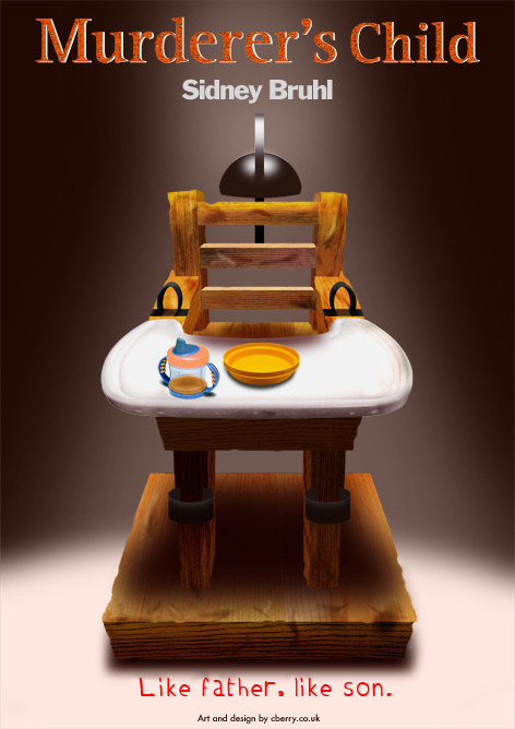
|
Posted on 20/03/08 10:48:20 PM |
|
chris berry
Overhead Overlord Posts: 724 Reply |
Re: Murderer's Child
Hi Meltonian Don't mind you playing with this image at all. First, thanks for the font site, it's now loaded in favourites. Great technique for distressing the chair - I suspected liquify might be involved! However, I think it makes it look like a child's been electrocuted, whereas what I want to show is the symolism of it ie suggest that's what will happen. I think the idea is more disturbing than the reality. That said, I think you're right about the chair looking too new, and when I'm sober tomorrow and can handle a mac responsibly, I will darken the wood. I think that might age it sufficiently without making it look like it's been through several fryings. Will post when I've done it and see what you think. Love the way think, though. Fancy setting up a Photoshop agency!? As for the font, I see where you're going but I'm not convinced that it's a better option. I might go for a more conventional font on this and avoid the problem altogether. Just goes to show, it's all subjective. Thanks for the time you've spent on this. This is why I post - sometimes feedback reveals things you would never have considered. Watch this space! Thanks again. Chris |
Posted on 21/03/08 07:32:54 AM |
|
Babybiker
Shadow Spectaculator Posts: 151 Reply |
Re: Murderer's Child
Personally, I like the original! I can see where you are going with the Comic Sans font being too overused, but it seems to fit OK here - especially as it is only the subheading and not the whole poster. If you must change the bottom line, why not look at a paintbrush style font as an alternative? My only other thought is that the shadow/ reflection on the "plastic (?) head cap" from the bracket is too distracting as it carries straight on down from the top of the bracket and back behind the chair back to the back of the bracket as "one line". Perhaps a little Spherize and gausian blur might help? or maybe a little brushed steel texture (Gausian Blur and Wind)? I hope that made sense - well it is 6.30am and I need to get some sleep shortly! I will have a chat with some friends next week and see if anyone fancies a trip from Rochdale up to Hebden Bridge for one of the plays. I hope they are as good as the posters? BB |
Posted on 21/03/08 11:53:50 AM |
|
chris berry
Overhead Overlord Posts: 724 Reply |
Re: Murderer's Child
Thanks for the feedback, BB. I'll look at the shadow - what do you mean about the brushed steel texture. Would you put it on th shadow? As for the plays, you're more than welcome! I've sent you a personal message with details. Chris |