
| » Forum Index » Readers' gallery » Topic: New Poster |
|
Posted on 04/10/08 9:13:47 PM |
|
chris berry
Overhead Overlord Posts: 724 Reply  |
New Poster
Hi all Here's the first poster for our 2009 season. Feedback welcome as always. Cheers Chris (Just noticed I haven't changed 2008 to 2009 on the logo!) 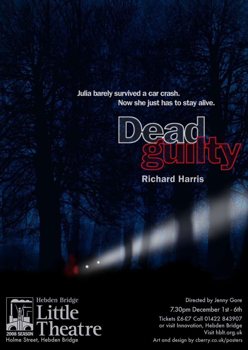 |
Posted on 05/10/08 00:03:31 AM |
|
David Asch
Tech Support Posts: 1913 Reply |
Re: New Poster
Another great one. Just one small tweak: I would line the s of survived up with the beginning of the second line. Just makes it look tidier. _________________ Leap and the net will appear |
Posted on 05/10/08 05:44:10 AM |
|
Nick Curtain
Model Master Posts: 1802 Reply |
Re: New Poster
It looks great Chris Nick |
Posted on 05/10/08 09:49:29 AM |
|
chris berry
Overhead Overlord Posts: 724 Reply |
Re: New Poster
Thanks Dave I'd lined up the J on Julia with the edge of the Hebden logo, but I'll play with the kerning to get the S to line up. Good spot! |
Posted on 05/10/08 09:50:10 AM |
|
chris berry
Overhead Overlord Posts: 724 Reply |
Re: New Poster
Thanks Nick! |
Posted on 05/10/08 12:15:50 PM |
|
tooquilos
Wizard of Oz Posts: 2989 Reply |
Re: New Poster
Very eerie and effective Chris |
Posted on 05/10/08 1:09:20 PM |
|
katew
Virtual Virtuoso Posts: 681 Reply |
Re: New Poster
Looks great Chris - lots of atmosphere. |
Posted on 05/10/08 2:33:54 PM |
|
Deborah Morley
Makeover Magician Posts: 1319 Reply |
Re: New Poster
Great work Chris, You have a really good style! |
Posted on 05/10/08 7:38:30 PM |
|
chris berry
Overhead Overlord Posts: 724 Reply |
Re: New Poster
Thanks everyone. I like the praise as much as the suggestions! Chris |
Posted on 07/10/08 12:15:34 PM |
|
Whaler
Visual Viking Posts: 330 Reply |
Re: New Poster
Hi Chris, I have a suggestion that you might try; The tree trunks that crosses the light beam should not be blurred the way they are, in my opinion. Rather, they should have a distinct profile (compare the tree to the left). Depending on if they are hit by the beam from the front or from the back they should be black or have their natural colour. If they are hit by the light directly from behind, they could have some glow around them, but as the beam comes from left, this doesn't seem to be the case in this image. Besides from the above, I like your poster very much! _________________ !!!!!!!!!!!!!!! |
Posted on 07/10/08 12:18:47 PM |
|
chris berry
Overhead Overlord Posts: 724 Reply |
Re: New Poster
I see what you mean - will remodel. Thanks for spotting that! Chris |
Posted on 08/10/08 07:23:22 AM |
|
Steve Caplin
Administrator Posts: 7180 Reply |
Re: New Poster
I don't agree. OK, the light may not produce this effect from this angle in real life, but it's an evocative and eerie effect, and I think it works well. If I were you, I'd keep it. |
Posted on 08/10/08 09:18:07 AM |
|
chris berry
Overhead Overlord Posts: 724 Reply |
Re: New Poster
I was just about to remodel it and I had the same thought. I think the light on the trees creates the "thriller" atmosphere. But thanks for throwing up an alternative, Whaler. Different ideas always welcome! Thanks everyone for taking the time to look. Cheers Chris |
Posted on 08/10/08 09:35:18 AM |
|
maiden
Golden Gif Gagster Posts: 471 Reply |
Re: New Poster
Love all of your posters Chris especially the typography. I've seen many "professional" theatrical posters around Sheffield for The Crucible and The Lyceum but in my opinion yours are much better than those and really get the viewers' attention. Great work. |
Posted on 08/10/08 10:26:09 AM |
|
chris berry
Overhead Overlord Posts: 724 Reply |
Re: New Poster
Thanks Maiden, that's really nice of you to say so. What you've just pinpointed is the reason I started designing theatrical posters in the first place. The majority of imagery used in theatre posters is whipped from a photo library with some type stuck on. There's no concept to sell the story of the play. Now, if I can just get the theatres to agree with you, I might start making some money. I'm doing free work for a theatre so I can get my work seen, so keep an eye on www.sotheatre.com I've just done BIG, and there are another 4 shows coming up, for which the imagery will be up soon. Once again, thanks for the compliments, and taking the time to look. Cheers Chris |
Posted on 08/10/08 10:38:23 AM |
|
maiden
Golden Gif Gagster Posts: 471 Reply |
Re: New Poster
Well you have a great opportunity to get your work seen even if you are working for free at the moment and getting your work seen is the most important step plus it allows you to create a portfolio of work which you can show a future employer. I do wish you all the best in securing paid work the holy grail of us 'Enthusiastic Amateurs' which I always feel is a little condescending as I like to think we are 'Undiscovered Professionals'. 
Good work like yours seldom goes without recognition unfortunately many Theatres may well just like to stick to their old Cut'n'Paste methods for the sake of saving themselves some money, however, this is a very short-sighted view as a professionally designed poster can really draw in the crowds and that is your strongest selling point - appeal to their 'little money demon' and say out loud and proud. "My posters will put bums on seats, luvvy!" and I think you will gain some resonance with that. |
Posted on 08/10/08 11:38:05 AM |
|
chris berry
Overhead Overlord Posts: 724 Reply |
Re: New Poster
Interesting you should say that. The stuff I do for our local amateur theatre (cberry.co.uk/posters) has done just that. Since my posters have gone up attendance has gone up by about 15%. Go figure! |
Posted on 08/10/08 3:28:54 PM |
|
Whaler
Visual Viking Posts: 330 Reply |
Re: New Poster
That's OK if you don't change. It's just a matter of taste and taste is something that really can't be discussed! _________________ Why? |