
| » Forum Index » Readers' gallery » Topic: New poster |
|
Posted on 21/10/08 2:15:00 PM |
|
chris berry
Overhead Overlord Posts: 724 Reply  |
New poster
Hi all Re-visited this one. Would be interested in your comments. Cheers Chris 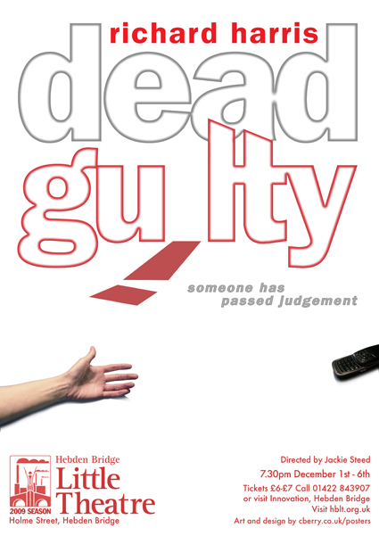 |
Posted on 21/10/08 8:46:55 PM |
|
Nick Curtain
Model Master Posts: 1802 Reply |
Re: New poster
Hi Chris This is simple and that's good, but I think a darker image would add more mood. Pure white is a little to goody goody for me. Also, I cannot really connect the arm with the phone and don't understand what it is telling me. Also not sure why the i has fallen over. The L in guilty looks like a T? Sorry!!! Nick |
Posted on 21/10/08 10:32:48 PM |
|
Paul 2007 thru 2010
Lego Legend Posts: 361 Reply |
Re: New poster
What is the play about? Murder? I'd have done the "dead" as a chalk outline  |
Posted on 22/10/08 09:52:12 AM |
|
Hero Face
* Posts: 19 Reply |
Re: New poster
Is the arm reaching for the phone or has the phone fallen from a dying arm? both could do with a sizing up a bit I think, very nice idea though hopefully I'm right in guessing that this play is some kind of murder mystery comedy story? I'm with nick on the 'i' , can't work out why it's fallen and broken |
Posted on 22/10/08 09:57:25 AM |
|
The Mad Lep
Four-Leafed Fantasist Posts: 323 Reply  |
Re: New poster
I love this poster, I think it's simple but gets the message across in a great way. The 'i' letter represents the whole "dead" thing? Or am I mistaken  That's what I immediately assumed anyway. Dead guilty... letter on the ground dead... maybe I'm wrong though? That's what I immediately assumed anyway. Dead guilty... letter on the ground dead... maybe I'm wrong though?
My only remark is about the hand and phone, it looks a little as if the phone is being thrown. Maybe if you put it nearer the hand and down a little, it would give the effect of having fallen from a murdered hand? A smallish blood trickle perhaps? I think this is a great poster, well done Chris! Nice work!  |
Posted on 22/10/08 5:11:01 PM |
|
Hero Face
* Posts: 19 Reply |
Re: New poster
i agree lep... maybe if the arm was pointing down on the picture.. maybe from the right hand side reflecting the angle of the 'I' as if they'd both fallen the same way and the the phone would be fallking toward the camera... a great opportunity to flex some perspective muscle haha |
Posted on 24/10/08 5:10:45 PM |
|
chris berry
Overhead Overlord Posts: 724 Reply |
Re: New poster
Hi all Taken all your feedback into account and I'm much happier with this version. I knew it wasn't quite right, and everyone, as usual, has given me the perspective I needed to make it stronger. Excuse the screwy colour - that's down to save for web. The original is much richer. If you have any further comments, let me know, but I don't think it's going to get any stronger than this. Thanks for making this piece better. Chris 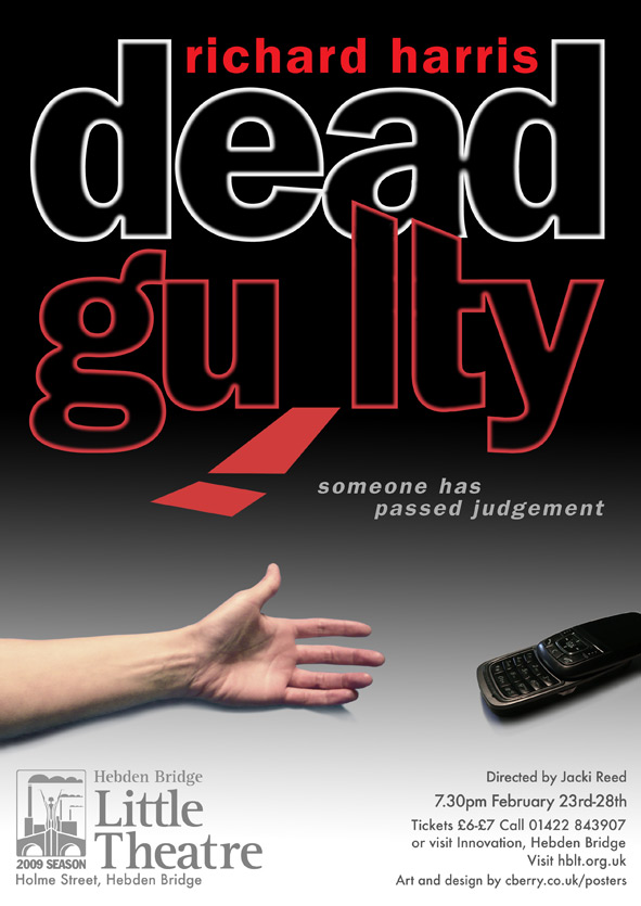
|
Posted on 24/10/08 5:43:33 PM |
|
maiden
Golden Gif Gagster Posts: 471 Reply |
Re: New poster
Excellent  I think that works really well. I think that works really well. |
Posted on 24/10/08 6:12:06 PM |
|
The Mad Lep
Four-Leafed Fantasist Posts: 323 Reply |
Re: New poster
Excellent Chris! A very nice reworking. Love the colours, it gives it extra oomph - that "i" is a lot more striking now. I think the hand/phone thing works better now too, and being closer together it doesn't distract the eye from the title either. Good work buddy!  |
Posted on 26/10/08 2:28:22 PM |
|
chris berry
Overhead Overlord Posts: 724 Reply |
Re: New poster
Thanks everyone - you're advice was very helpful. Cheers Chris |
Posted on 26/10/08 3:26:56 PM |
|
Nick Curtain
Model Master Posts: 1802 Reply |
Re: New poster
That's great and very much more powerful Chris. There are four small bobbles where you have removed the cross from the T though. Nick |
Posted on 26/10/08 3:37:44 PM |
|
chris berry
Overhead Overlord Posts: 724 Reply |
Re: New poster
Hi Nick Had spotted that, and will correct before it goes to print. Thanks for keeping a sharp eye, though. It's really appreciated. It's at the end of the project when you think you've put it to bed that these things can slip through! Thanks again Chris |