
| » Forum Index » Readers' gallery » Topic: Post Processing |
|
Posted on 15/02/09 01:30:21 AM |
|
Paul 2007 thru 2010
Lego Legend Posts: 361 Reply |
Post Processing
I have been trying things to make my photographs more "interesting". There is certainly more to these photos compared to the bland originals. What do you think? The originals first. 


|
Posted on 15/02/09 02:21:48 AM |
|
powerslave
Custom Cobber Posts: 136 Reply |
Re: Post Processing
Im not sure what you did, but they look like macro shots on a matchbox toy to me. Im not saying thats what they are though, the sharpening and DOF perhaps, hmmm, I think id have to see all of them full sized to perceive correctly. |
Posted on 15/02/09 10:50:25 PM |
|
brewell
Pixel Pentagrammarian Posts: 752 Reply  |
Re: Post Processing
Here's a technique I've been experimenting with all week that Stefan suggested in his Museum Lighting image. Copy the image and add a radial blur centered on what you want the viewer to look at. Lower the opacity until the effect is almost but not quite subliminal. Add a layer mask and paint out the parts you want to be crisp. I go around every edge that I can find, and then into a little bit of contours in the background. The whole point is to draw the eye into what you want to emphasize, without being blatant. It adds a sense of action and/or emotion. The radial blur in the first picture is centered on the driver. In the second picture, there are two blur layers - one centered on the man, one on the vehicle. From static to dynamic.  _________________ "Do what you can to make the world more colorful" - Hugh Sacher-Asian |
Posted on 15/02/09 11:28:50 PM |
|
Swade
* Posts: 19 Reply |
Re: Post Processing
I actually love the colour you obtained through the work you did on your pictures. Definitely fell in love with the first one. I would slightly adjust the second one as follows though : First; I think (that's MY opinion and anyone can disagree of course !!) that the man on the back ground sets of focus point for the eye. What you are trying to show is the car, and that "black mass" in the background keeps pulling the eye away from your actual subject. Second; i find that the lightning of the water on the back of the car does the same thing once you have remove the man. I would adjust it to a blending colour according to the "regular" water colour that you have all around. Then I would somewhat use the technique described by Brewell but with an adjustment layer in order to sharpen the car. Here is my five minutes brainstorming on it, please feel free to comment ! Swade 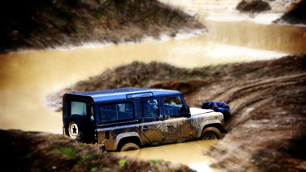 |
Posted on 16/02/09 05:49:54 AM |
|
Nick Curtain
Model Master Posts: 1799 Reply |
Re: Post Processing
Bruce and Swade have made some great suggestions. I would guess that you have used a hard light technique, which certainly gives punch, but possibly too much for some. I remember TV cameraman telling me that the basis for a good colour picture is a good black and white. When you install a new TV, it's best to produce a decent B&W image first and then turn the colour up to taste. So I always try this:-. - Open the B&W adj layer and move the sliders around until the result is pleasing. Sky can be given more punch by darkening the blues, for example. Det the default colours to B&W and create a gradient map adj layer. This will ensure you have a full range of tones and you can adjust the opacity at any time. Copy the original layer and move it above the others. Change the blend to Colour. Merge all layers. With the image below, I created a new channel (Alpha 1) and with a soft brush painted a straight line to cover the grill of the car. Then with a small brush paint in the rest of the car, where you want it to remain sharp. Apply lens blur, using Alpha 1 as the source. If you do this on a copied layer you can always adjust the strength later. With lens blur, add a small amount of monochromatic noise and a touch of specular highlights. Nick 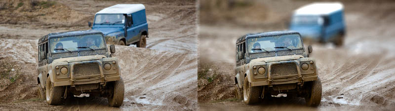 |
Posted on 16/02/09 07:35:48 AM |
|
Steve Caplin
Administrator Posts: 7150 Reply |
Re: Post Processing
I agree with Swade on this one: removing the figure from the background is a great improvement, mainly because he seemed so uninterested in what was going on. Good points from Nick and Bruce, too. Brendan, this looks like a model because of the very tight focus: it's similar to that treatment that turns any landscape into a model railway set. Great images! |
Posted on 17/02/09 1:39:33 PM |
|
Cl&m&nt
** Posts: 112 Reply |
Re: Post Processing
hi Beautiful image but I find that the river draws us too the eye. It focuses on the water but no on the car and I think it's shame. My eye is drawn to the bottom of the image but not on the car! And I think it takes longer to value the car and less on decorations. |
Posted on 17/02/09 8:13:55 PM |
|
Paul 2007 thru 2010
Lego Legend Posts: 361 Reply |
Re: Post Processing
Thanks for the help and suggestions. I know what people mean about them looking like models. This is made worse by what I have done, but because it was a dull day and the lens was wide open even some of the untouched photos looked like models 
Removing that person does improve the second image. I sort of liked him as I think he was friends with the stuck driver and he seemed fed-up at being in the cold again. But, with him gone, it does seem better. @Cl&m&nt I know what you mean. I cropped it originally to include the figure standing on the bank. If I'd have thought to remove him earlier I would have cropped it differently. I agree, there is too much water there |
Posted on 18/02/09 11:17:24 AM |
|
Cl&m&nt
** Posts: 112 Reply |
Re: Post Processing
hi To put more value in the car you could reduce the picture: Delete the top. This could make a panoramic image cool! cl&m&nt |