
| » Forum Index » Readers' gallery » Topic: Fun with Politics |
|
Posted on 02/09/09 05:03:11 AM |
|
Chiro
* Posts: 13 Reply |
Fun with Politics
Being new to this forum, I'm not sure if anyone will actually see this but I just wanted to share my latest montage. I'm still reading htcip but I think I'm coming along. Would love comments, good or bad! XD 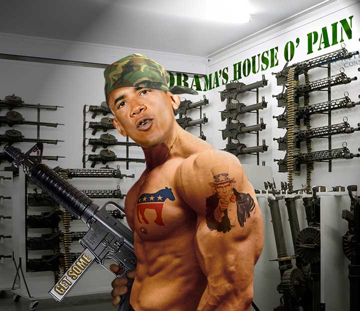 |
Posted on 02/09/09 05:40:05 AM |
|
Chiro
* Posts: 13 Reply |
Re: Fun with Politics
Ooops! Missed that ear! 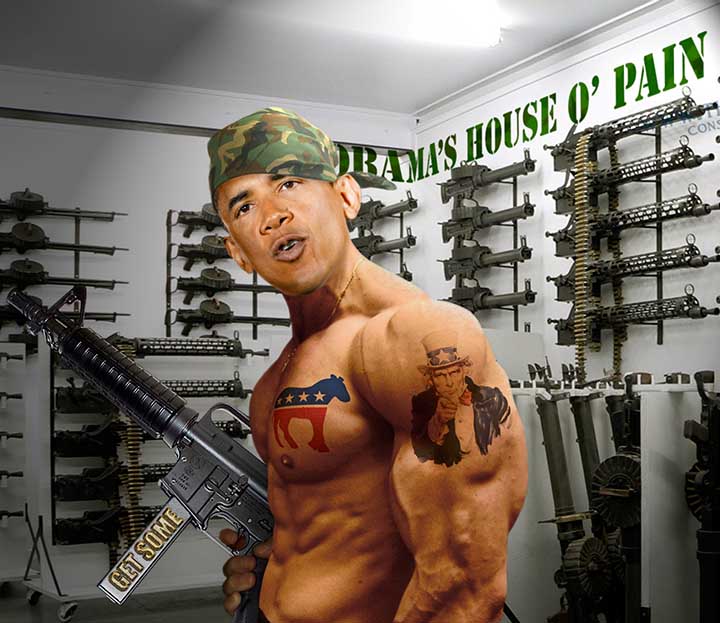 |
Posted on 10/09/09 6:31:37 PM |
|
Republic Of Game
Detail Distresser Posts: 26 Reply |
Re: Fun with Politics
Hi my own opinion is that there still seems to be a hardness to the indvidual parts of the image i.e. edges. Not that I'd cpndone skipping huge chunks of the book but check Chapter 8: Changing history (How To Cheat in Photoshop CS4). Otherwise good attempt  |
Posted on 10/09/09 7:12:05 PM |
|
Steve Caplin
Administrator Posts: 7180 Reply |
Re: Fun with Politics
Excellent work! I like the way you've integrated the tattoos. And the bending of the text around the corner is nicely done. Are you sure you've got the right president, though? |
Posted on 10/09/09 8:23:47 PM |
|
Chiro
* Posts: 13 Reply |
Re: Fun with Politics
Thanks Steve... no political message intended, really. Just messing about. I was just happy I was able to get something close to Obama's skin tone from that white body-builder's body (thanks to your book, of course).
|
Posted on 11/09/09 05:10:46 AM |
|
Chiro
* Posts: 13 Reply |
Re: Fun with Politics
My take on the republican reaction to Obama addressing school children in the US. 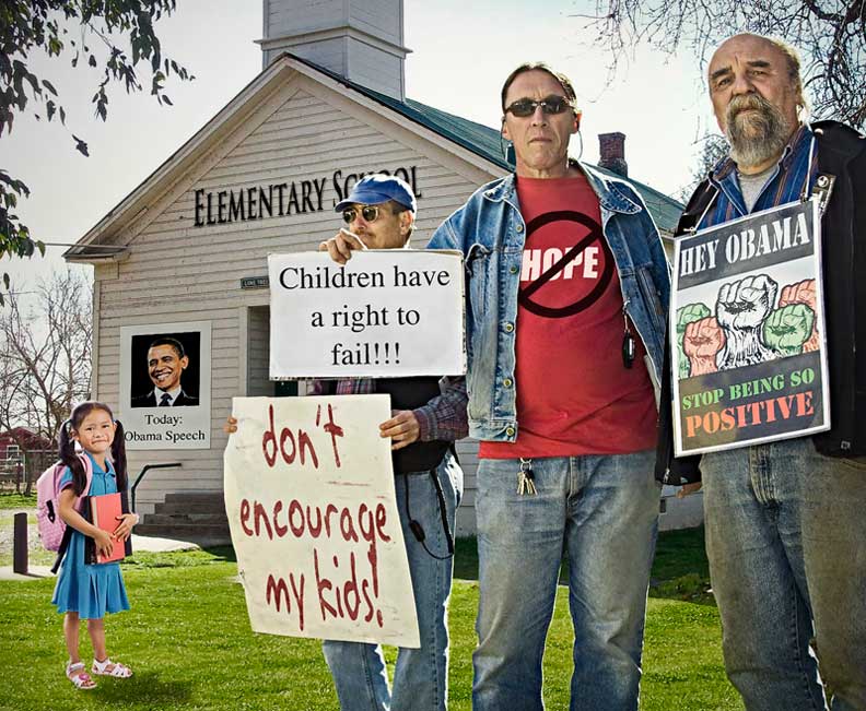 |
Posted on 11/09/09 09:39:25 AM |
|
maiden
Golden Gif Gagster Posts: 471 Reply |
Re: Fun with Politics
Superb Chiro - my only concern with this image is the "Children have a right to fail!!!" text it looks composed rather than part of the card as the text is too sharp and the paper too clean. Otherwise I like this. Becky |
Posted on 11/09/09 12:35:03 PM |
|
Chiro
* Posts: 13 Reply |
Re: Fun with Politics
Thanks Maiden. You're right about the sign, of course. I tried to reproduce the original signs as accurately as possible with new text and that sign happened to look very phony in the source image. I suppose that's not an excuse though... after all, the whole point is to improve on reality. Thanks for the constructive criticism!  |
Posted on 11/09/09 3:40:46 PM |
|
Republic Of Game
Detail Distresser Posts: 26 Reply |
Re: Fun with Politics
the text on the placard the guy's holding is much better, although topline seems a bit too sharp and straight. Concerning the t-shirt, it is my opinion that the original 'no hope' was a much more visually imapcting t-shirt, than the over used (and comercially viable) CND symbol. |
Posted on 12/09/09 03:22:46 AM |
|
Chiro
* Posts: 13 Reply |
Re: Fun with Politics
actually, the original is the one with the CND symbol. I created the one with the 'no hope' symbol. |
Posted on 12/09/09 09:35:35 AM |
|
maiden
Golden Gif Gagster Posts: 471 Reply |
Re: Fun with Politics
As you can see, Chiro, in the original whilst it's text printed from a computer onto white paper the tone of the text fades closer to the bottom. The paper whilst being white is slightly off-white with a slight hint of blue. Also there is noticable jpg artifacts on the poster in the original which aren't there in your composition. An easy way to get those jpg artifacts is to make the text on the paper background in a seperate document and save as a jpg then import this jpg into your original and transform to shape and you will have the artifacts that give realism to the poster. |
Posted on 12/09/09 5:58:02 PM |
|
Chiro
* Posts: 13 Reply |
Re: Fun with Politics
Great, thanks for the advice. I agree with most of what you say but I think the difference in paper white is only due to the warming of the image overall (The paper in the montage is cloned from the paper in the source so maintained its hue relative to the rest of the image). Good trick with the jpeg artifacts, though, and I'll definitely try to give my work a more critical review before publishing in the future. |