
| » Forum Index » Readers' gallery » Topic: Another new poster |
|
Posted on 09/07/11 1:55:11 PM |
|
chris berry
Overhead Overlord Posts: 724 Reply  |
Another new poster
Please feel free to feedback - criticism is learning! Would be interested to see what you all think of the concept as well as the execution. Chris 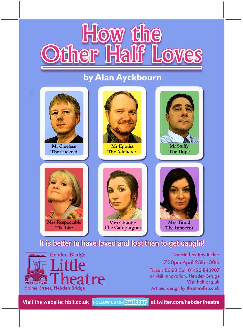 |
Posted on 09/07/11 2:43:19 PM |
|
Jota120
Ingenious Inventor Posts: 2615 Reply |
Re: Another new poster
Couple of ideas. Its fine the way it is. 1) You could maybe throw the cards down, with some overlapping without giving the plot(s) away. That's just a thought, not sure could work. 2) Or maybe someone is holding the cards in their hand, but need to put names at the top then. Only need to see half their faces to recognise. |
Posted on 09/07/11 5:21:49 PM |
|
chris berry
Overhead Overlord Posts: 724 Reply |
Re: Another new poster
The layout is based on the box cover of the card game Happy Families, which is an ironic comment on the theme of the play as none of them are happy. I had tried the scattered cards idea which didn't really work, but did lead me to the idea of the box cover, so everything worked out. Cheers Chris |
Posted on 11/07/11 08:01:01 AM |
|
Steve Caplin
Administrator Posts: 7150 Reply |
Re: Another new poster
I'd take away the underline on the play title - it cuts the title off from the rest of the poster, and doesn't add anything. Were the photos taken specially for the poster? Only some of the poses don't look convincing... Mrs Chaotic doesn't appear either chaotic or campaigning, for instance, and Mr Stuffy looks far too supercilious, rather than a dupe. |
Posted on 11/07/11 10:28:50 AM |
|
chris berry
Overhead Overlord Posts: 724 Reply |
Re: Another new poster
Hi Steve The underline graphic was taken from a 1950s box cover of Happy Families, which is why I included it - and I thought it worked(!) The shots were taken for the play, but the characters were quite difficult to nail, so it was tricky to match expressions. Looking back, I think the dupe should have been pompous, but his character flips between both during the play so it was a question of which one to use. Cheers Chris |
Posted on 12/07/11 07:55:00 AM |
|
Steve Caplin
Administrator Posts: 7150 Reply |
Re: Another new poster
I think the real issue with this one is that the rigid layout may match the original packaging of the game, but it makes for a rather static, uninvolving poster. It doesn't give the impression that the performance will be dynamic or entertaining. Shaking up the arrangement of the cards, as Trevor suggested, would help a lot. Use a game or other packaging as inspiration, by all means, but you wont get any extra points for sticking slavishly to the design: selling the play is more important than authenticity. |
Posted on 12/07/11 08:04:13 AM |
|
chris berry
Overhead Overlord Posts: 724 Reply |
Re: Another new poster
You've just proved the old adage that learn something new... I like the irony of the design but what you're saying the joke is killing the poster, and I see what you mean. As I've posted this after the play, I probably won't go back to it, but can I ask how you would re-arrange the cards? Also, the play got 100% attendance - but I'm sure that's not because I was in it!! Thanks for your time on this Steve Chris |