
| » Forum Index » Readers' gallery » Topic: Theatre poster |
|
Posted on 15/07/11 3:19:03 PM |
|
chris berry
Overhead Overlord Posts: 724 Reply  |
Theatre poster
We haven't performed this one at our theatre, but the professional publicity for it annoyed me so much (ie no thought behind it) that I had to do it to show how I think it should be done. Let me know what you think - even if you hate it. Cheers Chris 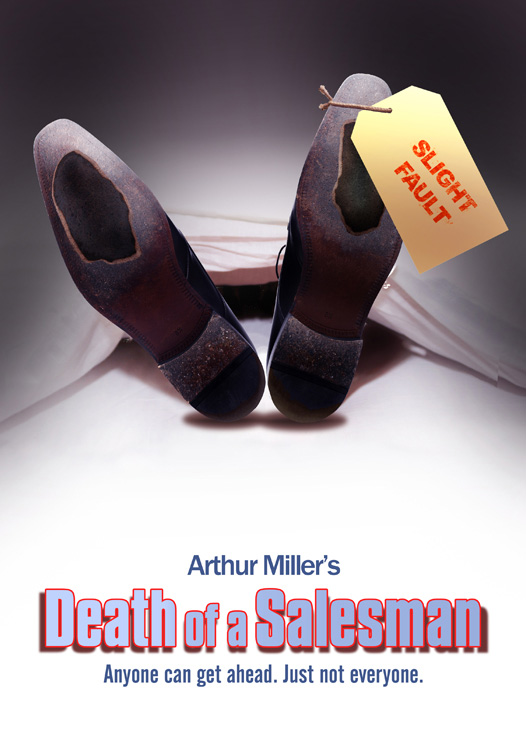 |
Posted on 20/07/11 11:38:52 AM |
|
tooquilos
Wizard of Oz Posts: 2965 Reply |
Re: Theatre poster
hi Chris, I meant to reply the other day but time got away. I like this..the one thing I would reconsider is the label. I think it needs some texture like cracks or paper peeling. As it is right now..it looks a bit sterile Anna  _________________ Wicked Witch of the West:I'll get you, my pretty! And your little dog, too! |
Posted on 21/07/11 07:47:39 AM |
|
Steve Caplin
Administrator Posts: 7150 Reply |
Re: Theatre poster
Or perhaps do away with the label altogether? I think it lacks subtlety, and the holes in the shoes are enough by themselves. Also: the sheet between the feet doesn't seem to rise high enough to contain a body. And, hate to be picky about this, but the headline: blue text, red outline, drop shadow... don't you think that's an effect too many? My advice would be to avoid outlines in all cases, except when absolutely necessary (which is almost never). |
Posted on 23/07/11 09:32:06 AM |
|
chris berry
Overhead Overlord Posts: 724 Reply |
Re: Theatre poster
Sorry I've taken so long to reply - just back from hols. Tooqullos: I've used a clean label because I don't think they'd have a cracked one? Sterility was the feel I was going for. Steve: I liked the jokey tone that the label gave this otherwise depressing play. Sheet between the feet - you're right dammit! Agree with you on the headline but (there usually is one!) the play is set in the 50s in the US, and I wanted a cheap, dime store feel for the logo, as that is essentially what the lead character is. With this information, does it still work for you, or does it feel wrong? Cheers Chris |
Posted on 25/07/11 07:31:02 AM |
|
Steve Caplin
Administrator Posts: 7150 Reply |
Re: Theatre poster
Chris, Understood about the label. (Still don't really like it though.) I'm not sure the lettering does suggest dime store - especially with the soft drop shadow, which is quite at odds with what was graphically possibly in the 1950s! |
Posted on 25/07/11 08:25:06 AM |
|
chris berry
Overhead Overlord Posts: 724 Reply |
Re: Theatre poster
You're right about the drop shadow on the title. It shouldn't be there. I think I was trying to give it an extra bit of visual punch which it doesn't need and which, as you say, wrecks the 50s look. Still needs the label tho'! Thanks for looking at it Steve - learned something from this. Chris |