
| » Forum Index » Readers' gallery » Topic: Old Time Radio |
|
Posted on 17/02/12 11:45:41 PM |
|
Old Salt
* Posts: 12 Reply |
Old Time Radio
Hi, this is my first post here. The forum seems really friendly. Also some very talented artists here. Posting the pic of a cathedral type radio design I did for a friend. Any tips on improvement will be welcome. I have 100% Photoshop book and am learning a great deal from it. BTW this was done prior to getting the book. 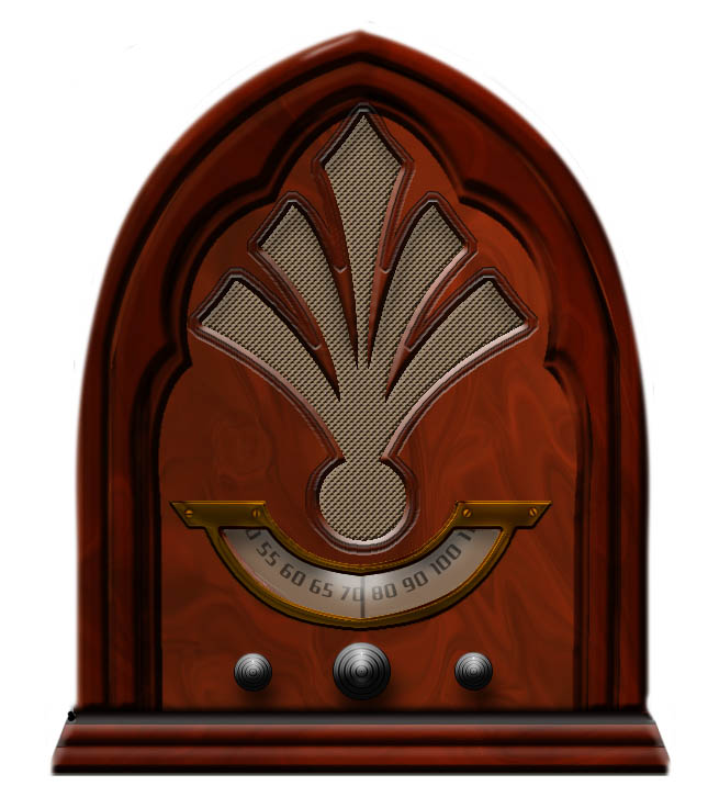 |
Posted on 18/02/12 04:32:14 AM |
|
Artwel
Satire Supremo Posts: 607 Reply |
Re: Old Time Radio
Hi, Looks pretty good to me Salt, maybe some of those edges could do with tidying up but you've got the light and shadow pretty spot on. Take a look at the Retro 80's tape player tutorial in the readers tutorial section, might give you some ideas on Knobs and Grill textures!  _________________ Art Is Never Finished, Only Abandoned. |
Posted on 18/02/12 7:34:28 PM |
|
Old Salt
* Posts: 12 Reply |
Re: Old Time Radio
Thanks Artwel. Great looking tape player you made. I know my rendering has lots of flaws. One thing I was trying to do but never got quite right is the metal frame. Was looking for a shiny copper look but this is as close as I could get. |
Posted on 18/02/12 8:32:18 PM |
|
Jota120
Ingenious Inventor Posts: 2615 Reply |
Re: Old Time Radio
Welcome to the forum Bill. Your created image looks great to me. If you want comments, you can get them here. Steve will comment later he refrains over over the weekends, Just on this Artwel's skills are great, see his previous posts... Many people will try to help and give constructive comments in my view here. As I'd said before, I think Steve's 100% Photoshop is a great inspiration for creative images (art). As Steve would say though, as I understand, he gives ideas, as you wish you need to work off them Jota120 - Trevor. We have a Trevor in NZ, need to contact him. |
Posted on 18/02/12 11:26:06 PM |
|
Old Salt
* Posts: 12 Reply |
Re: Old Time Radio
Thanks for the welcome Jota. |
Posted on 20/02/12 07:42:08 AM |
|
Steve Caplin
Administrator Posts: 7150 Reply |
Re: Old Time Radio
That's a very good illustration. I like the shapes and textures used here. Artwel's right about the tidy-ing up - the corners and some of the edges are a little fuzzy, particularly on the base. I'd change the angle of lighting on the knobs, so it comes more from the side - this is as simple as rotating the knobs. It would break up the symmetry a little, and make them look more realistic. Also, the shadows beneath the knobs, particularly the smaller ones, look a little too distant. The font you've used for the numbers seems rather out of keeping for the period. I'd recommend a serif font, or if not then something more suitable for the 1930s - Gill Sans, for instance. Welcome to the forum! Steve |
Posted on 20/02/12 4:02:05 PM |
|
munchonu
Horror Master Posts: 277 Reply |
Re: Old Time Radio
Looks good to me but then I'm not the best when it comes to shadows and what have you. Nice job. Doug |
Posted on 20/02/12 5:17:53 PM |
|
Luis
Six-String Synthesist Posts: 236 Reply  |
Re: Old Time Radio
I think you did an excellent job on creating the radio. Creating something from scratch can be difficult in trying to make it look real. These are the types of projects I like to do from scratch. The one thing that stood out to me were the knobs and some how it does not look right. I will try to see if I can give you some pointers on this. If you take a look at the knob on the right that I created, you can see the difference on the look of the radio. It looks like an old type of knob. 
I hope this will give you some ideas when creating something. The knobs took five layers to create and here is a brief description how to create this. Step 1- New Layer: Create a circle. For this, I made a copy of the wood texture and created the circle from this texture. Then I used the following Layer Styles:
Step 2 - New Layer: I created the same size circle as in step 1 but filled it in with 50% Grey. The Blending mode for this set to Hard Light. The only layer style added to this layer is the Bevel & Emboss. Try using different Gloss contours for different results. Step 3 - New Layer: I created a smaller circle in the middle and with 50% Grey. The Blending mode for this set to Hard Light. The I added the following Layer Styles:
Step 4 - New Layer: I added small dots around the knob and used the Bevel & Emboss Step 5 - New Layer: I created a smaller circle in the middle and used the following Layer Styles:
I hope this will give you some ideas. I know this a lot of work to create a old radio knob and I'm sure there are simple ways to create a basic knob. I hope to see some more work from you and welcome to the forum. Luis |
Posted on 22/02/12 12:57:54 PM |
|
Frank
Eager Beaver Posts: 1840 Reply |
Re: Old Time Radio
As a relative newbie to this type of art work looks very good to me --especially since you didn't have the book yet -- I agree with others remarks but hey still a good job. Frank |
Posted on 24/02/12 00:13:26 AM |
|
Old Salt
* Posts: 12 Reply |
Re: Old Time Radio
Thank you all for the comments, and warm welcome. Luis: Really great help on the knobs. I was looking back at the photo I used as a general reference and the knobs looked almost exactly like yours. I need to pay attention to details  like the knobs and font used etc, Thanks Steve for your critique as well. I'll post a remake with some new dials and clean up. like the knobs and font used etc, Thanks Steve for your critique as well. I'll post a remake with some new dials and clean up. |