| » Forum Index » Readers' gallery » Topic: The Lighthouse |
|
Posted on 20/09/25 01:50:05 AM |
|
tom8gem@gmail.com
** Posts: 68 Reply |
The Lighthouse
I tried out a new technique for painting a different kind of water using PS brushes on this one, choppier and wavier. For the breakwater, each rock is a separate shape done in Illustrator using its Mesh tool, which enabled the amount of variation in their colors that was needed. These were then brought into PS, where filters were applied to them for texture. Does using Illustrator (partially) count as cheating?  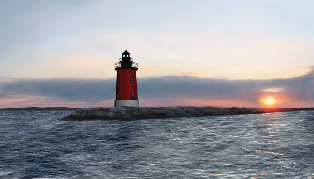 |
Posted on 20/09/25 06:49:54 AM |
|
DavidMac
Director of Photoshop Posts: 6198 Reply  |
Re: The Lighthouse
The water and breakwater are excellent. The water particularly so. I would never have guessed! To my eye, the lighthouse doesn't quite convince. The surfaces are just a little bit too clean and perfect to be real. They lack the subtle scars of time and use. Reality so often lies in imperfections. Also just a very faint hint of orange glow on the lighthouse' right side mind bind it better to it's environment. But it's easy to criticise. This is wonderful work Tom. I couldn't do it. Not even close. _________________ The subtlety and conviction of any Photoshop effect is invariably inversely proportional to the number of knobs on it ....... |
Posted on 20/09/25 09:55:16 AM |
|
dwindt
Realism Realiser Posts: 1049 Reply |
Re: The Lighthouse
What David said, Tom but it's wonderful to watch your growth. A hint of white water at the foot of the rocks may be a nice touch. If you enjoy using brushes, Ron Deviney has some wonderful brushes that are made very nicely. When you're ready, why don't you join the mad crowd of very capable artists in "the Friday challenge." The variation and brief tasks give you tremendous challenge and really take you out of your comfort zone and force you to think out of the box. You will learn a great deal about cheating there to...lol. _________________ The grass is greener on the other side of the fence because there is more $hit there. |
Posted on 20/09/25 12:44:23 PM |
|
DavidMac
Director of Photoshop Posts: 6198 Reply |
Re: The Lighthouse
I love his brushes! I've had a collection of them for years and years. I used to get them from Deviant Art (still a great resource) but he has his own site now Deviney Designs . _________________ The subtlety and conviction of any Photoshop effect is invariably inversely proportional to the number of knobs on it ....... |
Posted on 20/09/25 6:54:38 PM |
|
tom8gem@gmail.com
** Posts: 68 Reply |
Re: The Lighthouse
David and Dennis Thank you both kindly, once again! I'll look into Ron's brushes; I used some by Aaron Blaise on this piece (https://creatureartteacher.com/). If it's okay to shout out others here from whom I've also gained knowledge and assets (?), I'd like to do so for Devin Elle Kurtz, https://www.devinellekurtz.com/ awesome foliage brushes! I hear you both per your suggestions; these are valid critiques. Some front waves over the breakwater will be key; I'll be doing that, even if they weren't in the reference photo, thanks! We don't need to restrict ourselves to reality, right? 
The lighthouse is somewhat idealized; I debated whether to make it more realistic, or dreamlike. I omitted a nearby maintenance shack even after I'd made it, since it seemed to detract from the power and perfection the piece has without it. The structure itself is somewhat aged now, but I referenced photos from a younger version. I do think a hint of orange will be a nice touch, so will try that out too! |
Posted on 22/09/25 8:54:55 PM |
|
tom8gem@gmail.com
** Posts: 68 Reply |
Re: The Lighthouse
Here's another take, with reflected sunlight and water/spray over the rocks. Thanks again for the input, things so often turn out better as a result! 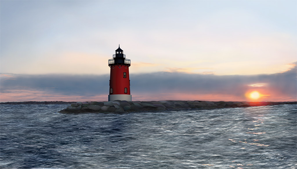 |
Posted on 24/09/25 1:40:44 PM |
|
Frank
Eager Beaver Posts: 1870 Reply |
Re: The Lighthouse
Agree with above comments - nice work.Water looks real good. Should the glare have a subtle tint of orange? |
Posted on 27/09/25 02:34:38 AM |
|
tom8gem@gmail.com
** Posts: 68 Reply |
Re: The Lighthouse
Thank you, Frank! |
Posted on 24/10/25 09:03:25 AM |
|
Steve Caplin
Administrator Posts: 7169 Reply |
Re: The Lighthouse
An interesting technique, and of course cheating is what it's all about. The sea would be greatly improved by some sense of perspective. |
Posted on 15/11/25 05:47:28 AM |
|
tom8gem@gmail.com
** Posts: 68 Reply |
Re: The Lighthouse
Thank you Steve, glad you approve of the cheat!
I'd be interested to learn how you'd add more perspective to the sea, in such a composition. I was shooting for that with approaches such as having larger brush strokes in the foreground, and coloring the swells with sunlight to correspond to their position in the scene. |