
| » Forum Index » Readers' gallery » Topic: New Air Safety Poster |
|
Posted on 01/10/07 4:37:43 PM |
|
GKB
Magical Montagist Posts: 4173 Reply |
New Air Safety Poster
Just been working on this image for a new aviation safety poster. Aside from anything aviation related I would appreciate any constructive comments. 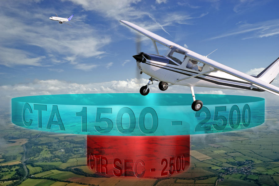
|
Posted on 01/10/07 5:16:28 PM |
|
Steve Caplin
Administrator Posts: 7178 Reply |
Re: New Air Safety Poster
It'd be a lot safer if they didn't fly so close to those enormous floating disks! |
Posted on 01/10/07 5:40:20 PM |
|
GKB
Magical Montagist Posts: 4173 Reply |
Re: New Air Safety Poster
Hi Steve, I suppose that I should have explained that the red and turquoise 'discs' are supposed to represent 3 dimensional, but simplified, areas of controlled airspace that aircraft are not supposed to enter without clearance from Air Traffic Control in order to protect you when you go off to Paris or Benidorm on your hols. The 'CTR' goes up from ground level to 2,500 feet while the 'CTA' starts at 1500 feet and goes on up to 2,500 feet. There are other layers on top of that but to show them would be too much clutter. |
Posted on 01/10/07 6:37:18 PM |
|
vibeke
Kreative Kiwi Posts: 2204 Reply |
Re: New Air Safety Poster
Hi Nice look, but the first thing that hit me was the turquoise colour, to me it crashed (forgive the choice of word) with the rest of the sky. If it has to be that colour perhaps change the hue of the sky? |
Posted on 01/10/07 6:54:44 PM |
|
Bob
Expert Expressionist Posts: 130 Reply |
Re: New Air Safety Poster
Gordon, As a retired air traffic controller, I'm surprised that you allowed those two aircraft to get that close together! 
Seriously now, I'd ditch one of the two aircraft. I'm personally finding it distracting and drawing attention away from what you want to show. I'd also raise the text in the CTR disk. Next to the ground, it's hard to tell the "R" from a "B", and it looks to be easier read against the background a little higher. Other than that, it looks great to me! Preparing posters for flight schools? |
Posted on 02/10/07 05:55:46 AM |
|
srowden
Detail Devil Posts: 114 Reply |
Re: New Air Safety Poster
with all the other comments already said (if i say the same thing as someone else i apologize in advance) First thing that distracted me was the plane in the rear view (suggestion: either remove it completely or blur it enough so your eyes stay on the main focus of what you are trying to present.) The turquoise hue is too closely related to the blue sky, try a yellow,orange to compliment the red also the text could be a bit more readable. And give that main plane some shadow to add depth. |
Posted on 02/10/07 09:08:41 AM |
|
GKB
Magical Montagist Posts: 4173 Reply |
Re: New Air Safety Poster
Thanks all, I had already been wondering about the inclusion of the Boeing 737 in the background so I reckon that will disappear in the final version. Vibeke - I had a yellow version of the disc prepared as an alternative but I preferred the turquoise. Two comments really means that I'll have another look at yellow (or some other colour) and see what happens. Bob - When I read your comment about the lettering I went straight to the MAC and moved it up to halfway - much better. Thank you. The final poster is being produced for National Air Traffic Services. It is number three in a series and is intended for distribution around flying clubs and schools to increase awareness among pilots of the dangers of entering controlled airspace without permission. Scott - I'm not sure what you mean about adding a shadow to the Cessna 152. As it is supposed to be flying at altitude there would be no discernible shadow. Gordon |
Posted on 02/10/07 09:12:13 AM |
|
Steve Caplin
Administrator Posts: 7178 Reply |
Re: New Air Safety Poster
I hadn't read that the discs were supposed to be grounded - they seemed to be flying, to me. I'd suggest masking the bottom one behind the trees, which would give it more of a sense of being within the scene. I agree with Vibeke about the turquoise: it really clashes with the sky. A subtler blue, perhaps? Also, I hate to raise the thorny perspective issue, but the vanishing point thing should apply to the disks as well! Move the ground/horizon up, perhaps? |
Posted on 02/10/07 09:21:51 AM |
|
GKB
Magical Montagist Posts: 4173 Reply |
Re: New Air Safety Poster
Thanks Steve. |
Posted on 02/10/07 1:46:21 PM |
|
GKB
Magical Montagist Posts: 4173 Reply |
Re: New Air Safety Poster
Sorry but yellow just didn't work so I tried blue instead. There may yet be some tweaking on the blue. 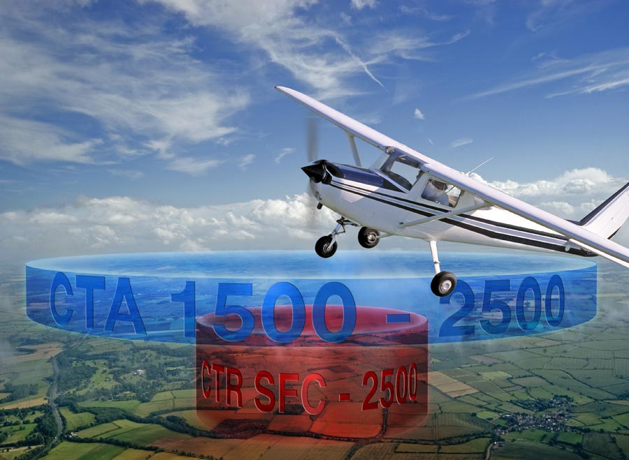
|
Posted on 02/10/07 4:45:37 PM |
|
srowden
Detail Devil Posts: 114 Reply |
Re: New Air Safety Poster
ahh i understand i assumed that the plane was supposed to be on the disc haha oops. 
you know i didn't think blue worked but i think this sorta blue looks fairly nice against that light blue sky nice job. |
Posted on 02/10/07 6:55:15 PM |
|
vibeke
Kreative Kiwi Posts: 2204 Reply |
Re: New Air Safety Poster
Starting to look really good, a bit more sregth in the blue and possibly lighten the sky a little. 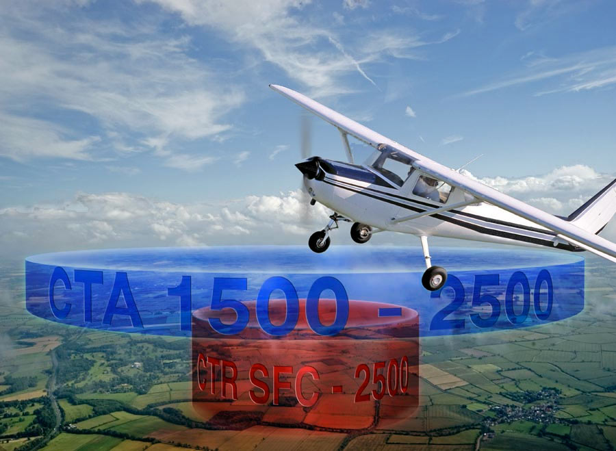 |
Posted on 03/10/07 12:55:45 PM |
|
Neil O
Cartoon Contractor Posts: 389 Reply |
Re: New Air Safety Poster
Gordon, did you try reversing the blue disk and letter color? Darker disk lighter letters maybe? _________________ "I haven't failed.... I've found 10,000 ways that don't work!" Thomas Edison |
Posted on 06/10/07 10:18:48 AM |
|
GKB
Magical Montagist Posts: 4173 Reply |
Re: New Air Safety Poster
Neil, The darker disc didn't work too well but the lighter letters did. Steve - I changed the perspective slightly and it looks much better. Vibeke - the turquoise was wrong. Thanks. Many thanks everyone - it's nice to have more than one set of critical eyes look at these things. Gordon |