
| » Forum Index » The Friday Challenge » Topic: Challenge 305: Into space |
|
Posted on 20/06/10 5:38:45 PM |
|
Stefano Giacomuzzi
Modernist Maestro Posts: 146 Reply |
Re: Challenge 305: Into space
Maybe my second entry is an improvment, in fact I made a rocket. Higher resolution here: http://img340.imageshack.us/img340/9031/rocketlamp.jpg 
|
Posted on 20/06/10 8:28:34 PM |
|
LonnieK
Diorama Dreamer Posts: 238 Reply  |
Re: Challenge 305: Into space
Like Tooquilos, I've strayed somewhat from the space theme. 2010 Lotus Exige shown with optional rocket booster kit!  _________________ Lonnie |
Posted on 22/06/10 7:25:41 PM |
|
Gerard
Digital Dutchman Posts: 145 Reply |
Re: Challenge 305: Into space
Hy everyone, Could not resist, my favourite serie when I was a little boy, Gerard   |
Posted on 22/06/10 8:38:44 PM |
|
Jan in France
* Posts: 34 Reply |
Re: Challenge 305: Into space
Gerard, that's great with the Thunderbirds theme. I wanted to do a similar one with Fireball XL5 as that was my favourite series as a child, but my knowledge of Photoshop isn't up to it yet. |
Posted on 22/06/10 9:28:53 PM |
|
Eva Roth
Luminous Liberator Posts: 269 Reply |
Challenge 305: Into space
All the good outer space ideas had been taken by the time I got round to starting this week's challenge, however I found a couple of interesting starting images. Here's the first one... 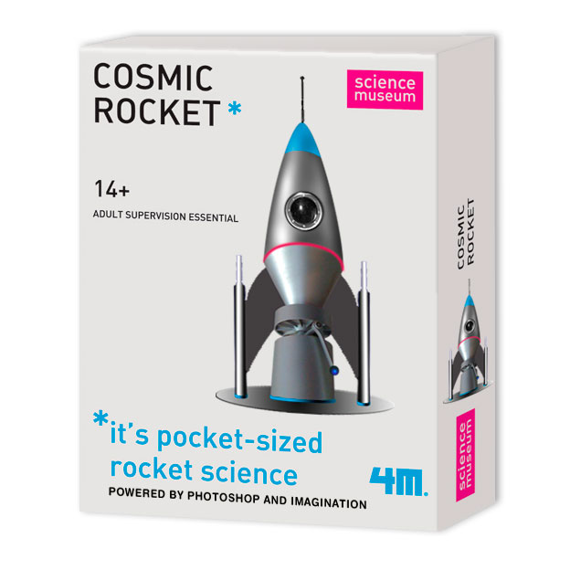 |
Posted on 22/06/10 9:30:20 PM |
|
Eva Roth
Luminous Liberator Posts: 269 Reply |
Challenge 305: Into space
... and here's my second image. 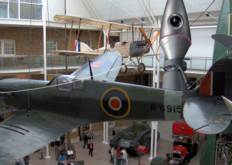 |
Posted on 23/06/10 3:41:56 PM |
|
Deborah Morley
Makeover Magician Posts: 1319 Reply |
Re: Challenge 305: Into space
Funnily enough I drove past the sign for the Space Station on Sunday, but didn't have time to call in.  |
Posted on 23/06/10 4:52:49 PM |
|
josephine harvatt
Gag Gadgeteer Posts: 2605 Reply |
Re: Challenge 305: Into space
A little homage to Frank Hampson, creator of "Dan Dare" 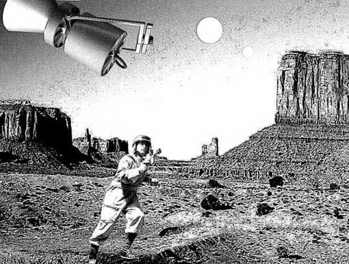
_________________ I'm not really bad - I just draw that way |
Posted on 24/06/10 10:53:28 PM |
|
Jota120
Ingenious Inventor Posts: 2615 Reply |
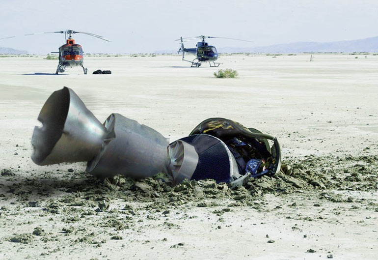
Re: Challenge 305: Into space
Here's my quick later entry. Crash landing.... (sorry time short again  , but no excuse next week). , but no excuse next week).
 |
Posted on 25/06/10 08:20:44 AM |
|
Steve Caplin
Administrator Posts: 7157 Reply |
Re: Challenge 305: Into space
Glad you all found the lamp so inspirational. It was just one example of the imagination of the designers of the National Space Centre in Leicester. First into the void was laddition, with a beautiful piece of work - I love the way the exhaust from the rocket is made of missing pieces from the planet. Or is it building the planet? Either way, a really great effect, and a fantastic use of Spherize to wrap the grid around the planet. Very clean work from GKB, with a beautifully modelled rocket - delicate lines around the doors and some funky lighting make this sparkle. The way the NASA logo is wrapped around is perfect - Gordon, did you do this in Photoshop? Or with a 3D modelling program? Just one thing: the cone is clearly lit from the right, matching the planet, but the body of the rocket (and the logo) could do with the same directional shading. And I love the Ryanair gag in the second entry, especially with the giant milk bottle to launch the rocket from - funny stuff! A curious use of the lamp from Carlo Alessandro Della Valle, who has turned it into more of a vacuum flask than a rocket - interesting choice of bright red cap! I like the atmospheric background, and the strong shading. But with the light source behind it, almost the entire rocket should be in shadow. Ingenious satellite repair from Paul 2007 - I like the way the astronaut is manhandling the receiver back onto the body, and the Earth view behind is very compelling. Good matching of the shading to the shuttle, too. But, so close to earth, wouldn't the gravitational pull be just to strong? Good to see you back, Paul. A shiny and rather attractive rocket from Vibeke, with some fine blobby stars - they have an almost out-of-focus look to them, which pushes them neatly into the background. And I really like the translucent texture of the fire and the galaxies. The whole image has a stylized quality to it that's rather appeali ng. A fun Roadrunner movie from tooquilos - I didn't even realise he had his own theme tune! A neat adaptation of the rocket, and of course the Coyote comes to a sticky end, as he always does. (Does anyone remember the ancient story Appointment in Samarra? The Coyote is a retelling of that story over and over again.) Just hope you don't get into trouble for the Loony Tunes logo at the end! A gloriously home-made space shuttle from Ben Mills, which has a real internal integrity to it - a great assembly of spare parts. The only thing I don't really get is the scale: a reflection in the water, or a shadow on the field, would help us to pin it down. A new member this week, as Stefano Giacomuzzi turns in his first Friday Challenge. It's a very textural, complex entry, built up from a variety of sources: I like the way the body of the satellite matches the angle and position of the lamp base. Is that an asteroid field behind it? I like the new position in the second entry, and the very stylized flames. The words on the side need to be curved to follow the shape of the rocket, though - use Image Warp, with the Arch preset, as the easiest way to do this. Welcome to the forum, Stefano! Neat Pizza Hut branding from brewell, with a rather find space-insulated pizza box - clever stuff. So is the astronaut going to open the window to let him in? A first Friday Challenge entry from Jan in France, with a homage to Kubrick's 2001. The rocket has very neatly constructed to replace the one in the original poster, with exactly the right feel for the tone of the original. And I'm glad this Challenge has prompted you to learn the Pen tool! That's really the point of these, to encourage you to try techniques and tools you wouldn't otherwise have thought of. A careful and moody entry from Nick Curtain, with neat shading and subtle colouring. I like the way the arm remains sticking out, and the extra fine detail that gives it a sense of scale. Nice. I like the way james' rocket loops around the moon, and the pause while we wait for it to come out the other side. I was expecting it to go back off the bottom, but the way it turns around before reversing into its "parking space" is brilliant! A very atmospheric entry from nerdtron, with what has turned out to be a rather good metallic effect. I really like the flames, and the way the cones have been recoloured to reflect them: and a good use of Lens Flare. My only tiny quibble is with the red nose cone: shave a bit of red off the sides, so it matches the shape of the base of the cone. Is that the French World Cup team in tomiloi's entry? At this stage in the game, getting them off the planet is probably the safest place for them. A great treatment of the lamp, very dark and moody, and the windows work really well. Is the nose too flat, though? They usually have a cone on the end... A rather funky pair of rocket boosters from LonnieK - an interesting approach to road safety. You really wouldn't want to be behind this one. And is that really the new Lotus? Horrible. They used to be so elegant. An ingenious reworking of Thunderbird 3* from Gerard - got the flavour of it just right. It was one of my favourites, too. (*someone always corrects me when I mention the name of a Thunderbird model. I expect I've got this one wrong too.) A perfect recreation of Science Museum packaging from Eva Roth, with a stunning version of the rocket that's been beautifully remodelled. Everything about this is exactly right (apart, perhaps, from the drop shadow - shouldn't it be standing up, rather than lying down?). Beautiful. And I like the idea of placing in the museum in the second entry, but the perspective is all wrong: we're looking down from the balcony, so we should be looking down onto the cylinders of the rocket, rather than up at them. A very classy rocket from Deborah Morley, with subtle reworking of the lamp elements to make it work - and I love the branding on the side. Very fine use of perspective, too, with the far end being more curved away from us than the top end - this must have taken some working out! And I like the green planet. Is it full of little red men? A neat Dan Dare homage from Josephine Harvatt, with perfect matching of tone and shading to produce this strong scene. Did Dan Dare really wear a baseball uniform, though? And with those two extra suns up there, are you sure the shading on the rocket is from the right direction? Fantastic destruction from Jota120, with an immaculate crashing of the rocket into the landscape. I've studied this one and it really is a beautiful piece of work - terrific stuff, Trevor. Blending the lamp into the original crash is seamless. Fine work this week. |
Posted on 25/06/10 08:41:37 AM |
|
laddition
femme fatale Posts: 585 Reply |
Re: Challenge 305: Into space
Thank you so much, Steve!  _________________ Mais je me connais, je lâcherais pas l'affaire.... Je vais piquer de grève comme on pique une colère... Plus têtue que tous les vieil homme et la mer... Pour que continue le combat ordinaire! |
Posted on 25/06/10 08:44:06 AM |
|
Nick Curtain
Model Master Posts: 1800 Reply |
Re: Challenge 305: Into space
Thanks Steve I must congratulate Trevor on his crashed rocket - wonderful. Nick |
Posted on 25/06/10 10:06:52 AM |
|
josephine harvatt
Gag Gadgeteer Posts: 2605 Reply |
Re: Challenge 305: Into space
Cheers Steve! The figure was filched from one of the photographs that Frank Hampson used as the basis for his drawings of Dan Dare - so actually pretty authentic ! As for the 2 suns - they are moons! Moons, I tell you  _________________ I'm not really bad - I just draw that way |
Posted on 25/06/10 10:08:56 AM |
|
Stefano Giacomuzzi
Modernist Maestro Posts: 146 Reply |
Re: Challenge 305: Into space
Thanks Steve |
Posted on 25/06/10 11:42:06 AM |
|
Jota120
Ingenious Inventor Posts: 2615 Reply |
Re: Challenge 305: Into space
Thanks again Steve, and thanks Nick! Enjoyed all entries, amazing what you can do with a lamp, but could only monitor with v.poor quality last couple of days for this FC.... Trevor |
Posted on 25/06/10 3:20:20 PM |
|
Gerard
Digital Dutchman Posts: 145 Reply |
Re: Challenge 305: Into space
.....and you are right Steve!! Its number 1!! the number two is the green one, number 3 is the slim brown looking type of rocket, number 4 is the yellow sub and number 5 is the space ship which still hangs somewhere with Brains hidden! Jeff, John, Gordon, Tracy, Virgil, Alan, Penelope, Brains and the butler Parker where the names of the caracters. and I still have this one...... original dinky toy!! 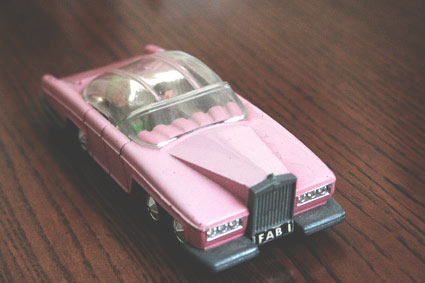 |
Posted on 25/06/10 5:09:25 PM |
|
GKB
Magical Montagist Posts: 4139 Reply |
Re: Challenge 305: Into space
Thanks for that Steve. I enjoyed this one but I had to rush it as a trip to the vinyards of Burgundy beckoned. The wrapping of the NASA logo was done in Photoshop using the same technique as for 'turning' a head around. I had thought of doing it in Cinema but decided not to cheat with this one. Well done everyone. Lots of good images from such a simple start. _________________ If at first you don't succeed, destroy all evidence that you ever tried. |
Posted on 25/06/10 8:57:12 PM |
|
Jan in France
* Posts: 34 Reply |
Re: Challenge 305: Into space
Thank you Steve for your comment on my attempt. I am quite chuffed to of learnt how to use the pen-tool, even if its very simply for the moment, and this is why I bought your books and joined the forum, to learn more and have fun at the same time. Some great entries from everyone, interesting to look at them in detail and try and work out how they've done them. Cheers |
Posted on 26/06/10 03:10:27 AM |
|
nerdtron
Neutron Neth Posts: 76 Reply |
Re: Challenge 305: Into space
Thanks Sir Steve!  _________________ Let's go the lab. Gotta Blast!!! - Jimmy Neutron |
Posted on 26/06/10 7:50:08 PM |
|
Eva Roth
Luminous Liberator Posts: 269 Reply |
Re: Challenge 305: Into space
Thanks for your comments Steve, spot on as always. I recreated the packaging as the one I found online was below HTCIP standard and I just had to put the rocket in a museum, but of course the angle is all wrong. Thought about giving it some motion blur and letting it swing... |
| page: 1 2 3 last |