| » Forum Index » The Friday Challenge » Topic: Challenge 314: Crop Circles |
|
Posted on 26/08/10 03:44:14 AM |
|
Jota120
Ingenious Inventor Posts: 2615 Reply |
Re: Challenge 314: Crop Circles
 |
Posted on 26/08/10 3:48:43 PM |
|
james
Surreal Spoofer Posts: 1194 Reply |
Re: Challenge 314: Crop Circles
http://i153.photobucket.com/albums/s211/fungismith/cornfield-prime.gif |
Posted on 26/08/10 8:01:22 PM |
|
Emil
KAFKAsFRIEND Posts: 413 Reply |
Re: Challenge 314: Crop Circles
 _________________ There are most happy who have no story to tell. - Anthony Trollope. |
Posted on 26/08/10 8:26:19 PM |
|
Sophie
Political Parodist Posts: 595 Reply |
Re: Challenge 314: Crop Circles
I admire you all! Couldn't do any better than this. My problem solving skills are not blossoming right now! 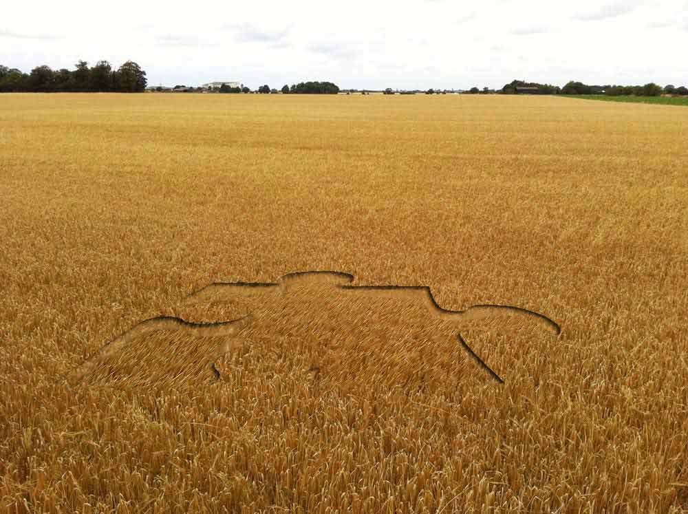 |
Posted on 27/08/10 08:21:10 AM |
|
Steve Caplin
Administrator Posts: 7157 Reply |
Re: Challenge 314: Crop Circles
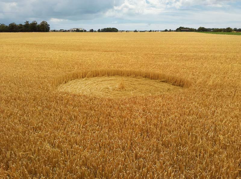
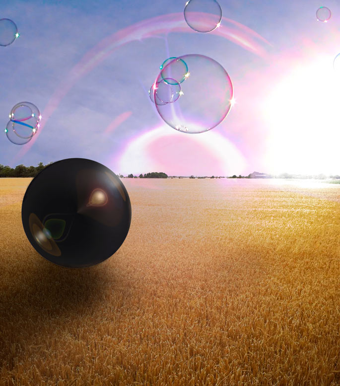
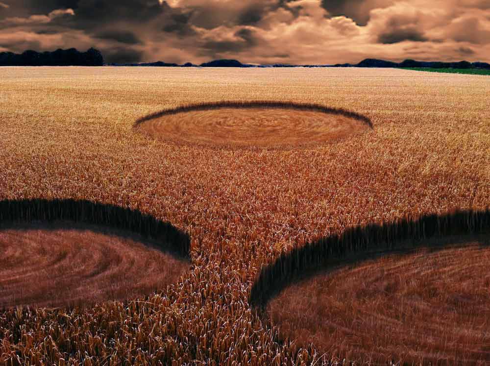
Some beautifully flattened corn from Nick Curtain to kick off this week - I like the circular pattern, and the vertical edge to the corn works really well. Great lighting, which adds to the realism. But here's the thing: if the flattened area is highlit on the left, shouldn't the surrounding vertical edge be highlit on the right? Just thinking of the direction of the shadows... A beautifully chewed-up field from Ben Mills, with the sides and ground blending beautifully in with the field - a really expert job. I like the new sky, but the clouds need to be smaller and more distant that close to the horizon. Some good distant crop carving from Jota120, the sense of scale accentuated by the figures in the field - a nice addition. Good edges make this one work particularly well. An amazing portrait of Einstein from brewell - now that would take some carving! I like the added figures for the scale, but they are rather small given the size of the barley in the foreground. And perhaps roughen up that circle a little? It's just a touch too neat. I like vibeke's Photoshop-inspired crop carving - great edges, there. The perspective on the lettering seems rather extreme: the height of the sides in the 's' is much less than in the 'p', which is odd given that they're right next to each other. And when the kids race through the field, surely they dont pick up their feet that carefully? Wouldn't they carve out a channel? A rather beautiful circle from tooquilos, and I like the puzzled look on the man in the maze. Given the height of the barley, though, he's either got very short legs or he's standing in a hole. He does move around well in the animated version, though. I was wondering why you'd chosen that Who soundtrack, until the first line - "out here in the fields". How on earth do you remember all that stuff? An intricately carved HotChiPs logo from LonnieK, which must have taken an age to extrude. What I really like here is the quality of the light, fading to a misty distance - and a terrific choice of distant sky, which matches the perspective perfectly. Beautiful. My only issue is that the lettering is so stretched vertically: we could have just seen a section of it close-up, rather than trying to fit the whole logo in the scene. Great carving, and good blending into the original from Carlo Alessandro Della Valle. I like the moody tone of this one, although I don't remember ever seeing a sky that colour! With the lighting on the cornfield, an evening sunset is really called for. Very neat work from Deborah Morley: am I right in thinking those seemingly random shapes are all part of the logo for the London 2012 Olympics? Great edges in the foreground pair, perhaps a touch too crisp at the back. And a dramatic rainbow that matches the rainy sky! Wildly off-topic it may be, but Jota120 (after a considered lecture on quantum physics) has come up with a field full of bubbles. And very pretty they are, too, although the nuclear explosion on the horizon does rather detract from the serenity of the scene. And wouldn't the bubbles distort the view through them? A beautifully considered animation from james, with a perfect representation of how the design might be carved. I see you've moved the action to the coast. An interesting idea, except that the field already tends to the horizon: adding a second one rather unbalances the first. Three very strong circles from Emil, with a beautiful circular pattern. The quality of the light here suggests an evening view, in which case the shadows inside the circles should be rather longer and we should see the sun in the distance: otherwise, this works really well. A jigsaw puzzle piece from Sophie. An interesting approach, using Layer Styles and then distorting them - and it very nearly works, except it does make the edges rather too crisp. Perhaps apply the Diffuse filter to the piece to roughen up the edges slightly? Great work this week. Good to come back and find three such strong sets of FC entries! |
Posted on 27/08/10 08:33:23 AM |
|
Deborah Morley
Makeover Magician Posts: 1319 Reply |
Re: Challenge 314: Crop Circles
Many thanks Steve. Hope you had a good holiday. One small point, are you going to change the picture of your book to CS5 on your front page? |
Posted on 27/08/10 08:40:29 AM |
|
Emil
KAFKAsFRIEND Posts: 413 Reply |
Re: Challenge 314: Crop Circles
Welcome back Steve and thank you for your comments. I hope you had a great holiday and your batteries were recharged  . .
_________________ For me the creative process is more one of discovery than creation. - James Lee Burke |
Posted on 27/08/10 09:06:01 AM |
|
Nick Curtain
Model Master Posts: 1800 Reply |
Re: Challenge 314: Crop Circles
Thanks Steve The image I used was taken under almost identical lighting, so it was merely a question of adding a couple of curves adjustments to change the colour and luminosity of the donor image. The corn flattened away from us will be brighter than that flattented towards us, rather like a freshly mown lawn, hence the difference in shade. Have to beg to differ slightly on this one. Nick |
Posted on 27/08/10 10:25:43 AM |
|
tooquilos
Wizard of Oz Posts: 2970 Reply |
Re: Challenge 314: Crop Circles
Thank you Steve. Part of my own personal challenge is finding suitable music and/or sounds for the FC. _________________ Wicked Witch of the West: I'm melting! I'm melting! |
Posted on 27/08/10 10:47:31 AM |
|
Steve Caplin
Administrator Posts: 7157 Reply |
Re: Challenge 314: Crop Circles
Ah! So that's it! You're absolutely right, of course. |
Posted on 27/08/10 6:51:54 PM |
|
Sophie
Political Parodist Posts: 595 Reply |
Re: Challenge 314: Crop Circles
Thanks Steve! Welcome back. In my image post I stated I had no idea how to give my corn any depth. Did my best but would still like to know how people did such good work. |
Posted on 30/08/10 11:46:31 PM |
|
Jota120
Ingenious Inventor Posts: 2615 Reply |
Re: Challenge 314: Crop Circles
Its not really like that Steve. My idea was"Alliens" they come in energy forms and send out the avaters to create the circles. Even forgive this I did not know you wanted the circles in the fields ;  If you know quantum mechanics you know you don't know ... If you know quantum mechanics you know you don't know ...
|
Posted on 31/08/10 00:05:17 AM |
|
Jota120
Ingenious Inventor Posts: 2615 Reply |
Re: Challenge 314: Crop Circles
Sorry that does not make much sense. Maybe this is even worse, the spheres come down and create the circles, ...... okay Steve and you guys can just say Trevor, what are talking about, and we can have a good laugh at least ... |
Posted on 23/09/10 1:44:22 PM |
|
Kuham
* Posts: 47 Reply |
Re: Challenge 314: Crop Circles
Wao, Nick you'r really an amazing digital impressionist. I like the simplicity of your imagination and illustration. Kuham |
Posted on 23/09/10 1:46:52 PM |
|
Kuham
* Posts: 47 Reply |
Re: Challenge 314: Crop Circles
But I trust your clever represention and delivery of your imaginations. This art work looks and feels real. I love it. Kuham |
Posted on 23/09/10 1:49:05 PM |
|
Kuham
* Posts: 47 Reply |
Re: Challenge 314: Crop Circles
Am blown alway with your art work, its emotional and well created. Kuham |
| page: 1 2 last |