
| » Forum Index » The Friday Challenge » Topic: Challenge 356: The staircase |
|
Posted on 22/06/11 06:59:39 AM |
|
Jimbean
Sparky Shopper Posts: 105 Reply |
Re: Challenge 356: The staircase
Really struggled with perspective an still not got it right but here it is anyway!!   |
Posted on 22/06/11 9:58:36 PM |
|
bjansen
Satire Surgeon Posts: 32 Reply |
Challenge 356: The staircase
Great work so far everyone. Might I ask how you guys are doing such a superb job of cutting out/isolating the railing? Is there a new fancy trick that I need to learn, or are you all just meticulously selecting each and every one? Thanks! |
Posted on 23/06/11 00:04:10 AM |
|
james
Surreal Spoofer Posts: 1194 Reply |
Re: Challenge 356: The staircase

|
Posted on 23/06/11 02:00:38 AM |
|
LagoDiLecco
Lombard Illuminator Posts: 41 Reply |
Re: Challenge 356: The staircase
Hey bjansen, I'm not fully happy with my railings but I had to make myself stop because I can get a bit too obsessed! I made some selections (and layers) containing just sections of railing. Because I didn't really know what I was doing, I had about three different sections of railing trying slightly different ways each time. I wanted to learn how to make masks with alpha channels. My steps were basically: - make a rough selection containing just that section of railing - copy to its own layer (unnecessary, but I didn't know better) - look at color channels to see which one had good contrast - copy that channel to a new alpha channel - apply levels to alpha channel to increase contrast - apply threshold to get black and white, paint out extra bits, turn into a selection. That selection can then be used to isolate just a piece of railing (though for me it still needed a quick mask to tidy it up). This can then go in a layer above other stuff (like carpet). If I was doing it again I'd probably just try quick selections + a quick mask to tidy up. I'm not sure the channels were actually worth it. Hope that helps and hope I'm not too embarrased when other people explain better and more obvious ways (Steve?)... |
Posted on 23/06/11 04:43:41 AM |
|
bjansen
Satire Surgeon Posts: 32 Reply |
Challenge 356: The staircase
Took the easy way out and decided to just demolish the railing altogether....  |
Posted on 23/06/11 05:41:28 AM |
|
vibeke
Kreative Kiwi Posts: 2190 Reply |
Re: Challenge 356: The staircase
Didn't think I would have time this week, but it has been raining all day.  _________________ Perfect confidence is granted to the less talented as a consolation prize. |
Posted on 23/06/11 07:43:20 AM |
|
PDelavigne
Mannequin Mestre Posts: 124 Reply |
Re: Challenge 356: The staircase
Hi folks, great works,as usual! here's my try !   |
Posted on 23/06/11 09:05:31 AM |
|
josephine harvatt
Gag Gadgeteer Posts: 2605 Reply |
Re: Challenge 356: The staircase
Ha! I started mine out as an Escher homage too bjansen but you have done a much better job than I could have managed _________________ I'm not really bad - I just draw that way |
Posted on 23/06/11 4:42:09 PM |
|
Garfield72
Montage Manceau Posts: 353 Reply |
Re: Challenge 356: The staircase
 |
Posted on 23/06/11 9:31:09 PM |
|
Deborah Morley
Makeover Magician Posts: 1319 Reply |
Re: Challenge 356: The staircase
Josephine, Your challenge made me think of 'Frenzy' |
Posted on 23/06/11 10:05:36 PM |
|
josephine harvatt
Gag Gadgeteer Posts: 2605 Reply |
Re: Challenge 356: The staircase
Not a film I'm familiar with but having looked it up on t'net I can see what you mean ! Actually I was stealing from the very similar Vertigo poster - Hitchcock must have had a thing for spirals _________________ I'm not really bad - I just draw that way |
Posted on 23/06/11 10:12:52 PM |
|
Emil
KAFKAsFRIEND Posts: 413 Reply |
Re: Challenge 356: The staircase
Great works. Here is my try. 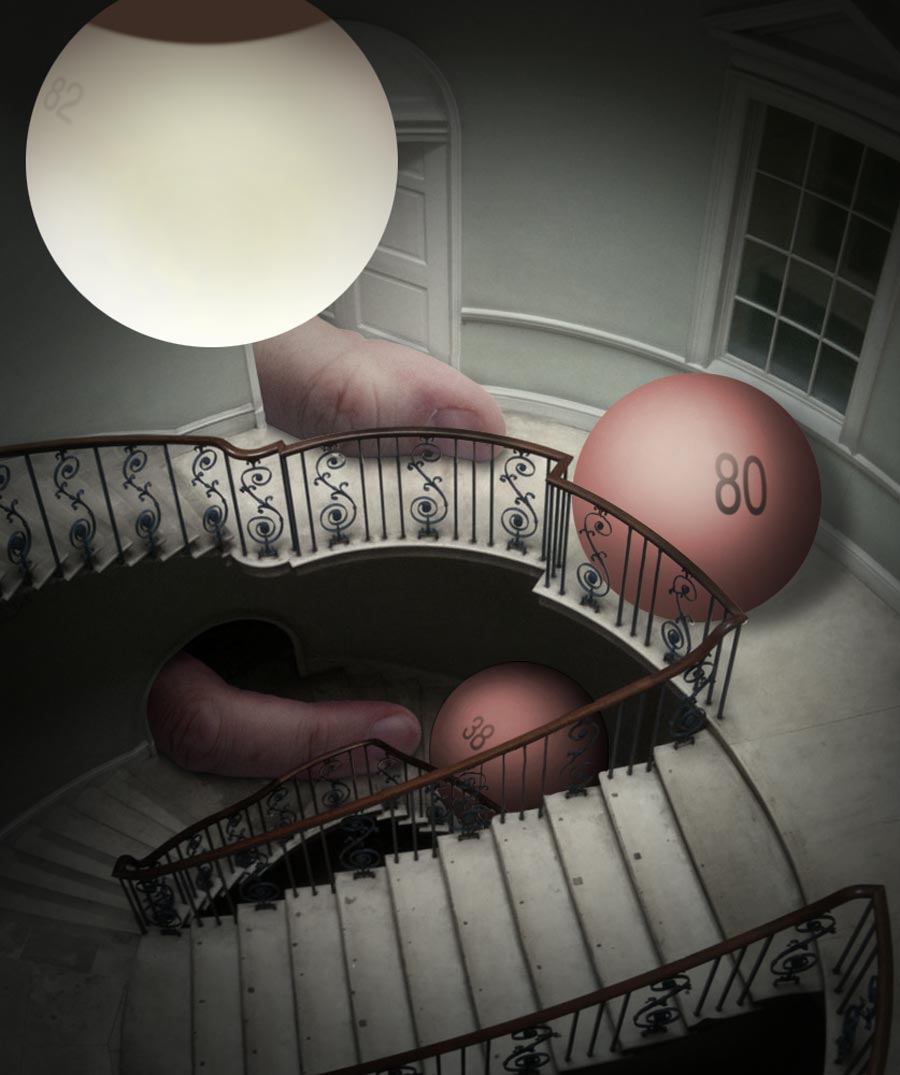 _________________ I have the true feeling of myself only when I am unbearably unhappy. - Franz Kafka |
Posted on 23/06/11 10:54:21 PM |
|
dwindt
Realism Realiser Posts: 1032 Reply |
Re: Challenge 356: The staircase
Hi everybody. Great challenge. Had to force myself to stop. Hope the resize doesn't affect the image to much. Some lovely images. Well done.  |
Posted on 24/06/11 00:08:08 AM |
|
BigVern
Q Quipper Posts: 674 Reply |
Re: Challenge 356: The staircase
Dear All, Wow ... some beautiful and impressive images this week. I am glad my photo sparked some creative interest. Thanks for using it Steve. I would recommend to any of you who visit London to spend some time at Somerset House. As well as some interesting architecture it runs some great exhibitions. When I visited a short while ago it was hosting the World Photography winners and a series of Chinese Zodiac bronze statues by the artist Ai WeiWei. Anyway ... I have been quite busy the last few weeks so have not had the opportunity to come and play on the forum but this week I had some time and seeing as it was my photo as the starting image I decided I must have a go. This is probably about my most ambitious photoshop effort to date with about 50 layers and multiple blend modes and layer styles. I had a great deal of fun doing it though. Thanks to squidinc3d at www.turbosquid.com for kindly donating the base Dalek model which I used. 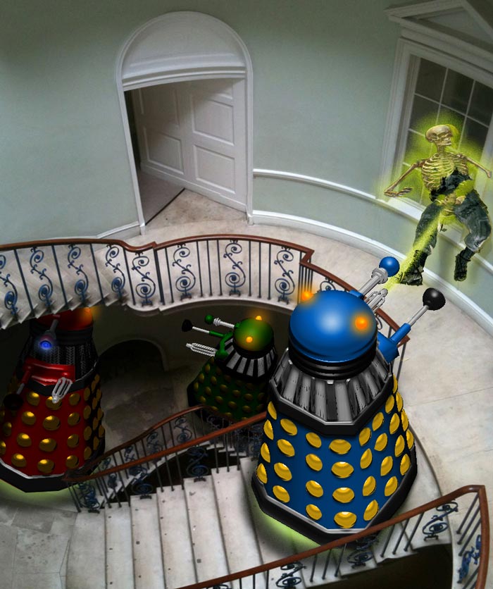 |
Posted on 24/06/11 02:13:04 AM |
|
bjansen
Satire Surgeon Posts: 32 Reply |
Re: Challenge 356: The staircase
I'm sure you could have easily bested me Josephine, especially seeing as how I demolished the railing in order to avoid dealing with it, haha. It seems as though we are often on the same wavelength, as I thoroughly enjoyed your Sherlock quote regarding the T.K. paintings 
|
Posted on 24/06/11 02:57:00 AM |
|
Daniel
Poser Professor Posts: 192 Reply |
Re: Challenge 356: The staircase
Vern, your entry is great ... and colorful ... Those robots remind me on "My Favorite Martian" (if you are old enough to remember those tv shows)! 
And Ai Weiwei is now a free man (after three months in jail)! |
Posted on 24/06/11 08:05:38 AM |
|
Steve Caplin
Administrator Posts: 7157 Reply |
Re: Challenge 356: The staircase
Well, this was a tricky one. The perspective is seriously complex in this image. You nearly all managed to populate the scene with convincing bodies and other added elements, but there were three running problems that seemed to affect a number of you: 1. Extreme perspective There's a plentiful supply of "up the top of a ladder" shots available, as this angle was very popular a decade or so ago. But the problem with all these shots is that they were photographed very close to the subject, which meant huge heads and tiny feet. With the distance from which we're viewing this scene, the perspective distortion would be much less pronounced. 2. The view through the window This one seemed to baffle a lot of you: just what would you see through a window at this angle? Well, what you wouldn't see is the horizon. Looking down from the top of this staircase, you'd most likely see a lot of ground, with perhaps the base of a building or two. Imagine standing at your own window and looking out through the very bottom of it: thats the angle we're talking about here, and more so. 3. How big? A strong temptation to make all the people big in this scene - after all, the human element does draw the eye, But you need to take the railing into account. It should be at least at waist height, if not higher, to stop people toppling over it. First up this week was Stefan, with a magnificent underwater scene: the tone, colour and lighting are all just right here. The bubbles make it clear we're under water, and that floating chair (perfectly in keeping with the style of the house) pushes the point home. An immaculate, well-conceived image. Even the carpet looks good. Perfect. A very fine entry from brewell - the person walking through the doorway looks excellent. The baby and dinosaur could both do with shadows, I think, and I'd be tempted to move that dinosaur down a stair or two for dramatic effect. And shouldn't the other one be facing the other way? Great curtains and carpet, and I like the painting (but watch the direction of all your shadows). I like tooquilos's colour scheme and the new wood floor. The paint and accessories seem rather brightly lit for that dark shadowy place - and see (1) above re the figure. Very clever use of all the different poses in the animated version - I especially like the moving finger on the book. With the benefit of Poser, of course, Daniel was able to pose his figures however he wanted. THe woman at the top of the stairs is excellent, although I'd have tucked her thumbs under the banister rail. I like the dog, although the cat seems to be leaning back a little. Not sure about the tiles - are they just too narrow? I like the fact that you've placed a reflection in the window, although of course we shouldn't be able to see the original reflection through it. Lower the contrast, not the opacity! A great scene from Nick Curtain, with a Norman Rockwell figure (I'm guessing) sliding down the banister rail. A lovely image, and the cat is a cute element on that fine new carpet. The view through the window seems rather uncomfortable - see (2) above - but it's hard to work out exactly why: it should work, but somehow it doesn't quite. I think this bears further investigation. I really like LagoDiLecco's story of the missing cat - beautifully expressed through the poses of the figures (great perspective) and the paw prints on the wall. A subtle new carpet, and I like the picture on the wall (but watch the perspective). A good sense of the presence of glass in the window, too, and I think the angle of view is very nearly right. Excellent work. I like the way Deborah Morley has smashed the place up - with fantastic attention to detail: the cracks and stains on the walls, the worn patches on the carpet (a really nice touch, that). I think the view through the window is just about right, too: of course the fact that it's a curved wall only makes it harder to tell. And good figures, if perhaps a little too large: see (3) above. So are we to understand that Josephine Harvatt has had some difficulty with this one? A great resulting poster, very Hitchcock. Your eyes could be a little more open, and the eyebrows a touch higher - use the Liquify filter! A valiant attempt at the perspective from Jimbean, and it does nearly work - but see (1) above. A great cast of characters, though, and I like the ghost chasing up the stairs. I'd be very tempted to lose those stripes in the carpet, as they only accentuate the trickiness of the angle. And is it just me, or does that girl have a tiny head? The pair of men in James's image are just right - a touch more shadow, perhaps. The woman is a great angle, but she seems tiny compared to the men - especially as she's closer to us than they are. With the light coming from the window, were you intending to add that shadow to the rest of the scene? Only it's rather as if the window didn't have walls around it! I can't quite make out what's hiding in that space under the stairs, though. A homage to M C Escher from bjansen, neatly slotting one of his impossible rooms beneath the staircase - and it's a very good fit. I was going to query your placement of the pictures on the wall, but in an image like this it seems rather bizarre to complain about the perspective! Good work from Vibeke - I like the new double doors, and the view through the window. I'm especially impressed that you managed to find a shot of a chandelier from above! Good people (although see (1) above) - but that does seem like an odd place to sit on a suitcase and make a phone call. A good piece of drama from PDelavigne, although I'm having trouble placing the 18th century soldier with the 19th century swordsman. I suppose they do both fit the location, though. The jaunty angle of the painting adds to the effect, although the angle of view on the chandelier is a little awkward. The view through the window should show the buildings parallel to the window bars: and see (3) above regarding the size of the people! I like the texture of Garfield72's carpet - but why a separate piece for each step? What's holding it down? The man does have a certain knowing look, though. But see (1), (2) and, er, (3) above... I've become used to Emil's fondness for surrealism, but I have to admit that this week's entry is even more baffling than usual. Nice lighting, although the shadows seem too well-defined for such a diffuse light source. Perhaps we need to hear the story behind this image. A clever and detailed entry from dwindt, with plenty of action in an Escher-inspired room. This is one that really needs to be seen at a larger size! a very intriguing piece of work. A dynamic entry from BigVern - so daleks can climb stairs after all! I like the illuminated bases and the head lights, and the destruction of the man at the window has been very neatly handled. We could do with more dramatic lighting in the upper part of the room, though - and see (3) above. Exceptionally good work all round this week, on a very hard challenge. Many thanks to BigVern for the photograph! ________________________ 
So how are we to deal with that view through the window? Clearly, simply sticking a scene out there doesn't work (1). We could try rotating it so the verticals align with the verticals in the window frame, but even this is wrong - it's still a low view, and we're looking down at the scene (2). The only viable solution is that we're really only see the ground from this high up - perhaps with a touch of detail in there to prevent it from looking too monotonous (3). And for a little extra realism, adding a window ledge outside - there's the suggestion of one in the reflection - does tie the interior to the exterior (4). |
Posted on 24/06/11 08:46:22 AM |
|
Daniel
Poser Professor Posts: 192 Reply |
Re: Challenge 356: The staircase
Thanks a lot for the comments Steve. You are absolutely right, the original reflection should not be seen through the reflection of the poser figure. One question though (and I might be totally wrong): Regarding the view from the window: Don't you think that (3) and (4) give th impression that the window and the street are almost at the same level??!! |
Posted on 24/06/11 08:54:46 AM |
|
Nick Curtain
Model Master Posts: 1800 Reply |
Re: Challenge 356: The staircase
Thanks Steve I pondered over the view for some time and it occurred to be that the distortion should carry on throughout the image, i.e. the outside view (horizon) would have to match the horizontal window frames. The question was how much of the skaters should show and not knowing how high the staircase is, it was pure guesswork. I think a visit there is on the cards and I'll take a wide angle with me to capture what I see. Thanks Vern for a great image. Emil, I thought your idea was visionary and excellent Nick |
Posted on 24/06/11 09:03:03 AM |
|
PDelavigne
Mannequin Mestre Posts: 124 Reply |
Re: Challenge 356: The staircase
Thanks Steve! very interesting comments !  |
| page: 1 2 3 last |