
| » Forum Index » The Friday Challenge » Topic: Challenge 395: Advertise here |
|
Posted on 27/03/12 10:09:04 PM |
|
Deborah Morley
Makeover Magician Posts: 1319 Reply |
Re: Challenge 395: Advertise here
 |
Posted on 28/03/12 10:27:08 AM |
|
LagoDiLecco
Lombard Illuminator Posts: 41 Reply |
Re: Challenge 395: Advertise here
 |
Posted on 28/03/12 11:32:32 AM |
|
vibeke
Kreative Kiwi Posts: 2190 Reply |
Re: Challenge 395: Advertise here
Leap into profits  _________________ Perfect confidence is granted to the less talented as a consolation prize. |
Posted on 29/03/12 10:32:34 AM |
|
james
Surreal Spoofer Posts: 1194 Reply |
Re: Challenge 395: Advertise here
Thank you Josephine. I apologise for the late response. |
Posted on 29/03/12 10:46:00 AM |
|
james
Surreal Spoofer Posts: 1194 Reply |
Re: Challenge 395: Advertise here
A great poster Vibeke (arn't they all) A true leap of imagination. |
Posted on 29/03/12 11:17:48 AM |
|
GKB
Magical Montagist Posts: 4139 Reply |
Re: Challenge 395: Advertise here
I tried to post this tweak ages ago but Photobucket wouldn't upload it. I eventually re-saved it using a different file name and it uploaded! Don't understand that one. http://i150.photobucket.com/albums/s93/GKBphoto/Carwindscreentomtom.jpg _________________ You do not need a parachute to skydive. You only need a parachute to skydive twice. |
Posted on 29/03/12 11:26:26 AM |
|
vibeke
Kreative Kiwi Posts: 2190 Reply |
Re: Challenge 395: Advertise here
Thanks James, and yes there are many great images, including you gif which is as always, very good. _________________ Perfect confidence is granted to the less talented as a consolation prize. |
Posted on 29/03/12 12:10:24 PM |
|
Mariner
Renaissance Mariner Posts: 3298 Reply |
Challenge 395: Advertise here
High res is here. 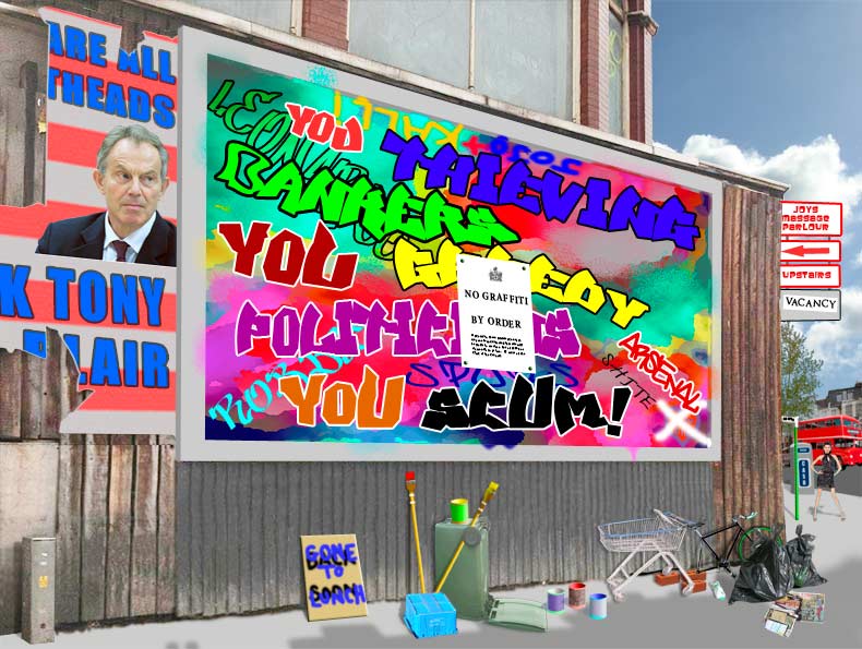
|
Posted on 29/03/12 4:22:29 PM |
|
Garfield72
Montage Manceau Posts: 353 Reply |
Re: Challenge 395: Advertise here
 |
Posted on 29/03/12 6:15:30 PM |
|
Deb Raskin
Bodywork Boss Posts: 63 Reply |
Re: Challenge 395: Advertise here
I made a little mock-up of the "sculpture" to try and see how the shadow would fall in late afternoon sun. In the end, I opted for something that would, at least, imply that the object was raised from the flat plane of the sign. I will need to be "enlightened" on Friday. 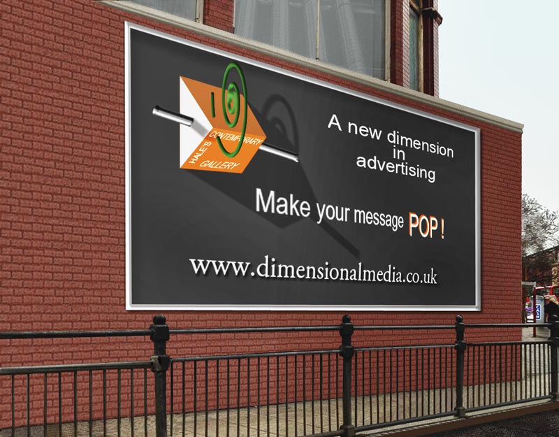 |
Posted on 29/03/12 7:54:51 PM |
|
Eva Roth
Luminous Liberator Posts: 269 Reply |
Re: Challenge 395: Advertise here
http://www.evaroth.com/EvaAdvert |
Posted on 29/03/12 9:41:28 PM |
|
Sophie
Political Parodist Posts: 595 Reply |
Re: Challenge 395: Advertise here
Sorry! Wrong image uploaded & don't know how to replace! |
Posted on 29/03/12 9:47:18 PM |
|
Sophie
Political Parodist Posts: 595 Reply |
Re: Challenge 395: Advertise here
 |
Posted on 30/03/12 00:36:20 AM |
|
Jota120
Ingenious Inventor Posts: 2615 Reply |
Re: Challenge 395: Advertise here
 |
Posted on 30/03/12 04:14:44 AM |
|
Artwel
Satire Supremo Posts: 607 Reply |
Re: Challenge 395: Advertise here
Nice ideas everyone. In case you're wondering, the website address on my poster says www.unleashed ads.com, not www.unleash dads.com ! ..of course 
I'm not pleased with this font at all.. Hi Res: http://i1229.photobucket.com/albums/ee466/Artwel/PShop/Ad_Here_L2.jpg 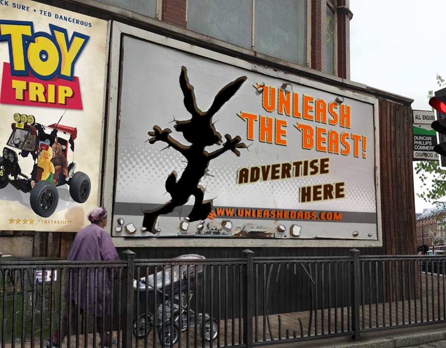 _________________ Art Is Never Finished, Only Abandoned. |
Posted on 30/03/12 08:34:58 AM |
|
Steve Caplin
Administrator Posts: 7157 Reply |
Re: Challenge 395: Advertise here
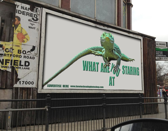
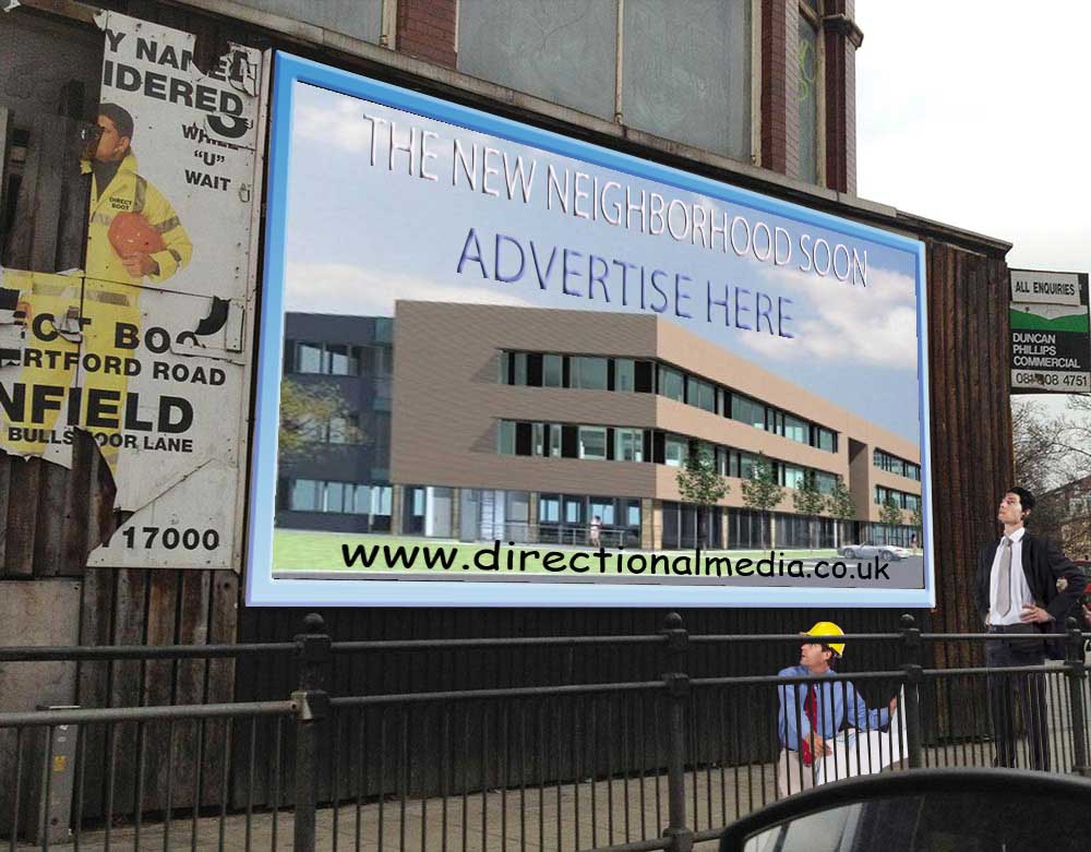
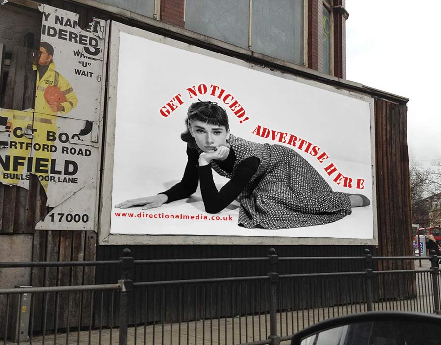
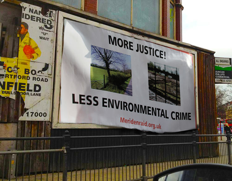
Lots of ingenious designs this week. One common factor was a desire to embellish text with drop shadows, embossing, strokes and other effects: really, for impact, text is much better left plain. All the effects make it harder to read, not easier! First to design a billboard this week was Josephine Harvatt, with a funny and striking entry - a terrific idea, and one I first saw on a National Lampoon cover in, er 1973. But it's still a glorious entry! A compelling poster from Ant Snell - and very topical for an Olympic year. But watch out when you mix your colours: thin red text on a strong blue background produces a visual dazzle that makes it almost impossible to read. When in doubt, stick with white text on just about any background. A nicely-made night scene from Lorenzo1977 - it's certainly eye-catching, but the over-enthusiastic treatment of the lettering (embossing, metallic, drop shadow) makes it very hard to read. And are you absolutely sure you want yellow light from those spotlights? Eye-catching work from brewell, and very strong it is too. A great sense of movement on the eye, and neat placement of the mitt. But - do try to avoid those text effects! They only serve to make it harder to read. A colourful entertainment from tooquilos, with Severus Snape (of all people) showing a surprisingly shapely leg in an ad for Dancing with the Stars. I like the exuberance of this, but the colours all seem unnaturally strong and saturated for this location. I like the added tree, though, which pushes the ad more effectively into the scene. And some cool effects in the animated version - I like the lens flare. Jimbean makes us an offer we can't refuse - in the most compelling way. Once again, though, do watch out for those text effects: the 3D extrusion is just too strong for that weight of type, and makes it much harder to read. I was hugely impressed with Ben Mills' clever entry, in which the poster becomes the baseboard for flyposters. Not just a really original idea, but very well executed - and I like the 'thank you' tucked away in the background. Very original work, Ben! There's a neat 1950s feel to Frank's poster that makes it quite charming - and I like the fact that it's not set at night, with the new chrome frame on the billboard. But watch the text effects: the stroke on the URL lettering makes it harder to read, not easier. Double advertising from James, with the animated poster and the sandwich board man walking past it - a great walking move end, and he fits very neatly behind those painstakingly cut-out railings. But watch those text effects! The perspective on the headline makes the last word impossible to read, and I've lost count of the number of Layer Styles added to the Advertise Here board. A pristine Sistine reference from joeysala, and it's certainly striking: but I think stroke and drop shadow may just be a text effect too far. I like the faux cheapness of the second entry, especially with the scuffing of the poster. But I'd lose the stroke on the text. Splendid work from GKB - now that's what I call a striking ad, and it does make new sense of the directional media address. (Although for a company based in the UK, I'd say they seem to be several thousand miles off-course.) Great attention to detail - the smashed windscreen, the hand on the steering wheel, the reflection in the rear-view mirror: and have you started using Poser, Gordon? I like the flying glass in the second entry, too. A striking image from marlcliff, with strong, no-nonsense text. From a compositional point of view, I'd have put the girl at the side rather than in the middle, and run Advertise Here on two lines; and I'm not sure about the watery background. Otherwise, this is strong - and I like your own flyposters on the side. Confused by emanuelefrau's entry - I even tried visiting the URL, but no luck. Not sure what you're trying to say here - unless you really did experience a high voltage shock, that is, in which case I wish you a speedy recovery! I like Deborah Morley's simple ad, and the way the lizard interacts with the lettering is good. A shame to put 'at' on a new line, though: I'd have moved it all over to the left (we could afford to lose a bit of tail) so it could go back up with the rest of the headline And that's a minimal URL size! Perhaps lose the embossing on the text, too. Striking work from LagoDiLecco, a simple concept that's been well implemented. I'd suggest either having the headline all in lower case, or putting an upper case W on to match the upper case YOUR - it seems a little unbalanced as it stands. A well worked background that looks like it's been out in the weather for a while - nicely achieved. A fine set of athletes from vibeke, and I like the overall composition. But all those perspectives on the text leave me a little visually confused: better, I'd have thought, to design the ad flat and then distort the whole thing (as a Smart Object, of course) to fit the space. Excellent posters for Casablanca and Dr Who, even though the headline text on Casablanca goes against everything I've been saying about keeping text simple! A touch of politics from Mariner, with some very nicely wrought graffiti (although watch the saturation of those colours - they're far too bright to be believable). I like all the assembled detritus at the bottom, and the added detail of the massage parlour, bus and other elements: the cracked Blair poster is particularly appealing. Good work! A good idea from Garfield72, with architects planning a new building to replace this rather broken-down one - neatly inserted behind the railings. Watch the bevel effect on the text, though, which simply makes it harder to read. And - Comic Sans? You really used Comic Sans? No no no no no! The only place for Comic Sans is in a children's picture book, and even that's pushing your luck. Good work from Deb Raskin, who has built a new wall to match the brickwork in the upper storey. Very neatly integrated behind the railings, and I especially like the idea of the three-dimensional sculpture mounted on the billboard. The shadow of the sculpture on the backing is great, although it should go over the lettering, not under it. The only thing that's missing is a shadow from the green swirl on the sculpture itself, which would certainly enhance the 3D impression. And given the two orange planes, surely the upper one would be brighter than the lower, rather than the other way around? I like Eva Roth's flashing speed camera - now that's certainly the way to attract the attention of passing motorists! Not sure it would put them in a very positive frame of mind, though. A simple and well-achieved animation. A rather beautiful image from Sophie, with the text running neatly around the figure. I wouldn't have chosen a stencil font, though, which just makes it harder to read. And when you run text along a path, there's always some manual tweaking of both the letter spacing and the text involved. The word 'here' is awkwardly spaced, and the path needs smoothing out under it so the E and R don't run into each other like that. I like the way Jota120's poster is falling out of place, with some great shading on the underside. What's casting the shadow on the top, though? It seems to me the whole scene is in the shade, and I'm not sure where your bright sunlight is coming from. A couple of fine posters from Artwel, with that great Bugs Bunny cutout - I especially like the way the railings have been buckled in front, a really clever touch. And that's a good version of the Toy Story poster, too. Surely, though, that's an unleashed dad walking past? |
Posted on 30/03/12 08:46:50 AM |
|
plawansine
Wrinkle Wizard Posts: 11 Reply |
Re: Challenge 395: Advertise here
oh ! wait me please 
[SIZE=1]Thanks: ฝากรูป[/SIZE] |
Posted on 30/03/12 08:50:18 AM |
|
Steve Caplin
Administrator Posts: 7157 Reply |
Re: Challenge 395: Advertise here
And finally, a late entry from plawansine, showing where it is and is not permissible to advertise. I like the style of this, and the text fits in well: but the word "exceptable" is not found in the English language! "Except" or "acceptable" would do - either one, but not both! |
Posted on 30/03/12 08:54:16 AM |
|
GKB
Magical Montagist Posts: 4139 Reply |
Re: Challenge 395: Advertise here
Thanks Steve. I was really stuck for ideas this week. It was the wing mirror in your original image that took me down this road. (Pun intended) There was some rather convoluted thinking to get there, though. I started to use Poser some years ago but don't use it very often. It takes too much time to make it look like anything other than a Poser model but every now and then it comes into its own and I wasn't worried about the lack of realism for this particular image. _________________ Only one shopping day left until tomorrow! |
Posted on 30/03/12 09:26:55 AM |
|
plawansine
Wrinkle Wizard Posts: 11 Reply |
Re: Challenge 395: Advertise here
I'm sorry about my English language because I'm not use English, I'm Thai Thank you very much Mr.Steve 
[SIZE=1]Thanks: ฝากรูป[/SIZE] |
| page: 1 2 3 last |
