
| » Forum Index » The Friday Challenge » Topic: Challenge 458: Degree show |
|
Posted on 19/06/13 9:13:47 PM |
|
michael sinclair
Off-Topic Opportunist Posts: 1871 Reply |
Re: Challenge 458: Degree show
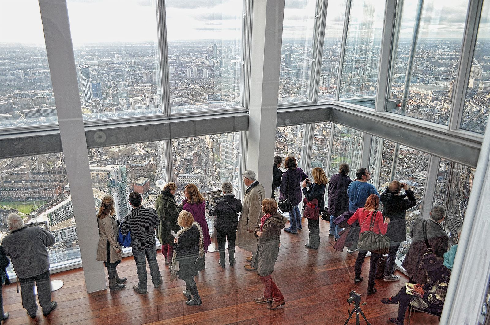
If there is going to be a viewing gallery, then let it be the best! The viewing gallery from the Shard tower in London. NOTE: the internal reflections are coming from the big sheet glass window from which we view. 
 |
Posted on 19/06/13 10:45:05 PM |
|
Whaler
Visual Viking Posts: 330 Reply |
Challenge 458: Degree show
Interesting challenge! 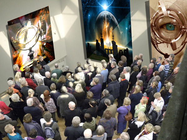 _________________ Why? On the other hand, why not? |
Posted on 20/06/13 00:33:19 AM |
|
joeysala
Perfect Palmist Posts: 604 Reply |
Re: Challenge 458: Degree show
Hey Whaler, I think I've seen this show.........don't recall exactly where or when, but it is definately familiar!  _________________ "Imagination, not invention, is the supreme master of art........" Joseph Conrad |
Posted on 20/06/13 04:07:35 AM |
|
Whaler
Visual Viking Posts: 330 Reply |
Re: Challenge 458: Degree show
Deja vu! All the other entries from last weeks challenge are just around the corner. Just a thought to provoke your minds a little bit. How about that, Steve, putting on our own show some time in the future! Food for thought. Joeysala, I hope I can be excused for using yours and Josephine's pictures in my entry without prior permission. _________________ It's only in my brightest moments that I understand myself |
Posted on 20/06/13 09:30:45 AM |
|
joeysala
Perfect Palmist Posts: 604 Reply |
Re: Challenge 458: Degree show
Joeysala, I hope I can be excused for using yours and Josephine's pictures in my entry without prior permission. [/quoted] I can't speak for Josephine, but I'm flattered. _________________ "Imagination, not invention, is the supreme master of art........" Joseph Conrad |
Posted on 20/06/13 3:35:13 PM |
|
Mariner
Renaissance Mariner Posts: 3298 Reply |
Re: Challenge 458: Degree show
 |
Posted on 20/06/13 6:31:26 PM |
|
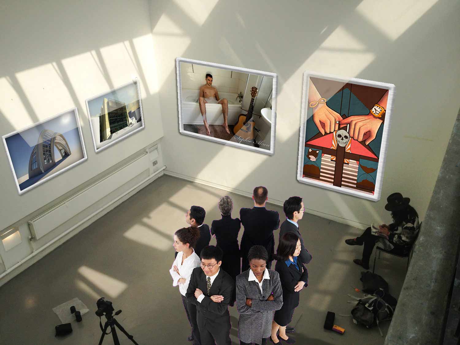
Garfield72
Montage Manceau Posts: 353 Reply |
Re: Challenge 458: Degree show
 |
Posted on 20/06/13 9:46:40 PM |
|
Jota120
Ingenious Inventor Posts: 2615 Reply |
Re: Challenge 458: Degree show
Some great work. Running out of time here. But anyway, the stained-glass work with freedom looks out in contemplation or reflection..... (The stained-glass was made by a friend of mine). 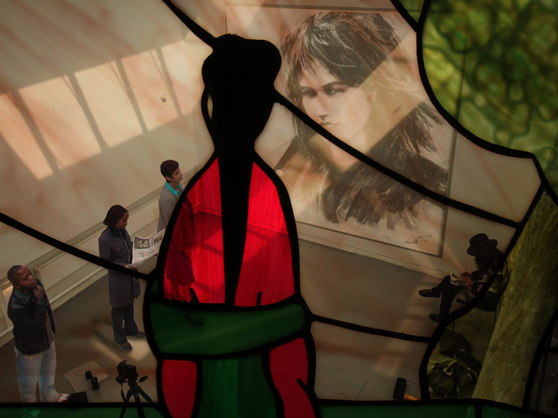 |
Posted on 21/06/13 06:08:44 AM |
|
darrenandcolleen@telus.net
Serene Synthesist Posts: 119 Reply |
Re: Challenge 458: Degree show
Running outta time 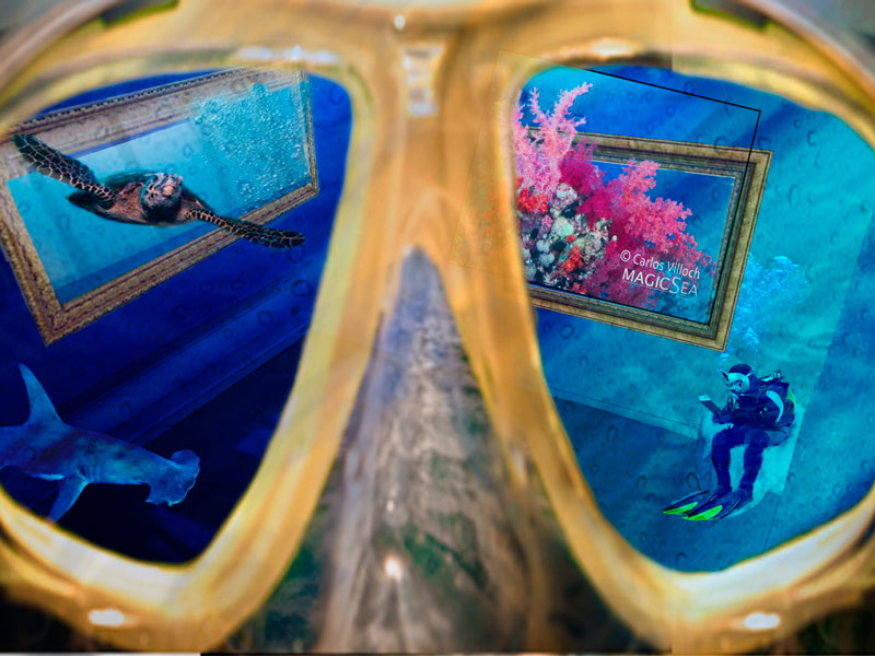 |
Posted on 21/06/13 09:11:08 AM |
|
Steve Caplin
Administrator Posts: 7157 Reply |
Re: Challenge 458: Degree show
First to decorate the walls this week was GKB, with a rather splendid collection of his own photographic prints. The perspective is spot on, the shadows running over the top of them - and I like the way the shadow bends over the easel stand on the floor. Only the lighting on the frames seems a little artificial: too many of them are lit from the lower right. But otherwise, a highly convincing piece of work. A packed scene from James, with highly decorated walls and even three-dimensional displays - and it's very good to see the celestial sphere from last week in there. The angle on the students themselves is a little extreme for this distance, but they very nearly fit. I waited about 15 minutes for a dog to run into the scene - no animation from you this week, James? A large number of paintings from Ant Snell, filling the side wall remarkably well. The angle of the panels on the left seems a little extreme - since we're looking down on the whole scene, we shouldn't be looking up at the tops of those paintings on the left! And much as I admire the T-shirt of the boy, his perspective is way too strong for this distance: compare him with the girl sitting on the far right. An impressive scene from Ben Mills, with three photographs filling the walls. Here's a tip: set the mode of these images to Multiply, and then not only will the shadows show through them, the whites in the images will also be the right tone to match those white walls. I like the group of students, just from the right angle, but they are rather too big compared to the girl in the corner and the camera on the tripod. Some splendid images adorn Frank's walls, fitting in neatly with the wall colour and the shadows. I'm not sure about the bevelled edges, especially on the large image on the right - the lower bevel is much too wide to be seen from this angle - and the people are just a little too big. But overall it's a very pleasing piece of work. A glorious image from Emy, with a splendid illustration on the far wall and a beautifully paint-spattered floor. Personally I'd have left the texture off the left wall, and perhaps moved the mouth up a little way, but that doesn't stop this from being a wholly consistent, really strong image. Fantastic. Superb placement of images from joeysala - I especially like the way the image on the left wall is leaning forwards in its frame, and the way the shadows break over the images. The girl in the middle fits very well, on a good angle. I'd tone down all the images a little, though, since the wall themselves were of course bright white to begin with. And I agree, the perspective does work better in the second entry. Very fine work from brewell, with pictures very neatly arranged - together with perfect placement of the edges, which must have taken some working out. The girl also fits perfectly into the scene: I like her subtle shadow, and the lighting direction on her back and legs. Really good work: I can't fault it. Now that's what I call a student exhibition! Sjef has adorned the walls and even the floor with images, and there's even a symbol hanging from the ceiling. A fine choice of Pink Floyd-inspired shots. The only thing that breaks the illusion is the cup on the upper rail - the perspective is completely wrong for this shot, we need to be looking much more down into the cup. The scene in tooquilos's entry is set for a cinematic presentation, with a fine screen and truly convincing projector rays. I really like the colouring of the light on the ground, and the slight reflection of the screen in the floor. And I really like the way the horse leaps out of the screen in the animated version - complete with its reflection! That must have taken some working out! Given Deborah Morley's famed antipathy towards perspective, it's surprising to see an attempt at such a complex piece of perspective matching. Happy to say you've graduated with honours, Deborah! This is a remarkable piece of work, with glorious perspective on the whole object. The only slightly awkward area is the top edge of the hole, which is sloping down a little; having got the shape of the object itself exactly right, it would have made sense to place a basic grid over it, distorted to fit the corners, which would then show you exactly how to place the elements inside it: 
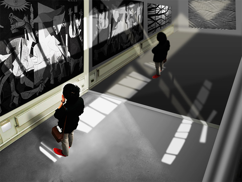
I thought for a minute that michael sinclair had gone 100% off topic this week with his view from the Shard, but no - there's the girl sitting in the corner, and her camera next to her. A great view indeed! I like the fact that Whaler's gallery features art from last week's Challenge, and good to see such a large crowd gathered to examine... an empty corner? You really should stick something in there for them all to be looking at! Great shadows from the paintings, though, and a well chosen group. A real tour de force from Mariner, who has not only filled the walls with a selection of great 20th century art (I've always loved Guernica) but has also created a reflection of the entire room - as well as adding that part of the room we can't see, and complete with a reflection of the student. Terrific work, Michael - what an amazing job! Even such tasks as distorting the radiator must have been a major challenge. Superb. I like the artworks in Garfield72's entry, with artfully recreated light splashes (but why didn't you just use the originals?). The crowd of people rather baffles me, though: its an odd way to view a gallery! An interesting view from Jota120, looking down through a stained glass window. Perfect placement of all the people in the gallery, with a tremendous sense of them belonging in the scene. A very novel take! A clever underwater scene from Darren, viewed through a pair of goggles. I like the diver in the same pose as the girl in the original shot,and all the sea creatures. But you should have removed the original black frame from the coral before distorting it! |
Posted on 21/06/13 09:33:14 AM |
|
Deborah Morley
Makeover Magician Posts: 1319 Reply |
Re: Challenge 458: Degree show
Many thanks Steve. Loads of perspective lines, but didn't think of a grid. |
Posted on 21/06/13 09:42:38 AM |
|
Mariner
Renaissance Mariner Posts: 3298 Reply |
Re: Challenge 458: Degree show
Thankyou Steve for your unstinting praise. I really struggled with this one and nearly ran out of time. |
Posted on 21/06/13 09:50:41 AM |
|
brewell
Pixel Pentagrammarian Posts: 752 Reply  |
Re: Challenge 458: Degree show
The edges were simple enough after I copied each picture from the vanishing point layer onto a new layer. Then it was a matter of adding thickness behind a flat surface. Thanks. _________________ I aim to give pause. |
Posted on 21/06/13 10:42:00 AM |
|
Jota120
Ingenious Inventor Posts: 2615 Reply |
Re: Challenge 458: Degree show
Thanks again Steve. I would have maybe liked to exhibit a few more visible artworks, but .... |
Posted on 21/06/13 12:34:59 PM |
|
GKB
Magical Montagist Posts: 4139 Reply |
Re: Challenge 458: Degree show
Thanks Steve _________________ 76.38% of all statistics are made up on the spot. |
Posted on 21/06/13 4:57:49 PM |
|
Sjef
Flying Dutchman Posts: 571 Reply |
Re: Challenge 458: Degree show
Haha, the perspective of that cup was wrong in the first place, but I wanted to do something with it. So I lay it down and glued it on the upper rail. I agree, lying down the perspective is not right too  |
Posted on 22/06/13 11:03:12 AM |
|
Frank
Eager Beaver Posts: 1848 Reply |
Re: Challenge 458: Degree show
Thanks Steve, I too wondered if the people were a tad too big but thought if that person in the corner stood up she would be about that height. As for the bevels the pictures were made rectangular first and slid in using the vanishing point filter which I assumed would put everything in perspective. |
Posted on 22/06/13 6:39:04 PM |
|
Whaler
Visual Viking Posts: 330 Reply |
Re: Challenge 458: Degree show
Thanks, Steve, I'm glad you liked the general idea. But I know that the curator made a mistake putting Giacommetis's tiniest pieces (5-10 mm tall) in that corner. It really should have been something more monumental. But still, the crowd are apparantly eager to see the small statues, too! _________________ It's only in my brightest moments that I understand myself |
Posted on 23/06/13 07:16:35 AM |
|
tooquilos
Wizard of Oz Posts: 2970 Reply |
Re: Challenge 458: Degree show
Thank you Steve _________________ Dorothy: "there's no place like home!" |
| page: 1 2 last |