
| » Forum Index » The Friday Challenge » Topic: Challenge 478: A better reception |
|
Posted on 05/11/13 7:14:50 PM |
|
puffin31939
Montage Mariner Posts: 383 Reply |
Re: Challenge 478: A better reception
 _________________ Man cannot change the direction of the wind but he can adjust the sails |
Posted on 05/11/13 8:55:53 PM |
|
Ben Boardman
Printing Pro Posts: 752 Reply |
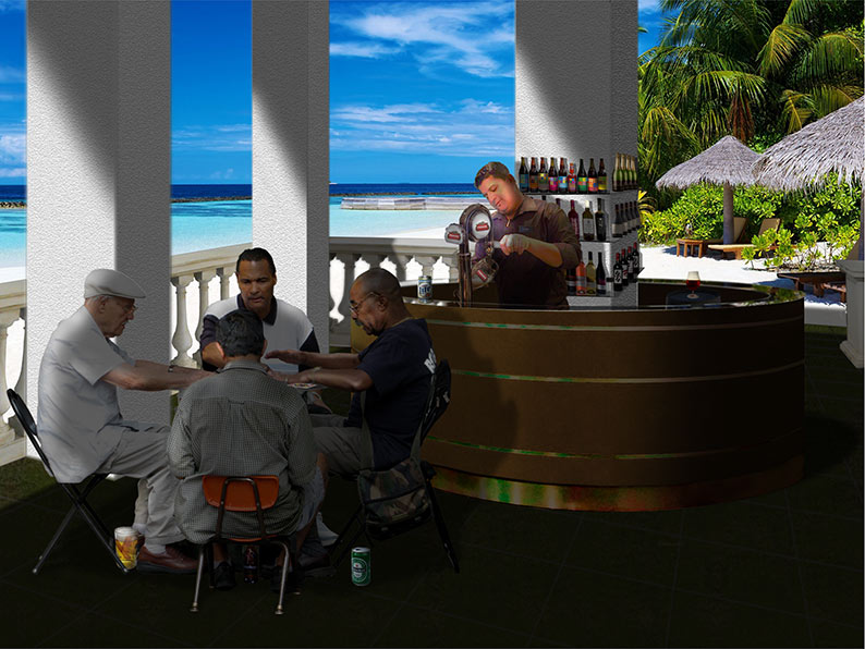
Re: Challenge 478: A better reception
Thanks Josephine - I love your bar! |
Posted on 06/11/13 01:23:43 AM |
|
Artwel
Satire Supremo Posts: 607 Reply |
Re: Challenge 478: A better reception
There are some impressive works this week, very good! |
Posted on 06/11/13 08:17:40 AM |
|
brewell
Pixel Pentagrammarian Posts: 752 Reply  |
Re: Challenge 478: A better reception
Quick and cheap  _________________ Is it necessary? Does it work? |
Posted on 06/11/13 11:30:43 AM |
|
james
Surreal Spoofer Posts: 1194 Reply |
Re: Challenge 478: A better reception
 |
Posted on 06/11/13 2:54:55 PM |
|
Mariner
Renaissance Mariner Posts: 3298 Reply |
Re: Challenge 478: A better reception
 |
Posted on 06/11/13 9:03:13 PM |
|
Deborah Morley
Makeover Magician Posts: 1319 Reply |
Re: Challenge 478: A better reception
Great entries all - James great animation.  |
Posted on 06/11/13 10:08:04 PM |
|
james
Surreal Spoofer Posts: 1194 Reply |
Re: Challenge 478: A better reception
Thank you Deborah. |
Posted on 07/11/13 08:40:21 AM |
|
josephine harvatt
Gag Gadgeteer Posts: 2605 Reply |
Re: Challenge 478: A better reception
and hello to Iwa - your entry was so well done I didn't realise you were a newcomer! _________________ I'm not really bad - I just draw that way |
Posted on 07/11/13 09:24:47 AM |
|
Deborah Morley
Makeover Magician Posts: 1319 Reply |
Re: Challenge 478: A better reception
Yes, Hello to Iwa - I love your wallpaper. |
Posted on 07/11/13 11:04:10 AM |
|
iwa
* Posts: 10 Reply |
Re: Challenge 478: A better reception
|
Posted on 07/11/13 11:06:42 AM |
|
iwa
* Posts: 10 Reply |
Re: Challenge 478: A better reception
I've tried my best, we'll see how the next challenge goes  |
Posted on 07/11/13 9:14:59 PM |
|
Steve Caplin
Administrator Posts: 7157 Reply |
Re: Challenge 478: A better reception
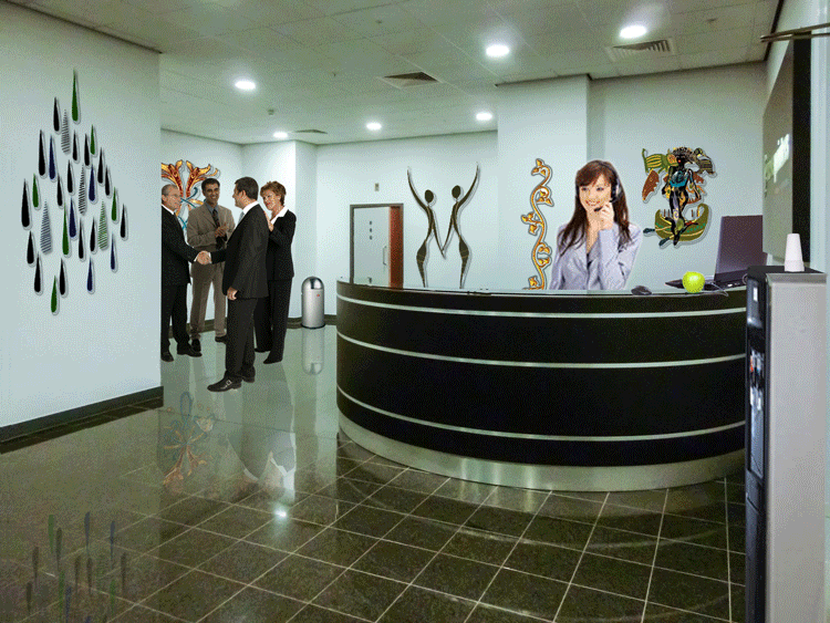
A speedy entry from ahmedalij this week - and that reception area is certainly much brighter. But you've made a common mistake: the people are much too big for the desk. There simply isn't room for the receptionist's legs behind there, even if she was sitting down! A packed entry from Vibeke, with a number of Banksy works gracing the walls. In the reflection of the man, though, you need to make sure you can't see the reflection of the reception desk through his legs! Lowering the opacity is not the answer in this case. Oh, and the perspective of the can of paint needs to match that of the circular desk, of course. Tricky stuff, perspective. An entertaining image from sciteach, with a great queue of people - and good reflections (but watch the angles of those feet). The lettering doesn't quite match the curve of the desk: the trick here is to make a larger rectangular selection around the (rasterised) text, then distort using Image Warp that so that it aligns with the lines on the desk. I really like Emy's elegant solution, with a fish tank inside the desk (great reflection!) and a new ceiling that's a perfect match for the perspective of the original. The nearest brick wall, though, has some awkward angles in it, that don't match either the sofa beneath or the wall to its right: make sure those horizontal lines all point in the same direction. A sumptuous scene from tooquilos, full of eastern artefacts set against the purple walls. I like the details - the pile of cushions, the lamp, the skull bell holder, the ceiling lights. And a great hideaway in the animated version, complete with skull cliff and rope ladder: now that's the way to come home of an evening. A well-populated office from micky47, with a receptionist and some wall maps, as well as an impressive looking safe and a new desk. Don't forget about the reflections, though - the map and especially the desk need to be seen reflected in that shiny floor. And if you start to do that, you may have second thoughts about choosing that desk. I like the added man in the second entry, but he too needs a reflection. A rather fine 3D printing office from Ben Boardman - is that the high-tech equivalent of the office party trick of misusing a photocopier? Good decorations all round, and I remember that Printing Office poster well. Nice work. A new member this week, and Iwa has kicked off with a splendid entry - great wallpaper, some artfully arranged prints on the wall and on the curved desk, and a well chosen group of people populating the scene. I especially like the new floor, which fits the perspective of the scene remarkably well. My only slight criticism is that the man is rather too big for the sofa - but overall this is a well considered, immaculate entry. Excellent work - and welcome to the Forum! I'm guessing it was the shape of the circular desk that gave TheBlueJam the idea for a Pirelli office - and it's a very fine idea. The stacks work remarkably well with the perspective of the scene, and the diffuse reflections are very nicely judged. Good use of the Pirelli calendar and sign as well - very complete work. I was most taken with Josephine Harvatt's cocktail bar, which perfectly suits the round reception desk. Splendid work behind the bar, and with the Cocktails sign over the top. That's a great cast of characters, too, including (unless I'm mistaken) Emcee from Cabaret... and cleverly positioned so you didn't have to be concerned about a single reflection! A serene scene from Garfield72, with perfect integration of four characters. I like the added plants and prints, which do liven the place up. But watch those reflections: we shouldn't be able to see the reflection of the desk through the reflection of the suitcase; and nor should we be able to see the earth inside the reflected plant pot on the left. This is a case for translating the pot down without flipping it vertically (see the camera example in HotChiPs). A well-populated scene from puffin31939, with a great cast of characters and some good artwork to brighten the place up. A great sense of distance here, with very good attention to relative sizes. But watch those reflections: we shouldn't be able to see the desk through the reflection of the man's legs, nor the ceiling light through the reflection of the boy in the distance. A variety of decorative items from brewell, from Lichtenstein to Obama's Hope poster - all rather artfully arranged on the walls. The reflections work well, although one or two of the perspectives are a little off (the Jaws poster needs to be skewed down on the right a little, and the Warhol is too high in the scene). I like the way the receptionist is peeking over the top of the desk. Terrific decoration from James, and of course the ingenuity lies in the way the artwork comes to life after all the people have left - a great punch-up, complete with matching reflections! Just make the receptionist about half the size and this one will be perfect. A desk transplant from Mariner, who has moved it to an altogether more appealing location. It does work well here - but watch your relative sizes: those bottles behind the bartender are barely more than miniatures. Immaculate work from Deborah Morley, with a great set of characters, furniture and wall art. What really pleases me here, though, is the perfect nature of the reflections - something I've been banging on about throughout this write-up. Look, guys, this is how it's done: note how the woman's legs are not transparent. Great work. |
Posted on 08/11/13 01:16:17 AM |
|
Emy
Composition Chef Posts: 390 Reply |
Re: Challenge 478: A better reception
True. Thanks Steve |
Posted on 08/11/13 03:13:38 AM |
|
joeysala
Perfect Palmist Posts: 604 Reply |
Re: Challenge 478: A better reception
I really misunderstood re. the deadline for this FC......and I've worked too long on this not to submit it. I hope you'll consider checking it out, Steve? (I hope no one is offended that I've usd these images!?!)  _________________ "Imagination, not invention, is the supreme master of art........" Joseph Conrad |
Posted on 08/11/13 03:21:57 AM |
|
vibeke
Kreative Kiwi Posts: 2191 Reply |
Re: Challenge 478: A better reception
"A packed entry from Vibeke, with a number of Banksy works gracing the walls. In the reflection of the man, though, you need to make sure you can't see the reflection of the reception desk through his legs! Lowering the opacity is not the answer in this case. Oh, and the perspective of the can of paint needs to match that of the circular desk, of course. Tricky stuff, perspective. " Thanks Steve The moment I had posted the image, noticed the perspective of the can, being all wrong. Hadn't noticed the see through reflection, that was plain stupid. _________________ Perfect confidence is granted to the less talented as a consolation prize. |
Posted on 08/11/13 06:03:42 AM |
|
brewell
Pixel Pentagrammarian Posts: 752 Reply |
Re: Challenge 478: A better reception
?  ? ?_________________ The journey of a thousand hours begins with a single layer. |
Posted on 08/11/13 09:03:48 AM |
|
josephine harvatt
Gag Gadgeteer Posts: 2605 Reply |
Re: Challenge 478: A better reception
Thank you Steve - re: the positioning of the characters - I don't do these things by accident you know ...
Also Joey -  that is a suspiciously flattering image - I think I must have been photoshopped in more way than one ...I don't think I will be much cop as a receptionist if I'm knocking back the vino at work though that is a suspiciously flattering image - I think I must have been photoshopped in more way than one ...I don't think I will be much cop as a receptionist if I'm knocking back the vino at work though_________________ I'm not really bad - I just draw that way |
Posted on 08/11/13 09:26:03 AM |
|
joeysala
Perfect Palmist Posts: 604 Reply |
Re: Challenge 478: A better reception
Also Joey - that is a suspiciously flattering image - I think I must have been photoshopped in more way than one ...I don't think I will be much cop as a receptionist if I'm knocking back the vino at work though
[/quoted] I only messed with the sleeve - honest! As for the job requirements - you only have to smile! _________________ "Imagination, not invention, is the supreme master of art........" Joseph Conrad |
Posted on 08/11/13 3:43:48 PM |
|
puffin31939
Montage Mariner Posts: 383 Reply |
Re: Challenge 478: A better reception
Thanks, Steve. I worked hard on trying to get the people correct perspective-wise. Unfortunately I never gave reflections a great deal of thought, other than the fact that they were necessary. Something else to learn and watch out for... _________________ Man cannot change the direction of the wind but he can adjust the sails |
| page: 1 2 3 last |
 ))
))