| » Forum Index » The Friday Challenge » Topic: Challenge 709: The Mardi Gras Shark |
|
Posted on 14/06/18 07:51:00 AM |
|
DavidMac
Director of Photoshop Posts: 6270 Reply  |
Re: Challenge 709: The Mardi Gras Shark
This one made me smile. I did't see it coming ........  _________________ The subtlety and conviction of any Photoshop effect is invariably inversely proportional to the number of knobs on it ....... |
Posted on 14/06/18 08:33:48 AM |
|
DavidMac
Director of Photoshop Posts: 6270 Reply |
Re: Challenge 709: The Mardi Gras Shark
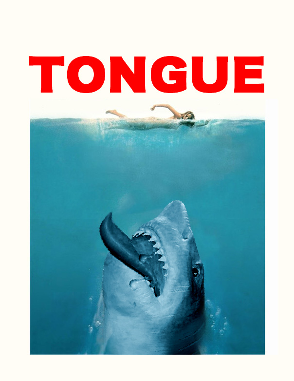
Apologies for multiple entires but Deborah sparked off an entirely new slant on the JAWS poster that was so obviously crying out for this from the beginning. Even deeper apologies to her for not only stealing her idea but, quite literally, her image. 
 _________________ The subtlety and conviction of any Photoshop effect is invariably inversely proportional to the number of knobs on it ....... |
Posted on 14/06/18 4:48:17 PM |
|
srawland
Pixel Perfectionist Posts: 885 Reply |
Re: Challenge 709: The Mardi Gras Shark
Thanks David, I'm glad you liked it. I have to cross my fingers when I render because I don't have enough RAM to get a good preview. _________________ I'm still learning. |
Posted on 15/06/18 08:40:45 AM |
|
Steve Caplin
Administrator Posts: 7180 Reply |
Re: Challenge 709: The Mardi Gras Shark
First to jump the sharkthis week was DavidMac, with a very fine loan shark - and a student missing his arm and leg hopping behind. Very neat. Apart from the distorted typography of Student Loans, that Special Offer looks wrong. Perhaps white text out of a red banner would look better? I enjoyed the Threepenny Opera treatment in the second entry - so what did MacHeath do in the original German? Great take on the Jaws poster in the third entry. Thats a very neat tongue. I really like the subtle way in which lwc has shown just a small portion of the shark, which really emphasises its huge size. Perfect composition. And, of course, thats a fine badge on the steering wheel. Good bird movement in the second entry; the larger birds moving faster emphasises the perspective. And I like how the shark misses. Remarkable work from michael sinclair, with not only a perfectly coloured shark but some extraordinary twisting of the viewpoint. One very small point: if you have more sky below what you show here Id suggest moving it up a little, so we can see the horizon (where the clouds would appear much smaller). An entire shark from tooquilos - good to see you back after your travels. I like how it glides in the animated version (except the shark shadow should go behind the posts, rather than in front); and the shoals of fish and general underwateriness are beautifully realised. Great to see all the images that made up the animation at the end - thats some complex blending of the shark! A cheeky ice cream loving shark from Deborah Morley, rearing up over a seaweed-covered parapet (groin?). Thats a fine tongue it has there! Great to see you back, Deborah, and on such fine form. A very neat animation from srawland: I like the splashes as the sharks emerge from the water, and the rippling water itself. Cleverly realised water around the base of the sharks, too, rippling nicely there; would it be possible to get some white foam around there? Very good motion, and an excellent soundtrack. |
Posted on 15/06/18 09:27:18 AM |
|
DavidMac
Director of Photoshop Posts: 6270 Reply |
Re: Challenge 709: The Mardi Gras Shark
Even having been in the 'biz' I hadn't heard that before. Thanks. I love it. Very apt.
Typography really is my weak spot. This is not the first time you have focused on it. The red Special offer was less worrisome in the original PSD. For some reason it got denser and more saturated in the JPG export which makes it seem to be no longer attached the poster.
I can't find the the reference to this that I read when I was researching the image, but there's some very interesting information on the history of this song here
The entire head, tongue and all, was lifted directly from Deborah's image. All I did was remove the ice cream and give the tongue a pointy curved tip. Plagiarism with a very capital "P" I am afraid. Thanks Steve. _________________ The subtlety and conviction of any Photoshop effect is invariably inversely proportional to the number of knobs on it ....... |
Posted on 15/06/18 12:55:36 PM |
|
lwc
Hole in One Posts: 3568 Reply |
Re: Challenge 709: The Mardi Gras Shark
Thanks Steve... enjoyed the challenge. |
Posted on 15/06/18 2:04:02 PM |
|
srawland
Pixel Perfectionist Posts: 885 Reply |
Re: Challenge 709: The Mardi Gras Shark
Thanks Steve, Masks work a little differently in HitFilm and I'm still getting a handle on them. Next time I have a water challenge, I might know enough to include the foam. _________________ I'm still learning. |
Posted on 15/06/18 10:42:03 PM |
|
Deborah Morley
Makeover Magician Posts: 1319 Reply |
Re: Challenge 709: The Mardi Gras Shark
Thanks Steve and Gordon, good to be back. David glad to see my image sparked a plagiarism! |
| page: 1 2 last |