
| » Forum Index » The Friday Challenge » Topic: Challenge 1071: The Kauffman Office |
|
Posted on 19/09/25 10:03:27 AM |
|
lwc
Hole in One Posts: 3560 Reply |
Re: Challenge 1071: The Kauffman Office
Falling Water was an obvious addition for the first one. The suspenders give later years a 1950s look and I also lengthened the womens skirts in keeping with the fashion of the time, that adds to the overall appearance. The minions are always fun to use in an animation they might also look good in a phone box. 
Thanks Steve! |
Posted on 19/09/25 12:10:03 PM |
|
DavidMac
Director of Photoshop Posts: 6262 Reply 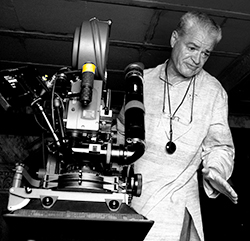 |
Re: Challenge 1071: The Kauffman Office
Yes he is. It's one of the reasons I was so unhappy with the image. It was difficult finding good images of Kaufmann and I really liked the natural pose of this one. The problem lies in the contrasty black and white original which has some very dark shadow areas where he should be lit. Because they were dark grey/black they couldn't really be lifted successfully. The only solution I could see was to overpaint by hand. That's not my strong point and I couldn't really get it to work. It was better in the end to leave it as it was. Flipping Kaufmann or moving the lamp didn't work well either. I knew you'd pick up on it! _________________ The subtlety and conviction of any Photoshop effect is invariably inversely proportional to the number of knobs on it ....... |
Posted on 24/09/25 1:23:08 PM |
|
Frank
Eager Beaver Posts: 1878 Reply |
Re: Challenge 1071: The Kauffman Office
Thanks Steve. Difficult getting images of Kaufmann and making it work. |
| page: 1 2 last |