
| » Forum Index » The Friday Challenge » Topic: Challenge 1077: A spooky house |
|
Posted on 28/10/25 10:54:31 PM |
|
lwc
Hole in One Posts: 3561 Reply |
Re: Challenge 1077: A spooky house
Spectacular lighting on the horseman entry Frank well done!  |
Posted on 28/10/25 10:56:04 PM |
|
lwc
Hole in One Posts: 3561 Reply |
Re: Challenge 1077: A spooky house
|
Posted on 29/10/25 11:01:16 PM |
|
DavidMac
Director of Photoshop Posts: 6265 Reply 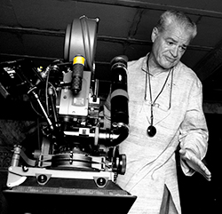 |
Re: Challenge 1077: A spooky house
What Loyd said Frank. Spectacular! This rather dry, not terribly spectacular, image is another of my self imposed technical challenges. I wanted to see if I could create and map a convincing shadow onto the ground and the house, taking into account ruptures in distance and the relief of the house's facade with its recesses and mouldings. On this technical level I have to confess to being quite pleased with the outcome. Since this, and not the overall image, was my target I have taken the easy way out for the background and used AI Image Extend. I also have to accept that no carbide lantern of the day would be capable of this ......... but ........ who cares!?  _________________ The subtlety and conviction of any Photoshop effect is invariably inversely proportional to the number of knobs on it ....... |
Posted on 30/10/25 01:17:52 AM |
|
lwc
Hole in One Posts: 3561 Reply |
Re: Challenge 1077: A spooky house
Shadow is on the money David... convincing indeed! I hadn't thought of carbide lamps in years, when I was young and went fishing with my dad at night, he used two brass carbide lamps on the river bank for light... strange as it sounds, I can still remember the odor of the burning carbide gas. Thanks for the memory! |
Posted on 30/10/25 01:19:19 AM |
|
lwc
Hole in One Posts: 3561 Reply |
Re: Challenge 1077: A spooky house
|
Posted on 30/10/25 09:52:20 AM |
|
Mariner
Renaissance Mariner Posts: 3350 Reply |
Re: Challenge 1077: A not so spooky house
 |
Posted on 30/10/25 10:43:29 AM |
|
Frank
Eager Beaver Posts: 1880 Reply |
Re: Challenge 1077: A spooky house
Thanks Loyd and David. I think you did great on your shadow David, looks convincing to me and the overall image is good. |
Posted on 30/10/25 1:54:41 PM |
|
DavidMac
Director of Photoshop Posts: 6265 Reply |
Re: Challenge 1077: A spooky house
This is longish and sort of off topic 'ish ......... so skip if you want. Loyd's reminiscence of carbide lamps put me in mind of something similar. In 1983 I shot a music/documentary film, with the singer Waylon Jennings, about the last of the real American cowboys. We shot on the Kokernot 06 Ranch in West Texas. Terrain there is so rough and inaccessible in places that the four wheel drive vehicles used on most ranches were quite simply not viable. The Autumn roundup was done by a team of cowboys on horseback the way it always had been. For two weeks, we went out on the roundup and filmed them. We needed to shoot at night in the overnight camps. It is so silent at night in the remote countryside there that even a tiny generator placed several hundred metres away and baffled with polystyrene was too noisy for our soundtracks. So we used paraffin pressure lamps (called Tilley lamps in England and Coleman lamps in the US.) They use a mantle like the old gas lights and produce quite a good light with only a gentle hissing noise. 
Our film stock in those days was 50ASA Eastman Colour Negative, so for some scenes, even with fast lenses, I needed floodlights that had reflectors and could project light further than the Tilleys. LED's had yet to arrive and battery powered halogen lamps were too short lived and, miles away from anywhere, we had no way to re-charge them. Then I remembered that, when I was a youngster, nighttime road working crews in Britain had used Calor gas powered floodlights. So I did some researching and found they still existed. They also used mantles and produced a light with a very comparable colour temperature to the Tilleys. Further research failed to find anything comparable in the US so we bought three of these in the UK and took them with us to Texas. We could easily get Calor (propane) cylinders there to power them. To give an idea of size the lamp heads are about 45cm (18") in diameter. They proved perfect for the job and when we finished we gave them to the ranch owners who were delighted to have them. I love improvised solutions of this type. 
_________________ The subtlety and conviction of any Photoshop effect is invariably inversely proportional to the number of knobs on it ....... |
Posted on 30/10/25 3:40:45 PM |
|
lwc
Hole in One Posts: 3561 Reply |
Re: Challenge 1077: A spooky house
Interesting David, for the record, dad's were small, made originally to be used as headlamps for miner's caps/helmets... like this: 
Keeping the reflector clean and polished enough to make much light was a challenge in itself... 
|
Posted on 30/10/25 4:31:57 PM |
|
Mariner
Renaissance Mariner Posts: 3350 Reply |
Re: Challenge 1077: A spooky house
Loyd, I used to have a problem in Flickr, the free version, where I wasn't given the option to scroll down to "Original 4000 x 3000". I solved it by making the screen size smaller until the bottom row was visible. Maybe that will work for you. |
Posted on 30/10/25 4:35:08 PM |
|
Mariner
Renaissance Mariner Posts: 3350 Reply |
Re: Challenge 1077: A spooky house
Ben, excellent work in both your entries. I escpecially like the one with the camera. |
Posted on 30/10/25 5:25:27 PM |
|
lwc
Hole in One Posts: 3561 Reply |
Re: Challenge 1077: A spooky house
I will give it a try, thanks Michael. btw- It appears you have made the house completely new again... nicely done! |
Posted on 31/10/25 10:06:27 AM |
|
Steve Caplin
Administrator Posts: 7180 Reply |
Re: Challenge 1077: A spooky house
First to light up the house this week was Ben Boardman, cleverly dealing with the extreme perspective by moving it to the top of a hill. I like the witches, the pumpkins, the bat and the lit-up windows, as well as the rather splendid cliff face. But Im confused by the surface on which the witch is standing: it doesnt appear to be steps, so why is it sloping down like that? The vintage camera entry is absolutely glorious, a near-perfect image: the lighting, the couple, the car, the upside-down view in the camera, even the squirrel peeking in at the bottom gorgeous, Ben. If I were a nitpicker (well, you know I am) I might point out two tiny errors the perspective of the car is rather extreme for this distance, and theres a ghostly outline of the spire just next to it but those are barely worth mentioning. A terrific piece of work. A fiery image from GKB, replacing bats with dragons now thats a Halloween innovation. Im going to pick a nit thats so small Im almost embarrassed to mention it. The reflection of the pumpkin in the road surface shouldnt show over the vertical face of the kerb: 
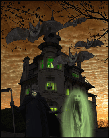
A retro feel from tooquilos, with spooky ghosts apparently rising out of the graves. I was wondering about the bright white of the windows, though; should we assume that the picture frame was originally white? In which case, shouldnt that set the bar for the maximum brightness? No such concerns in the animated version, with a sky full of illuminated flying pumpkins? Sky candles? Those things have got me baffled, pretty though they are. I see Ant Snell has gone for the comedy angle, with some truly absurd decorations. I like the face in the tree best. The bats are among the friendliest Ive seen, thats a remarkably cheerful pumpkin, and the child looks suitably baffled by the whole thing. Only the figure in the top window displays any real menace. Detailed spookiness from DavidMac, with magnificently human-headed bats flying over a rugged landscape. I like the wafer-thin bridge, the hearse, and of course the overall lighting. Its worth zooming in to see the profusion of detail in the windows, although I do have to point out that the four poster bed in the upstairs window is viewed from above, when of course were seeing the room from below (its your own fault for putting in so much detail). Zooming in also reveals a curious horizontal line in the sky below the moon. But ignore these comments, its a really fine image. And very interesting to see your source material. Some great drama in the rainy entry, with the woman in the window (very nicely backlit, by the way) peering out at the mysterious cloaked figure. I like the reflections. Theres something about the rain that doesnt quite convince, though; is it simply too opaque? The Nosferatu image is something of a tour-de-force, as you expected it would be the way the shadow bends over the contours of the building is astonishingly convincing, and I cant believe the amount of time and effort you must have had to put into this. Splendid. An initial triptych from lwc, with green and orange skies and an assortment of ghouls. Why is it that the children are the scariest of all? I enjoyed the placement in your local lake, where it looks right at home. Yes, the perspective isnt quite right, but its a two-minute fix: 
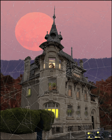
I dont know whats going on with your file uploads and Ive never seen a + sign on any images on this site, that could be a browser thing. Those are very cuddly bats! And even the ghost is quite friendly. The spider's web entry is gun, although Im more interested in whats going on in that top window. Plenty going on in Frank's entry, with ghosts and other evildoers wandering the desolate landscape. I like the inclusion of last weeks pavilion. Whoever owns that house really does like red lights. Can you explain the ladder into the skies? And whats holding up the Welcome Sinners sign? Some magnificent action in the second entry, with the headless horseman placed just far back enough to blend him into the scene. Love the desolate landscape, and the new staircase up to the house. The reflections are nicely judged, too. A really powerful image. I thought Mariner might do some research, and it is indeed the Villa Alsace. The lighting is excellent, and the repaired window is most impressive. I like the eyes at the top. I assumed you would attempt to rebuild the wall behind the hedge, but making the texture work isnt quite as tricky as it might appear. I copied a section of it to a new document, squared it up to remove the perspective, and blended it to make it seamless. Then I duplicated it to the right size and distorted it to fit the wall: 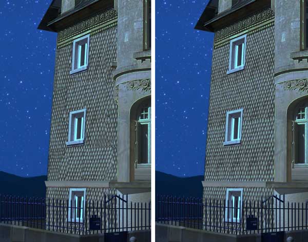
The daytime version shows off your reconstruction skills well, although I must admit to being somewhat baffled by the woman hanging upside down by her ankle. |
Posted on 31/10/25 10:34:19 AM |
|
Mariner
Renaissance Mariner Posts: 3350 Reply |
Re: Challenge 1077: A spooky house
Nice trellis Steve! Better than mine. And thanks for the advice. The Haniging Man is a Tarot card figure meaning, among other things, "seeing the world from a different angle". I was struggling to add "spookiness" to my daylight picture. Daylight and spookiness don't really match, so I just threw in The Hanging Man for fun. Merci bien Steve. |
Posted on 31/10/25 12:14:53 PM |
|
DavidMac
Director of Photoshop Posts: 6265 Reply |
Re: Challenge 1077: A spooky house
You're not supposed to zoom in that far Steve! I thought I'd fixed the bed. I was aware of it but it got forgotten in all the multiple attempts at getting the bats right. The fine line is really sharp eyed of you. It's the top edge of the landscape image on which the house is posed. Removing the sky from it must a have left a one pixel edge behind. I am suffering eyesight problems at the moment so fine details like that are easy to miss.
The way we see rain without movement is very notional. I was never quite happy with it. I just tried your suggestion and it does help but still doesn't really convince.
Less time than I expected. Obviously you have to analyse to try and work out what would happen. But the helpful thing is that, once you've got the general idea, what looks correct works just as well as what is correct. There's a lot of margin. Thanks Steve. I really enjoyed this one. I love Art Nouveau architecture. We have a lot of it here. Brussels was its birthplace. If you've got 1,9 million to spare this little gem is currently for sale. 
_________________ The subtlety and conviction of any Photoshop effect is invariably inversely proportional to the number of knobs on it ....... |
Posted on 31/10/25 12:14:55 PM |
|
DavidMac
Director of Photoshop Posts: 6265 Reply |
Re: Challenge 1077: A spooky house
Double post removed. _________________ The subtlety and conviction of any Photoshop effect is invariably inversely proportional to the number of knobs on it ....... |
Posted on 31/10/25 12:21:36 PM |
|
Steve Caplin
Administrator Posts: 7180 Reply |
Re: Challenge 1077: A spooky house
Dont tempt me! |
Posted on 31/10/25 12:35:49 PM |
|
lwc
Hole in One Posts: 3561 Reply |
Re: Challenge 1077: A spooky house
A very tiny werewolf.

Thanks Steve! |
Posted on 31/10/25 1:32:21 PM |
|
Ben Boardman
Printing Pro Posts: 779 Reply  |
Re: Challenge 1077: A spooky house
the surface on which the witch is standing - its a boat access ramp, saw quite a few of theses in Italy - that's where the ramp came from. I saw the squished Rolls when I logged on earlier today and hoped you wouldn't. The ghost spire - well spotted. Thanks Steve, this kept me amused for quite a while this week. |
Posted on 31/10/25 1:42:34 PM |
|
Frank
Eager Beaver Posts: 1880 Reply |
Re: Challenge 1077: A spooky house
Thanks Steve: All the red symbolizes the gore and evil radiating from within that house. The ladder into Heaven is a traverse for sinners to meet their fate , whatever that might be. Second entry an after thought and tamed down a bit. |
| page: 1 2 3 last |
