

| » Forum Index » The Friday Challenge » Topic: Contest 169: Take to the skies |
|
Posted on 23/10/07 3:25:40 PM |
|
Deborah Morley
Makeover Magician Posts: 1319 Reply |
Re: Contest 169: Take to the skies
Tom a fantastic image, as ever. Kate, I agree lovely colours. Well, I was going to do a sunset, but this was more fun!  |
Posted on 23/10/07 3:38:21 PM |
|
katew
Virtual Virtuoso Posts: 681 Reply |
Re: Contest 169: Take to the skies
Thanks Deborah! |
Posted on 24/10/07 01:03:46 AM |
|
dave.cox
Marquee Master Posts: 518 Reply  |
Re: Contest 169: Take to the skies
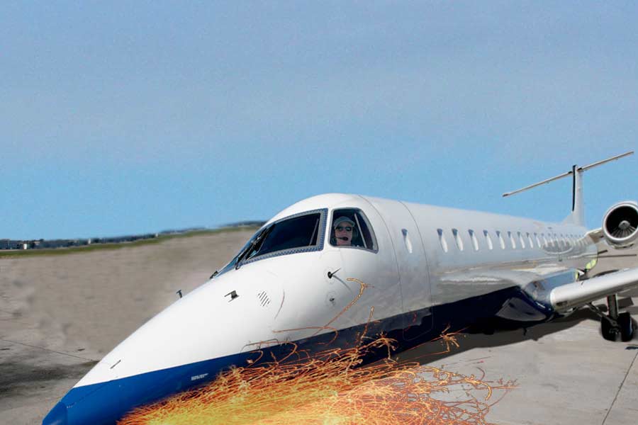
Darn! Faulty Landing Gear. 
 |
Posted on 24/10/07 01:43:30 AM |
|
Neil O
Cartoon Contractor Posts: 389 Reply |
Re: Contest 169: Take to the skies
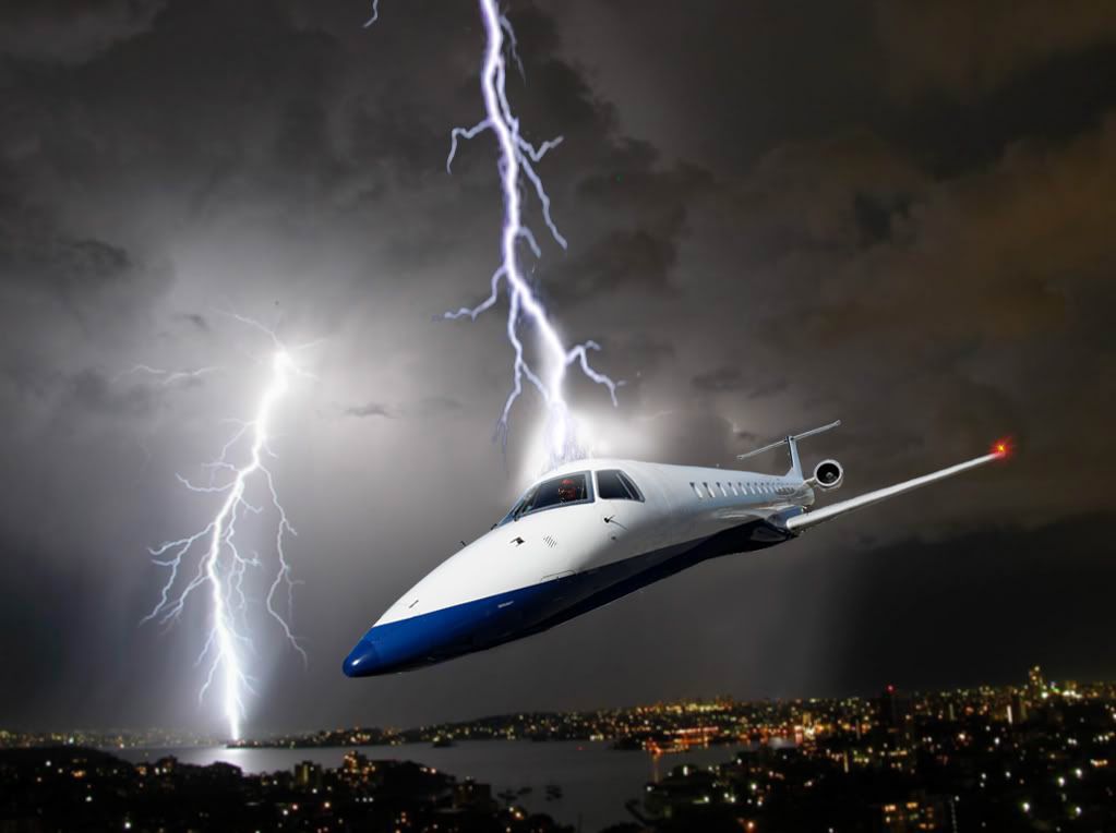
Revised! Had to refine the door, tail & background. 
_________________ "I haven't failed.... I've found 10,000 ways that don't work!" Thomas Edison |
Posted on 24/10/07 12:13:51 PM |
|
maiden
Golden Gif Gagster Posts: 471 Reply |
Re: Contest 169: Take to the skies

|
Posted on 25/10/07 10:52:09 AM |
|
Atomicfog
Virtual Visualizer Posts: 238 Reply |
Re: Contest 169: Take to the skies
Hopefully I'll try my hand at a few of these later on, but it's tough to find time now that I'm in college. I would just like to say that you guys are doing a great job... I see many intriguing and amusing images while looking through all of these new challenges that I've missed out on. So many of you have really improved as well. |
Posted on 25/10/07 8:19:54 PM |
|
Brian Garrison
* Posts: 55 Reply |
Re: Contest 169: Take to the skies
Here's my rather boring entry... 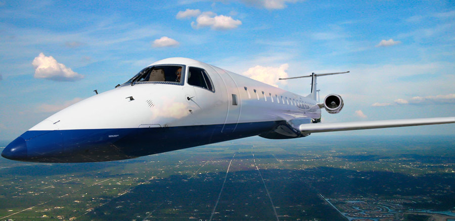 |
Posted on 25/10/07 8:32:33 PM |
|
BigVern
Q Quipper Posts: 674 Reply |
Re: Contest 169: Take to the skies
Brian, that's not boring but it is good. I like the reflections, the door and the blowup autopilot from Airplane!  |
Posted on 25/10/07 10:14:59 PM |
|
Wayne
Printers Devil Posts: 312 Reply |
Re: Contest 169: Take to the skies
First one for a while! A bit rusty, but it's good to get back to it! 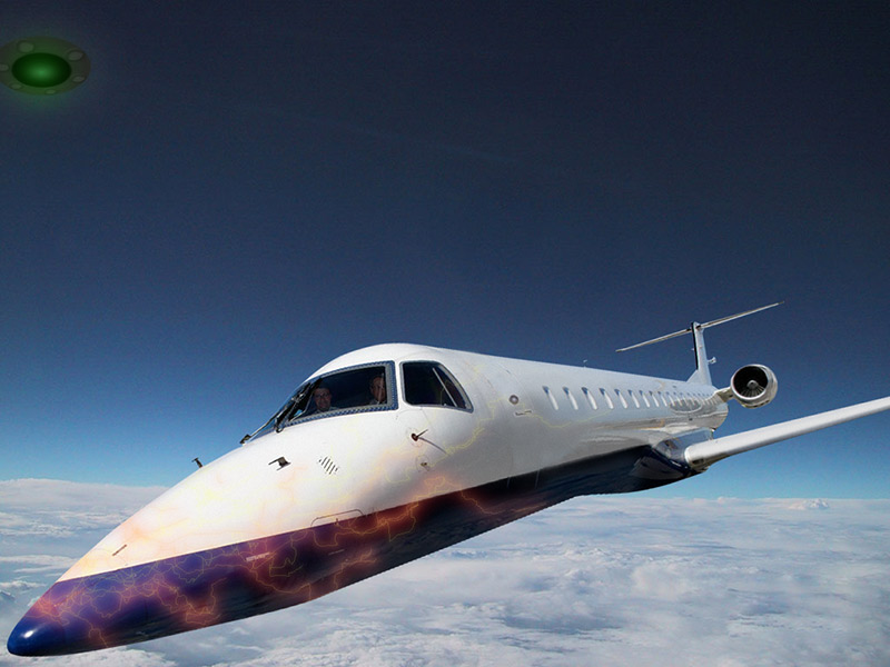 |
Posted on 26/10/07 02:17:03 AM |
|
celosia
Wondrous Woolflower Posts: 58 Reply |
Re: Contest 169: Take to the skies
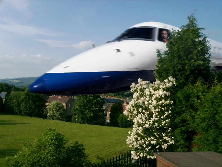 |
Posted on 26/10/07 03:33:59 AM |
|
mj
Guest Reply |
Re: Contest 169: Take to the skies
 
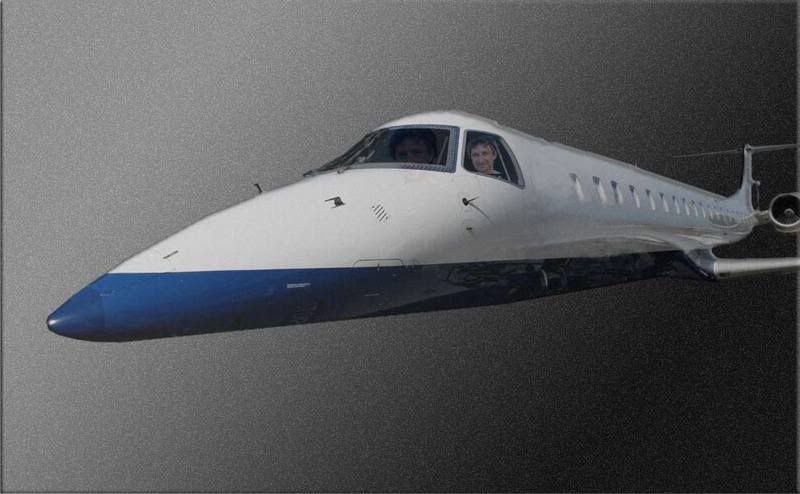
_________________ -Never met a PS'er I didn't like- Will Rogers |
Posted on 26/10/07 09:02:23 AM |
|
Steve Caplin
Administrator Posts: 7157 Reply |
Re: Contest 169: Take to the skies
Before we go into specifics this week, a quick word about perspective. My original photo of this plane shows a very strong distortion, with the nose elongated and a slight fisheye effect, making the whole thing appear slightly curved. This is because I was standing close to it when I photographed it, of course. What this means for you is that the plane looks correct when it's close up, but when it's pushed further back in the scene the distortion makes it look incorrect. The first entry this week was from newcomer loonybox, with a detailed and impressive entry: a perfectly patched doorway, with blurring to hide the joins; reworked reflections on the side of the plane; clouds appearing over the top; and there's Superman diverting a meteor, which unfortunately seems to have set fire to his legs in the process. Excellent stuff, Ludo. One small point, though: the clouds are a little too distant to be overlapping the plane in this way. A second layer, right up front, is really needed here. Welcome to the forum! Clean work from mguyer, with chopped off wheels and some added sparkle to the windows. Not sure about your doorway joins: they seem to be compromising the integrity of the whole plane! And while I appreciate the new branding, are you sure a handwriting font is the most appropriate choice? The clouds in the second entry seem a little cludgy: more transparency needed! Another newcomer this week - and CharlotteBabb has turned in a fantastic illustration, with plenty of detail - the reflected treeline in the nose of the plane, the skeletal crew, the blue flames overlaid over the side. there's a great sense of drama here, but I've have added a little Motion Blur to avoid the sense of the plane hanging in mid air. Welcome to the forum, Charlotte. A perfectly patched doorway from aviation expert GKB - and there's Gordon in the copilot's seat, with what looks frighteningly like me at the controls. Neat new livery, Gordon, but without any door at all how on earth are we going to get out? I really like the second entry though - and that pilot certainly knows how to keep cool in a crisis. Some great drama from vibeke, made more real by the pose of the people in the foreground. But check my first paragraph about distortion: that plane needs a nose job! Neaty tucked behind the plant, though, so top marks there. A rather tasty Superman entry from Elliott, with a great blazing engine and plenty of added smoke. With images like this, one's eye is always drawn to the joins: and I'm concerned that Superman is attempting to grasp the plane with his fists. You need a collection of open hands for occasions like this! Very funny work from tooquilos - a great idea, really well achieved. My only small quibbles here are with the size of the text - could go much bigger in that space - and the lack of wings on the rather rectangular shadow. Good use of lens flare, though. Ingenious work from james, whose rebuilt perspective matches the distant shot well - albeit with a slight Concorde-like droop on the nose. A truly splendid animated version, with a good scrolling sky. My only concern here is that the plane is pointing towards us but isn't getting any closer! What makes Tom;s entry so beautiful is the quality of the lighting on the plane, which clearly points to the Sun as the source in this condensed universe. Again, though, with the plane pushed back in the scene, the nose curves around a little too much; otherwise, this one's gorgeous. High drama in the skies from JRogue, with a lot of speed on the plane that appears to be hanging between heaven and hell. I like the concept, James, but I'm not sure the sharp divide between the two sky layers makes that much sense. And, purely from the point of view of composition, the horizontal split just below the middle is a weak point to break the image. Rotating the view to create a diagonal join would have greatly increased the drama. A great new livery from srowden, complete with new uniformed crew. The FedEx logo is perfectly branded on the side - good distortion! And the good choice of clouds makes a dramatic and compelling background. My only problem here is with the wing disappearing into the clouds - not when they're as distant as this! A neatly rebuilt wing, though, makes this a great job. A powerful scene from Neil O, and a beautiful piece of work (subject to the perspective issue discussed at the top). I particularly like the red wing light, which seems to bring the whole plane alive. Very good stuff - especially the second entry. I like the way BigVern's plane bursts out of its frame, and the reflected clouds - themselves reflected in the water - add a lot to the realism of the scene. And this is the neatest new door we've seen so far: the slight bevel gives it a real sense of being an opening unit. Very appealing work from vicho, set off by the stunning wide screen runway shot which perfectly matches the perspective of the front half of the plane. But let's look at a couple of ways of improving this one. First, the back half of the plane appears to curve away from us: this needs to be distorted to match the runway view. The colouring of the whole plane is now too blue; you need some red in there to match the background. And finally - that's a very neat removal of the wheels. But don't you think this is one case where they should have been kept? A fantastically moody sky from katew, with a perfectly recoloured plane to match it. Excellent reflections, too, and a neat if slightly bulging new door. An interesting sky reflection on the water: should we lose so much colour here? Not sure. Very funny work from Brian Ruddock - the controls inside the cockpit, the appropriate watch, the headlight glares on the window of the plane, the lit-up windows, the lighting overall - very good detail here. The only thing I'd have added is a reflection to the inside of the cockpit window, giving it a sense of being glass rather than just a hole. Otherwise, this is really great work! A good snow scene from Steve Mac, with a subtle new door and a good new pilot, complete with aviator sunglasses. I like the slight mist over the plane - but I think a touch of Motion Blur may help this one. A comical entry from chris berry, with a comedy pilot beaming out of the cockpit at us. A great new door, too, but the graduated background does let it down; real clouds, please! Some fine mist from Dek_101, with a subtle door an a great ethereal effect overall. With the background at this sharp angle, though, I'd have angled the plane slightly the other way to increase the drama; flying purely horizontally, it seems a little static. An excellent model from Meltonian -neatly set off by perfectly appropriate period lettering. Classy! What makes 2bfree's animation work so well is the timing - both on the movement of the plane, and the time it's our of view. Disappearing behind the rock on the return flight adds a real sense of depth here. The plane's perhaps a touch too blue - otherwise, this works really well. Very tickled by Deborah Morley's entry - and as usual, I end up feeling sorry for Wile E Coyote and wishing the Road Runner would finally get his comeuppance. And Chuck Jones' signature is a neat touch. Excellent sparks from dave.cox: the new shadow works particularly well. Bit of a wonky horizon, though, Dave! Funny stuff from maiden: love the L plate! The lighting needs to be reversed, of course, so more light comes from the top - but it's a good gag and an enjoyable entry. I'm particularly intrigued by your speech bubble technique: don't think I've ever seen one working quite like that, it's a novel approach. A rare entry from Brian Garrison - where have you been, Brian? - with an excellent door, perfectly distorted reflections beneath the plane, and best of all, sitting next to the pilot is the inflatable from the Airplane! movie. A really great touch! Alien adventure from Wayne: those sparks around the plane have the whiff of EyeCandy to me, but look good all the same. What's most interesting here is seeing how much difference changing the angle of the plane makes. I know I've banged on about this before, but I'll continue to do so: diagonals are stronger than horizontals! Very nice work from celosia, who's tucked her obviously speeding plane behind that tree to very dramatic effect. Just the right amount of Motion Blur here, and the expression on the pilot's face is classic. Good job! The plane's flying through a bank of noisy fog in MJ's entry - and for some reason I appear to be driving it twice, once at extra size. I'm sure there's a hidden meaning in here somewhere... are the Templars involved? |
Posted on 26/10/07 09:43:14 AM |
|
maiden
Golden Gif Gagster Posts: 471 Reply |
Re: Contest 169: Take to the skies
Thanks for the comments Steve, yes the lighting was a total oversight it didn't even occur to me until you mentioned it. as for the Speech Bubble Text effect I can't claim that as my own unfortunately, it's actually from one of "Dr" Russell Brown's Techniques, one that I think add an extra dimension and emotion to comic speech-bubble effects. Here is the link for that technique. http://av.adobe.com/russellbrown/ComicWowViP.mov |
Posted on 26/10/07 09:46:32 AM |
|
GKB
Magical Montagist Posts: 4138 Reply |
Re: Contest 169: Take to the skies
Good morning Steve, Thanks for that. Next week's challenge should be fun too. |
Posted on 26/10/07 10:19:39 AM |
|
BigVern
Q Quipper Posts: 674 Reply |
Re: Contest 169: Take to the skies
Steve, Thanks for the nice comments, this was a fun challenge. |
Posted on 26/10/07 11:27:20 AM |
|
katew
Virtual Virtuoso Posts: 681 Reply |
Re: Contest 169: Take to the skies
Thanks for the comments, Steve. I had loads of trouble with the door! |
Posted on 26/10/07 11:50:10 AM |
|
tooquilos
Wizard of Oz Posts: 2970 Reply |
Re: Contest 169: Take to the skies
Thank you Steve for your comments  Im looking forward to this week's challenge Im looking forward to this week's challenge |
Posted on 26/10/07 12:53:46 PM |
|
dave.cox
Marquee Master Posts: 518 Reply  |
Re: Contest 169: Take to the skies
Oops! I meant to blur that background. Thanks Steve.  |
Posted on 26/10/07 1:03:53 PM |
|
Steve Mac
Grunge Genie Posts: 539 Reply |
Re: Contest 169: Take to the skies
Thanks Steve. That's the second time I used motion blur on an entry and yet it didn't seem to be enough. I guess my concern is having to burry. ...'til next time. |
Posted on 26/10/07 4:39:35 PM |
|
srowden
Detail Devil Posts: 114 Reply |
Re: Contest 169: Take to the skies
ahh!! mate!! I left that part untouched until I thought why not put the wing through clouds with not enough aircraft experience never knew the wing shouldn't be through the clouds in that example. I'm surprised you said nothing about my pilot and co-pilot haha. |
| page: 1 2 3 4 last |