
| » Forum Index » The Friday Challenge » Topic: Contest 195: Stained glass window |
|
Posted on 29/04/08 06:04:20 AM |
|
Ellen
Fire Queen Posts: 102 Reply |
Re: Contest 195: Stained glass window
I'm dazzled by all the Jacks - new here but this does indeed seem an especially inspired bunch of images. 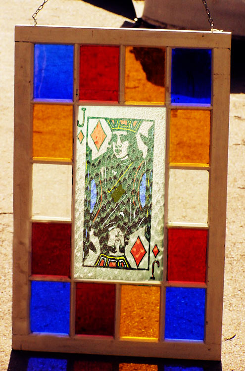 |
Posted on 29/04/08 08:24:29 AM |
|
Maja
Dewey Decimator Posts: 66 Reply |
Re: Contest 195: Stained glass window
Second try! Maybe this one is more in line with the challenge.  |
Posted on 29/04/08 10:20:05 AM |
|
james
Surreal Spoofer Posts: 1194 Reply |
Re: Contest 195: Stained glass window
Steve Mac, Please, how do you achieve such clear transparency without loss of colour density? Glass for me is a nightmare, your effect is dazzling. |
Posted on 29/04/08 10:20:32 AM |
|
james
Surreal Spoofer Posts: 1194 Reply |
Re: Contest 195: Stained glass window
? Oop's. Double post. |
Posted on 29/04/08 5:20:00 PM |
|
rufus
Destructive Demon Posts: 243 Reply  |
Jack on Red Satin
Mick, Your second entry is truly stunning, how about a tutorial on your technique. rufus |
Posted on 29/04/08 5:44:54 PM |
|
Deborah Morley
Makeover Magician Posts: 1319 Reply |
Re: Contest 195: Stained glass window
Really excellent images.  |
Posted on 29/04/08 8:37:48 PM |
|
chris berry
Overhead Overlord Posts: 724 Reply  |
Re: Contest 195: Stained glass window
Paul Nick's dead right - this isn't a competition (well, maybe a little bit!) but we all come here to learn, and if you take something away from an exercise it's time well spent. Also, your entry holds it own from what I can see. Don't worry - enjoy and learn! |
Posted on 30/04/08 08:28:11 AM |
|
Nick Curtain
Model Master Posts: 1800 Reply |
Re: Contest 195: Stained glass window
Steve, apologies for submitting another one, but this has been so enjoyable. There is fantastic work on here this week. Daleks have been absent for a few weeks, so here they are putting the finishing touches to their new glass doors. Nick 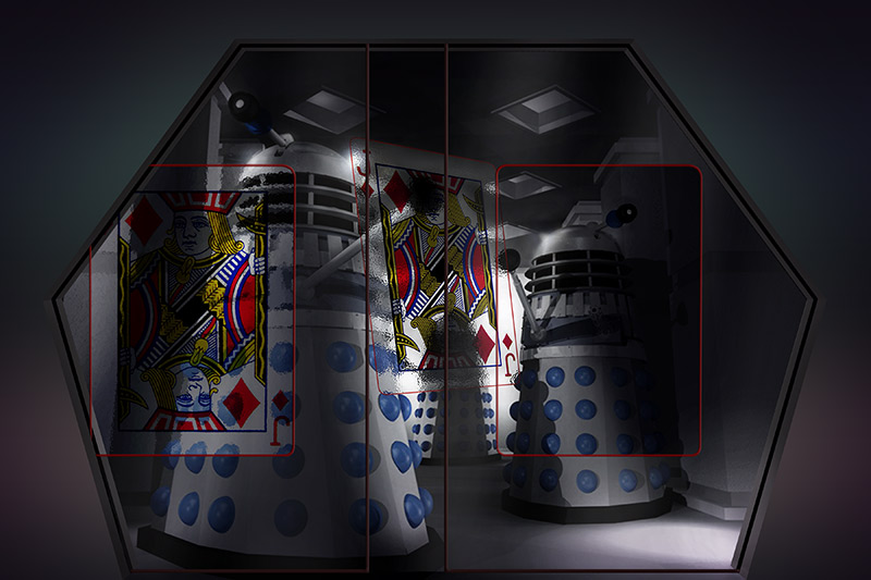 |
Posted on 30/04/08 11:47:47 AM |
|
katew
Virtual Virtuoso Posts: 681 Reply |
Re: Contest 195: Stained glass window
Not one of my best, I'm afraid - I've had a lot on my plate this week.  |
Posted on 30/04/08 1:31:20 PM |
|
james
Surreal Spoofer Posts: 1194 Reply |
Re: Contest 195: Stained glass window
Deborah, Your skills are evident in a wonderfully produced Jack. I feel it could be lifted from the background. Marvellous |
Posted on 30/04/08 3:15:44 PM |
|
Deborah Morley
Makeover Magician Posts: 1319 Reply |
Re: Contest 195: Stained glass window
Many thanks James! |
Posted on 30/04/08 10:42:11 PM |
|
Eva Roth
Luminous Liberator Posts: 269 Reply |
Contest 195: Stained glass window
This one looks a bit dull, but it'll have to do as I've had no spare time whatsoever. Bank holiday weekend coming up, though, which means plenty of time for the next challenge... 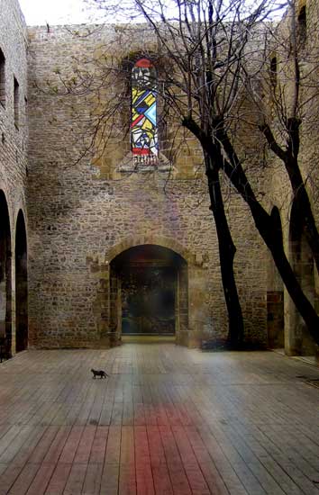 |
Posted on 01/05/08 9:01:19 PM |
|
james
Surreal Spoofer Posts: 1194 Reply |
Re: Contest 195: Stained glass window
Steve Mac, Thank you Steve, much obliged, it's been bugging me no end. |
Posted on 02/05/08 02:57:36 AM |
|
Steve Mac
Grunge Genie Posts: 539 Reply |
Re: Contest 195: Stained glass window
No problem james. |
Posted on 02/05/08 07:54:34 AM |
|
Steve Caplin
Administrator Posts: 7157 Reply |
Re: Contest 195: Stained glass window
Some really accomplished work this week: and very good to see so many different approaches to the problem. First in was Atomicfog, with an ingenious suggestion: a stained glass window to cut down the effects of the suns rays. Beautifully achieved with Lens Flare, and theres a tinting on the earth to match the colours in the window. Um... but shouldnt the side of the earth facing us be in deeper shadow? An outdoor view from vicho, with the Jack neatly slotted into a Norman church. A good use of the leading, but Id love to see this one at night with the lights on. Always good to see Hoppers diner making a guest appearance, and Mick Malkemus has worked a cunningly Art Deco version of the Jack into the window, complete with image on the street outside. Very good perspective on the cast light! And a stunning second entry - that must have taken a while! Am I right in thinking this was assembled from pieces of a real window? An interesting experiment in the third entry: theres something not quite right about the light on the wall and floor, but its hard to pin this one down. A good ecclesiastical setting from Elliott: I like the coloured borders round the window (not sure about the magenta and cyan, though) and the liht streaming in works very well. On the ground, though, we can see a hard edge filled with white; but it seems to me that all the light on the ground comes from that window, so surely the Jack should be spread out a lot more? A moody scene from Maya, whose window is casting its light onto a woman inside. The light beams work well here, as does the intensity of colour on her face; but why is only the yellow light coming through? Add in some blue and red and it would look much more like its coming from the Jack. I like the second entry, but have to point out two problems with the light cast through the window. First, on the windowsill it should line up with the image in the window. Think about how the light works: the Jacks hat should match the position in the window, upside down. And second, you have light on the wall facing us - but this is facing away from the window! Theres no way for the light to get there! Subtle work from Nick Curtain, whos shown us the wall facing the window in his version of the church, with the light showing beautifully against the stonework. I really like this one, especially the way the light has been shaped to match the pattern of stone in the visible window; a great sense of place here. And I love the second entry - not just the execution, but a fantastic idea. And all those tiny J cards placed on the seedlings - must have taken forever! Always good to see daleks back, as in the third entry: at last, a use for those suckers! The extra border colours from tooquilos greatly add to the stained glass feel, giving the window a rather cosy domestic setting. But think about how these windows are constructed: the lettering, both at the top and on the J in the Jack, are floating in the middle of panes of glass. How could the glassmaker cut the holes for them? More leading needed to hold them in place! A beautiful quality of light from Steve Mac, whose window really seems to radiate the sun behind it. I especially like the subtle light cast on the hand, and the coloured border. Very intrigued by the hand itself, of course: how did you do the water effect? Its most convincing. Not crap at all, Paul 2007: your leading has an excellent three dimensional quality. A few extra pieces would help - around the J and the diamonds, going to the edges, for example. And that reflected version would work best on a real textured surface to make it look more like light coming in. This one really needs a room setting, either domestic or ecclesiastical, to really complete the picture. Theres a fantastic translucent quality to the window Luis has entered, greatly accentuated by the cracks in the bottom panes. A great texture to the leading, although those corners look impossible to make out of glass - especially with the J and diamond motifs set in them. I really like the way the whole frame, and the brickwork, has been created in Photoshop - most accomplished. A great use for an old stained glass window from Neil O, whos had his rebuilt into an outdoor table. Excellent extra pieces of leading, but the light through the window bothers me slightly. Maybe its because its smaller than the window itself: can this ever be the case? Even if the sun were an infinite distance away, the smallest it could be would be the same size. Seriously good work from vibeke, whos built a memorial to the Diamond family (although no king, curiously). Intricately modified windows, with the new elements perfectly set within the frames: A seamless, beautiful job. If I were really nitpicking I might point out that the diamond on the far left doesnt quite fit the leading - but no, that would be stupid of me. This is a gorgeous piece of work. Ben Mills has had to disassemble his Jack and rebuild it to fit the window space - looks like this was originally made for a church and repurposed for this building. Its a great fit, if a slightly unconventional design. I like the slight coloured light that it casts: a touch too subtle, perhaps? A new member this week: and nwag has given us an excellent first entry, in which the Jack has been redrawn and simplified using larger panes of glass. An intriguing dotty effect on the leading that Im not entirely sure about, but the way the Jack has been integrated into the scene - tucked behind those flowers - really makes this one work well. And the tone and texture of the second entry are good - but why is the top of the window in shadow? After all, thats where the light is coming from! Excellent work, Maksim - welcome to the forum! A fine domestic setting from mariong, who has worked her window perfectly into the scene. Theres an excellent translucent quality to even the bright outside panes, and the slight lens flare gives the sense of light shining through it. The colours cast on the floor work exceptionally well, and the reflection in the side wall is a great touch. My only slight issue is the colour on the wall directly below the Jack: theres no way for the light to get there, surely? Short of bending round corners, that is. The cathedral may have lost its roof, but at least the window survived in michael sinclairs entry. The light beneath the window works well, as does the light streaming in from the side; but the window itself is somehow too sharp and too saturated to look like it belongs there. And all those colours really need some leading! Im having trouble recognizing the building in mguyers entry: its so dark in there! From what I can make out, though, we seem to be looking up at the window - but the regular grid on top of the Jack is seen straight on. Some distortion needed to match the angle of view, perhaps. A second new member this week, and bjansen has come up with a great approach. The window fits well into this rather grand setting, and the reflection on the floor is excellent. But why does the Jack appear so bitmapped? It looks to me as if youve used the low res preview version, rather than clicking the link for the full high res image. Welcome to the forum - and next time, use the high res! A wonderfully conceived and accomplished entry from salfordnurse, whos fully exploited the Alice in Wonderland theme - complete with Alice herself and a curiously purple-striped Cheshire Cat (if I didnt know better, Id think youre basing your entry on Disney rather than Lewis Carroll). The way the Jack has been worked into the hedge is excellent, with the slight view of a stately home through it: and the playing card motifs in the topiary are a great touch. I like this one! A twinkling window starts off the animation from james this week - and the rearing horse completes it. A good idea to concentrate on the main image, losing the outer border; and the raised quality to the leading works well. The light in front is just too neat a fit to the shelf, though - Id like to have seen this spilling over the walls slightly. But entertaining as always, James. I dont recognize the face in gaoxiguos entry - but its a strong effect, with the light behind it. I like the idea of it being broken, but is it possible to break a chunk out of the middle of a window like that? Surely all breaks would reach to the edge? Thats one hefty still in brewells entry - and I like the placement of the window here. Id like it better if the rest of the room were darker, though, so theres more of a focus coming from the window itself. A shame the original picture was so low res, though. A novel approach from Ellen, with the Jack as the middle pane of a domestic window, The glass texture is good, but a little rippling on the Jack artwork would have helped it to look like its printed on top: those straight lines are just too straight. Looks like Deborah Morley has redrawn the image from scratch - and made a very fine job of it. Some bevelling on the leading would help it to look more three dimensional, and you need to make a distinction between the actual leading (which holds the panes of glass together) and the painted detail, like the mouth and nose. A tremendous translucent quality, though, but remember my thing about showing images at angles rather than head-on. I like katews idea of placing the window within this fascinating shop. But as the main light source, it would do far more than merely cast an image on the floor: the whole room should be coloured by red, yellow and blue splashes of light. Theres a great opportunity to improve on this one! A small section of the playing card pressed into use by Eva Roth, but its enough to have the light streaming through it and making rather splendid coloured light on the floor. Which would be more impressive if this were the only light source: but the lack of a roof on the building rather breaks this illusion! Crop the image slightly lower, so we lose the sky, and the whole thing will make more sense. Cool cat, though. Glad to see this simple idea inspired so many of you to such great work! |
Posted on 02/05/08 09:38:51 AM |
|
vibeke
Kreative Kiwi Posts: 2188 Reply |
Re: Contest 195: Stained glass window
Thanks Steve, I enjoyed this one, it just seemed to grow by itself. Judging from the many entries I wasn't the only one getting carried away this week. |
Posted on 02/05/08 10:29:54 AM |
|
Nick Curtain
Model Master Posts: 1800 Reply |
Re: Contest 195: Stained glass window
Hi Steve Many thanks for the comments. This was a particularly enjoyable challenge and the many fantastic entries from everyone endorse that. I found the most difficult element in the nursery picture was warping the card to fit the roof sections and maintain scale. Those handles do strange things at times! The tags were very simple to create. I drew a wedge shape with the pen around the J and filled in the missing bits with white. Once the tag was on its own layer, it was copied to preserve the original and then transformed to the correct size. It was then simple to copy them by holding Alt with the move tool selected and dropping each tag into place. Some were rotated and resized slightly to add interest. I then made a layer mask for each one. The tips in your book have been so valuable. Nick |
Posted on 02/05/08 10:42:12 AM |
|
katew
Virtual Virtuoso Posts: 681 Reply |
Re: Contest 195: Stained glass window
Thanks Steve. I found this one quite difficult! |
Posted on 02/05/08 11:34:17 AM |
|
tooquilos
Wizard of Oz Posts: 2970 Reply |
Re: Contest 195: Stained glass window
Thank you Steve for your feedback.  It was an interesting experiment this week. I learned quite a bit about clipping masks and blending modes. So much so that I forgot about adding the lead to the text It was an interesting experiment this week. I learned quite a bit about clipping masks and blending modes. So much so that I forgot about adding the lead to the text |
Posted on 02/05/08 12:04:02 PM |
|
Steve Mac
Grunge Genie Posts: 539 Reply |
Re: Contest 195: Stained glass window
Thanks Steve. I used several brushes for the water with different scatter and opacity settings. |
| page: 1 2 3 4 last |
