
| » Forum Index » The Friday Challenge » Topic: Contest 221: Sign of the times |
|
Posted on 29/10/08 12:48:53 PM |
|
katew
Virtual Virtuoso Posts: 681 Reply |
Re: Contest 221: Sign of the times
Here's mine (sorry, xboxmaniac, I'd already done it before you did yours so I didn't nick your idea, honest!   ) )
 |
Posted on 29/10/08 1:01:24 PM |
|
stefan
Detail Demon Posts: 401 Reply |
Re: Contest 221: Sign of the times
Stefan love your treatment to the signpost I can see you have Steve's new book as I'm guessing the Germanic Font is from there but very suitable for your image. Hi Maiden, Thanks a lot...unfortunately I don't have Steve's new book. Until recently, I lived and worked in Germany for 6 and a half years, that's why I have this Fraktur font . |
Posted on 29/10/08 1:18:19 PM |
|
maiden
Golden Gif Gagster Posts: 471 Reply |
Re: Contest 221: Sign of the times
Very nice it is too. I'd recommend Steve's new book it has a lot of very useful free fonts. |
Posted on 29/10/08 2:52:29 PM |
|
Neal
Master Manipulator Posts: 322 Reply |
Re: Contest 221: Sign of the times
Watch out! They're on the road to Barton In The Beans. 
|
Posted on 29/10/08 3:00:22 PM |
|
The Mad Lep
Four-Leafed Fantasist Posts: 323 Reply  |
Re: Contest 221: Sign of the times
 Neal! Neal!  That's freakily brilliant. Nice one! That's freakily brilliant. Nice one!  |
Posted on 29/10/08 5:18:01 PM |
|
GKB
Magical Montagist Posts: 4139 Reply |
Re: Contest 221: Sign of the times
Neal, What are you going to do after the election when Dubya's gone and forgotten? _________________ The roundest knight at King Arthur's round table was Sir Cumference. He acquired his size from too much pi. |
Posted on 29/10/08 6:18:47 PM |
|
Neal
Master Manipulator Posts: 322 Reply |
Re: Contest 221: Sign of the times
Thank you Mad Lep and GKB! Once Dubba's gone from office, I won't know what to do with myself. Maybe I'll take up knitting. |
Posted on 29/10/08 7:33:02 PM |
|
maiden
Golden Gif Gagster Posts: 471 Reply |
Re: Contest 221: Sign of the times
There's plenty of scope yet 
|
Posted on 29/10/08 7:56:41 PM |
|
GKB
Magical Montagist Posts: 4139 Reply |
Re: Contest 221: Sign of the times
Well, at least it's an improvement. _________________ No matter how much you push the envelope, it'll still be stationery. |
Posted on 29/10/08 9:47:40 PM |
|
Neal
Master Manipulator Posts: 322 Reply |
Re: Contest 221: Sign of the times
Outstanding, Maiden! I love it. |
Posted on 30/10/08 00:06:34 AM |
|
Ellen
Fire Queen Posts: 102 Reply |
Re: Contest 221: Sign of the times
Neal and Maiden, those are both terrific! |
Posted on 30/10/08 09:06:09 AM |
|
powerslave
Custom Cobber Posts: 136 Reply |
Re: Contest 221: Sign of the times
Wicked stuff there Katew, Neal and Maiden  |
Posted on 30/10/08 10:06:53 AM |
|
stefan
Detail Demon Posts: 401 Reply |
Re: Contest 221: Sign of the times
great Becky !! |
Posted on 30/10/08 1:49:34 PM |
|
Deborah Morley
Makeover Magician Posts: 1319 Reply |
Re: Contest 221: Sign of the times
Great stuff from everyone, so much you can do with a signpost!  |
Posted on 30/10/08 3:35:38 PM |
|
Nick Curtain
Model Master Posts: 1800 Reply |
Re: Contest 221: Sign of the times
Maybe it's because .......  |
Posted on 31/10/08 09:33:21 AM |
|
Steve Caplin
Administrator Posts: 7157 Reply |
Re: Contest 221: Sign of the times
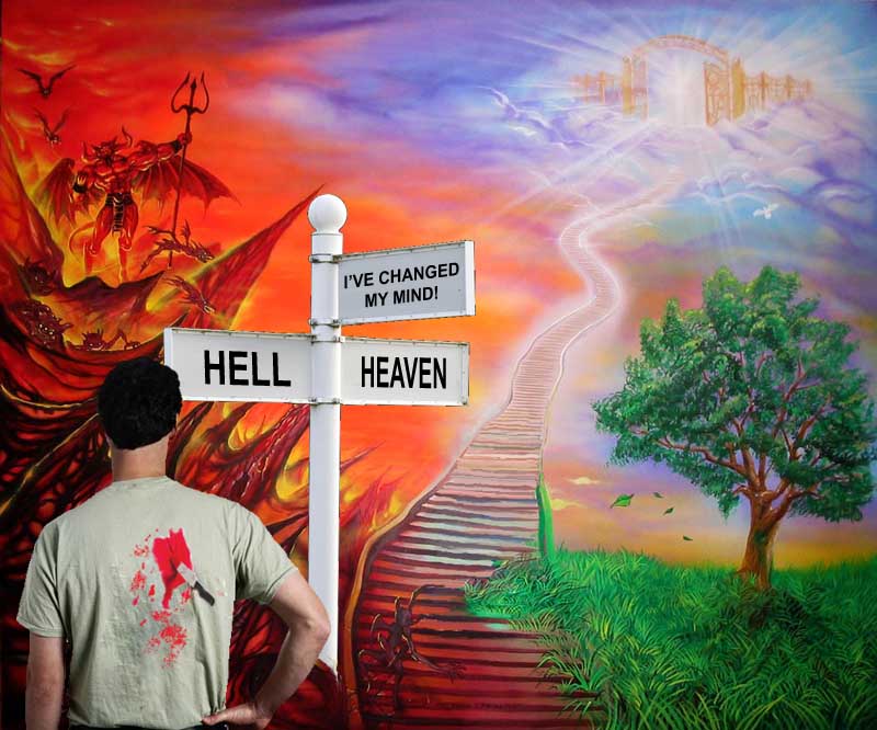
Strange how such a simple idea can spark off so much imaginative work! I knew there would be something in this sign when I first saw it... Andy L's dripping Recession sign sums up the current financial mood perfectly: it's meltdown, without mentioning the word. The distorted background (that's the Bank of England, by the way) adds to the general air of despair. Great work, Andy. I enjoyed brewell's buddhist version - a scene of suitable tranquility. This one's really made by the shadows, which show the Buddha hovering transcendentally above the path surface. Very neat idea, neatly executed. A touch of genius from maiden, whose background reflects and adapts the original signage. Bart in the Beans is fantastic! In a job like this, it's all too easy to overlook the skill involved in matching the original sign lettering - and this has been perfectly achieved. And I love the second entry - great idea, great animation! And as for the third entry - well, what can I say. Astoundingly good. Becky, you're working overtime this week. Excellent deep shadow on Neil O's sign, and the passing space shuttle adds both scale and focus. If NASA have been reduced to photographing potatoes and passing them off as asteroids, though, I think someone should be asking what's happened to all the money, Ben Mills is absolutely right - I did take the original photograph in the Leicestershire village of Nailstone. This homage to the local mining heritage is an evocative one: but I'm surprised you passed up the opportunity to place the sign in one of the brick miners' hands. Elliott gave us the first of several references to the Wizard of Oz, with the sign neatly inserted behind our two foreground characters. But who are these people? Should I recognize them? Nice work tucking the sign behind the hair. It seems the sign has sparked a number of allegorical entries - and Steve Mac's man at the crossroads is a poignant image. Shouldn't we see some visible difference between the hard road and easy street, though? Especially since the hard road is only a mile long? Hilarious work from The Mad Lep, with a gallant knight having chosen the wrong one of four baddies to stick it to. A great story told here, but it's the detail that works so well: the distant mist, the reconfigured signpost, the subtle shading beneath the knight, and the sensitive choice of font for the caption. And a great idea in the second entry - is Cork maternity hospital really that bad? How on earth can you misdiagnose a maternity? The forest returns in michael sinclair's entry, who resurrects his Roman soldiers to take their revenge on, er, a one-armed leprechaun. Have to admit, Michael, I'm a little baffled by this one! I like the gently waving water in the second entry - most appealing. The choice of font seems a little relaxed, though. More social comment, this time from jwhite, whose market clearly isn't that bullish at present. Are you sure about the red lettering on the sign, though? It does seem to point up the fact that it's a montage. And... Times Roman! Not on a signpost, you don't. You need to take a look at Art & Design in Photoshop... I see mguyer's back making his Hitchcockian guest appearances, with Mrs Mguyer faithfully by his side. One thing puzzles me: if you're both on a bridge over a canyon, is that a very, very tall signpost? Or should it be this side of the railings? A bit of a Tolkien moment from Philbo. Great choice of lettering, and the silhouette has been well achieved, with a great shadow. I like the shape of this one, reading nicely from left to right. A great animation from tooquilos, with the Wicked Witch of the West (Naughty Witch of the North? Eccentric Witch of the East?) flying out to knock the Emerald City sign spinning on its post. A great idea, with good detail: the nodding munchkins, the eyebrow-twitching scarecrow. And it certainly is a long way from Kansas! The element that really makes Nick Curtain's entry is, of course, the fine shadow, rippling over the sand's surface. It's a convincing piece of work, with great shading on the underside of the sign itself. And I love the fact that the sign washes up on the embankment in the second entry: I've taken many a walk along the Thames at low tide, but I've tended to find more 18th century clay pipes than wooden sign posts. I like the idea of dave.cox's signpost in the sky - but the perspective needs a bit of a kicking, Dave! from what angle are we looking at those skyscrapers? Great cloud action, though/ It's been a year since xboxmaniac last entered the Friday Challenge - and he returns with a moody choice between the demon of hell and the angel's wings of heaven. The tunnel in front of us, though, seems to be taking a middle path between the two: is there a third choice? An astoundingly good entry from stefan, showing a war-torn sign in1940s Germany. It's a truly gorgeous piece of work, with paint decay, staining, chipping and even bullet holes. Perfect choice of font, and the squadron of planes makes the point beautifully. Personally, I've have added a little interest lower down the image - perhaps some war torn buildings in the distance? But overall it's a finely detailed, very appealing piece of work. Another space image, this time from GKB - and the sign fits well on the lunar surface. But take another look at the shadows, Gordon: with the light source so low in the sky, the shadows are several times as long as the objects which cast them. All we should see of the sign's shadow is the post, disappearing off to the right. A positive outlook from vibeke, offering the choice between what we like and what's good for us. Great to see a figure from thefullmontage making a guest appearance in here - and the way she's weighing up the choice between the cards and the apple is perfect. A great job! A tough choice for Ellen's dog: he's clearly heading for a roll in the stinks. Strange bit of planning, though, to place the signpost in the middle of the road! A rare English entry from gaoxiguo, with the traveller ignoring the sign to go his own way. Great footprints in the sand, and a well damaged sign. Good work! Beautiful work from katew, offering us the choice between heaven and hell: both are fantastically rendered (is that Blake's hell?) in this very satisfying piece. That's a pretty tiny knife in the guy's back though! It seems that Neal never misses the chance to turn a Republican into a zombie... so no prizes for guessing which way you'll be voting on Thursday, then. It's an extraordinarily detailed, powerful and downright gory piece of work: seriously, Neal, this is astounding in its disgusting realism. Wonderful! A Jurassic Park quality to Deborah Morley's entry, with the reptiles taking over the theme park. Very nicely achieved, and I particularly like the big head in the foreground. But I'd question your choice of font on the sign: too hard to read, Deborah! Fantastic work all round this week - not a duff entry amongst them. Pats on the back to everyone. |
Posted on 31/10/08 09:52:27 AM |
|
vibeke
Kreative Kiwi Posts: 2188 Reply |
Re: Contest 221: Sign of the times
Thanks, It was a lot of fun. Good not to have to rush this one. |
Posted on 31/10/08 09:55:05 AM |
|
Nick Curtain
Model Master Posts: 1800 Reply |
Re: Contest 221: Sign of the times
Thanks Steve Nick |
Posted on 31/10/08 10:07:54 AM |
|
The Mad Lep
Four-Leafed Fantasist Posts: 323 Reply |
Re: Contest 221: Sign of the times
God I never thought of it that way!  It was the first decent-ish shot of an Irish hospital I found. I shudder to think what kind of Photoshops that idea would produce. It was the first decent-ish shot of an Irish hospital I found. I shudder to think what kind of Photoshops that idea would produce.
Thanks for the lovely comments Steve, this challenge was open ended fun all the way!  |
Posted on 31/10/08 10:14:11 AM |
|
Deborah Morley
Makeover Magician Posts: 1319 Reply |
Re: Contest 221: Sign of the times
Many thanks Steve, point taken on type face! |
| page: 1 2 3 4 last |