
| » Forum Index » The Friday Challenge » Topic: Challenge 258: Classical architecture |
|
Posted on 23/07/09 9:32:53 PM |
|
stefan
Detail Demon Posts: 401 Reply |
Re: Challenge 258: Classical architecture
[quoted] Dara wrote: This is my first post here. Thought I'd keep it simple the 1st time. Hi..and welcome!! That looks very nice! A bit like a matte painting for some film  |
Posted on 23/07/09 11:23:42 PM |
|
Emil
KAFKAsFRIEND Posts: 413 Reply |
Re: Challenge 258: Classical architecture
 |
Posted on 24/07/09 08:17:36 AM |
|
Steve Caplin
Administrator Posts: 7157 Reply |
Re: Challenge 258: Classical architecture
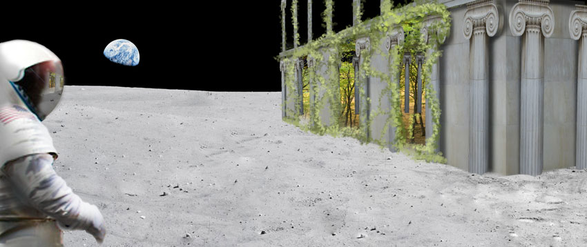
Our first columnist this week was stefan, with a splendid construction - greatly helped by the mist, the doomy sky and, of course, the artful ivy. The columns square on to us are fine, but those at an angle show the capitals still facing us. These need to be angled too, of course - and thats no easy task. Most embarrassing image of the week is from Gerard - to be ranked with Scott Kelby and Bert Monroy is one thing, but to be placed next to Photoshop inventor Thomas Knoll is something else altogether! Great architecture, and a neat photographic treatment. Im not sure the modern Greek typeface really matches the classical architecture, but I see what youre getting at. A rather beautiful set of bird perches from gaoxiguo - with well placed doves, birds of peace. The perspective of the scene is rather odd, but I do like the idea. An interesting observation from tooquilos, recognising the similarity between the Ionic capital and Wall-es robot eyes. But its the animated version thats the most fun, as Wall-e usurps the original caryatid: charming work! I like the zoom-in on the end. A very ambitions entry from Canna W, who has used a variety of techniques to bend these columns into a cylinder. Id start off with the Spherize filter set on Horizontal, to make the initial distortion, and then add perspective with Image Warp (as youve done) afterwards. Its a great idea, though, and the composition and painterly treatment are fun. Placing the stork in the foreground is a great move. A novel picnic shelter from brewell - good conversion work! I like the wood effect on the columns. Interesting architectural note of the week: the leafy design of Corinthian capitals is said to come from the wooden acanthus trunks which were originally used as columns, and which used to take root and sprout foliage at their top. A magnificent dog house from Ben Mills, very neatly created from our spare parts. One minor point on the lettering, though: the shadows coming from the wrong direction. Surely these letters should be engraved, not embossed? A cosy scene from Nick Curtain, with two fullmontage characters perched on what does look like a rather uncomfortable bench. I think a flat top would have helped here! The clock is a good addition, though, and the whole construction has a rather appealing quality. Real genius from China: the statue carving herself out of a column is beautifully created, with the hands, arms and head at exactly the right angle. And the pieces of broken column at the bottom tell the whole story. Fantastic work! And it certainly earns a title for you. How about Surreal Sculptor? I like the inclusion of the columns in the second entry, the well-known false perspective painting. Good snow technique! A very tasty bird house from katew - the columns do give it a classical touch. And I like the Dunflyin label! Those stone pillars do look a touch heavy for the wooden bases, perhaps. Ever thought of spicing it up with a few of mguyers exotic birds? A magnificent fireplace from LonnieK: and an artfully selected assortment of additional items, blending in with the tone of the scene well. I particularly like the leafy arrangement in the vase, which strengthens the outdoor feel of the piece. Very consistent, very nicely judged. I like Jota120s idea of the column replacing the gantry for Apollo 11s launch, and its well integrated into the scene. But why is the capital bending over like that? It looks like its melting! Intrigued by the Taj Mahal in the second entry - nicely placed. The third entry is just weird! A real labour of love from Deborah Morley - perspective, Deborah, your favourite topic! And it all works rather well (except, of course, that the capitals should be facing up the length of the temple rather than towards us, but well let that go). I like the strong shadow from a light source on the right, but have a couple of issues with it. First, the roof shadow needs to be at least as wide as the roof itself! Second, the shadow on the statue should be horizontal, not vertical. And third - what are those splashes of light on the ceiling? What could possibly be causing them??? A tricky one, indeed! Some rather beautiful surrealism from Tom: its well worth opening the high res version to see how the column fades into a drawing on the right. Many entertaining additions here: the only one Im not sure about is the Plastic Wrap on the roses! Great texture, as always, and I like the added shine on the capital. A fantastic effort from Ivan: those capitals have been turned to be viewed from the side, rather than head on. All thats needed now is to shear them so that they all point in a line down the row. All the added statues and figures work well, bringing the scene to life. The floor texture is tricky: it needs to be at right angles to the columns, and yours is coming towards us too much. A very ambitious project! I love the expression on Cheneys face in Neals entry - and where did those hatchet hamsters come from? Its worth noting the attention to detail here: look at the sides of the seats to see how the perspective viewpoint has been built into them. Nice work! Subtle work from michael sinclair, substituting the original Corinthian columns for my Ionic versions. The only problem here is with the capitals around the side of the rotunda: you need to give them some thickness, and stand them forwards of the columns a little to accentuate the sense of depth. Clever synchronised flying from james: youve really got the flapping motion pinned down well. Theres a really natural feel about the way the birds take off and fly towards us: youre getting good at this! An extraordinary portrait from BigVern: this must have taken some working out! Not just the columns as hair, but the capitals for eyes and the delicate reworking of the stone to make the nose and cheeks. Excellent, and wholly original. A beautiful underwater scene from The Mad Lep: the structure is perfectly integrated into the scene, the colouring is exactly right. I really like the way the top of the building is breaking through the waters surface - nice touch! I suspect, however, that there are no fragments of my original columns in this work... A first entry from new member Dara, with a surreal scene - replacing the original lighthouses with our column. Note the way the dark reflections have been copied across from side to side, rather than mirrored: a good technique, which breaks up the symmetry well. I like the classical placement of all the items, very neat. The only thing I would change would be to rearrange some of the rocks on one of the front lighthouses, to hide the fact that they are clones of each other. Welcome to the forum, Dara! A surreal scene from Emil - temples on the moon, eh? I like the idea - but are you sure all that ivy would grow in an airless, waterless environment? Great work this week. |
Posted on 24/07/09 08:46:30 AM |
|
Emil
KAFKAsFRIEND Posts: 413 Reply |
Re: Challenge 258: Classical architecture
Hello Steve. It is the enchanting thing that in the surreal can graw anything everywhere, especially in a temple on the moon :-) |
Posted on 24/07/09 09:08:27 AM |
|
Gerard
Digital Dutchman Posts: 145 Reply |
Re: Challenge 258: Classical architecture
Steve, being famous comes with a price!! 
Thanks for your comments! Gerard |
Posted on 24/07/09 09:27:31 AM |
|
Nick Curtain
Model Master Posts: 1800 Reply |
Re: Challenge 258: Classical architecture
Thanks Steve Nick |
Posted on 24/07/09 10:45:17 AM |
|
stefan
Detail Demon Posts: 401 Reply |
Re: Challenge 258: Classical architecture
Thanks Steve..yes I noticed..afterwards again of course.....the whole temple was made out of the photo you provided....so no cheating..and I guess Iwas too busy concentrating on the perspective (which isn't faultless eiter ).... |
Posted on 24/07/09 12:35:10 PM |
|
China
Surreal Sculptor Posts: 109 Reply |
Re: Challenge 258: Classical architecture
Hi Nice commend. Many thanks for you! Will, I just do it what I like. And that all posts with your help is good for me. I appreciate your help. China boy _________________ Impossible is nothing |
Posted on 24/07/09 12:35:49 PM |
|
katew
Virtual Virtuoso Posts: 681 Reply |
Re: Challenge 258: Classical architecture
Thanks for some good feedback, Steve. |
Posted on 24/07/09 12:39:47 PM |
|
BigVern
Q Quipper Posts: 674 Reply |
Re: Challenge 258: Classical architecture
Steve, thanks for the good feedback. I had a warpy good time this week! |
Posted on 24/07/09 12:58:22 PM |
|
The Mad Lep
Four-Leafed Fantasist Posts: 323 Reply  |
Re: Challenge 258: Classical architecture
**Buzzzzz** Wrong answer caller, thank you for playing.. The grooves in each pillar were made from your original column, painstakingly I might add, because I had to use three sections for each bit on each individual pillar. So HAA! "No original fragments" !!!! I'm grievously offended now.  |
Posted on 24/07/09 3:00:41 PM |
|
Steve Caplin
Administrator Posts: 7157 Reply |
Re: Challenge 258: Classical architecture
Haa! indeed! Got me bang to rights there, guv. I'll come quietly. |
Posted on 24/07/09 5:27:37 PM |
|
Ivan
* Posts: 6 Reply |
Re: Challenge 258: Classical architecture
Thank you for the feedback!  |
Posted on 24/07/09 11:48:00 PM |
|
Jota120
Ingenious Inventor Posts: 2615 Reply |
Re: Challenge 258: Classical architecture
Thanks again Steve, Agree problems with the "capital". I was envisioning "Alien" influences or mutated/evolved Greece, if they had not "stopped" (organic). Apollo 11 was the main theme. I'm glad I got the "weird" recognition! this week! ......
Trevor |
Posted on 27/07/09 09:57:42 AM |
|
Canna_W
* Posts: 14 Reply |
Re: Challenge 258: Classical architecture
A belated thank you for the feed back Steve... I did not do it the way you suggested, but will definitely experiment with that once I have photoshop back.... My computer has died  so I probably won't be around for a while. so I probably won't be around for a while. |
| page: 1 2 3 last |