
| » Forum Index » The Friday Challenge » Topic: Challenge 290: a block of ice |
|
Posted on 08/03/10 08:44:06 AM |
|
Nick Curtain
Model Master Posts: 1800 Reply |
Re: Challenge 290: a block of ice
Very good indeed Trevor. The uneven quality of the letters make this so believable. Nick |
Posted on 08/03/10 12:27:10 PM |
|
Deborah Morley
Makeover Magician Posts: 1319 Reply |
Re: Challenge 290: a block of ice
Some really lovely image this week. There really are so many variations of ice. Not too sure about this. May try another if time. 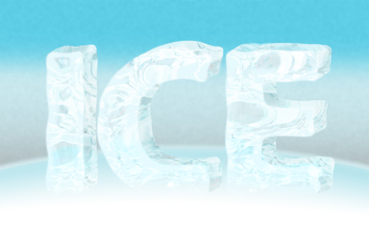 |
Posted on 08/03/10 7:25:03 PM |
|
vibeke
Kreative Kiwi Posts: 2190 Reply |
Re: Challenge 290: a block of ice
Got a bit carried away. 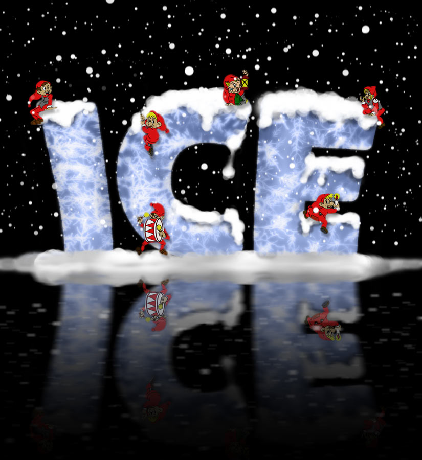 _________________ Perfect confidence is granted to the less talented as a consolation prize. |
Posted on 08/03/10 10:09:35 PM |
|
Jota120
Ingenious Inventor Posts: 2615 Reply |
Re: Challenge 290: a block of ice
That's great Vibeke. (I think SC will give a couple of comments  ) )
You remind us you're going to do winter in the southern hemisphere. |
Posted on 08/03/10 10:25:42 PM |
|
Jota120
Ingenious Inventor Posts: 2615 Reply |
Re: Challenge 290: a block of ice
Thanks Emil and Nick. I feel like a cheat. I do not understand ICE so I made it and took it to the sea. Its very very funny stuff. Might be clear on the inside, frost on the outside, until it melts then goes clear outside, with bubbles within, or not (distil). According to my understanding, it does not go blue until very dense and amount of scattering, i.e. all around the red is absorbed. The H2O molecules absorb red, so we just see (sea) blue, just like the sky. Can experiment yourself. It does not cost very much.
Little Trev |
Posted on 08/03/10 10:54:57 PM |
|
vibeke
Kreative Kiwi Posts: 2190 Reply |
Re: Challenge 290: a block of ice
That's why we enter these images. _________________ Perfect confidence is granted to the less talented as a consolation prize. |
Posted on 08/03/10 11:24:41 PM |
|
Jota120
Ingenious Inventor Posts: 2615 Reply |
Re: Challenge 290: a block of ice
Ok 
 |
Posted on 09/03/10 3:13:34 PM |
|
katew
Virtual Virtuoso Posts: 681 Reply |
Re: Challenge 290: a block of ice
Boy, this was much more difficult than it looked! 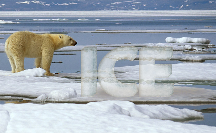 |
Posted on 09/03/10 3:36:57 PM |
|
tomiloi
Créateur de Caverne Posts: 87 Reply |
Re: Challenge 290: a block of ice
Hi eveuribaudie, Ice inspires this week. I really felt overwhelmed with some of the pictures. What is the recipe of Ice cubes, can't remember... Here is mine... Bonne semaine 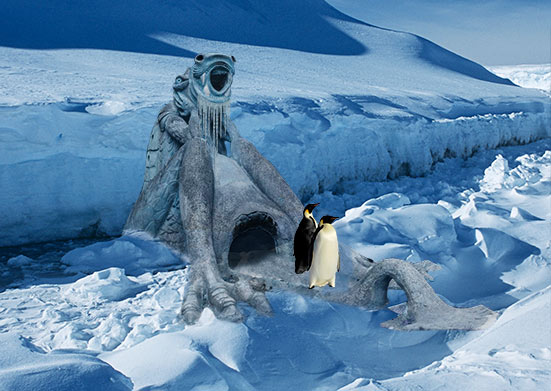 _________________ This is only Love |
Posted on 09/03/10 4:05:38 PM |
|
Deborah Morley
Makeover Magician Posts: 1319 Reply |
Re: Challenge 290: a block of ice
Thought I'd have another try, this time with good old plastic wrap. A very difficult Challenge. 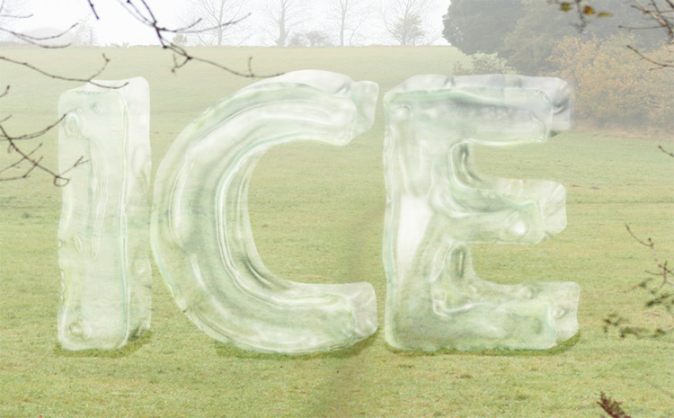 |
Posted on 10/03/10 8:59:31 PM |
|
james
Surreal Spoofer Posts: 1194 Reply |
Re: Challenge 290: a block of ice
http://i153.photobucket.com/albums/s211/fungismith/seal.gif |
Posted on 11/03/10 08:16:25 AM |
|
Sophie
Political Parodist Posts: 595 Reply |
Re: Challenge 290: a block of ice
Love your animation James. Can I ask how many frames you had and the size of the final file? Would like to have another go at animation but still find it a little daunting. |
Posted on 11/03/10 3:02:33 PM |
|
james
Surreal Spoofer Posts: 1194 Reply |
Re: Challenge 290: a block of ice
Hello Sophie, the number of frames (27) and PSD file size (8.06 MB) Somewhat complex, but animations dont have to be. Becky (Maiden) advocates simplicity, sound advice, which I generally forget. Its my own fault when things go wrong, and they often do, the atmosphere around here can get quite blue. With your undoubted talent and skills I dont believe you would have much difficulty. Look to Anna and Becky for inspiration, I do. Come on then what have you got |
Posted on 11/03/10 3:12:30 PM |
|
color
* Posts: 16 Reply |
Re: Challenge 290: a block of ice
Hello evryone , wonderfull work from all and thats mine : Dark ice |
Posted on 11/03/10 3:14:38 PM |
|
color
* Posts: 16 Reply |
Re: Challenge 290: a block of ice
sry here 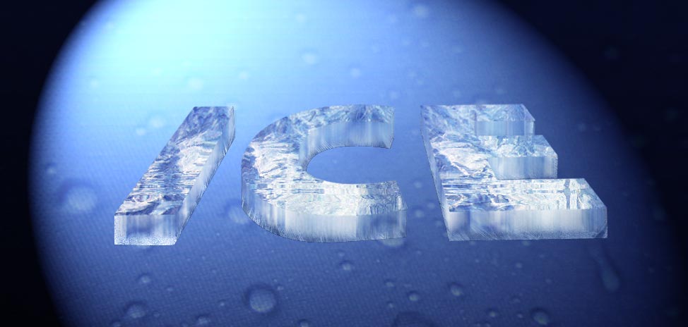 |
Posted on 11/03/10 5:59:09 PM |
|
Emvee
* Posts: 17 Reply |
Re: Challenge 290: a block of ice
Hello everyone. This is my try....  |
Posted on 11/03/10 7:28:05 PM |
|
laddition
femme fatale Posts: 585 Reply |
Re: Challenge 290: a block of ice
 _________________ Mais je me connais, je lâcherais pas l'affaire.... Je vais piquer de grève comme on pique une colère... Plus têtue que tous les vieil homme et la mer... Pour que continue le combat ordinaire! |
Posted on 11/03/10 11:28:19 PM |
|
Sophie
Political Parodist Posts: 595 Reply |
Re: Challenge 290: a block of ice
Thanks for the suggestion Tom. I have it but not used it yet! Shocking I know. Will have a look following your suggestion |
Posted on 12/03/10 08:11:08 AM |
|
Jota120
Ingenious Inventor Posts: 2615 Reply |
Re: Challenge 290: a block of ice
Sorry late addition. 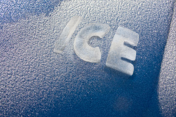 |
Posted on 12/03/10 08:50:58 AM |
|
Steve Caplin
Administrator Posts: 7157 Reply |
Re: Challenge 290: a block of ice
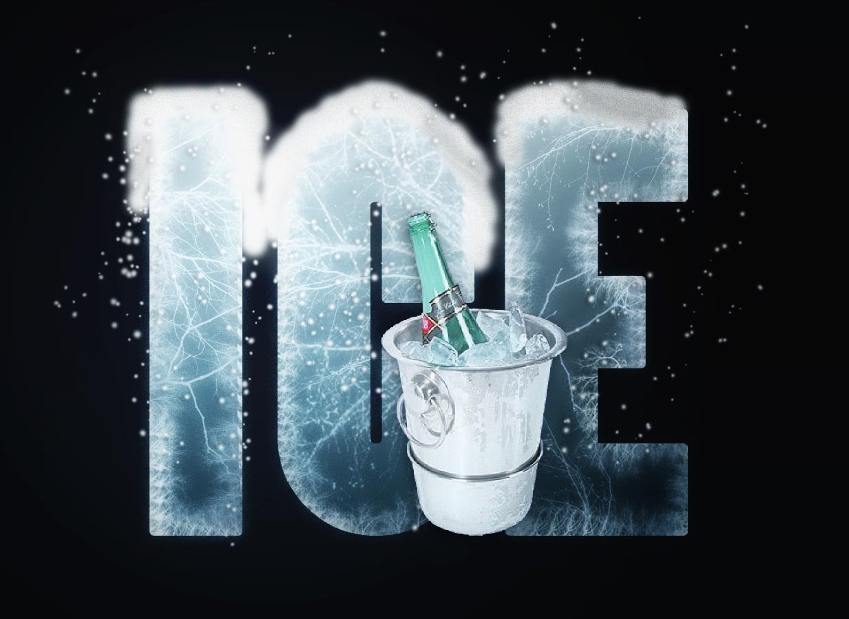
Well, this turned out to be a tricky one. Some very innovative approaches, though - and so many different ways of tackling the problem. First into the freezer was Babybiker, with some great ice texture - nicely achieved. The edges are just too hard, though, especially the corners: some rounding needed here. I like the reflection, but why is the melting water a different colour from the ice? A very clever second entry - did you have to draw all those perspectives manually? Very convincing texture from Josephine Harvatt, with a top-down view of some custom ice cubes - and I like the rounded corners. The inner angles of the E need to be smoothed over as well, though. Some shiny lettering from michael sinclair. I like the reflections, but your shadows are often in the wrong place: too far below the word (surely it wants to be nestling in the ice?) and we really shouldn't be able to see it at all on the background. Still got rats on the brain, eh? That could explain a lot. A decent attempt at texture form Jonvee Leo. Two problems here: the ice needs to refract the view seen through it; and it fades too smoothly into the water. And some distortion needed beneath the water surface! Massive blocks from GKB - I like the refracted view, and the reflections. Are the letters a little too jagged, though? Wouldn't the ice be smoother than that? My real issue is with the shadows, though: look how dark the undersides of the C and E are, compared with the deepest shadows in the background. A cute second entry! Truly monumental ice from Ben Mills. I like the way the texture continues from the glacier up into the lettering, but those edges are just too hard - except for under the top of the C, where it's just too soft (I'm fussy that way). And I'm sure those long bars on the E would have started to crumble away under their own weight! Very interesting texture from brewell - the colour is an excellent match for the background. But why are the letters leaning together like that? Is it to strengthen the sense of scale and perspective? You'd need to distort the background as well, in that case. A clever second entry! Harry Potter meets the Ice of Destiny from Carlo Alessandro Della Valle - now this really is mystical ice! A fantastic glow effect, and the drips are excellent. I'm not sure it's really ice, but it's certainly impressive. Subtle blocks from Nick Curtain - and the ice itself is looking rather convincing. the only problem is that the view through it needs to be distorted: try a displacement map, using the lettering on its own (and perhaps inverted) as the source. Some charming carved ice from vibeke - I like the way it grows out of the surroundings. The dark blue top is rather out of place, though: clone in more of the texture from beneath. And do round off those edges! As to the second entry - heavens! Is it Christmas already? A great reflection here, but for a more 3D effect the background stars need to be reflected higher than the lettering. And the stars are too visible through the words! Unless it's stars but snow, of course, in which case other comment would come into play... The glass texture used by Sophie works rather well - and I like the way the ice is part sunk into the water, with its rippled reflection, and the riding penguin is a nice touch. But I am going to have to mention perspective again - especially when the horizon is so clearly visible! And to answer your question - the 3D plug-in was dropped from CS3 at the last minute, after the book had gone to press. If it's any consolation, it wouldn't have helped in this case! A beautiful ice block from Tom - some great texture in this, and the man trapped inside adds a lot of interest to the image. When you flip the lettering to make the reflection, though, you need to ensure the reflections of the sides meet up at the bases: there's just too big a gap between the bottom of the C and its reflection, for instance. A really charming animation from tooquilos - the ice is carved out of an iceberg and travels the world before landing in a glass of water. Some really nice touches - the rippling of the water surface in the glass, the bobbing of the letters in the sea, and the elegant carving. Clever stuff! Clever work from james, with the ICE lettering cut out of a huge glacier -and I really like the hole they stand in. The whale and the boat add a sense of scale, as well as a lot of interest. A really neat idea - and the slight wobble on the boat really gives it a watery feel. High drama in the second entry, with the Northern Lights as a backdrop - but those waves need to move as well! Astounding realism from Jota120 - Trevor, this really is a fantastic piece of work. The modelling of the ice, the tone and light, the angles of the letters, all look totally convincing in this setting. Congratulations. I can't fault this one. And a really subtle second entry - I think you've found your medium, Trevor! Monumental ice from LonnieK - and the texture and raggedness of the edges both work well. But you really need to refract the view seen through it! There's some wobble introduced on the cloud edge, but more offset is needed here. Multi-layered, complex ice forms from Jeepy - with a beautiful result. I love the drips and the complexity. Very strong work! A great setting, and some very realistic lettering, from Emil - and I like the way the branches of the tree fall in front of the word. Very good texture here. My only issue is with the view through it, which needs to be much more refracted than this. And why is there a dark shadow on the back of the E? Some great icy texture from Deborah Morley - very nicely worked up, and some neatly wiggly edges to the lettering. A stronger background would help this a lot, though. Aha - there it is, in the second entry. This is much stronger. Plastic wrap does the business! A great setting from katew, with some rippling of the view through the word - but much more drastic refraction is needed here. And with such a clear horizon, the perspective thing comes into play again. If it had been me, I'd have moved the block so the bear was sniffing at it. Very shiny ice from tomiloi - and I like the way the beaver is wrapped up with a scarf. Two things: you need to distort the view through the ice even more (some rippling needed); and the lettering really needs to be drawn by hand, rather than using a font. A very good perspective view from color - I like the angle on this one. The extruded sides have a very good texture, and I like that we can see some of the inside of the blocks... good work! It would be better on a perspective surface, though. Some subtle texture from Emvee: I like the rounded edges, but why the grey border? This isn't needed, and detracts from the icy effect. The shadow is a good idea, but of course it needs to only darken the ground in front - and does all need to be the same colour! Very cool work from laddition, with highly textured ice capped by a snowy top. I like the luminous feel of this one, and the bubbles around it - and the ice bucket with a bottle of Perrier in (I think) is a great touch. The only thing that concerns me is that the bucket is too high in the frame, and seems to be floating: move it down so it's on the same plane as the base of the letters, and this one will be perfect. Oh, and the edge of the snow is a little too soft as well - it should have a hard edge. Really good work this week, on a very tricky project. |
| page: 1 2 3 4 last |