
| » Forum Index » The Friday Challenge » Topic: Challenge 374: Horror, at a price |
|
Posted on 27/10/11 10:06:59 AM |
|
Jota120
Ingenious Inventor Posts: 2615 Reply |
Re: Challenge 374: Horror, at a price
Yes you are right Jim! Welcome Katty. Nice surreal and Monty-Python-esque (?), not really, it yours..........like it a lot Sorry, excuse me, another bit fell out earlier in the week. I'll just put a link in. Can ignore then  As you can see I'm not GIFted like you other guys. As you can see I'm not GIFted like you other guys.
http://i492.photobucket.com/albums/rr283/Jota120/VPrice-Jota-C-2.gif |
Posted on 27/10/11 1:22:53 PM |
|
BigVern
Q Quipper Posts: 674 Reply |
Re: Challenge 374: Horror, at a price
Welcome Katty. Your image is gruesomely Pythonesque, I believe, with the head on feet, telly heads and Battersea Power Station backdrop. I like the reference to The Raven (a VP classic) and the treatment of the colouring and faded/distressed photo edges. An arresting composition that is both humourus and eerily unsettling. Vern 
|
Posted on 27/10/11 4:47:47 PM |
|
josephine harvatt
Gag Gadgeteer Posts: 2605 Reply |
Re: Challenge 374: Horror, at a price
Hello from me too Katty - two new contributors in one week - grand! _________________ I'm not really bad - I just draw that way |
Posted on 27/10/11 8:39:17 PM |
|
Ben Mills
Luminous Luminary Posts: 570 Reply |
Re: Challenge 374: Horror, at a price
 |
Posted on 28/10/11 01:04:41 AM |
|
sutex
Specular Specialist Posts: 157 Reply |
Re: Challenge 374: Horror, at a price
Last Time Acting  |
Posted on 28/10/11 02:53:15 AM |
|
Artwel
Satire Supremo Posts: 607 Reply |
Re: Challenge 374: Horror, at a price
I like those eyes Sutex |
Posted on 28/10/11 04:20:35 AM |
|
Tom
Texture Technologist Posts: 405 Reply |
Re: Challenge 374: Horror, at a price
Happy Hallowed Eve. 
 |
Posted on 28/10/11 08:44:15 AM |
|
Steve Caplin
Administrator Posts: 7157 Reply |
Re: Challenge 374: Horror, at a price
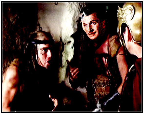
An all-purpose frightener from GKB started this week's entries, combining Dracula's fangs, Frankenstein's monster's bolt through the neck and a pair of rather devilish horns. I like the glowing eyes here, but feel there's a lack of colour on the lips - and shouldnt the moustache match the hair? A most impressive tongue in the animated version - perhaps the mouth should open a little as it comes out. An intriguing image from tooquilos, combining the furriness of a werewolf with a somewhat leprous skin condition. I like the idea of the dripping wax, but it all looks rather two-dimensional: if the wax curled over the contours of the face, such as bending over the mouth, it would look more convincing. I like the way the scene builds up in the animated version, especially the wax drips: but I think After Effects can do more natural flames than that! A gloriously gruesome image from Luis, with glistening bones, shiny blood and dank holes visible through the corrupted flesh. It's a beautiful piece of work, make all the more impressive by being entirely in black and white. Fantastic - I could stare at this for ages. Price as The Joker, from Nick Curtain - a neat colouring job, with a subtly whitened skin (and this is really hard to do properly). The only thing I'm not sure about is that bulge in the cheek: should that crease be there? Operatic drama from brewell, as the Phantom comes to life. I like the new make-up, but doesn't the mask conceal a face that's altogether more distasteful than this? Interesting work from Jimbean, merging a skull into Price's decaying skin - I like the way we can see glimpses of it here and there. If the mouth is closed, though, shouldn't the teeth be together? There's something about that flap on the forehead that looks too flat: add more of a curl here as it rips away from the skull. A touch of plastic surgery from Josephine Harvatt, with Price immediately post nose job and collagen lip implant - although I don't think the surgeon's done much of a job on losing the bags under those eyes. A great sign - but who are those women in the background? Good to see Wayne Morton back after a long absence - and here's a devilish film poster, starring all the usual suspects. Excellent typography and colouring, and I really like the way the silhouette of the building defines the base of the fire. Most enjoyable! Beautiful reptilian skin texture from BigVern. I like the way it fits onto the face, but it does need to wrap around the side of the head and over the nose rather more - it looks a little flat in these areas. Try spherizing the texture, using Horizontal only, first - and then use a different piece for the nose. Beautiful eyes, and very fine typography for the title (but don't be tempted to fall back on Times for the remaining text). I don't know if Price the spider, or if he's being eaten by the spider, in Jota120's entry - perhaps a bit of both? Too many eyes altogether, Trevor! The second entry has him given a skin texture of daisies - and there's enough back story here to fill a novel. Extraordinary to see Price camping it up in the Alice Cooper video! I lie the subtle colouring in the third entry. I really like the way joeysala's Price has tree roots growing out of his skin - most impressive, and a very innovative approach. The highlights on the side of the face and the neck shine out too much for that deep shadow, though, and make the texture look too two-dimensional. Great glowing eyes! Tremendous action in the second entry - those writhing worms are a great touch, and I really like the way you've opened the mouth. But watch you don't distort the iris as you stretch the eye down. A new member this week - and TheWanderingSlacker has produced a Terminator image that's beautifully integrated into Price's face. I really like the eaten-away skin, and the glow on the metal around that eye is a terrific touch. Great lettering, and a very convincing poster altogether. Good to see the detail in the second entry - although the hair could do with smudging out a little, it looks a little too smooth-edged here. Welcome to the forum! A couple of rather nicely worked sores from emanuelefrau, with great texture - and subtle recolouring overall. I like the reptilian eyes, but feel their colour shouldn't be the same as the sores, as it rather detracts from their impact. And is that a suggestion of a Vulcan ear? Glad to see Eva Roth was paying attention at my lecture last weekend! The plastic wrap makes good glistening sweat, and I like the repositioned eyes - except it doesn't feel as if they're both looking in the same direction. Move his left eye further to the left, perhaps. Are you as frightened of dentists as I am? A very nicely decayed Price from Artwel, with a neatly closed eye and a very well-opened mouth. An impressive poster, complete with comic ghouls in the background... very nice. Very funny work from James, with Price disappearing in flames - I like he way the eyeballs melt at the end! That must have taken a lot of frames (and a lot of work to achieve). But Price seems to disappear entirely when the flames start: a slower fade, perhaps? A lot of smudging in Tissana's entry, as Price's features have been pushed and stretched into place. It looks rather as if this has been done with the Smudge tool - and Liquify is really the job for this effect. The edges of those scars on the cheek are rather too well-defined: is that a Layer Style? Perhaps tone it down a little. I like the pointy ear! Beautiful lighting from munchonu, and a fine new pair of eyes. I like the opened mouth, although the teeth could do with shadows to match the rest of the face - they do shine out rather too much. Overall, though, a very strong effect. Good distortion from Garfield72, as the features are twisted into a new shape - I like the open mouth. The teeth don't look right, though: more shading needed here? And when you distort the eyes, you need to leave the irises and pupils alone - or replace them with new ones. Subtle work from Deborah Morley, as Price has a touch of colour and some new eyes (but do make sure they're looking in the same direction, Deborah). I like your choice of font for the title, but this really is a case where manual kerning would help: position the cursor between the T and A, and between the R and O, and use alt + left cursor key to bring these characters closer together. Our second new member this week is Katty Lemons, with a gloriously surreal entry - it's a truly remarkable style, beautifully achieved. Excellent work, both in the choice of elements and in the final composition. Welcome to the forum! Price crops up in a Roman epic in Ben Mills' entry - great colour matching, and a wry smile on his mouth. Hard to imagine him as an effective gladiator, though! A truly extraordinary entry from Sutex, with Price almost unrecognisable under that facial distortion. Some major plastic surgery here! There's a great texture and colour feel to this work - it may not be Vincent any more, but it's a very attractive montage. A gruesomely gory entry from Tom, who seems to be tempted back by the macabre these days. The light from the church window provides a great focus, and the scabrous treatment of Price's skin is most appealing (or, indeed, off-putting). But with the light source so clearly visible in the image, should the shadows on the face and rope reflect this? Great gruesome work all round - have a great Halloween! |
Posted on 28/10/11 10:10:35 AM |
|
Nick Curtain
Model Master Posts: 1800 Reply |
Re: Challenge 374: Horror, at a price
Thanks Steve I wanted to do something a bit different and tried to model him on Jack Nicholson in the original Batman, where he played a superb Joker. I found this hard to achieve though, not being an artist of any calibre. Have a google and see what I was looking at. Nick |
Posted on 28/10/11 10:11:59 AM |
|
josephine harvatt
Gag Gadgeteer Posts: 2605 Reply |
Re: Challenge 374: Horror, at a price
Thanks Steve! _________________ I'm not really bad - I just draw that way |
Posted on 28/10/11 10:25:37 AM |
|
Jota120
Ingenious Inventor Posts: 2615 Reply |
Re: Challenge 374: Horror, at a price
Thanks again Steve. Reading through your comments, putting it midly you observe a lot 
Re "..perhaps a bit of both?" Yes we are what we eat "Too many eyes altogether"  they have eight eyes, how come we missed out with just two they have eight eyes, how come we missed out with just two 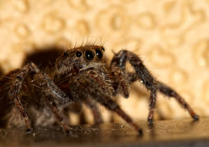 |
Posted on 28/10/11 10:28:00 AM |
|
joeysala
Perfect Palmist Posts: 604 Reply |
Re: Challenge 374: Horror, at a price
Enjoyed this one a lot - I like creepiness! Point taken re. the iris; I thought of it as in the process of morphing, but I see how it could/would be more effective left intact. Thanks for the crit........ _________________ "Art is a blade of grass ... and in a moment I will eat it." |
Posted on 28/10/11 2:01:58 PM |
|
munchonu
Horror Master Posts: 277 Reply |
Re: Challenge 374: Horror, at a price
Cheers Steve, I need to keep a closer eye on detail, appreciate it. |
Posted on 28/10/11 7:14:28 PM |
|
BigVern
Q Quipper Posts: 674 Reply |
Re: Challenge 374: Horror, at a price
Thanks Steve for the kind and insightful comments, I will try using spherise (horizontal) to round out portions of the face texture. I had been relying on the displacement map to wrap the reptile skin around his face but can see you are spot on about some of the areas not bending enough. Putting the strap line in Times was a bit lazy and on reflection does let the poster down. I had spent an age creating the main text from scratch and so was looking for a shortcut to finishing off the text. Cheers Vern |
Posted on 29/10/11 00:02:53 AM |
|
brewell
Pixel Pentagrammarian Posts: 752 Reply  |
Re: Challenge 374: Horror, at a price
There's too much decay and corruption in the world already, I just can't bring myself to add to it. So, rather than graphic horror I went with Rocky Horror. _________________ The journey of a thousand hours begins with a single layer. |
Posted on 29/10/11 00:21:40 AM |
|
TheWanderingSlacker
* Posts: 6 Reply |
Re: Challenge 374: Horror, at a price
Thanks for the feedback! I feel bad when I receive praise for something I didn't do, so in the interest of disclosure, the red light shining on the metal was part of the terminator photo I used to begin with. I'll have to work on my hair effects: first time I've tried lighting hair like that. |
Posted on 29/10/11 07:23:24 AM |
|
Jimbean
Sparky Shopper Posts: 105 Reply |
Re: Challenge 374: Horror, at a price
Cheers Steve, that flap of skin bothered me too but just couldn't get it right. Just bought your 100% Photoshop book so maybe just draw it in next time?? |
Posted on 29/10/11 6:37:54 PM |
|
sutex
Specular Specialist Posts: 157 Reply |
Re: Challenge 374: Horror, at a price
Thanks for looking Steve! |
Posted on 30/10/11 5:06:16 PM |
|
Eva Roth
Luminous Liberator Posts: 269 Reply |
Re: Challenge 374: Horror, at a price
Thanks for your comments Steve! Yes, I certainly couldn't think of anything more scary than a dentist. As for the eyes, they were left unfinished for some strange reason - they were meant to focus on the victim. |
Posted on 02/11/11 11:08:03 AM |
|
tooquilos
Wizard of Oz Posts: 2970 Reply |
Re: Challenge 374: Horror, at a price
Thank you for the comments Steve Ive created fire in AE for the "Light my fire" FC.... _________________ Wicked Witch of the West:I'll get you, my pretty! And your little dog, too! |
| page: 1 2 3 last |