
| » Forum Index » The Friday Challenge » Topic: Challenge 397: Dress her up |
|
Posted on 11/04/12 2:47:39 PM |
|
Deb Raskin
Bodywork Boss Posts: 63 Reply |
Re: Challenge 397: Dress her up
Drawn from scratch but copied style. Changed up color and material as well. No claims to original fame here but glad you like it! |
Posted on 12/04/12 00:54:35 AM |
|
Jota120
Ingenious Inventor Posts: 2615 Reply |
Re: Challenge 397: Dress her up
Great image Deb and all. I have one more intricate version in progress, but no time to complete it seems. Travel again. Sorry. I'll try to post under Readers' Gallery later... Thank you Deb for birthday greeting! 
Deb not sure how you knew it was my birthday? I don't remember leaking that? but many thanks! That could be an age thing  Either way great to see one of my daughters come to see me with hers, my grandchildren they are wonderful. But I'm not very old,... yet .... Either way great to see one of my daughters come to see me with hers, my grandchildren they are wonderful. But I'm not very old,... yet ....
Trevor |
Posted on 12/04/12 07:28:30 AM |
|
Old Salt
* Posts: 12 Reply |
Re: Challenge 397: Dress her up
 |
Posted on 12/04/12 09:55:17 AM |
|
munchonu
Horror Master Posts: 277 Reply |
Re: Challenge 397: Dress her up
Some lovely frocks going on here!  |
Posted on 12/04/12 3:35:15 PM |
|
plawansine
Wrinkle Wizard Posts: 11 Reply |
Re: Challenge 397: Dress her up

[SIZE=1]Thanks: ฝากรูป[/SIZE] |
Posted on 12/04/12 6:27:59 PM |
|
Deborah Morley
Makeover Magician Posts: 1319 Reply |
Re: Challenge 397: Dress her up
 |
Posted on 12/04/12 11:07:59 PM |
|
Eva Roth
Luminous Liberator Posts: 269 Reply |
Re: Challenge 397: Dress her up
last minute cheat... 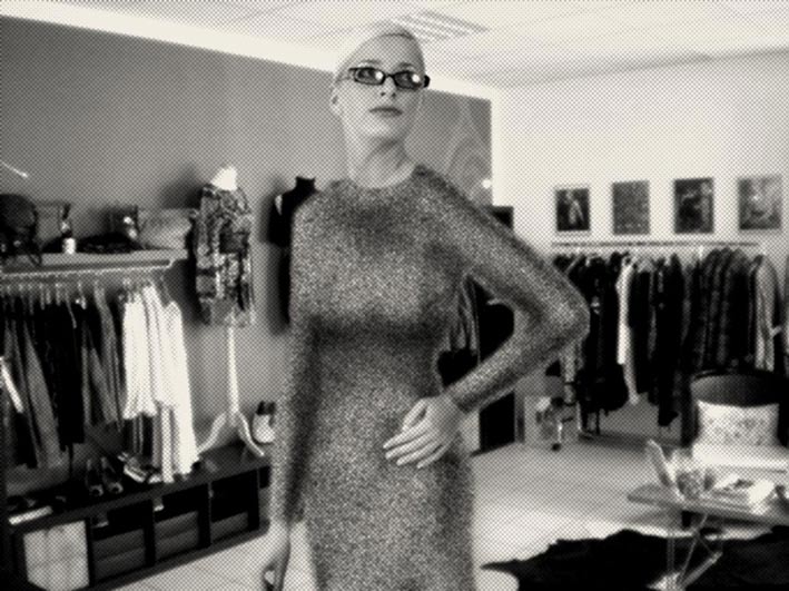 |
Posted on 13/04/12 03:32:00 AM |
|
joeysala
Perfect Palmist Posts: 604 Reply |
Re: Challenge 397: Dress her up

This isn't so easy.......not too satisfied with either entry. Oh well......... _________________ "Art is a blade of grass ... and in a moment I will eat it." |
Posted on 13/04/12 03:39:42 AM |
|
Artwel
Satire Supremo Posts: 607 Reply |
Re: Challenge 397: Dress her up
Woman in a Box Bit of a late entry here. She doesn't want a dress, prefers the casual look!..and umm comes in a box? Video version: http://vimeo.com/artwel/woman-in-a-box Hi Res: http://photobucket.com/PSART  _________________ Art Is Never Finished, Only Abandoned. |
Posted on 13/04/12 08:09:51 AM |
|
Steve Caplin
Administrator Posts: 7157 Reply |
Re: Challenge 397: Dress her up
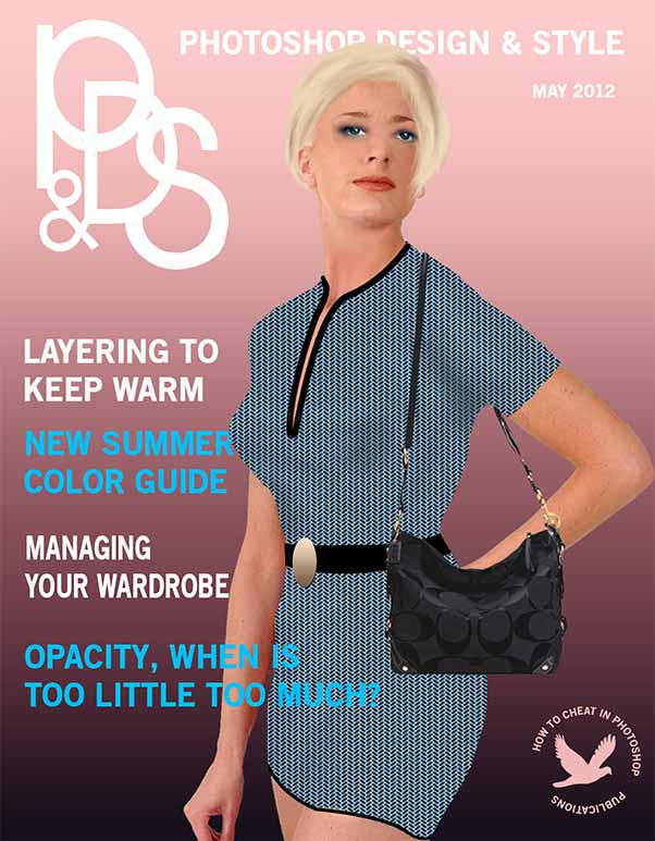
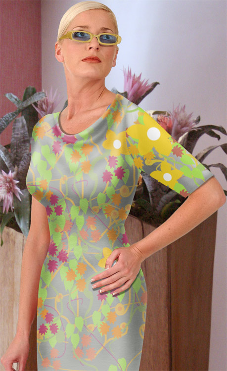
An extremely high standard this week, as so many of you get to grips with the problem of drawing clothing from scratch. One of the harder Challenges, but certainly one of the most rewarding. First up was Ant Snell, with a lemon yellow dress in a rather charming pastoral scene straight out of Disney. I like the dress fabric, and the shape of the top; but there's something rather two-dimensional about it overall, despite the folds: it feels like it's standing in front of the body, rather than wrapping around it. I liked Nick Curtain's HotChiPs-themed fabric - especially the way it wraps around the figure, which can't have been easy. The shading, though, is just too smooth, as if the dress is made of plastic; we really need a sense of there being folds in the fabric - although with this pattern, that would have been very hard to achieve. Good thumb! Very good texture from GKB, especially the way the fabric bends over the curves of the body - and I like the thumb replacement. Not sure about the shading, though - is she incontinent? and that belt could do with some shadow to make it seem like it wraps around her waist. A very demure bride in the second entry: not sure about the shading on the dress itself, but I do like the working of the veil and the neckline. Perhaps some ruffs at the wrists: And maybe a less bottom-hugging shape? "Never paid much attention to frocks," says Ben Mills, and I don't think he's exaggerating. The overall shape is there, Ben, but I think the choice of fabric makes it look rather itchy... although the shading, what I can see of it, seems along the right lines. An exuberant entry from Luis, with a haute couture extravaganza featuring a complex belt, scarf, pearls and a plunging neckline A great piece of design, but it makes her breasts look somewhat misshapen... aiming to get them both the same size is always a good thing, I think. A bright blue dress from Sophie - and I mean bright. It's always a temptation to add strong colour, but you should beware of making it unnaturally over-saturated, especially with this muted background. A lot more shading needed, too: try duplicating and desaturating the dress and changing it to Hard Light mode to boost the shadows. It's a funny thing, but when people put heads on bodies they often forget to include enough neck. This is the case with Artwel's entry - although the glasses have been well rescued from the original, and I do like the tattoo. A political statement from David Asch, with an anti-fashion dig at the Emperor's New Clothes fairy tale - a touch more modest than the original story! A gloriously sparkly entry from tooquilos, with hundreds of hand-placed diamonds twinkling on the dress - and some great lettering for the perfume. The diamonds could do with curving around the contours a little more - as it stands, the lines are just too straight. I like the sparkle effect in the animated version. A novel colour scheme from puffin31939 - I don't think purple and green are sen together outside Wimbledon (and, as it happens, my old school uniform). The trouble with placing a texture is that if it doesn't wrap around the body, it just looks flat - although your shading looks effective. When designing a magazine cover, though, easy on the typography - setting every headline in a different font is never going to look convincing. A lager ad from brewell, with a cunningly reworked arm that allows her to be holding a pint of the fizzy stuff. Her dress looks a little as if she's already had rather too much of it and suffered the consequences - not a fabric I would have chosen! Subtle shading from Jota120 makes this rather convincing, and the bold stripes are a very attractive design. I'm not sure about the shoulder straps, though, which seem rather too ragged - a bit of tidying needed there. A strong pattern from Garfield72, but it does need to wrap around the body more - especially around the breasts, where it just looks flat. The shading seems good, but more is needed to make sense of the shape. And is that a feathered edge on the dress? Why? I like the new thumb and added watch. A new member this week, as Birgit Bentzen takes the plunge. There's something of the dress designer's sketchbook about this, with a deliberate lack of shading and an extravagant hat to match. But would anyone really choose to dress in a fabric inspired by a wire fence? Welcome to the forum, Birgit! Very textural clothing from Jimbean, who's also the first to attempt separate top and jeans. A bold attempt, although the top isn't quite as flattering as it might be - and the jeans could really do with a zip, or pockets, or something. The top is so much brighter than the woman's skin that it looks artificial: tone it down! Another magazine cover, this time from joeysala - and a splendid dress design, with a beautifully made top. The shading lower down seems a little uncomfortable, though: more folds needed to give the impression this is really a dress. But I do like the new thumb and the added bracelet. Subtle shading in the second entry, although she does seem to have a bit of a belly on her: but I like the feel of this one, and the bracelet and necklace are good additions. Extraordinary surrealism from James, whose take on the Easter Bunny is both bizarre and not a little disturbing. It's a rather fetching costume, though, although the fox looks more puzzled than predatory. Great new legs! Could do with some shoes, really. A finely-worked dress from Frank, and it's worth looking at the enlarged version to see the detail in the folds and wrinkles in the top. A great upper body and belt design, but it seems to tail off below the waistline - more folds needed here, I think. Splendid earrings and necklace! A woollen dress from Marlcliff, or at least I assume it's woollen because of the fuzzy outline - perhaps it's just blurred? The basics of the shading are there, you just need to smudge it into a more anatomical shape. And while adding a belt is a nice touch, dead straight is never going to look realistic: a curve, following the line of the waist, would look much more convincing. I'm vastly impressed by Deb Raskin's entry, with a design that's not only a stunning piece of couture but an exceptional rendering. The way the layers work upon each other is completely realistic, especially in the lower half - the sleeve of the top could do with a little more shading, particularly under the arm, to appear quite real. Some fantastic extra touches, too, such as tucking the hand behind the back and, remarkably, removing those heavy glasses. Superb work, Deb - would have earned you a title if you hadn't got one already. A welcome return from Carlo Alessandro Della Valle, with a midriff-baring combination - great jeans, complete with button and seam, and a well-fitted top. The shading suggests it's hugging beneath her breasts just a little too tightly, though: it needs to droop more, if it's really made of fabric. A valiant entry from vibeke, with a separate top and skirt. The shading is all along the right lines, but it really needs to follow the curves of the body more: the straight lines in the folds on the midriff have the effect of flattening the shirt, rather than accentuating its curves. And watch those dazzle colours: less saturation, with such a muted background! A magazine cover from Old Salt, with a magazine combining Photoshop and fashion. I like the shape of the dress, but such a regular pattern has the effect of flattening it out: if youre going to use such a regular design, it really needs to wrap around the body (and that's not going to be easy with this design). Good work taking the glasses off, though, and like the added handbag and belt. A self-conscious fashion shoot from munchonu - and that's quite a wide angle lens you have, that can take in so much of the model when placed so close to her! The dress itself occupies just a fraction of this scene - is that because you found the project a difficult one to master? Good cheat! Very fine work from plawansine, whose folds and wrinkles on the T-shirt are highly convincing: they match the shape of the shirt well, with additional shading on the back and beneath the hand that makes everything look very realistic. I like the denim texture as well, with the added stitching, and the new thumb fits well. An excellent entry, and certainly good enough to earn you a title, Warin. I think Wrinkle Wizard matches this image. Very good work! Very subtle work from Deborah Morley, with a bold pattern whose delicate shading gives it a really silky appearance. A touch more shading un the underside of the sleeve, perhaps, and a few wrinkles there too - although that's going to make the fabric hard to work with. A great neckline! I think Eva Roth's dot screen effect is there to mask some edge softness in the dress - I'd like to have seen the original! The shading on the arm looks good, but the breasts could be a little more flattering. A good location, though! A nicely-worked top and jeans from Artwel, with some subtle translucent on the shirt, showing off the bikini top nicely. Interesting pocket placement on the jeans! I really like the newly-tousled hair, and the animated version is terrific. Most entertaining! _____________ So after all these fantastic entries I'm reluctant to turn around and say "this is how it's done", so instead I'll just say "this is my approach". The key to this is to add only the most basic shading with the Dodge and Burn tools, and to do all the detailed work with the Smudge tool - it really is the best way to create organic, flowing curves, building up the folds and creases in easy stages: 
Full details on how to do this will be in How to Cheat in Photoshop CS6, and I hope to include as many of the Friday Challenge entries as I can fit in - although there are so many of them, I'll only be able to manage one entry per person, and even that will be very tight. I may just post this tutorial as a PDF when the book's been proofread as well. |
Posted on 13/04/12 08:21:29 AM |
|
munchonu
Horror Master Posts: 277 Reply |
Re: Challenge 397: Dress her up
Cheers Steve! Got a little carried away bunging items in there, almost forgot it was all about the dress. Doug |
Posted on 13/04/12 08:59:30 AM |
|
GKB
Magical Montagist Posts: 4139 Reply |
Re: Challenge 397: Dress her up
Thanks Steve but I had Pippa Middleton in my head at the time  _________________ My neighbour knocked on my door at 2:30am this morning, can you believe that 2:30am?! Luckily for him I was still up playing my Bagpipes. |
Posted on 13/04/12 11:39:50 AM |
|
Eva Roth
Luminous Liberator Posts: 269 Reply |
Re: Challenge 397: Dress her up
Thanks for your comments Steve! Here's the original. Needed a bit more work, but I was running out of time... 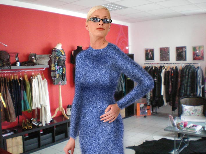 |
Posted on 13/04/12 11:49:33 AM |
|
Jota120
Ingenious Inventor Posts: 2615 Reply |
Re: Challenge 397: Dress her up
Thanks again Steve. >a bit of tidying needed there Agree. I was going to be a seamstress and pipe or hem the top. Seems I got caught short. I was worried running out time/memory would fail very shortly with nothing to post. So much Warping, two parts, probably no one can see that on the fabric. Tried Liquify much later in process, and my bias against it has gone, I got under control. I will try to complete my other version with all the folds later and post under the other topic of Readers' Gallery. Its a real challenge. Thank you very much for that, and not finished from here. PS This is Bridget Riley-esk, hence the design and my much folded version of one of her paintings in background, 100%! Refreshing tour! |
Posted on 13/04/12 1:18:57 PM |
|
Nick Curtain
Model Master Posts: 1800 Reply |
Re: Challenge 397: Dress her up
Thanks Steve I was going for the figure hugging summer dress look and the ones I looked at didn't seem to have too many folds. I applied texturiser to the base cloth, but maybe it was too subtle. Nick |
Posted on 13/04/12 4:19:05 PM |
|
puffin31939
Montage Mariner Posts: 383 Reply |
Re: Challenge 397: Dress her up
"easy on the typography" Normally I am super fussy about the number of fonts used. However, not being a reader of this sort of magazine, I pinched the cover basics from another source. I assumed that was how that sort of magazine presented itself. Just shows it is better to use your own ideas! Warp tool - never thought of that. Yet another lesson learnt. Thanks, Steve _________________ Man cannot change the direction of the wind but he can adjust the sails |
Posted on 13/04/12 7:04:29 PM |
|
marlcliff
Knight of Intrigue Posts: 171 Reply |
Re: Challenge 397: Dress her up
Thank Steve err yess woolen dress i was going for shabby chic (whatever that means)lol |
Posted on 13/04/12 9:14:19 PM |
|
brewell
Pixel Pentagrammarian Posts: 752 Reply  |
Re: Challenge 397: Dress her up
The final product wasn't as important as the quest to create a pattern. I had much fun with light modes and textures and filters, and then displaced everything. But yes, it kind of looks like something designed by a biologist. _________________ Onward and upward! Excelsior! |
Posted on 14/04/12 3:59:15 PM |
|
Deb Raskin
Bodywork Boss Posts: 63 Reply |
Re: Challenge 397: Dress her up
Thanks Steve for sharing your expertise in such a personalized manner. It is so helpful and very much appreciated. |
Posted on 15/04/12 07:38:32 AM |
|
tooquilos
Wizard of Oz Posts: 2970 Reply |
Re: Challenge 397: Dress her up
Thank you Steve  _________________ Wicked Witch of the West: I'm melting! I'm melting! |
| page: 1 2 3 4 last |