
| » Forum Index » The Friday Challenge » Topic: Challenge 399: Match the scene |
|
Posted on 26/04/12 7:22:15 PM |
|
brumtaffy
* Posts: 22 Reply |
Re: Challenge 399: Match the scene
Should there be a red light above the white doorway James? 
Great stuff |
Posted on 26/04/12 7:48:43 PM |
|
Nick Curtain
Model Master Posts: 1800 Reply |
Re: Challenge 399: Match the scene
Thanks Josephine The Spiders always did keep a low profile. Nick Another stunner James. |
Posted on 26/04/12 9:51:36 PM |
|
marlcliff
Knight of Intrigue Posts: 171 Reply |
Re: Challenge 399: Match the scene
Not sure i got the colours match right but i did learn to use a new tool in photoshop 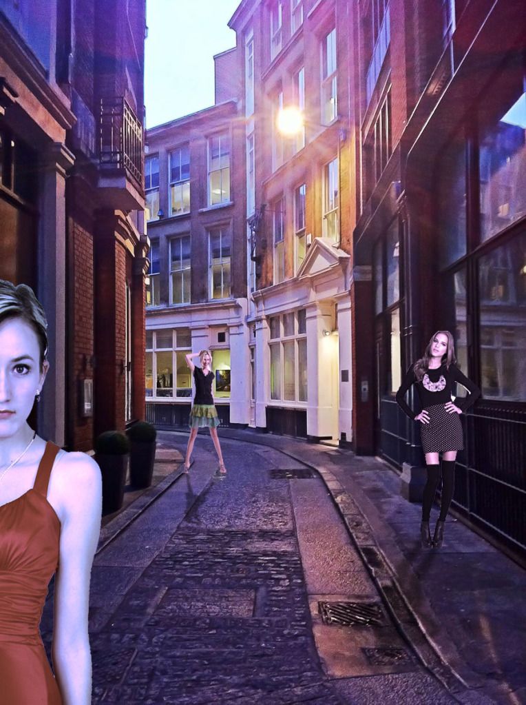 |
Posted on 26/04/12 10:17:57 PM |
|
Jota120
Ingenious Inventor Posts: 2615 Reply |
Re: Challenge 399: Match the scene
Welcome as well Arijel
Chicken or egg? 
Can see I'm going to get an, errr, less than -c-ve comments from Mr Caplin. Can't stop what I do though 
I still have another up my sieve, might be more juxtaposed, but good luck, my shirt sleeves are long at the moment .. 
|
Posted on 26/04/12 10:38:59 PM |
|
Emil
KAFKAsFRIEND Posts: 413 Reply |
Re: Challenge 399: Match the scene
Hello to everybody, a lot of great ideas. Here is my quick try, yes the drops on front window are too big :-). 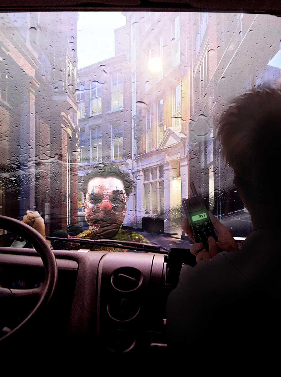
_________________ For me the creative process is more one of discovery than creation. - James Lee Burke |
Posted on 26/04/12 10:54:43 PM |
|
Jota120
Ingenious Inventor Posts: 2615 Reply |
Re: Challenge 399: Match the scene
Very great execution Emil. Great image. He should try 999 (uk) and/or 112 in Europe. I guess you know. |
Posted on 26/04/12 10:57:43 PM |
|
Emil
KAFKAsFRIEND Posts: 413 Reply |
Re: Challenge 399: Match the scene
of coarse you right. Thank you Trevor. _________________ There are most happy who have no story to tell. - Anthony Trollope. |
Posted on 26/04/12 11:39:07 PM |
|
james
Surreal Spoofer Posts: 1194 Reply |
Re: Challenge 399: Match the scene
Thank you Brumtaffy & Nick. A red light  not sure it's the right district not sure it's the right district |
Posted on 27/04/12 00:06:35 AM |
|
Jota120
Ingenious Inventor Posts: 2615 Reply |
Re: Challenge 399: Match the scene

Stop running away with my dad's money, we need it...(he can RIP) (my dad will kill you if you touch me) |
Posted on 27/04/12 03:03:27 AM |
|
Artwel
Satire Supremo Posts: 607 Reply |
Re: Challenge 399: Match the scene
Deborah Morley I really like that fox _________________ Quote of the day.. "Photoshop isn't really meant to be used for drawing".. |
Posted on 27/04/12 03:18:21 AM |
|
Artwel
Satire Supremo Posts: 607 Reply |
Re: Challenge 399: Match the scene
Didn't have time this week but thought I better get something done!.. I'm ashamed to put my name to this.. But good job everybody else! 
 _________________ Art Is Never Finished, Only Abandoned. |
Posted on 27/04/12 09:07:48 AM |
|
Steve Caplin
Administrator Posts: 7157 Reply |
Re: Challenge 399: Match the scene
One of the things most of you had difficulty with this week was what do do about shadows. Is most of the light coming from the street lamp, or from the sky? A glance at those two rather peculiar round business in big puts, on the left, should give you the answer. The light is almost all coming from that lamp: the ground on the side of the pots nearest us, and indeed the near side of the pot, is almost entirely black - and you can see the equivalent shadow, cast in the opposite direction, by the pillar opposite: 
First to fill the street was Ant Snell, with a rather fine marathon scene - and the late (and somewhat creepy) Jimmy Saville leading the pack. A great banner, and I like the man lying in the doorway. But why do your runners have such soft edges? And no shadows? I like Josephine Harvatt's snow scene - very light snow, and none of it has settle yet. The signs work well, but is the one in front too big, and leaning over to the right? I like the man, too, but feel he could really do with a shadow. A "diabolical" scene from brumtaffy, with multiple views of a boy playing with a diabolo. I like the way they recede in perspective down the street, and there's a good sense of action in the figure right in the foreground. Some Motion Blur on the diabolo would make it look more like it's moving, though; and the lighting needs to match the street more! I like all the Harrys in the second entry (Redknapp, Worth, Flash and Potter, Hill) - what, no Houdini or Corbett? Hope you're finding the book useful - welcome to the Forum! An interesting trio from Ben Mills, with the Queen, Reagan and Thatcher ambling down the street. I like the general lighting direction, but it could be a little stronger than this. And why is Reagan's shoulder evaporating into nothing? Bit of a cutout issue here? Good colouring on Vibeke's people, who match the tone of the street perfectly. I like the poses, too. But don't forget those shadows! A fun-packed scene from brewell - all those sinister people, including a woman who has unfortunately forgotten to put her skirt on. It's a very interesting arrangement, full of intrigue. But it needs shadows cast by the ensemble, as well as on them! A very strong scene from munchonu, with dead fairies littering the streets - and the silhouette of a fearsome beastie creeping up behind. Good use of light and shadow here, and a powerful sense of drama. Good stuff. I really like the figure at the front of PDelavigne's entry - a perfectly captured sense of paranoia. The soldiers all seem too brightly lit, though, and actually it might be better with just one of them; in fact, I'd ditch them entirely and stick with the man looking back at us in the distance - I think this would make for a much more subtle image. Sinister work from Frank, with not one but two spooky figures stalking the streets. Excellent lighting on both the girl and the figure in the distance - although his shadow should be at slightly more of an angle, pointing directly towards the light. And should the head of the spook on the right be quite so compressed? I'm very impressed with Old Salt's entry - not just because this is the first decent use I've seen of CS6's new Oil Paint filter, but because the scene has been so artfully put together. The subtle shading on the figures in the foreground, the queue of figures at the back, and the thoughtful direction of the shadows - all very well considered. And I always was a fan of Edward Hopper. A slightly harsh cutout on the roofline, though: perhaps a little less black in the sky would help? A truly glorious entry from James this week, with a car turning the corner (how did you manage that? It all happens so fast) before zooming not just down the street, but out of it entirely. And there you are, in the driving seat. Terrific! Fantastic walking action in the second entry - the swinging arms really make it work well. All they need is some shadows... A fine entry from Sjef, with a very glassy-looking box (I like the subtle reflections) and a neatly-dug hole. But it's the interplay between the two figures that works especially well: very well chosen poses! I think the woman could do with a reflection in that shiny patch of road in front of her, and certainly a shadow, but otherwise this is a splendid piece of work. A fantastic mugging scene from Deb Raskin, with a most unusual mugger. The colours are just right, the poses perfect, The only real problem is the direction of the shadows: they need to point directly away from the light source. Otherwise, excellent. I like Jimbean's flood scene - plenty of action going on there. The figures, and indeed the water, do need to match the strong purple colouring of the scene, though. And do watch the white fringe on your cutouts: the Defringe command can help here, or failing that delete 1 pixel around the edge. A rather beautiful animation from michael sinclair, with terrific rippling in the flooded road. Before you ripple, though, you need to adjust the angles of the reflected buildings: the one with the peaked door needs to be sheared down to the right, so that it follows the perspective line to the vanishing point. Very smooth action - there must be a lot of frames in this! A topical entry from bjansen, with the Titanic adrift on a flooded road. The figure in the foreground is well lit, and casting an appropriate shadow. But your reflection shows only the upper floors: what's happened to the ground floor? A tricky perspective issue from puffin31939 - and it is hard to work out, what with the street bending so many corners. I think it's largely a matter of relative scales: the back wheel of the cyclist is right by the couple next to him, but he seems much larger than they are. The others are mainly fine! But do watch the fringing on the man in the foreground - delete a 1-pixel edge, or Defringe, to get rid of it. I like Ben Boardman's entry, with lots of interesting characters, but I'm having trouble reading the story here: Obama Condoms? Money needed for weed? A cart and horse? What an interesting street this is! A tremendous Victorian carnival scene from tooquilos, which has the feel of one of those Hidden Object games to it - so much to look at, so many details! Great to see it all brought to life in the animated version. One tip: you can place elements you're going to zoom in on, such as the table with the crystal ball, at a much higher resolution in After Effects, so when you blow them up they don't pixellate. Great title sequence! An apocalyptic vision from Mariner - very nicely achieved, with a real sense of menace (although I don't think the tank could make it any further down the street). Much stronger shadows needed, though: look at the pots for how to do it. A first Friday Challenge entry from Arijel, with a selection of How to Cheat skeletons filling the street. A couple of things: you need to tint them all to match the colour of the street; and the one on the right needs to have his skull stretched so he's not so thin. Good reflection, though! A very fine, simple scene from Deborah Morley - London is full of urban foxes, and they do stop and look at you just like this. I'd add some more shading to the front, though, since he's lit entirely from behind. A good ground shadow! I like Garfield72's taxi entry, but I do have to question your headlights: if they're bright enough to light the whole street like that, then the lights themselves should be much brighter. Oh, and a small point: if the taxi is for hire his light needs to be on. Something like this: 
I was most amused by Nick Curtain's Ziggy Stardust image, using elements from the early David Bowie album. A great colour shift, too, to match the lighting in the original. My only problem is with the K. West sign, which needs to be sheared down a little - otherwise, perfect! A high-energy scene from joeysala, with a load of kids breakdancing down the street. They fit well, with good shadows on the ground, and the dance poster in the window is a good addition. The only thing that bothers me is the baby on the right - too bright, too small, and not needed! A nicely stark image from Jota120, with the skeleton of a chicken (?) menacing the street... or perhaps it's a dinosaur of some kind. I like the desaturated look! But where's the bird's shadow? I like the statue in the second entry, but it really does need to be lit in a way appropriate to the street! A good composition from marlcliff - I like the way the girl in the front is half out of the frame. Good eyeline alignment, and not a bad attempt at the shadows - but they all need to point directly away from the light source. An extraordinary nightmare scene from Emil, with a car being menaced by a spooky clown. You need a reflection of the dashboard in that windscreen to make it look like glass - and which decade did you get that phone from? A very interesting scene from Artwel. I like the balls, the refraction in the glass spheres, and the way the street has been bent around - perhaps a light needed on the nearest corner? A very refreshing approach! Good work all round - very entertaining entries. |
Posted on 27/04/12 09:36:39 AM |
|
james
Surreal Spoofer Posts: 1194 Reply |
Re: Challenge 399: Match the scene
Those shadows, so damn elusive. |
Posted on 27/04/12 09:52:47 AM |
|
munchonu
Horror Master Posts: 277 Reply |
Re: Challenge 399: Match the scene
Thank you very much Steve! Doug |
Posted on 27/04/12 10:03:22 AM |
|
josephine harvatt
Gag Gadgeteer Posts: 2605 Reply |
Re: Challenge 399: Match the scene
I must confess to a most dreadful cheat - I had a very similar street shot in terms of both perspective and lighting ,elements of which I used to combine with yours. Looking at it more closely the perspective was not quite the same (me being shorter than you) and yes, I should have tweaked the angle of the signage. I think the size is OK though (they were big boards) The new frontage on the right is also looming at the top now I look at it - I'll put that one down to the age of the building!  _________________ I'm not really bad - I just draw that way |
Posted on 27/04/12 10:11:23 AM |
|
Emil
KAFKAsFRIEND Posts: 413 Reply |
Re: Challenge 399: Match the scene
Thank you Steve, yes the dashboard reflected on windscreen _________________ There are most happy who have no story to tell. - Anthony Trollope. |
Posted on 27/04/12 10:13:24 AM |
|
Jimbean
Sparky Shopper Posts: 105 Reply |
Re: Challenge 399: Match the scene
Thanks Steve, instructive comments as usual, never thought of using "defringe" command but will in future!!  |
Posted on 27/04/12 10:40:35 AM |
|
puffin31939
Montage Mariner Posts: 383 Reply |
Re: Challenge 399: Match the scene
Bother - how did I miss that fringing? It is so obvious now. I am pleased that I mostly got the perspective right. Must be making progress. Thanks, Steve. Sorry, I can't join in with the 400th Challenge. No time this week. _________________ Man cannot change the direction of the wind but he can adjust the sails |
Posted on 27/04/12 11:14:13 AM |
|
Nick Curtain
Model Master Posts: 1800 Reply |
Re: Challenge 399: Match the scene
Thanks Steve Glad you liked the image. I was so busy last weekend, just didn't have a chance, so my entry was a bit of a rush job. I tried Match Colour for the first time, using the album cover as the source and PS did a wonderful job with only a slight levels adjustment needed to fix the contrast. Nick |
Posted on 27/04/12 11:18:33 AM |
|
tooquilos
Wizard of Oz Posts: 2970 Reply |
Re: Challenge 399: Match the scene
Thank you Steve. I used Premiere to zoom into the crystal ball which was clearly a mistake lol. Next time Ill use a camera and zoom properly in AE _________________ Dorothy: "there's no place like home!" |
| page: 1 2 3 4 last |