
| » Forum Index » The Friday Challenge » Topic: Challenge 437: The holy grail |
|
Posted on 24/01/13 9:18:38 PM |
|
darrenandcolleen@telus.net
Serene Synthesist Posts: 119 Reply |
Re: Challenge 437: The holy grail
 |
Posted on 24/01/13 9:39:03 PM |
|
marlcliff
Knight of Intrigue Posts: 171 Reply |
Re: Challenge 437: The holy grail
All hail to the ale 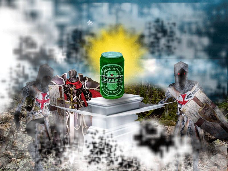 |
Posted on 24/01/13 10:59:40 PM |
|
michael sinclair
Off-Topic Opportunist Posts: 1871 Reply |
Re: Challenge 437: The holy grail
The Teutonic Knights don't like this new-fangled mead. 
|
Posted on 24/01/13 11:03:13 PM |
|
michael sinclair
Off-Topic Opportunist Posts: 1871 Reply |
Re: Challenge 437: The holy grail
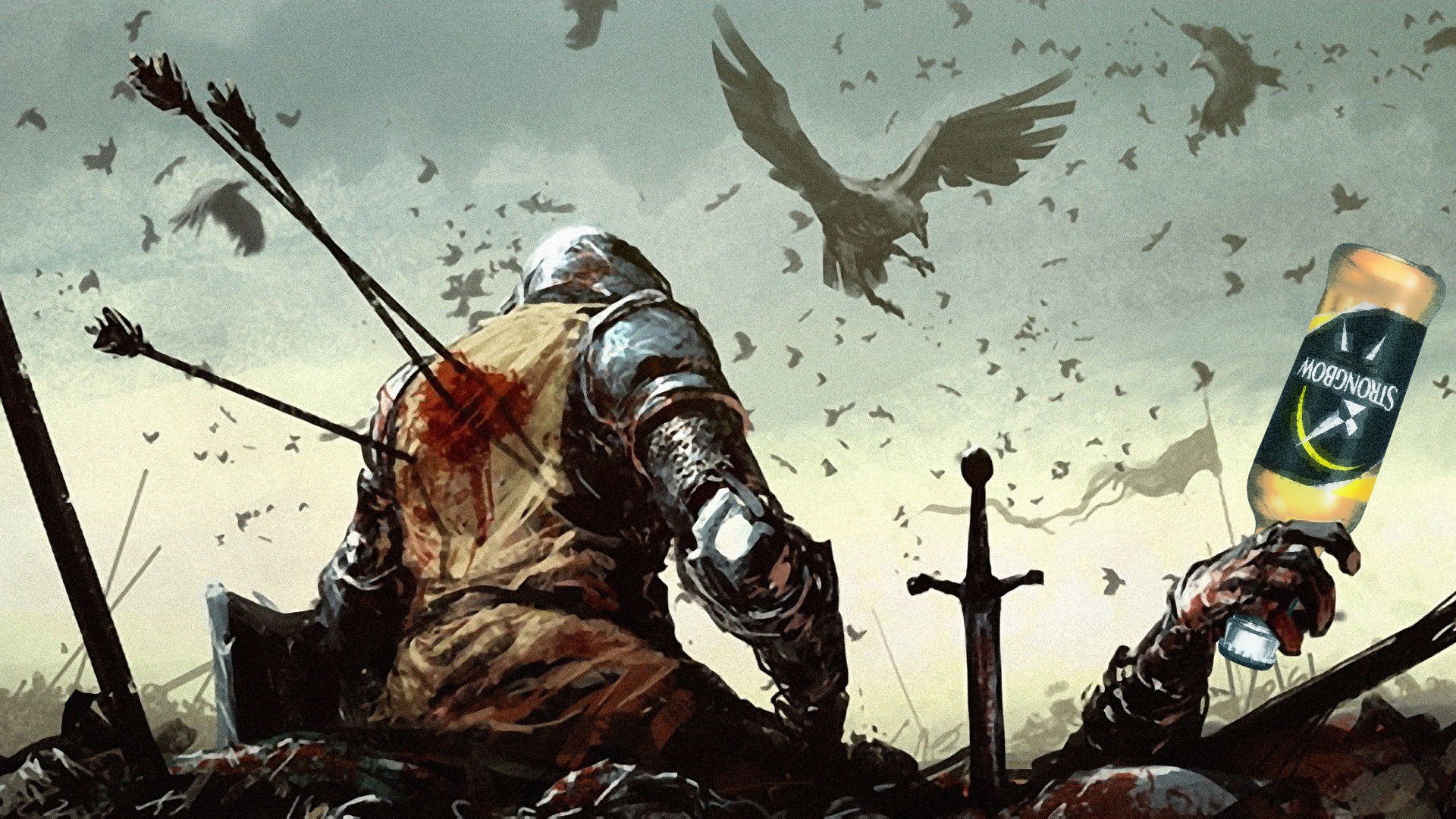
Strongbow cider...worth getting killed for...
|
Posted on 25/01/13 00:28:53 AM |
|
joeysala
Perfect Palmist Posts: 604 Reply |
Re: Challenge 437: The holy grail
[quoted] Deborah Morley wrote: Think I failed in this as the beer can is just to small in the image. Deb - in my opinion, you did a great job incorporating all the "parts"; especially the athmosphere! One thing I'm a bit confused about - and I hope you don't mind - is the light beams. I'm not sure they would fall on the front of the knight....??? And, the "glow" certainly worked! _________________ "Imagination, not invention, is the supreme master of art........" Joseph Conrad |
Posted on 25/01/13 02:27:51 AM |
|
joeysala
Perfect Palmist Posts: 604 Reply |
Re: Challenge 437: The holy grail
Michael - I just "read" your beer can......  _________________ "Imagination, not invention, is the supreme master of art........" Joseph Conrad |
Posted on 25/01/13 04:37:52 AM |
|
Artwel
Satire Supremo Posts: 607 Reply |
Re: Challenge 437: The holy grail
Looking for a Premium quality beer, but without the premium price tag?.. Discover your Can Of Gold today!  _________________ "Predictions are difficult. Especially about the future" |
Posted on 25/01/13 04:48:19 AM |
|
Artwel
Satire Supremo Posts: 607 Reply |
Re: Challenge 437: The holy grail
Sorry wrong one, this one had slightly more colour.. 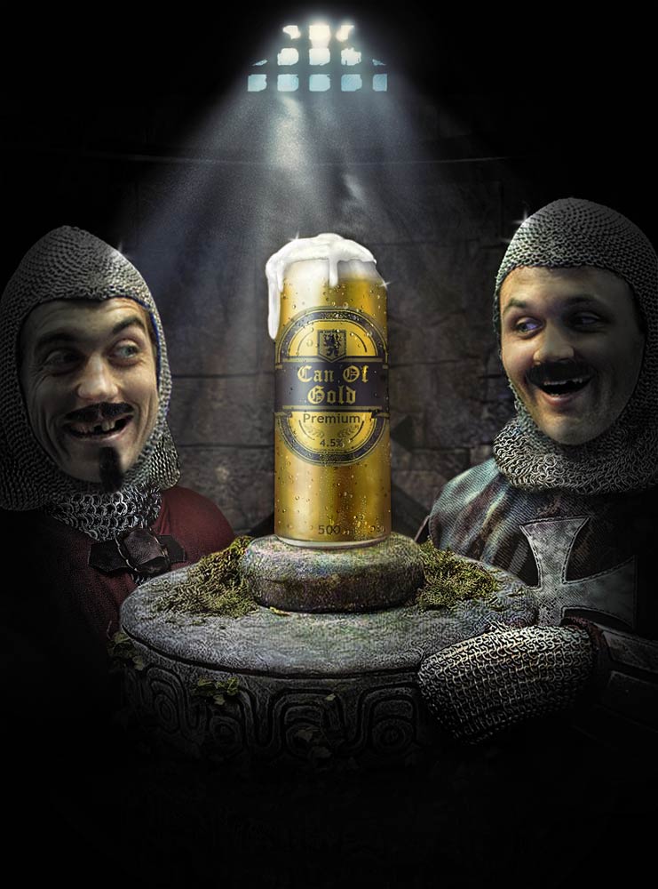 _________________ "If we don't succeed, we run the risk of failure" |
Posted on 25/01/13 09:54:00 AM |
|
Steve Caplin
Administrator Posts: 7157 Reply |
Re: Challenge 437: The holy grail
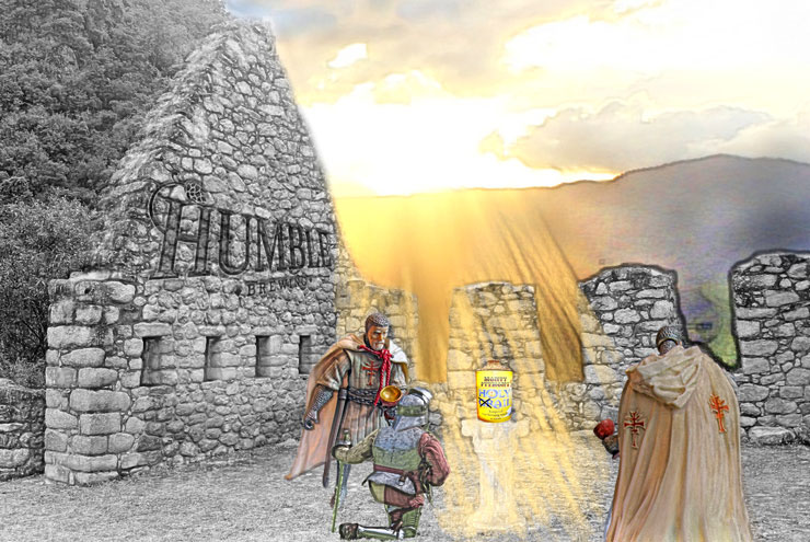
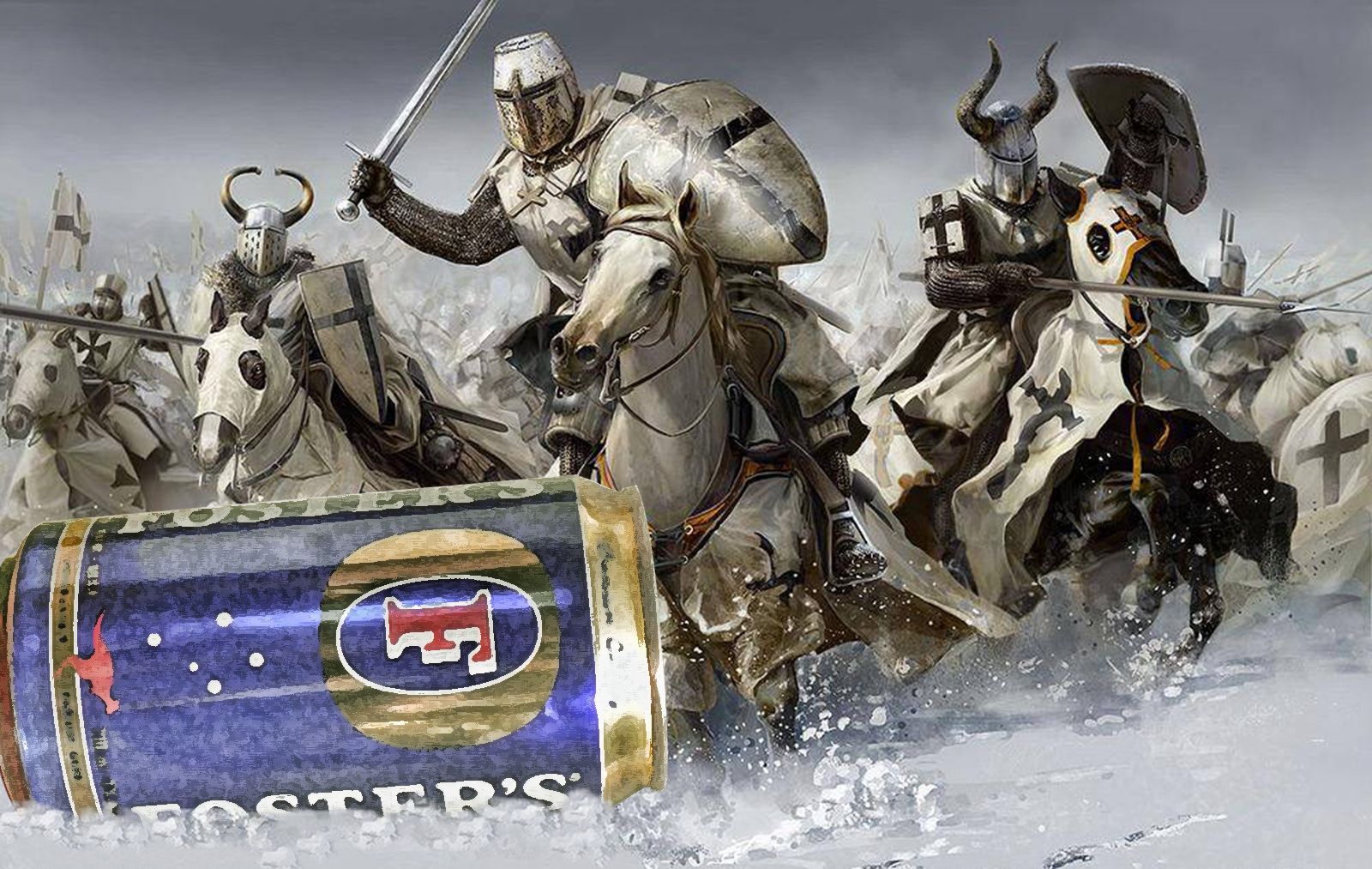
Congratulations to all of you who followed the brief and produced an image to the correct proportions. The rest of you, who chose a landscape format, wont get commissioned again. One of the key factors when working to a brief is to submit your work at the right size! First entry this week was from GKB, with a magnificent can atop a desert mountain. A great sunburst effect, and a cute pair of toy knights in the foreground. Two small points: the text should really be a less modern font for such a word as Halleluja; and to prevent the knights from looking so obviously duplicated, it would be better if the right one were holding the sword in his other hand - you could mask the existing hand with a shield. I was very amused by the second entry, too, with Nelson moved to one side to make room for the can. Terrific matching of perspective! A rather sad third entry, but again great perspective (and I like the amendment on the can). I especially like the lettering on the plinth - finally getting into 3D in Photoshop? I liked Josephine Harvatt's adaptation of the Byrne-Jones painting, with the can the object of adoration. But why do I get the sense that the can doesn't really fit in the space? Could it be something to do with (aaargh) perspective? An entertaining entry from Sjef, with a newspaper mockup that incorporates a clever interpretation of the brief - complete with grail beneath the can. But you really need to take a new look at a newspaper, Sjef! That overlapping typography... the statue image busting through the masthead... they just dont do that! Good to see the grail image larger, for a closer look. Are the knights a little too far into the distance? I enjoyed the second entry - but watch your spelling of independent! A good selection of modern knights from Ben Mills, even if one of them is actually a Lord. The Simpsons branded Duff Beer is a great choice, but you could do with some shading on the label to match the can, I think. Good lighting, and I like the way theyre all looking at the can. A great arrangement from Vibeke, with the knights clustered around a plinth bearing the can (are they from the stage version of Spamalot? Im sure I can hear a distant Ni). Carlsberg, eh? A touch of Danish heritage pride there? Arthurian overtones from James - why do I get the impression hes just pulled his sword out f the barrel? But either way, thats a very short barrel! I like the animated version, with the fox in the bowler hat. Subtle movements from all, as usual - very nicely accomplished. A chilled lager from tooquilos, encased in a block of ice - at the South Pole? Wouldnt it be cold enough already? but a great sunlight effect, and a fine pair of knights. A great piece of fantasy in the animated version - love the melting ice - but that must the your worst soundtrack yet! Where do you find all this stuff? A fine pair of grim-looking knights from Garfield72, with the bottle very neatly perched on a suitably crumbling plinth. I like the lighting, which perhaps could have been combined with the starburst in the second entry; try including that burst on the original sky background. Just one thing: the story is about how decent beer is now available in cans... I like the single burst of light illuminating brewells beer can, although Im not sure about the perspective of the top of the plinth - shouldnt we be looking down on it from this position? Its always tricky finding images of people from behind, and when you can only find low resolution images theres a simple solution: make them much bigger and bring them to the foreground, adding a lot of blur so it looks like theyre simply out of focus: 
Theres a great texture to KateW's entry, with fine lighting and a subtle flare on the can. The knights, though, seem curiously disengaged from the process: perhaps slightly more animated poses would help? And, er, they seem to have been caught red-handed... The original Monty Python knights finally make an appearance in sciteach's entry, all staring convincingly at the can on the plinth. A great setting, even if the image is the wrong shape, although Im not sure Lite Beer really gets the point of the illustration across! A great twist from puffin31939, with the beer replaced by a cup of tea and the knights by a couple of appropriate damsels. Are those sprigs of tea bush theyre carrying? A lovely image, the stencil lettering for the word Tea evokes memories of tea chests, and the steam rising from the cup is perfect. Excellent stuff! A highly dramatic image from Frank, with a stormy sky and some truly rugged knights. I very nearly used the one on the right myself - I really like the way youve moved that leg to lean against the plinth. The toppling bottle is a great touch! A very accomplished piece of work, Frank. The only negative point Id make is that its a magazine illustration, not a poster, and so shouldnt have all the wording. A splendid entry from michael sinclair, with the beer can beautifully lit and forming a great centrepiece of the image. Id adjust the perspective of the can, though, to match the strong angles of the surroundings: 
I like the second entry, though, with its great sense of drama, although you have gone somewhat off topic in the third entry. Extraordinary work from BigVern, with an image made almost entirely using Photoshops 3D tools - really, this is amazing! The reflections on the can, the texture of the helmet, the shine on the sword - beautiful work. Modelling the visor alone must have taken an age. And what a great final result! Just add a little more light to the can itself, so it jumps out, and it will be perfect. Knights of a different sort from joeysala, with the first chess entry of the week. Great shadows and lighting - I especially like the way the shading works on the king. You need to look at the perspective of the can, though: were looking up at it, so the bottom edge should be curving up, not down. Another chessboard, this time from Mariner - with a fine custom beer can. Ale from heaven, hangover from hell - what a great line! Its a potentially fine image, but that multicoloured floor really throws the perspective out. Replace it with a photographed scene and the image will be a hundred times better. A very moody image from Deborah Morley, with three highly suspicious-looking knights. I like the light on the face of the one on the right, which points very neatly to the sun. And the glow in the second entry is a good touch! Theres no reason why the beer can should be life size, though. This is fantasy, after all. I like the texture of darrenandcolleen's entry, and the way the knights are all grouped around the beer can. Thats a great sunburst, as well, very delicately coloured. But the perspective on your brewery sign is all over the place! Follow the rough lines of the stones, or at least the angle set by the tops of the windows, to match the perspective of the scene. A very intriguing image from marlcliff, with a glassy plinth rising out of the ground and some distinctly spooky red-eyed knights (obviously a couple of very late knights, ha ha). There are some oddities here - the perspective of the beer can could do with flattening to match the scene - but what I really like about this is the extraordinary blocky textures overlaid on top, which give the whole image a real sense of mystery and intrigue. I dont now where the idea for that came from, but its very surprising and very effective. Time for a very belated title for you, Phill - and I think Knight of Intrigue suits this weeks image best. Good work! A cheery couple of knights from Artwel, with a foaming can (thats a great idea!) that, somehow, seems to have found its way into a dungeon. Good lighting, and I like the way the can really stands out here. Excellent work all round this week - I should do more of these real-life Challenges. For what its worth, this was my version:  |
Posted on 25/01/13 10:14:59 AM |
|
brewell
Pixel Pentagrammarian Posts: 752 Reply  |
Re: Challenge 437: The holy grail
Great tips especially about the blur. The plinth is fixable, and as far as the landscape, my dreams are dashed.   _________________ Is it necessary? Does it work? |
Posted on 25/01/13 10:15:42 AM |
|
josephine harvatt
Gag Gadgeteer Posts: 2605 Reply |
Re: Challenge 437: The holy grail
Not the dreaded P-word!  _________________ I'm not really bad - I just draw that way |
Posted on 25/01/13 10:16:13 AM |
|
GKB
Magical Montagist Posts: 4139 Reply |
Re: Challenge 437: The holy grail
Good morning Steve, I'm afraid Cinema 4D was the software of choice for the the 3D work. And I do agree with the idea of using 'real-life' briefs for the odd challenge. BTW the Holy Grale beer is actually made by Sheherd Neame. _________________ You're never too old to learn something stupid. |
Posted on 25/01/13 10:23:16 AM |
|
joeysala
Perfect Palmist Posts: 604 Reply |
Re: Challenge 437: The holy grail
I thought the perspective seemed off, too - but actually, that "curve" is part of the label design. This was a fun one, Steve.......and very challenging! _________________ "Imagination, not invention, is the supreme master of art........" Joseph Conrad |
Posted on 25/01/13 12:46:59 PM |
|
katew
Virtual Virtuoso Posts: 681 Reply |
Re: Challenge 437: The holy grail
Thanks Steve. Funny, those hands didn't look that red in the version on my computer! |
Posted on 25/01/13 2:33:22 PM |
|
BigVern
Q Quipper Posts: 674 Reply |
Re: Challenge 437: The holy grail
Thanks Steve, it really did take an absolute age to build the visor and sword in bits in 3D but I have learnt so much in doing it and now feel quite confident about doing more 3D modelling. I learnt a great deal by following the short video tutorials of Daniel Presedo (an Adobe employee specialising in Photoshop); he has a YouTube channel called Dramenon with a whole series of tutorials clearly explaining each aspect of 3D modelling, scene setting and lighting using PS.. I'll have a go at brightening the can. Cheers Vern _________________ "Why so serious?" |
Posted on 25/01/13 3:01:36 PM |
|
puffin31939
Montage Mariner Posts: 383 Reply |
Re: Challenge 437: The holy grail
Thanks, Steve. I'm delighted with your comments as I nearly didn't try this one. And when I did I almost gave up as I couldn't get my photos of the cup to match the plinth. Finally my husband came to the rescue by telling me how to take the photo in the correct perspective. I think the perspective bit in my brain is absent! _________________ Man cannot change the direction of the wind but he can adjust the sails |
Posted on 25/01/13 5:46:50 PM |
|
josephine harvatt
Gag Gadgeteer Posts: 2605 Reply |
Re: Challenge 437: The holy grail
Join the club mate _________________ I'm not really bad - I just draw that way |
Posted on 25/01/13 6:49:29 PM |
|
michael sinclair
Off-Topic Opportunist Posts: 1871 Reply |
Re: Challenge 437: The holy grail
Thanks for the perspective tip Steve: A schoolboy error which I should have known  |
Posted on 26/01/13 12:01:43 PM |
|
Garfield72
Montage Manceau Posts: 353 Reply |
Re: Challenge 437: The holy grail
Thanks Steve, I read too fast, I have not seen it talked cans. |
Posted on 26/01/13 2:24:36 PM |
|
Sjef
Flying Dutchman Posts: 571 Reply |
Re: Challenge 437: The holy grail
Rather would like being able to download your original grail-file Steve. But that won't be possible I suppose...  |
| page: 1 2 3 4 last |