
| » Forum Index » The Friday Challenge » Topic: Challenge 438: The Ford Escort |
|
Posted on 31/01/13 03:37:19 AM |
|
darrenandcolleen@telus.net
Serene Synthesist Posts: 119 Reply |
Re: Challenge 438: The Ford Escort
"Who lives in a pineapple under the sea" love it! |
Posted on 31/01/13 04:58:57 AM |
|
Sjef
Flying Dutchman Posts: 571 Reply |
Re: Challenge 438: The Ford Escort
GREAT STUFF, BREWELL!  |
Posted on 31/01/13 09:10:28 AM |
|
brewell
Pixel Pentagrammarian Posts: 752 Reply  |
Re: Challenge 438: The Ford Escort
Thanks. It just looked like a cartoon car to me. _________________ Onward and upward! Excelsior! |
Posted on 31/01/13 2:14:40 PM |
|
Nick Curtain
Model Master Posts: 1800 Reply |
Re: Challenge 438: The Ford Escort
It's interesting that the Escort is depicted by some as being a rather hippy 1960's love car. Nothing could be further from the truth. While the average family saloon, say an Austin 1100, or Hillman Minx was seeing 0-60 mph in any blistering time between 16 and 23 seconds and with a potential top speed of around 75 - 88 mph, the Mexico set new standards and was the aspiration of many a dad, stuffed with a mortgage and thinking about the first colour telly. The car was a true icon and still is to many and I'm not surprised that this specimen has been loved and cherished. 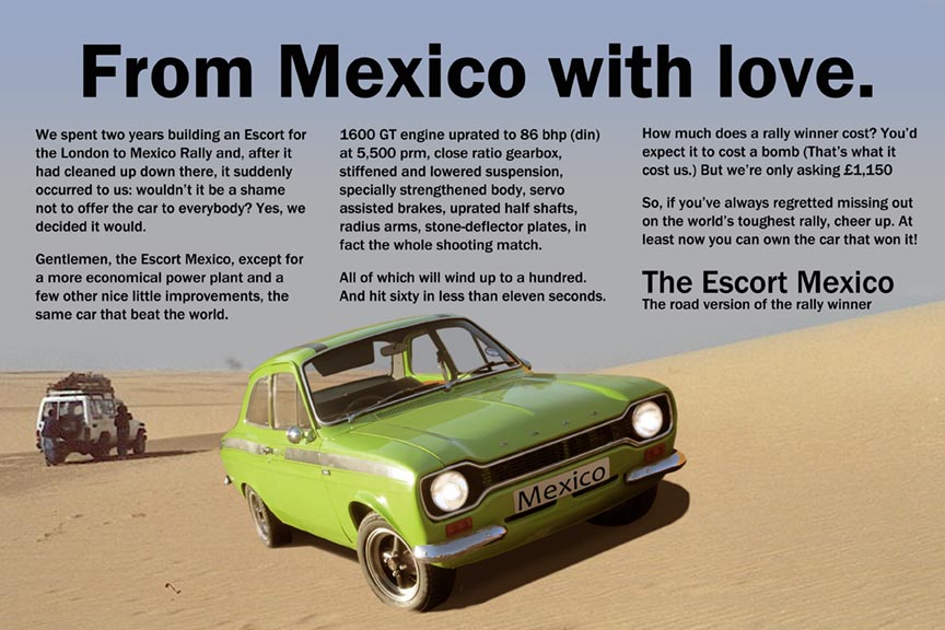 |
Posted on 31/01/13 6:24:47 PM |
|
Deborah Morley
Makeover Magician Posts: 1319 Reply |
Re: Challenge 438: The Ford Escort
Nick, That is just what the owner thought of when I said it was going to be a 60's advert!  |
Posted on 31/01/13 9:18:02 PM |
|
BigVern
Q Quipper Posts: 674 Reply |
Re: Challenge 438: The Ford Escort
_________________ "We don't need roads where we're going!" |
Posted on 31/01/13 9:38:06 PM |
|
BigVern
Q Quipper Posts: 674 Reply |
Re: Challenge 438: The Ford Escort
Some funny and clever work this week. Here's my effort ...  _________________ "We don't need roads where we're going!" |
Posted on 31/01/13 11:30:37 PM |
|
marlcliff
Knight of Intrigue Posts: 171 Reply |
Re: Challenge 438: The Ford Escort
not sure if this is what the brief ment i just like putting pretty girls in my pictures 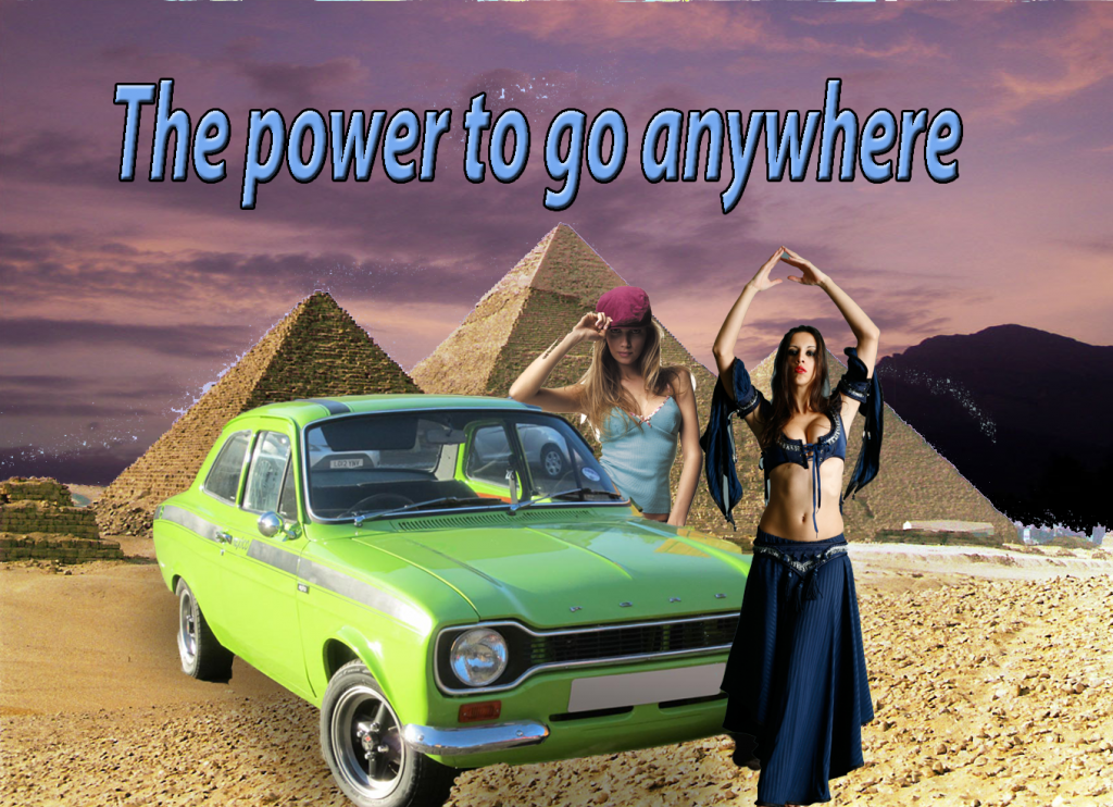 |
Posted on 01/02/13 04:28:16 AM |
|
Artwel
Satire Supremo Posts: 607 Reply |
Re: Challenge 438: The Ford Escort
Okay, maybe it's not quite in the 60's style. 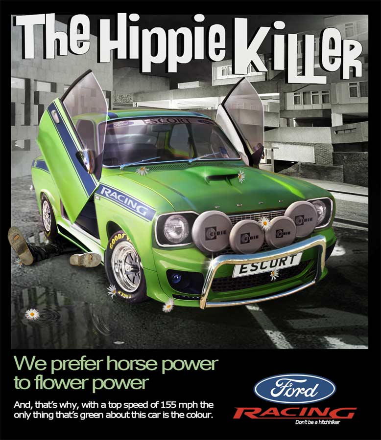 _________________ "Predictions are difficult. Especially about the future" |
Posted on 01/02/13 06:56:39 AM |
|
joeysala
Perfect Palmist Posts: 604 Reply |
Re: Challenge 438: The Ford Escort
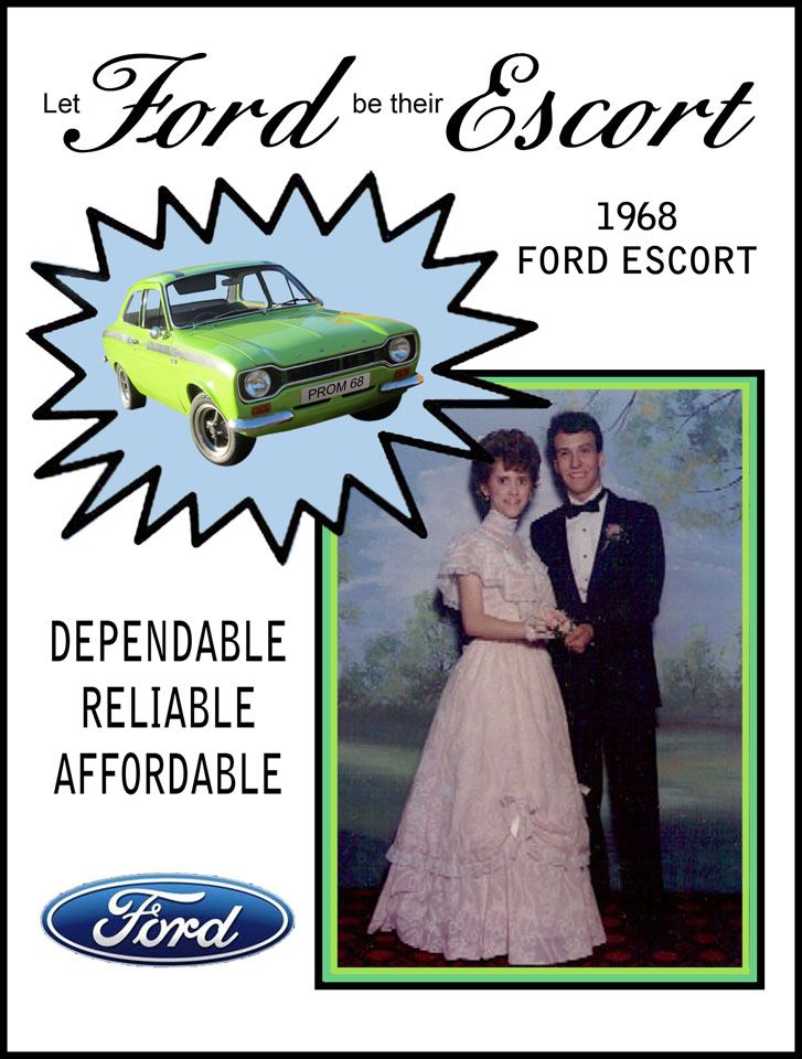
Sorry in advance for the lame entry......very last minute due to a week of %@#&& doctor appointments. Oh well......  _________________ "Imagination, not invention, is the supreme master of art........" Joseph Conrad |
Posted on 01/02/13 07:02:19 AM |
|
BigVern
Q Quipper Posts: 674 Reply |
Re: Challenge 438: The Ford Escort
Artwell ... Amazing! _________________ "Why so serious?" |
Posted on 01/02/13 09:30:44 AM |
|
Steve Caplin
Administrator Posts: 7157 Reply |
Re: Challenge 438: The Ford Escort
The first entry this week was from tomiloi, with the car neatly inserted in an action race shot. A great angle, a good fit, I like the way the windows have been cut out. But is it really likely that everything would be blurred in a racing shot? I could accept either the car or the background, but surely not both? And, er, no driver? A great setting from Sjef, in an old railway station with the Coliseum outside and a fantasy figure for good measure. I like the feel of this, and the streaks of light have been well reproduced in the shine on the car. I'm not sure about the typography, though - it seems too relaxed for a corporate advertisement! Total hipness from Josephine Harvatt, with a psychedelic paisley background and colour-dazzle lettering. Great custom number plate! Perhaps the view through the windows should be amended... Glorious modifications from Darren (I think I'm going to abbreviate to just your name from now on) with a fantastic set of add-on shiny chrome extras - even if the girl sitting on top is a rather peculiar shape. I really like the inset images, too, and a neat choice of typography. Nice work! A fine period ad from katew, with a great choice of colours in the pink and green, and the much toned-down blue of the car. The blue in the diamond behind it is much too saturated to be easily printable, but that's a minor point. Great shapes, great text... but please, not Times Roman! A classic advertisement from Ben Mills, perfectly arranged and with a subtle new view through the windows. I'd take another look at the typography, though: there wasn't a font like Myriad in the 1960s. And, er, is the car missing a front wheel? A very clever image from michael sinclair, with the car abandoned on a railway line - and its driver running from the scene. A great view through the windows, and a very good angle on the car with the background; I'd really like to have seen the driver's door left open! I like the subtlety of the second entry - very nicely achieved. A bit of shine and reflection on the windscreen, perhaps? A thoroughly groovy entry from tooquilos, with great period typography and a classic ad layout. Is the car too small for the people? Or is it just too low for that distant horizon? Incredible page-turning in the animated version - and the moving shine on the Ford logo at the end is spectacular! A hugely exuberant entry from Frank, with tremendous 3D lettering and a truly specatular (not to mention specular) shine to the car. Very small point: the tagline under the words Ford Escort needs to be sloping up at the back, so it's closer to the line above and so in the same perspective. But this is a really minor point - it's a fantastic image. Smashing fun from GKB, with a recoloured car that's seen better days. Great bricks and wheel hubs, but what impressed me most about this was the shadow of the half brick lying on the car - perfectly realised. The shadow of the bricks holding the front axle up is interesting. The tip of the shadow must, logically, be cast from the top of the pile of bricks. But at the top of the bricks there's a couple of tons of car! Why the gap in your shadow? A very clever poster from Garfield72, and it's good to see it located on a real billboard - but would they really stick out over the road like this? I prefer the Readymade shot in the second entry - very neat. A very accomplished ad from puffin31939, beautifully arranged and composed. My only real issue is that the family behind the car is very much too big for the car - but their composition and pose are perfect, and it's otherwise a very convincing ad. Ah - I see you've spotted it and corrected it in the second entry. Better! As a general practice, (a) always keep copies of your layers separate just in case you need to amend the look later, and (b) try turning the assembly into a Smart Object rather than merging the layers together. I like the feel of Whaler's entry, with the car lit by a distant volcano. Great shine on the windows, well lit headlights. I'd really get rid of that fence on the right, though, since it draws attention away from the car and doesn't really serve any useful purpose. Good to see Ford are now fitting their cars with ultra heat-resistant tyres, and especially good to see the rear view mirror coming back in the second entry. A dramatic shot from Emy, with a set of cars in rainbow colours - although their angle is a little at odds with the position of the background. Turning the escort into a convertible is a really great idea - and very well achieved. Very good typography, too: but you really need to use the Elliptical Marquee tool to lift that Ford logo off its white background. I like Jota120's souped-up ride, with plenty of added extras... and Stonehenge does make a dramatic backdrop. But - please not Times Roman! Come on, you can find a typeface more appropriate than that! A really clever entry from brewell, with a redrawn car fitting neatly into a Spongebob illustration. I like the outlines and the overall feel, but is the car a little too flat? There seems to be a lot of texture in the background. Wouldn't it look better with a little of that copied onto the car? 
Great to see sciteach's poster so neatly integrated into a workshop setting. It's a great poster, with a thoroughly groovy driver - and a great choice of typography. A couple of points, though: you need to keep the tonal range in line with the strong red cast of the background; and don't distort your poster to fit the space! Far better to make it deeper, and more hidden behind the objects at the back of the bench. A good sense of speed in James's entry - perhaps a touch of mud thrown up by those spinning wheels? You must have made dozens of layers for the animated version: I hope you used step and repeat to scale them down! A truly beautiful car from Mariner, with a thoroughly cleaned-up bodywork, beautifully shiny chrome (great hubcaps!) and a fantastic set of reflections on the glass. All in all a truly immaculate job, Michael - you should be seriously proud of your retouching skills here. A clever montage from Vibeke, showing the Escort replacing a broken old Ford Cortina. I like the transition from doom-laden, cloudy suburbia to a tropical beach, and the cheery family - and a perfect choice of typeface. The only thing that bothers me is the way the family is cut off at the bottom: could they have been faded away, perhaps? A bit of a tirade from Nick Curtain that continues into the copious copy in his advertisement - but, yes, the Escort was always a racer more than a safe family vehicle, and the increased insurance premium recognised the fact. Top marks for historical accuracy! And a very neat montage, too. I like the dramatic angle. A sparkling ad from Deborah Morley, with a neat cutout (although the sunshield could have been folded back up) and an appropriate miniskirted girl for decoration. But... Times Roman! What is it with this forum and Times Roman? It's never the right choice - unless you're reproducing the front page of The Times, and even they don't use it any more. Think creatively! I was very taken with BigVern's entry, both for the glorious typography (Layer Effects working overtime, there) and for the dramatic background. But best of all is the rippling reflection in the car, especially the detail of the way it bends over the bumpers... splendid work. A touch of Egyptian exoticism from marlcliff - and we've noticed your fondness for putting girls in your pictures! Just make sure they're of an appropriate scale - the one at the back is far too big for the car. And do make sure you take out the original view through the windows! A beautifully reworked scene from Artwel, with a gloriously shiny car bedecked with all manner of extras. I really like the windscreen shine and those swivelling doors - and the great choice of 1960s urban background, too. But I'm a little confused: is that a mechanic under the back wheels, or a run-over hippy? A great period concept from joeysala, with a fine custom numberplate and a completely appropriate wedding couple. But that black/green/light green border on the photo is at least two borders too many! It can be simpler than that! Good work for a rush job, though. Great work this week. We really, really need to work on the typography, though. |
Posted on 01/02/13 09:47:11 AM |
|
Nick Curtain
Model Master Posts: 1800 Reply |
Re: Challenge 438: The Ford Escort
A tirade, from me, surely not sir! This was an interesting challenge for me, firstly because I love cars and also because the way the advertisers display them in promotional material has always fascinated me. In the 60s, Ford adopted a very simplistic approach, but did include a few words. I have attached an actual advert for the Mexico. Nick  |
Posted on 01/02/13 09:52:26 AM |
|
Deborah Morley
Makeover Magician Posts: 1319 Reply |
Re: Challenge 438: The Ford Escort
Thanks Steve. I attach a shot of another advert, which is why I chose that typeface.  |
Posted on 01/02/13 10:03:39 AM |
|
brewell
Pixel Pentagrammarian Posts: 752 Reply |
Re: Challenge 438: The Ford Escort
We don't want to make it look dirty. I agree that more texture is needed, but it has to be related to the base color. I'll see what I can come up with. _________________ The journey of a thousand hours begins with a single layer. |
Posted on 01/02/13 10:18:25 AM |
|
Mariner
Renaissance Mariner Posts: 3298 Reply |
Re: Challenge 438: The Ford Escort
Thanks, Steve. I did consider having Jordan (Katie Price) leaning against the wall. An Escort. I can't believe what I just wrote. |
Posted on 01/02/13 11:18:09 AM |
|
puffin31939
Montage Mariner Posts: 383 Reply |
Re: Challenge 438: The Ford Escort
Thanks, Steve. I based the ad partly on a genuine 1960s advert for the Ford Anglia. The family I found looked fairly glum so I had to tweak their mouths a little. I had kept the layers but had also copied and merged them before the final filter. I didn't have to go all the way back - just redoing the last filters. I am just starting to work through your video2brain tutorial on Smart Objects so hopefully I will be making proper use of Smart Objects soon. _________________ Man cannot change the direction of the wind but he can adjust the sails |
Posted on 01/02/13 11:53:33 AM |
|
Artwel
Satire Supremo Posts: 607 Reply |
Re: Challenge 438: The Ford Escort
Thanks Steve. You can run over Hippies or mechanics. With an Escort the choice is yours! _________________ "If we don't succeed, we run the risk of failure" |
Posted on 01/02/13 1:28:46 PM |
|
katew
Virtual Virtuoso Posts: 681 Reply |
Re: Challenge 438: The Ford Escort
Thanks Steve. I chose Times Roman because I thought that it would be a widely used font in the 60s, but then I'm not much of a typography expert! Edited to add: the idea was my husband's - I just put it together! |
Posted on 01/02/13 1:49:27 PM |
|
BigVern
Q Quipper Posts: 674 Reply |
Re: Challenge 438: The Ford Escort
Steve, thank you for the nice comments. I just noticed flipping back through the other entries that I had (subliminally) Josephine's "Groovy" theme ...thanks Josephine for planting the idea in my head without me realising it! _________________ "Why so serious?" |
| page: 1 2 3 4 last |
