
| » Forum Index » The Friday Challenge » Topic: Challenge 444: London docks |
|
Posted on 14/03/13 8:24:05 PM |
|
Garfield72
Montage Manceau Posts: 353 Reply |
Re: Challenge 444: London docks
My participation quickly because not much time this week 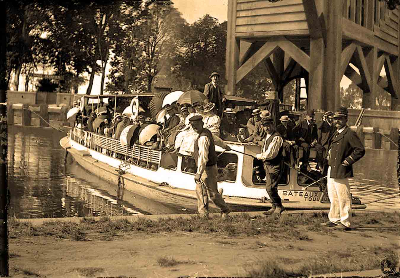 |
Posted on 14/03/13 8:36:04 PM |
|
puffin31939
Montage Mariner Posts: 383 Reply |
Re: Challenge 444: London docks
Bit last minute! Not sure of the era so I abandoned the photo idea and settled for this sketch. Hanging it on a wall caused me more hassle than the image itself! 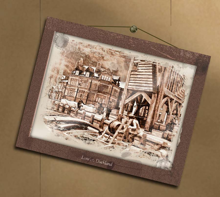 _________________ Man cannot change the direction of the wind but he can adjust the sails |
Posted on 15/03/13 04:06:24 AM |
|
darrenandcolleen@telus.net
Serene Synthesist Posts: 119 Reply |
Re: Challenge 444: London docks
final image 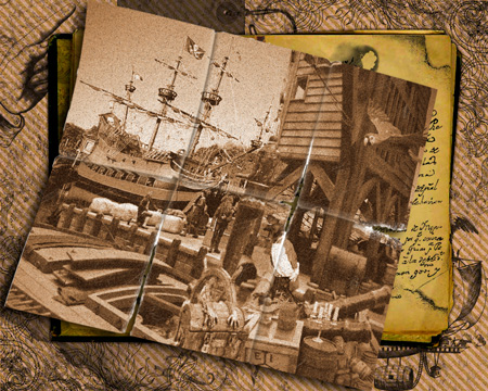 |
Posted on 15/03/13 04:07:54 AM |
|
darrenandcolleen@telus.net
Serene Synthesist Posts: 119 Reply |
Re: Challenge 444: London docks
before aging 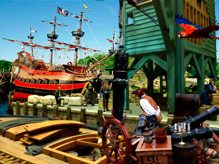 |
Posted on 15/03/13 09:14:39 AM |
|
Steve Caplin
Administrator Posts: 7157 Reply |
Re: Challenge 444: London docks
First into the docks was Sjef, with an interesting kaleidoscope approach giving a stained glass window effect, featuring sights of London in the panes - it's so surprising what a bit of symmetry can do. A very novel idea. Very fine work from Josephine Harvatt, with a thoroughly convincing montage in which the dock is perfectly merged in with not only a period background, but replaced sailors on and behind the boat. This really is splendid, Josephine - and completely seamless. Glorious. A foggy day from Ant Snell, with a background of St Paul's Cathedral - but is that a modern block of flats in front of it? I like the idea of the fog to blend things together, although I'm not sure it should be black. Good tonal matching, though, between the foreground and background. The docks get the old photo treatment from joeysala, and very convincing it is too, with the texture neatly masking the join between the foreground and background. There's a good sense of perspective here, too, as the dock seems to continue around the corner. Nice work. A colourful cast of characters from tooquilos, poised and ready for action amidst the mist. And the animated version shows a splendid tale of the convicts' deportment and discovery of all that Australia has to offer - I particularly like the bungee jumping and snorkelling! Really clever. What's the significance of the foxes, though? I like the painterly effect from lwc, which cleverly blends the dock in with the Bounty background. I think I'd have raised the horizon to the height of the eyeline of the people standing on the dock, but otherwise this is really effective. A modern background from Frank, which manages to blend the old with the new in a convincing way. There are a few odd things going on with the perspective: the horizon of the foreground and background suggest different viewpoints. But the colour matching is very effective, and the two scenes run together well. A clever reversal from sciteach, as a boy reaches in to adjust what's obviously a model... It works fine, but his hand should surely be out of focus to match the sailors at that distance. Detailed work from michael sinclair, having placed the dock behind some deeply convoluted rigging. Are you sure the Magic Wand was the right approach? Did you try the Background Eraser? If you can post your original boat image, I can see if there could have been a simpler method of isolating that rigging. A clever industrial dispute reported by Emy, neatly inserted into the background of a newsreader. But why is the screen behind her in black and white? Surely this would always be in colour? Magnificent work from GKB, with the photograph beautifully inserted into a nautical desk scene. Loads of detail here, from the compass and old map to the shine on the curling photograph. Just a couple of small points: you'd need a much wider border on the photograph for authenticity; and shouldn't the map have some folds in it? Splendid work. I like the way Vibeke has turned the image into an engraving, and placed it on the wall of an art gallery - it fits really well there. Is it just too starkly black and white, though? Given the warmth of the indoor lighting, I'd be tempted to add some brown and yellow to the engravings. Good perspective matching from Deborah Morley, whose new background buildings continue the line of the existing dock buildings - although I think the far left edge is leaning in a little too much. The replaced sailors match the originals well, and are far more convincing. I enjoyed Linda Eckert's irreverent approach, with the viewer bursting through the backdrop - that's a very effective shot! Did you find the man intact, complete with ripped paper? A scene of more contemporary devastation from Jota120, showing the aftermath of the bombing of London's docks. Good tubble, of course, but aren't those people much too big for the boat? Hope you get your computer woes sorted out! Ingenious work from, appropriately, Mariner, with all the people removed. Great detail, including the view through the hatch, and the hat on the bollard. Is the background rather too blue for that warm foreground, though? I'd like to draw your attention to the issue of the five crates in a row, as well. When you simply replicate them, making them smaller isn't quite enough - you need to swash up the sides and fronts independently, in order to make the perspective work. It wouldn't be easy! A quick solution from Garfield72, placing the dock buildings behind a much more recent boat. Is it just me, or does it all seem to be leaning to the right? A nice image from puffin31939, with a cleverly added background that's then placed inside a picture frame and hung at a jaunty angle. The frame's material is a little confusing - it's clearly not wood, but fibreboard seems out of keeping for the period. I like the way it's suspended, but do people ever hang a picture from a screw? A terrific image from darren, with a creased and torn photograph on a complex and appropriate background. Thanks for showing the original montage too - a lot of work has gone into this, from the parrot to the new sailors, cannon and ship's wheel! I'm concerned that your images are so small, though. Are you using Save for Web to shrink them down? Try dropping the jpeg quality a little, which should enable you to post a larger pixel size. Excellent work this week. Good to see so many inspired entries! |
Posted on 15/03/13 11:34:03 AM |
|
puffin31939
Montage Mariner Posts: 383 Reply |
Re: Challenge 444: London docks
Thanks, Steve. The frame wasn't supposed to be from the same era. It was an old picture hung in a scruffy modernish setting (Sam Spud's office actually!). I used a screw because that was what Sam Spud had to hand and I was in a rush! Good fun. _________________ Man cannot change the direction of the wind but he can adjust the sails |
Posted on 15/03/13 2:42:23 PM |
|
Linda.Eckert@wanadoo.fr
maîtresse marocaine Posts: 91 Reply |
Re: Challenge 444: London docks
Fifty-fifty, Steve, with your help on page 214. Tank you! |
Posted on 15/03/13 5:33:53 PM |
|
josephine harvatt
Gag Gadgeteer Posts: 2605 Reply |
Re: Challenge 444: London docks
Thank you kind sir  _________________ I'm not really bad - I just draw that way |
Posted on 15/03/13 10:13:11 PM |
|
GKB
Magical Montagist Posts: 4139 Reply |
Re: Challenge 444: London docks
Thanks Steve. So glad you didn't notice my initials scratched in the desk. Last time I did that I was 7 years old and got into deep dooh-dooh 
Josephine - it was a photograph! _________________ 76.38% of all statistics are made up on the spot. |
Posted on 16/03/13 00:55:35 AM |
|
tooquilos
Wizard of Oz Posts: 2970 Reply |
Re: Challenge 444: London docks
Thank you so much Steve
The fox was introduced to Australia by the early settlers around the 1830's. Primarily, it was for hunting and then they realised it could control the out of control rabbit population. Which of course didnt work - so now there is a problem with wild rabbits AND foxes. _________________ Wicked Witch of the West:I'll get you, my pretty! And your little dog, too! |
Posted on 17/03/13 4:24:05 PM |
|
Sjef
Flying Dutchman Posts: 571 Reply |
Re: Challenge 444: London docks
Thanks tooquilos for this short lesson. And thanks Steve for your informative critics on our posts. They are worth reading. But in the case of Emy, if there were real fotographs of this harbour from a long time ago wouldn't they be in B/W? And wouldn't such a picture be shown in B/W on TV? The fact that it is live could be a coverage of an exhibition. |
Posted on 17/03/13 4:27:19 PM |
|
Sjef
Flying Dutchman Posts: 571 Reply |
Re: Challenge 444: London docks
Thanks Steve for your informative critics on the posts. They are worth reading. But in the case of Emy's post: if there were real fotographs of this harbour from a long time ago wouldn't they be in B/W? And wouldn't such a picture be shown in B/W on TV? The fact that it is live could be a coverage of an exhibition. |
| page: 1 2 3 last |