
| » Forum Index » The Friday Challenge » Topic: Challenge 508: Oslo lighthouse |
|
Posted on 10/06/14 11:44:56 PM |
|
DavidMac
Director of Photoshop Posts: 6275 Reply  |
Re: Challenge 508: Oslo lighthouse
Both images very droll. 
"You're never too old to learn something stupid." ..... .... and the only difference between stupidity and genius is that genius has it's limits .....  |
Posted on 10/06/14 11:47:03 PM |
|
DavidMac
Director of Photoshop Posts: 6275 Reply |
Re: Challenge 508: Oslo lighthouse
Ooops .... forgot to tag the last post for GKB. |
Posted on 12/06/14 10:20:10 AM |
|
GKB
Magical Montagist Posts: 4181 Reply |
Re: Challenge 508: Oslo lighthouse
Thanks David. _________________  |
Posted on 12/06/14 10:22:03 AM |
|
GKB
Magical Montagist Posts: 4181 Reply |
Re: Challenge 508: Oslo lighthouse
Thank you Sara - always pleased to be of help _________________ It only seems impossible. |
Posted on 12/06/14 1:11:28 PM |
|
Mariner
Renaissance Mariner Posts: 3350 Reply |
Re: Challenge 508: Oslo lighthouse
 |
Posted on 12/06/14 9:00:48 PM |
|
Emil
KAFKAsFRIEND Posts: 413 Reply |
Re: Challenge 508: Oslo lighthouse
 |
Posted on 13/06/14 04:41:46 AM |
|
joeysala
Perfect Palmist Posts: 604 Reply |
Re: Challenge 508: Oslo lighthouse
 _________________ "Imagination, not invention, is the supreme master of art........" Joseph Conrad |
Posted on 13/06/14 05:44:10 AM |
|
Mariner
Renaissance Mariner Posts: 3350 Reply |
Re: Challenge 508: Oslo lighthouse
That's an impressive painting Stefan. |
Posted on 13/06/14 08:23:00 AM |
|
Steve Caplin
Administrator Posts: 7180 Reply |
Re: Challenge 508: Oslo lighthouse
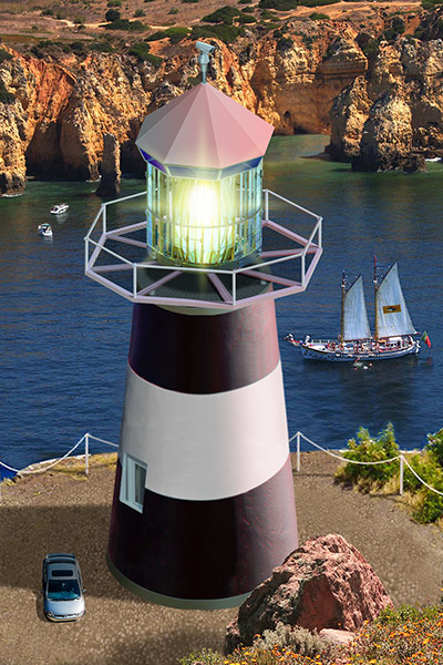
This week's Challenge was made more difficult, as DavidMac articulated, by "imposing a close up wide angle perspective on an object normally seen from a distance". The solution, of course, lies largely in your placement of the horizon. Eva Roth dealt with the problem by positioning the lighthouse on a rock, with some splendid waves crashing around it. The horizon is technically a little high - it should align about halfway down the window - but I like the exuberance of the scene, and the strong blue tint blends it very neatly into the background. A very textural image from stefan, which has an oil painting quality to it. I like the way the flare from the lamp has been created, giving a real sense of drama to the scene. A strong composition - well done avoiding placing the lighthouse directly in the centre. A clever shot from Ant Snell, with a very low perspective which explains the angle of the walkway at the top. I like the reflection, but shouldn't the light beam reflect as well? The beam is the only thing I'm not sure about, it looks rather artificial - and why is it green? I like the way it turns in the animated version - but no light reflection there either! A moody image from Garfield72, with a powerful black and white scene of boats in a storm. Great blending of the lighthouse, which is very well lit. A powerful result. I was amused by Josephine Harvatt's Monster Island image, with a giant moth fluttering around the flame. That does seem to be a very heavy moth, though: perhaps a little transparency on those wings to lighten it up? A great scene from Frank, which appears to have been compiled from a number of images of restaurants called Lighthouse. Placing the people in front blends it very neatly into the scene and that's a very convincing light in the tower. Very nicely done. I like Emy's solution, turning the lighthouse into a key fob - and it does sit rather neatly on the control panel of a very modern ship. Neatly blended in, it sits well on the surface. Ingenious work from Kathryn, who has integrated the lighthouse into a helter skelter. Not much remains of the original, just a single window and a couple of stripes - but that's enough to make it recognisable. A beautiful image from Vibeke, whose lighthouse perches on a hilltop at sunset. Excellent side lighting that points directly towards the setting sun, sitting the lighthouse perfectly into the scene. Most attractive. A dark, moody image from darren, with the lighthouse perched on an island. I like the composition, with the moon and the eagle, but I'm concerned about the logistics: with a waterfall right on the sea shore, wouldn't the sea just pour in and fill up whatever hollow is this side of it? High drama from tooquilos, with waves crashing around the lighthouse - and I particularly like the way the light illuminates the sea in stripes. A beautifully animated spinning light in the animated version, with a tremendous sense of passing time. I really like the combination of artificial motion with the real moving waves: perfectly composited together. Outstanding, Anna! An excellent lit helter skelter from DavidMac, with a ton of detail: I like the fact that we can see the interior not only of the entrance, with the handrail curving down, but the light container itself, with a wooden roof structure. Beautifully backlit people, too. Where do you source all these people from behind? They're a fantastic selection. Do you know the photographs of Gregory Crewdson? This reminds me very much of his work. A good scene from puffin31939, with a lit lantern and set on a rocky outcrop. I think that all that's missing here is some deeper shading on the lighthouse itself, and perhaps a touch of brown to blend it into those surroundings: the white should really be a closer match to the white of the clouds behind: 
A hilltop location from brewell, perched overlooking what may well be a Jota120rd. Beautiful lighting, with the moon glinting off the side of the lighthouse. I really like the lighting on that grassy path leading up to it - a very evocative view. I like the waves crashing around michael sinclair's lighthouse, which locates it neatly in the scene - and a neatly altered perspective too. The only thing that I'm not sure about is the light itself, which seems a little too crisp and hard-edged... and would it have made sense to delete the original lighthouse? An excellent second entry, with beautiful lighting on the lighthouse - outstanding work here. I like the idea of srawland's image, using the lighthouse as a domestic light. It's surrounded by other nautically-themed interior design elements, making it blend in cleverly. The shadows of the table and chairs work really well, particularly the outstanding shadow of the glass table top. But should it be casting a shadow of itself on the wall behind? Surely not! And the shadow of the left chair does need to be pointing towards the light source. A cute image from GKB, with a domestic lampshade perched on top. I really like the huge brass on/off switch, and the fact that the lighthouse keeper needs a ladder to climb up to it - ingenious! And the lighthouse works well in the second entry, now acting as a real bedside light. Once again, though, it will look a lot more convincing if the whites in the lamp matched the white tones in the room behind: 
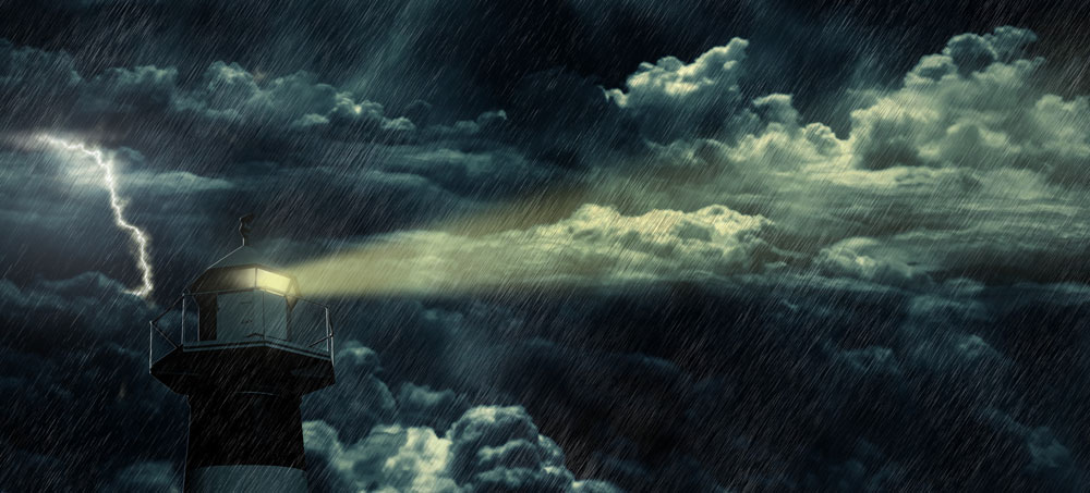
I like Daniel Millar's entry, in traditional lighthouse colours - with especially detailed placement behind all that wild grass in the foreground. The closeness to the viewer really makes sense of the perspective of the shot. A very fine image. A dramatic scene from hanxin16, with a Chinese boat with its distinctive sail sitting on the distant waves. But look at the perspective of the lighthouse: we're looking up at the platform, so it can't be below the horizon! A clever entry from Linda Eckert, placing the lighthouse on top of a French monument. I like all the people around it, with their shadows neatly bending up over the contours of the background. But with their heads at such different heights, it places the viewer very high in the scene - much higher than the horizon level would suggest! The real issue, though, is that the man at the top is not much further away from us than the people at the bottom. He should be a lot bigger than that. There have been many attempts to deal with the perspective of the original shot, but nothing comes close to Mariner's outstanding reimagining of the whole structure. Did you draw this from scratch? Everything about the perspective works perfectly, as well as the shadows, and the light in the lantern... Michael, this is astonishingly good work. Many congratulations and a truly remarkable entry. Emil's close-up makes sense of the perspective of the scene, and I like the way the light cuts through the rain. Great lighting on the lighthouse, too. Is the light beam perhaps just a bit too yellow, though? A neatly repainted lighthouse from joeysala, matching the colours of the surrounding buildings well. There's an issue with the perspective, though (and I know you hate me saying that). The top structure matches the buildings well enough, but that horizontal white band needs to follow the same perspective as the roofs of the buildings below it. Very fine work this week. Congratulations to all. |
Posted on 13/06/14 08:48:17 AM |
|
Mariner
Renaissance Mariner Posts: 3350 Reply |
Re: Challenge 508: Oslo lighthouse
Steve, thank you for your very generous critique. I had to draw the superstructure from scratch. There was no way around that. The lamp is from Makapuu lighthouse, Hawaii, but the light beams I also had to create from scratch. The body of the lighthouse I twisted using Warp, but the top and bottom edge rings are also from scratch as is the gravel around the base. It all gave me many hours of pleasure. |
Posted on 13/06/14 08:55:03 AM |
|
josephine harvatt
Gag Gadgeteer Posts: 2605 Reply |
Re: Challenge 508: Oslo lighthouse
Thanks Steve - I did experiment with some motion blur but couldn't get it quite right _________________ I'm not really bad - I just draw that way |
Posted on 13/06/14 10:14:19 AM |
|
srawland
Pixel Perfectionist Posts: 885 Reply |
Re: Challenge 508: Oslo lighthouse
Thank you Steve for your critique. I really appreciate the art lessons I am getting by participating in this forum. I will correct my image before I post it on my blog. _________________ I'm still learning. |
Posted on 13/06/14 12:07:26 PM |
|
DavidMac
Director of Photoshop Posts: 6275 Reply |
Re: Challenge 508: Oslo lighthouse
Thank you Steve. Source was google images. Just took a lot of tries with different search terms. I tend to start by restricting the search to large images. That way I can often find incidental figures in the background to suit my purposes. Libraries are mostly useless as they tend to have huge collections of people all looking straight at camera. I also have a huge library of source images of my own collected over the years. I try to source all my image elements as flat as possible. That way it is easy to impose my own lighting on them to blend them into their new 'host' image. Backlight is my favourite as I have developed a very quick and effective technique for it.
I didn't know the work of Gregory Crewdson. Thank you for bringing him to my attention. Lovely set pieces. Very cinematic. |
Posted on 13/06/14 2:03:22 PM |
|
srawland
Pixel Perfectionist Posts: 885 Reply |
Re: Challenge 508: Oslo lighthouse
Is this what you meant about the shadows? My sister thought the image needed some context which is why I added the text. I like the image better without it, but I'll probably put it back in for the blog. -Sara  _________________ I'm still learning. |
Posted on 13/06/14 3:20:50 PM |
|
Frank
Eager Beaver Posts: 1883 Reply |
Re: Challenge 508: Oslo lighthouse
Thanks Steve |
Posted on 13/06/14 3:42:40 PM |
|
stefan
Detail Demon Posts: 401 Reply |
Re: Challenge 508: Oslo lighthouse
Thanks ! |
Posted on 13/06/14 3:43:43 PM |
|
stefan
Detail Demon Posts: 401 Reply |
Re: Challenge 508: Oslo lighthouse
Thanks, Steve ! |
Posted on 13/06/14 7:18:12 PM |
|
Emil
KAFKAsFRIEND Posts: 413 Reply |
Re: Challenge 508: Oslo lighthouse
Thank you Steve. |
Posted on 13/06/14 8:11:37 PM |
|
puffin31939
Montage Mariner Posts: 383 Reply |
Re: Challenge 508: Oslo lighthouse
Thanks, Steve, for the suggestion about the shading and toning down the white on the lighthouse. A useful tip and something else to try and remember for the future. _________________ Man cannot change the direction of the wind but he can adjust the sails |
Posted on 14/06/14 7:17:28 PM |
|
brewell
Pixel Pentagrammarian Posts: 752 Reply  |
Re: Challenge 508: Oslo lighthouse
I know lighthouse doorway bothered you as much as it did me, so I shaded it out of existence. _________________ Is it necessary? Does it work? |
| page: 1 2 3 4 last |
