
| » Forum Index » The Friday Challenge » Topic: Challenge 779: The carousel horse |
|
Posted on 31/10/19 00:16:17 AM |
|
lwc
Hole in One Posts: 3545 Reply |
Re: Challenge 779: The carousel horse
 |
Posted on 31/10/19 10:00:47 AM |
|
Eva Roth
Luminous Liberator Posts: 269 Reply |
Re: Challenge 779: The carousel horse
bonus one from me I know its somewhat early to be showing Christmas stuff, but I needed a fitting background for my horse on wheels.. 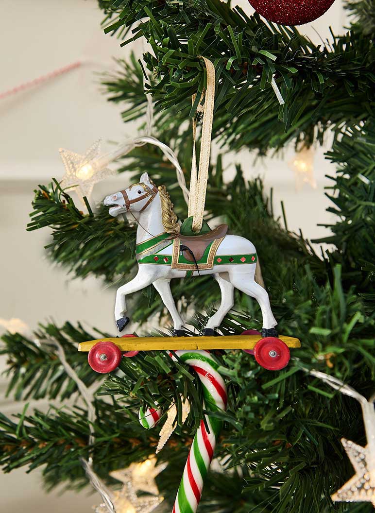 |
Posted on 31/10/19 12:22:47 PM |
|
Ant Snell
Specular Specialist Posts: 640 Reply |
Re: Challenge 779: The carousel horse
[quoted] tooquilos wrote: Oh Ant, that is superb. And you made it all? Yes, Anna, all my own work and I still have the scars to prove it! I almost lost my index finger with a saw chain blade while carving out the back legs. My own fault I took the guard off to get into award spot. Love the zebra, different slant on a traditional toy. 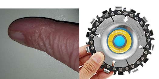 |
Posted on 31/10/19 1:00:13 PM |
|
Mariner
Renaissance Mariner Posts: 3340 Reply |
Re: Challenge 779: The carousel horse
Anna, beautiful, atmospheric, rocking and rolling! |
Posted on 31/10/19 1:05:47 PM |
|
Mariner
Renaissance Mariner Posts: 3340 Reply |
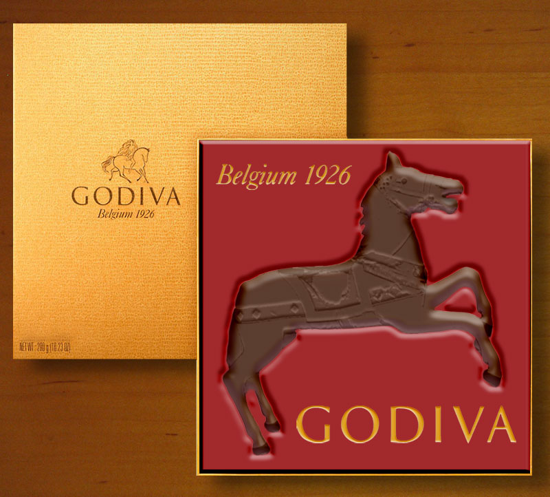
Godiva
 |
Posted on 31/10/19 4:10:35 PM |
|
DavidMac
Director of Photoshop Posts: 6244 Reply  |
Re: Challenge 779: The carousel horse
Lot of tiny movements in there Loyd. Needs study to see some. Very nicely done. _________________ The subtlety and conviction of any Photoshop effect is invariably inversely proportional to the number of knobs on it ....... |
Posted on 31/10/19 4:12:25 PM |
|
DavidMac
Director of Photoshop Posts: 6244 Reply |
Re: Challenge 779: The carousel horse
Very nice re-build of the legs. Seamless. _________________ The subtlety and conviction of any Photoshop effect is invariably inversely proportional to the number of knobs on it ....... |
Posted on 31/10/19 5:34:14 PM |
|
DavidMac
Director of Photoshop Posts: 6244 Reply |
Godiva
Great job making the horse real Michael. Here's the Belgian Godiva. 
 _________________ The subtlety and conviction of any Photoshop effect is invariably inversely proportional to the number of knobs on it ....... |
Posted on 31/10/19 8:47:37 PM |
|
lwc
Hole in One Posts: 3545 Reply |
Re: Challenge 779: The carousel horse
Thanks David. Many of the small effects aren't really needed, but may help the overall animation. |
Posted on 31/10/19 9:20:01 PM |
|
DavidMac
Director of Photoshop Posts: 6244 Reply |
Re: Challenge 779: The carousel horse
The 10% extra is always what makes the difference. It may not be needed but it makes far more than 10% difference.  _________________ The subtlety and conviction of any Photoshop effect is invariably inversely proportional to the number of knobs on it ....... |
Posted on 31/10/19 10:34:40 PM |
|
michael sinclair
Off-Topic Opportunist Posts: 1871 Reply |
Re: Challenge 779: The carousel horse
First of all I need to say that compared to two or three years ago, there has been a consistent and significant improvement in the quality of work from everybody. I say this as some might think I'm just giving "fulsome" praise for the sake of it. No the STANDARD is higher! So this week is no exception: good work everbody 
Michael your entry was very late last week: too late for comment, but it was fabulous--well done! 
Finally, Eva Roth your Christmas decoration is very attractive; however, where you really score is that you have changed the legs of the horse seamlessly, and I really love it. Incidentally, if you were to get a "second" set of legs then animate as a gif you would be very convincing. So it's the "Gold Star" for you 

|
Posted on 01/11/19 04:11:40 AM |
|
Mariner
Renaissance Mariner Posts: 3340 Reply |
Re: Challenge 779: The carousel horse
Michael, thank you, I will continue to improve, I hope. |
Posted on 01/11/19 04:26:39 AM |
|
Mariner
Renaissance Mariner Posts: 3340 Reply |
Re: Challenge 779: The carousel horse
David, thanks. Steve gives us one of these every few years. Every few years, did I really write that? He puts something like "Can you breathe life into this?" I ususally try to take him literally as it's more of a challenge that way. It's really quite difficult cutting up bodies to fit a certain shape, and this one was no exception. A Belgian chocolate horse! Good imagination. |
Posted on 01/11/19 04:38:58 AM |
|
tooquilos
Wizard of Oz Posts: 2986 Reply |
Re: Challenge 779: The carousel horse
Ouch Ant! That could have disastrous. That blade looks relentless and hell bent on cutting! Thank you Michael
Loyd there is so much movement in this one. Great work. My favourite bit is the mane. It looks beautiful. David, my head says it's photoshop but my eyes say it's chocolate! So convincing that I just broke open a bar and had a few bites to satisfy the craving! _________________ Dorothy: Toto, I've a feeling we're not in Kansas anymore |
Posted on 01/11/19 06:03:46 AM |
|
srawland
Pixel Perfectionist Posts: 885 Reply |
Re: Challenge 779: The carousel horse
I agree with Michael Sinclair. There is a marked improvement in the quality of everyone's work. Unfortunately, I only had a little more time than last week to work on this. Next week doesn't look much better right now. I was hoping to get in another animation, but it doesn't look likely right now. 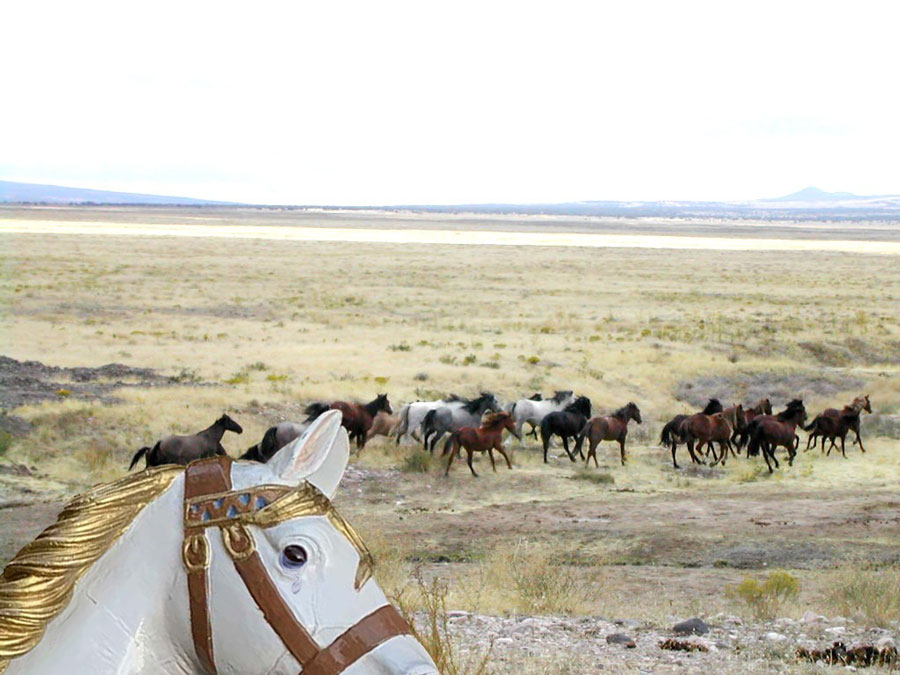 _________________ I'm still learning. |
Posted on 01/11/19 09:41:39 AM |
|
DavidMac
Director of Photoshop Posts: 6244 Reply |
Re: Challenge 779: The carousel horse
Love the cropped framing Sara! _________________ The subtlety and conviction of any Photoshop effect is invariably inversely proportional to the number of knobs on it ....... |
Posted on 01/11/19 09:45:36 AM |
|
Steve Caplin
Administrator Posts: 7174 Reply |
Re: Challenge 779: The carousel horse
First to ride the horse this week was DavidMac, with a splendid bucking bronco scene. Why is the edge of the arena going up and down low that, though? A splendidly realised second entry, with the horse beautifully inserted into the clockwork race machine. Just one point: you seem to have got your circular tracks in a muddle; your chaps riding on a spiral, which isnt really possible. A very fine unicorn in the third entry; but maybe use Puppet Warp to bend those back legs back? A glorious, and faultless, fourth entry though. And indeed, perfect lighting on the fifth entry, and a great composition. Love the chocolate in the sixth entry. A beautiful miniature scene from Ben Mills, complete with tilt-shift focus effect to enhance the scale - and those mushrooms really help, too. The womans pose is excellent. I think the unicorn might need to see a chiropractor, though. A dip into the past from GKB, with a Magic Roundabout theme. And the animated version - sigh its been a long time since I heard that theme tune. Your horses are rather two-dimensional, though; surely this an the ideal opportunity to inflate the horse in Photoshop: 
Continuing the childhood theme in the second entry, I see - big eyes and all. A purple tail needed, perhaps? A flying horse from Josephine Harvatt, hovering over what looks to me like the Blue Mosque in Istanbul. Nice use of filters; they almost hide the fact that the lighting on the background is strongly from the right. I really, really thought Id provided michael sinclair with a starting image he could work with this week - but no, hes provided his own horse. And yes, it does move rather well, even going up and down on its pole, but Id really like to have seen what youd do with the original. Hi ho, Silver! A fine replacement horse for the Lone Ranger from Eva Roth, neatly treated to match the background style. Just one thing: you should tuck that back leg behind the rock. And thats a glorious toy set in the second entry - nicely made shadow. A very cute Christmas decoration in the third entry, although Id lose that shadow - it makes the background too two-dimensional. A fabulous escape video from Frank, with splendid leaping movement and a true fairytale ending. A great setting, too. Couple of technical points: your clouds arent horizon level (clouds get much smaller as they approach the horizon); and surely the dust shouldnt appear until after the horse has hit the ground? Very fine animation, though. A rather magnificent attic from tooquilos, with a pair of helical staircases and a rather wistful horse gazing out of the window. I like the sliding action on the horse, and its new golden appearance. The outdoor scene is beautiful. And I certainly want one of this staircases. I like how you vary the lighting to match the background. I laughed out loud at Ant Snells naughty entry - beautiful, funny, expertly done. Outstanding, Ant. And Im seriously impressed by the horse you made for your daughter - magnificent work. A Halloween-themed horse from lwc, with flaming hooves and truly scary clowns. Cute hovering bat, but its that rippling horsess mane that really gets my vote. And the changing head position, of course. So much in one image! Lady Godiva prepares to ride in Mariner's entry, with an ingeniously remodelled horse - and, it has to be said, a remarkably discreet Lady G, with a well-placed hoof. The only thing that bothers me is that woman on the right: she appears to be looking at the horse, but shes standing behind Lady Godiva who is in turn standing behind the horse, so I dont see how thats possible. And would such neatly cropped grass be so deep? A quickie from srawland, very neatly cropped for a dramatic result. Good to see you back, Sarah, I was wondering where youd got to. ______________ There was a question from DavidMac about creating a metallic effect. You dont need to make the image black and white first; if you make a Curves Adjustment Layer and set its mode to Luminosity, it wont produce those bizarre psychedelic colours on the layer beneath. One advantage of making an Adjustment Layer is that you can see through it to correct the layer beneath - check my 2 Minute Photoshop video on the right sort of curve to draw. |
Posted on 01/11/19 09:51:57 AM |
|
josephine harvatt
Gag Gadgeteer Posts: 2605 Reply |
Re: Challenge 779: The carousel horse
Thank you Steve - yes it is the Blue Mosque well spotted and yes filters were very much my friend for this challenge! _________________ I'm not really bad - I just draw that way |
Posted on 01/11/19 10:14:17 AM |
|
Mariner
Renaissance Mariner Posts: 3340 Reply |
Godiva
I saw the woman was looking the wrong way and said to myself "So, she's looking the wrong way. So what? Maybe she is looking out of the corner of her eye at those two by the wall" I saw the grass was too deep and thought, hell, nobody, but nobody is going to notice that! Thanks Steve, for a very demanding challenge. |
Posted on 01/11/19 10:26:58 AM |
|
DavidMac
Director of Photoshop Posts: 6244 Reply |
Re: Challenge 779: The carousel horse
The arena edge was quite wavy in the original although lazy restoration after removing the mechanical bull that was there before our Dobbin has exaggerated this. Similar problem in the toy horse race. Lazy restoration. I have this lazy streak that always hopes to sneak these things past you ........ I really should know by now that it won't work .........
The curve tip is great. Works perfectly. However I am puzzled by the first line. I think you do have to start by making the layer to be metalised black and white. It's exactly what you do in your own tutorial. You got me a bit baffled there Steve. _________________ The subtlety and conviction of any Photoshop effect is invariably inversely proportional to the number of knobs on it ....... |
| page: 1 2 3 4 last |