
| » Forum Index » The Friday Challenge » Topic: Challenge 808: Pram to the future |
|
Posted on 05/06/20 07:42:58 AM |
|
vibeke
Kreative Kiwi Posts: 2204 Reply |
Re: Challenge 808: Pram to the future
Sara, Beautiful looking pram _________________ Perfect confidence is granted to the less talented as a consolation prize. |
Posted on 05/06/20 08:33:35 AM |
|
Steve Caplin
Administrator Posts: 7178 Reply |
Re: Challenge 808: Pram to the future
First to modify the pram this week was Josephine Harvatt, who has added a giant duck head. Which makes the prams bizarre shape into a perfect duck body, complete with folded wings. Whod have thought it? A 1960s feast from GKB, with a different pram pusher and a fine colour scheme. Good work on the shadows, and thats a splendid car in the background - but are you sure its period-appropriate? And a fun Jetsons-inspired second entry - although Im concerned about whats happening to that dog. A fabulous bat buggy from DavidMac, beautifully realised with batdog, batbag and other bat accessories. A great setting, with fine reflections; but why are we towering over the pair? Bring that horizon down! 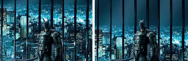
I enjoyed the second entry, especially the motorcycle cop writing a ticket in the background. The shadows on Flash Gordon need to be darker to match the background, though. Excellent placement in the third entry, except with the woman so far in the foreground she really needs to be a lot bigger - she only comes up to that mans waist! A splendid futuristic vision from JimH, with jet-powered bellbottoms. I like the moved dog, and the jets on the side of the pram. One issue, though: we can see the top of the pram, which means were looking down on it from above. But the horizon is much lower; it needs to be on our eyeline, which means you need to raise it a lot (see here for why this is important). A great alien in the second entry, although you now have the opposite problem with the horizon: the pram seems to be floating (although that may well be intentional). Why do you blur the womans face? A neat change of clothing from Born2Run, artfully achieved. Those legs could do with a little more contrast, though. The swapping of the dog and the baby is hilarious - but do remember to desaturate that baby to match the rest of the image! Great relocation from Vibeke, with the pram fitting perfectly into the street. Best of all here is the Japanese styling of the pram itself, complete with Manga illustration and gaudy gold trim. Outstanding work. A subsea excursion for tooquilos, with a baby in a bubble - and it looks to me as if youve been giving Poser a workout. A fabulous opening room in the animated version, with plenty of steampunk brass and even a brass dog. Great walking action in the Handmaid episode - its surprising how well the swishing skirt adds to the sense of movement. The distortion through the glass in the final section adds greatly to the realism; but you really need to get those legs flapping up and down to make the swimmer swim. A surreal remodelling from Mariner, in which the shopping cart, the boxes of lager, the dog and the baby all make sense - but its the golf course that baffles me. Also, watch the shadow beneath the baby: to match the ground shadow it needs to be lower and further to the right. Please tell me you didnt draw that shopping trolley from scratch. Frank has gone back to the future, with excellent integration into the scene - and the shortened skirt works exceptionally well. I like the added robot and sky traffic, and what looks like a rather splendid ironing board (but which I suspect is actually a surfboard). Youve packed a lot into this image! A rather beautiful new setting from Ben Mills, with the pram looking very sophisticated in its new black livery. The relocated dog and the new woman fit the scene perfectly. A very thoughtfully accomplished image, Ben. It seems michael sinclair has found his new home at Imgur - and look, more than two frames! Tremendous walking action, complete with bobbing head and upper body. Can I suggest, though, that while rotating the wheels you leave the tyres alone: the lighting on them shouldnt rotate. Interesting background information from srawland; are you saying that Amanda Lee is the woman in the original photo as well? That cant be the case - but they do look remarkably similar. And your restyled baby carriage does match her outfit perfectly. A shame this series didnt get made. A good week. Many thanks to DavidMac for the starting image. |
Posted on 05/06/20 09:01:05 AM |
|
Mariner
Renaissance Mariner Posts: 3347 Reply |
Re: Challenge 808: Pram to the future
I know, and I tried it, but you could no longer tell what it was, so I left it. Well spotted, Steve. No, the shopping trolley came from the net, already extracted. |
Posted on 05/06/20 09:02:59 AM |
|
josephine harvatt
Gag Gadgeteer Posts: 2605 Reply |
Re: Challenge 808: Pram to the future
Thanks Steve _________________ I'm not really bad - I just draw that way |
Posted on 05/06/20 09:22:56 AM |
|
tooquilos
Wizard of Oz Posts: 2986 Reply |
Re: Challenge 808: Pram to the future
Thank you Steve  _________________ Dorothy: "there's no place like home!" |
Posted on 05/06/20 10:06:01 AM |
|
vibeke
Kreative Kiwi Posts: 2204 Reply |
Re: Challenge 808: Pram to the future
Thank you Steve, high praise indeed. _________________ Perfect confidence is granted to the less talented as a consolation prize. |
Posted on 05/06/20 12:02:48 PM |
|
DavidMac
Director of Photoshop Posts: 6256 Reply  |
Re: Challenge 808: Pram to the future
Wow! You are on form today Steve! I am really kicking myself for the first. What is puzzling me is how I managed to get it so wrong! Here is my point of departure. Although it was almost certainly shot blue screen I think we must presume that Dark Knight's makers didn't screw up their horizons! 
The foreground looks to be shot from quite far back on a long lens so the high camera angle is not very evident in the foreground perspective - only in the horizon height. I missed this completely and placed my 'camera' at eye level without adjusting for it. Duh! As for Flash Gordon, I matched his shadow to the real shadow from the pram. I think where I went wrong is the inverse of your suggestion. I think I need to reduce the background rocket shadow. Either way that is very eagle eyed of you. It's a pretty furtive inconsistency. I fiddled with the girl in the Things to Come image a lot. Nothing I did seemed to look right. Coming back to it fresh, even given that Raymond Massey is a very tall man (in other stills from the film she barely reaches his shoulder) she is, as you say, far too small. Your remarks prompted me to go back and examine this again to try and determine what I should have done. This time I did a vanishing point analysis and, save error in my analysis, there seems to be something very odd indeed going on in the original image. The vanishing points are all over the shop! They make no sense! I'd be very curious to hear if you have any theories or suggestions, because it's really got me baffled! 
Thanks Steve. A sobering critique. _________________ The subtlety and conviction of any Photoshop effect is invariably inversely proportional to the number of knobs on it ....... |
Posted on 05/06/20 12:49:08 PM |
|
Steve Caplin
Administrator Posts: 7178 Reply |
Re: Challenge 808: Pram to the future
The perspective issues you're facing are from trying to follow very narrow lines on the floor - a small mismatch can produce erroneous results. If you follow the upper lines you see the horizon is on the men's eyeline: 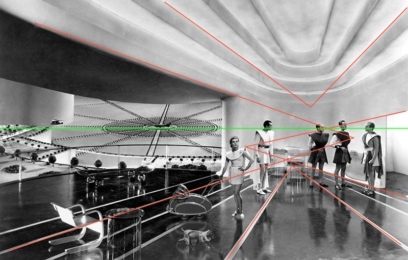
Which means you can position the woman so she's slightly below it, and it works better (excuse the dodgy cutout, I don't have access to your psd): 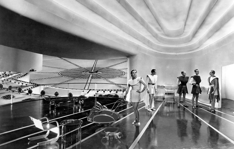 |
Posted on 05/06/20 2:13:43 PM |
|
JimH
Image Imaginator Posts: 74 Reply |
Re: Challenge 808: Pram to the future
Thanks Steve will watch the eye line in future!! I didn't intend to blur the ladies face I was trying to give her a skin tone as the rest was in colour, didn't work eh!!   |
Posted on 05/06/20 5:07:19 PM |
|
srawland
Pixel Perfectionist Posts: 885 Reply |
Re: Challenge 808: Pram to the future
Thank you, Steve. I do not know the name of the woman in the original image. Amanda Lee is the woman in my image. _________________ I'm still learning. |
Posted on 08/06/20 8:01:20 PM |
|
Frank
Eager Beaver Posts: 1877 Reply |
Re: Challenge 808: Pram to the future
Thanks Steve , and believe it to be somewhat of a surfboard as well. |
Posted on 11/06/20 11:03:15 AM |
|
DavidMac
Director of Photoshop Posts: 6256 Reply |
Re: Challenge 808: Pram to the future
Apologies for not thanking you for this before. I am not quite sure I agree with your analysis (I think you may have cherry picked the vanishing point that suits it.) My subjective instinct is that the shot is taken from below eye level. Be that as it may, the end result is a big improvement. Thanks. _________________ The subtlety and conviction of any Photoshop effect is invariably inversely proportional to the number of knobs on it ....... |
Posted on 11/06/20 11:23:26 AM |
|
Steve Caplin
Administrator Posts: 7178 Reply |
Re: Challenge 808: Pram to the future
I suspect the lines on the floor and the ceiling indentation were not made parallel, to exaggerate the sense of distance. It's quite possible the shot was taken below eye level - but in that case, the woman should be even higher! |
Posted on 11/06/20 6:08:39 PM |
|
DavidMac
Director of Photoshop Posts: 6256 Reply |
Re: Challenge 808: Pram to the future
Aha! Yes! You guessed! I think it goes even deeper than that. At the risk of boring the pants off you this is my take on it. I did quite a detailed analysis as it was driving me crazy. Even though your comp is an improvement on mine, to me, subjectively, she looks too big relative to Raymond Massey who was a very tall man and if, as I believe, the camera was lower than eye line then, as you correctly point out, she would be even bigger! On the other she makes sense relative to the space around her. I think the whole set has been built non parallel! Forced perspective sets were a common enough technique back then, and for quite a few years to come. I even shot a forced perspective set myself in the late sixties. They work fine as long as the people are more or less the same distance from camera and move only in a direction perpendicular to the lens axis. There is some degree of flexibility depending on the degree of 'force'. In a forced perspective the set gets larger the closer it is to camera. This means that a figure moving towards camera growing at a true perspective will appear to shrink because the set is growing faster. I had never stopped to think about this before, but I suspect because there is no true perspective it may be impossible to move a figure closer to camera successfully even in a still photo because there is always going to be an anomaly present relative to something. If you analyse vanishing points this set is crazy! Start with the top of the walls. That looks fine on its own and produces an eye line at about eye height. 
Another nice clean one to analyse is the right hand wall and doorway where we have nice clear parallels to use. 
Suddenly we have a whole new horizon! If we extend our original left hand wall line down to meet this things get even worse. We now have two hugely separated vanishing pints in what should be a classic single point "railway track" perspective. 
Try and project a floor line out from this and everything falls apart completely! It simply doesn't work whatever you do with it. 
The floor lines however behave sort of as we would expect, except they produce a vanishing point with a completely new "horizon". 
The ceiling opens a whole new can of worms. I am certain that it is a glass painting. I don't know if you are familiar with this or not. So if I am about to patronise you and teach you to suck eggs please forgive me. Given the slow film stocks in those days and the quantity of cumbersome lighting needed the set would have stopped at the top of the walls. 
The ceiling would be painted on a large sheet of glass a few feet from the camera. Thus closing the set and hiding the lights. This was, once again, a very common technique. The example here is quite different but the principle is exactly the same. 
The artist would be obliged to also create a completely false perspective so as to fit with the rest. It makes even less sense than the floor. 
I have no idea if I am close the truth or wildly off target. But I am unable to think of anything else that would explain so many anomalies. That's my two cents worth and I have to go NOW. Ingrid's calling for her pre dinner cocktail and then I have to cook. Curious to hear what you think. _________________ The subtlety and conviction of any Photoshop effect is invariably inversely proportional to the number of knobs on it ....... |
Posted on 12/06/20 08:31:13 AM |
|
Steve Caplin
Administrator Posts: 7178 Reply |
Re: Challenge 808: Pram to the future
David, I believe you've figured it out. The ceiling as a matte painting does of course make absolute sense. And, looking at it with that information, it's clearly a painted ceiling. Good bit of forensic cinematography! |
Posted on 12/06/20 09:49:13 AM |
|
DavidMac
Director of Photoshop Posts: 6256 Reply |
Re: Challenge 808: Pram to the future
Thanks. Given that it was a huge budget Alexander Korda movie I am surprised it wasn't better done! _________________ The subtlety and conviction of any Photoshop effect is invariably inversely proportional to the number of knobs on it ....... |
| page: 1 2 3 last |