
| » Forum Index » The Friday Challenge » Topic: Challenge 811: LWseen |
|
Posted on 25/06/20 02:37:17 AM |
|
Mariner
Renaissance Mariner Posts: 3350 Reply |
Grandad

|
Posted on 25/06/20 02:55:19 AM |
|
srawland
Pixel Perfectionist Posts: 885 Reply |
Re: Challenge 811: LWseen
Something about Loyd's eyes made me think of this. 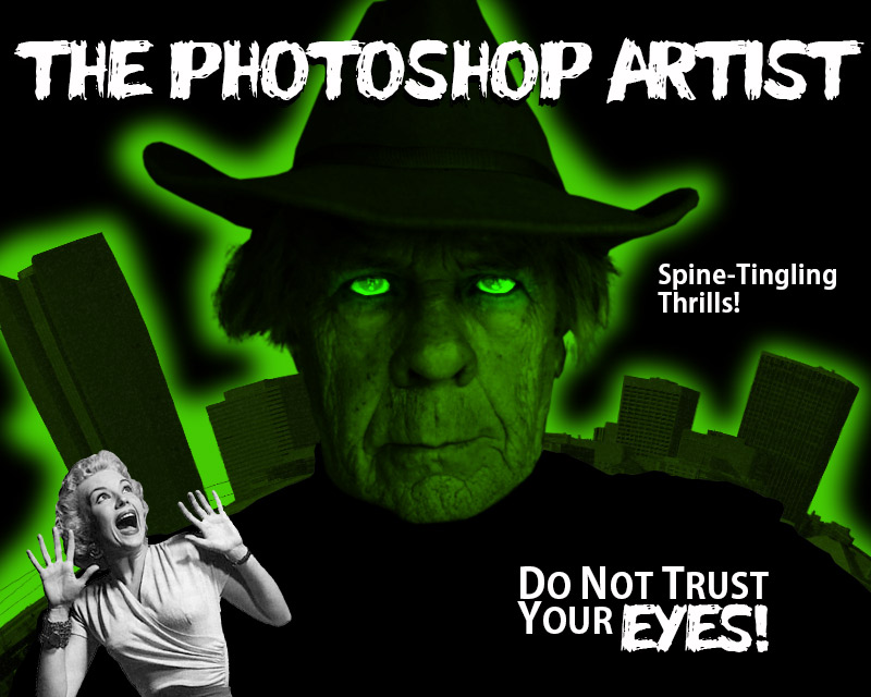 _________________ I'm still learning. |
Posted on 25/06/20 10:46:35 AM |
|
michael sinclair
Off-Topic Opportunist Posts: 1871 Reply |
Re: Challenge 811: LWseen

 |
Posted on 25/06/20 11:01:23 AM |
|
Mariner
Renaissance Mariner Posts: 3350 Reply |
Re: Challenge 811: LWseen
This week the gold star goes to... Michael Sinclair! 
|
Posted on 25/06/20 11:41:00 AM |
|
DavidMac
Director of Photoshop Posts: 6275 Reply  |
Re: Challenge 811: LWseen
Loyd you seem to have inspired everyone. Amazing and varied entries this week. Too many for me to comment individually but I do especially like Michael's rendition of you as an Ent. _________________ The subtlety and conviction of any Photoshop effect is invariably inversely proportional to the number of knobs on it ....... |
Posted on 25/06/20 12:27:09 PM |
|
DavidMac
Director of Photoshop Posts: 6275 Reply |
Re: Challenge 811: LWseen
This is so obvious I can't believe I didn't think of it earlier .......... 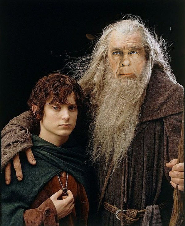 _________________ The subtlety and conviction of any Photoshop effect is invariably inversely proportional to the number of knobs on it ....... |
Posted on 25/06/20 1:16:05 PM |
|
Mariner
Renaissance Mariner Posts: 3350 Reply |
Re: Challenge 811: LWseen
Very convincing David. I wish I had thought of that. |
Posted on 25/06/20 1:20:06 PM |
|
DavidMac
Director of Photoshop Posts: 6275 Reply |
Re: Challenge 811: LWseen
And another ........ 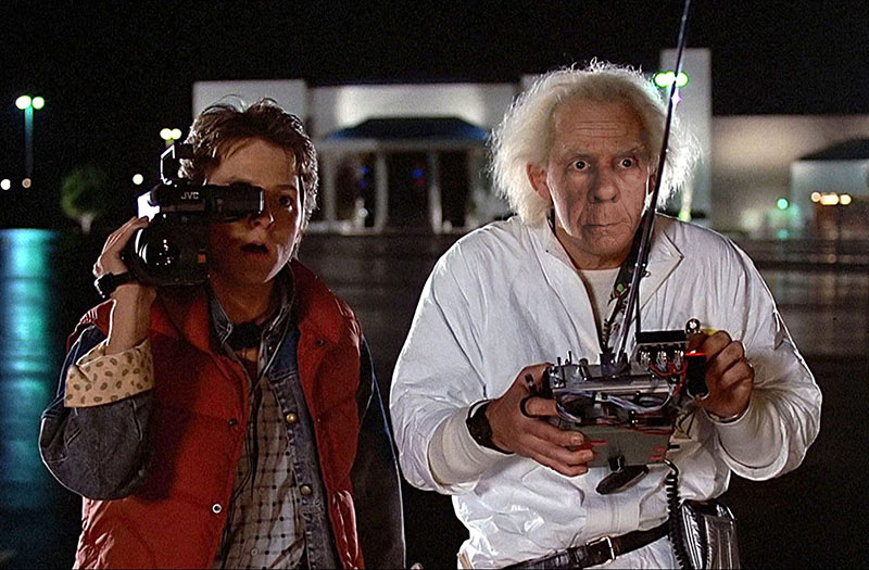 _________________ The subtlety and conviction of any Photoshop effect is invariably inversely proportional to the number of knobs on it ....... |
Posted on 25/06/20 5:03:06 PM |
|
lwc
Hole in One Posts: 3572 Reply |
Re: Challenge 811: LWseen
David, I have totally enjoyed seeing the amazing results of everyone's hard work. I wasn't sure what I was getting into, but it has proven to be completely painless and great fun for me. Michael Sinclair certainly deserves his gold star. There may be a need for another gold star award however, your last two are great. Thanks everyone for your efforts.... I've shared these with my family and they loved each and every one. Sign me... Chief Black Crow |
Posted on 25/06/20 7:15:52 PM |
|
vibeke
Kreative Kiwi Posts: 2209 Reply |
Re: Challenge 811: LWseen
I totally agree with that. _________________ Perfect confidence is granted to the less talented as a consolation prize. |
Posted on 25/06/20 9:40:20 PM |
|
michael sinclair
Off-Topic Opportunist Posts: 1871 Reply |
Re: Challenge 811: LWseen
First of all Loyd a big thank you for providing an excellent entry 
Yes brilliant work David! 
Thanks for the compliment Michael: it'll be the first time I have had the Gold Star. I cannot remember a time when I have enjoyed a challenge as much as this one 
Anna will recognise the type of "down under" character 


|
Posted on 25/06/20 11:24:25 PM |
|
lwc
Hole in One Posts: 3572 Reply |
Re: Challenge 811: LWseen
Michael, you are on a roll! While I don't recognize a specific character, I suddenly have 'Waltzing Matilda' going off over and over in my head...lol! |
Posted on 26/06/20 08:37:04 AM |
|
Steve Caplin
Administrator Posts: 7180 Reply |
Re: Challenge 811: LWseen
First to savour the extraordinary portrait was DavidMac, with a Depression-era montage in which Loyds head fits perfectly. Well, nearly perfectly; a touch more neck wouldnt go amiss. The collection of gears in the second entry was nicely done, although on opening the skull you need to take out some of the shadow that was under the hat. A fine treatment of Mount Rushmore in the third entry; and a novel stand-in for Clint Eastwood in the fourth entry. A fine Lord of the Rings tribute in the fourth entry, and a seriously splendid Doc Brown in the fifth entry. Good to see Nick Curtain back after a long break, with a very fine colouring job: subtle work, with just the hint of beard area. Is the building behind him on fire? And an extraordinary second entry - fantastic texture in that forehead. Good to have you back, Nick. A cleverly executed portrait from Josephine Harvatt, immaculately made. I like the new haircut. An entertaining second entry, too; but I wonder if the transition from Loyd to fox is too hard. A well-chosen setting from JimH, with a good choice of body. I like how youve left that group of flowers in colour - very Schindlers List. When adding elements such as the body, though, do be sure that the whites in the highlights arent brighter than those in the background. And, with that strong side lighting, he could really do with a shadow: 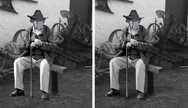
An on-topic michael sinclair, with a rather nightmarish farm setting. Interesting perspective here: I think our eye level is of someone sitting down, so Id make Loyd taller to bring him towering above us in the foreground. Good doomy stuff, though. An excellent second entry, but watch the texture mismatch with the neck: a touch of Median filter there would help. And bring that face down a little; eyes should be about half way up the head, not near the top. A great gunslinger in the third entry, too, but once again the eye thing applies: there isnt enough room for the top of his head under that hat. And I like the reworking of the first entry, with added effects. Id still consider making Loyd a lot bigger in the frame, though: 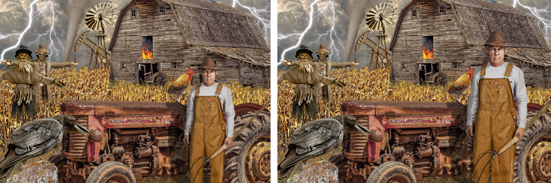
I really like the texture exercises in the fourth entry - its remarkable how much you can lose of the original image and still have it recognisable. I think perhaps texture overload in the fifth entry, though. An interesting aboriginal take in the sixth entry, and some sunflower fun in the seventh. Great work this week, Michael. Loyd has golf on his mind, says tooquilos - and its very neatly realised, so much so that I almost missed the fact that the top of his head has been rebuilt. Plenty of fun in the animated version, with spectacular lighting effects and some very neat 3D animation. I like the tornado, but not sure if the base of it should be spinning as well. The final golf sequence is fantastic! A terrific rebuild from Mariner, with tremendous matching of texture and a slick haircut. Very subtle colouring, too. A couple of points: the whites of the eyes look a little jaundiced; and maybe a touch more contrast in the forehead to blend in with the rest of the face? 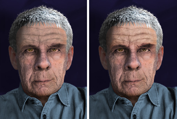
A playful second entry, thats rather touching - but seriously, Michael, lose those horrible sunglasses! Its American Gothic from GKB, with Loyds head standing in neatly for the original. An interesting blending of shirts! When working in monochrome, though, I strongly recommend using a Black & White adjustment layer to prevent mismatches between the foreground and the background: 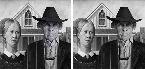
Historical golfing from Frank, with a beautiful colour scheme and artful shading. I really like the lighting in the second entry - immaculately achieved. As Vibeke says - nice work, Frank. Extraordinary work from Vibeke, with a new forehead that matches Loyds face perfectly. The shading, tonal matching, hair and background are all immaculately done; Vibeke, this is as near perfect a job as I can imagine. Many congratulations. A fun horror poster from srawland, nicely assembled. I think you could do a lot more with the typography, though; maybe some text curvature into an arc? With a bit of vertical distortion? _________ This has been a splendid week on the forum. Many thanks, Loyd, for the loan of your head! |
Posted on 26/06/20 08:46:44 AM |
|
Mariner
Renaissance Mariner Posts: 3350 Reply |
Re: Challenge 811: LWseen
Thanks Steve. Noted, except for this:
Loyd, Steve thinks your sunglasses are horrible! |
Posted on 26/06/20 09:07:13 AM |
|
vibeke
Kreative Kiwi Posts: 2209 Reply |
Re: Challenge 811: LWseen
Thank you Steve, I really struggled getting started with this one, and it was slow in the beginning, I had to keep coming back to it. I was happy with the finished result. _________________ Perfect confidence is granted to the less talented as a consolation prize. |
Posted on 26/06/20 09:07:19 AM |
|
JimH
Image Imaginator Posts: 74 Reply |
Re: Challenge 811: LWseen
Thanks Steve! I see what you mean in the second pic, does look more natural!! |
Posted on 26/06/20 09:16:09 AM |
|
Nick Curtain
Model Master Posts: 1802 Reply |
Re: Challenge 811: LWseen
Thanks Steve and great to have participated this week. Many thanks to Loyd for such a wonderful portrait to work with. I've had PS CC for some time now and this is the first montage work done using it. Many of the tools / features, i.e. swatches are different from CS6, so I did struggle initially, but hopefully I'll get the hang of it in time. The building in the first image is a wild west saloon at night, with the internal lights showing through the windows. I used the legacy 'save for web' at 600 x 400 px, but unfortunately this darkened the image and much of the background detail was lost. With the second, featuring Gary Oldman's Dracula, I used the export feature using 900 x 600 as the size and this gave a better result. Inspired work this week from everyone and great to join you all again. Nick |
Posted on 26/06/20 10:08:51 AM |
|
DavidMac
Director of Photoshop Posts: 6275 Reply |
Re: Challenge 811: LWseen
Oh dear me yes!
These were fun but surprisingly tricky. I tried a number of 'comparable' portraits (Einstein for one) but trying to maintain recognition and personality of both characters is really tricky. There is always a tendency for one to get lost. _________________ The subtlety and conviction of any Photoshop effect is invariably inversely proportional to the number of knobs on it ....... |
Posted on 26/06/20 12:11:07 PM |
|
lwc
Hole in One Posts: 3572 Reply |
Re: Challenge 811: LWseen
I didn't realize they were that offensive... I guess I will have to make a new avatar. lol. |
Posted on 26/06/20 2:25:08 PM |
|
srawland
Pixel Perfectionist Posts: 885 Reply |
Re: Challenge 811: LWseen
_________________ I'm still learning. |
| page: 1 2 3 4 last |