
| » Forum Index » The Friday Challenge » Topic: Challenge 860: The 1940s kitchen |
|
Posted on 09/06/21 4:38:51 PM |
|
DavidMac
Director of Photoshop Posts: 6256 Reply  |
Re: Challenge 860: The 1940s kitchen
Michael you did an amazing job on the little table with the bowls. I did the same thing for bathing baby. The bowl was easy but the cloth completely defeated me. In the end I gave up and clipped it out of picture. Lovely exterior too ... although the car is a tad anachronistic. _________________ The subtlety and conviction of any Photoshop effect is invariably inversely proportional to the number of knobs on it ....... |
Posted on 09/06/21 7:35:45 PM |
|
Mariner
Renaissance Mariner Posts: 3347 Reply |
Re: Challenge 860: The 1940s kitchen
Don't run yourself down, you did some really good work, David. The table with the cloth and bowls took me about 6 hours of study/work and I had to redo it a couple of times. The outside world is a shot of Cheapside, Birmingham, UK, which I have had on my hard disk for years. I wasn't sure how old the car was but I just hoped nobody would notice. Obviously not a lot gets past you, David. |
Posted on 09/06/21 9:35:15 PM |
|
DavidMac
Director of Photoshop Posts: 6256 Reply |
LLewelyn Bowen adds a touch of wartime chic in his latest makeover.
For those of you who may not be familiar with him, Lawrence LLewelyn Bowen was a camp British TV design guru who did a makeover show called Changing Rooms. Known for garish colours and generally over the top decoration, such was his flamboyant taste that his own luxurious extravagant mansion went unsold for a year until he re-decorated it 'normally'!  _________________ The subtlety and conviction of any Photoshop effect is invariably inversely proportional to the number of knobs on it ....... |
Posted on 09/06/21 9:58:27 PM |
|
dwindt
Realism Realiser Posts: 1093 Reply |
Re: Challenge 860: The 1940s kitchen
Wow David that's bright. Just what my room needs...lol. Thanks Lloyd. We were on the same page there thinking of WW2. I really don't know how the Brits survived all that bombing and still went across the channel and kicked some butt. Love the extension Mariner. Lovely stuff. Well I tried to make my image a little lighter without losing the feel I was aiming for. Dark pictures like this either work well or end up being to flat. Hope this one looks bright enough. I just wanted a subtle light on the stove but still wanted its form, contrast and high lights. Here goes  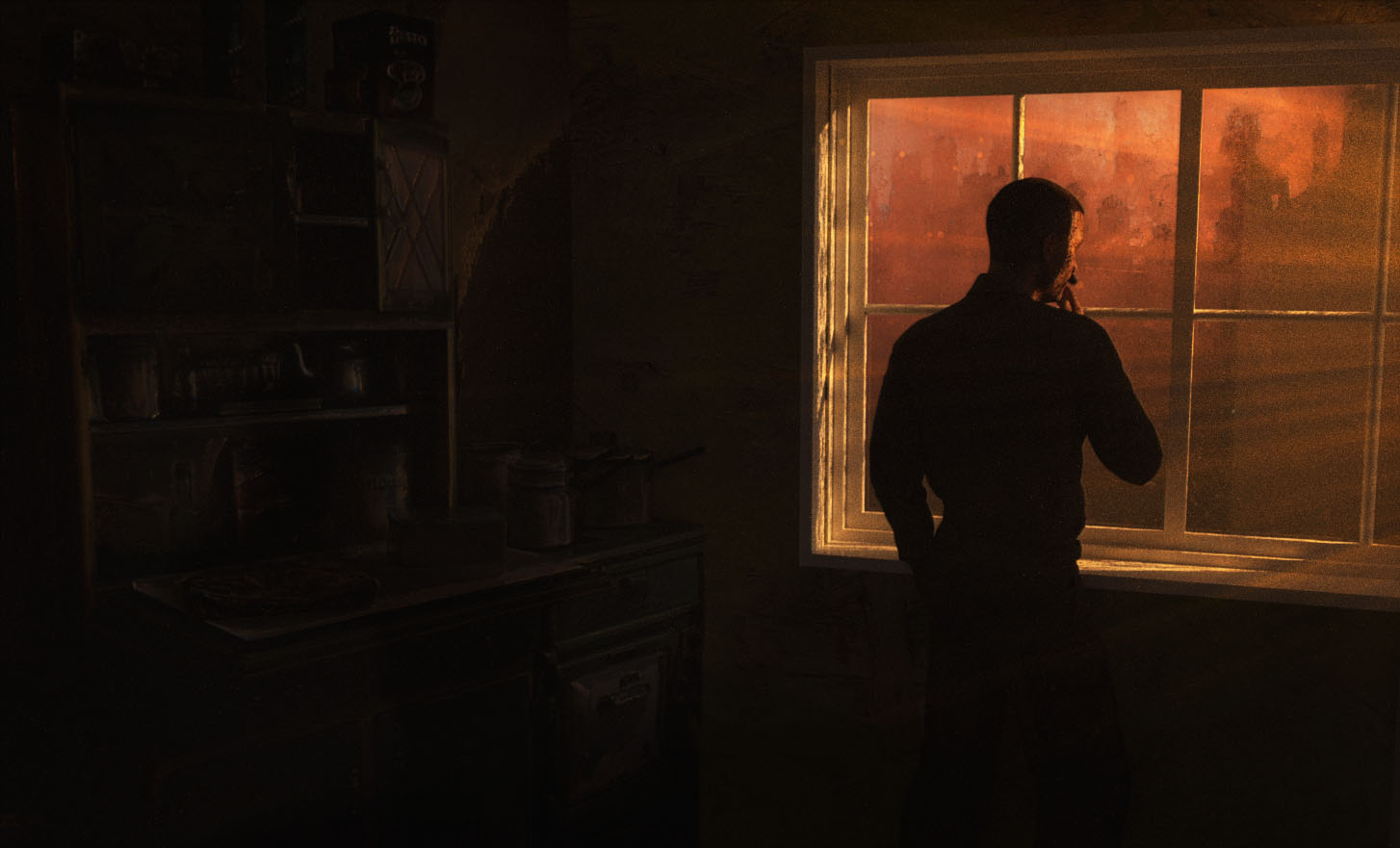 _________________ The grass is greener on the other side of the fence because there is more $hit there. |
Posted on 09/06/21 10:13:42 PM |
|
Frank
Eager Beaver Posts: 1877 Reply |
Re: Challenge 860: The 1940s kitchen
Some great and funny entries (David). Bit of a rush this week so a quickie. 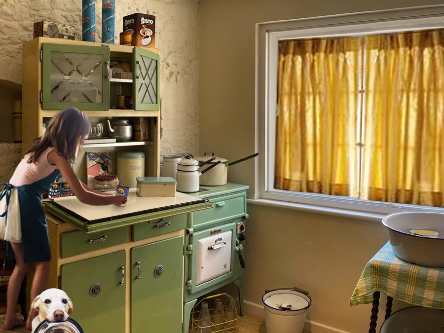 |
Posted on 10/06/21 02:56:46 AM |
|
Mariner
Renaissance Mariner Posts: 3347 Reply |
Re: Challenge 860: The 1940s kitchen
Thanks, Dennis. When in doubt, stretch it out! |
Posted on 10/06/21 03:07:04 AM |
|
Mariner
Renaissance Mariner Posts: 3347 Reply |
LLewelyn Bowen adds a touch of wartime chic in his latest makeover.
David, you have really brought out the murky contents of that cupboard. Llewelyn-Bowen. What a strange man he is. I can barely believe that for 32 years he has been, and still is, married to a woman, Jackie, and they have two children together. |
Posted on 10/06/21 09:52:25 AM |
|
DavidMac
Director of Photoshop Posts: 6256 Reply |
Re: Challenge 860: The 1940s kitchen
That's what it is here now. Still very close to the limit but some details just discernible. Personally I would be tempted to lift just the lighter tones a teeny bit while keeping the blacks crushed and solid. Very nice Dennis. _________________ The subtlety and conviction of any Photoshop effect is invariably inversely proportional to the number of knobs on it ....... |
Posted on 11/06/21 08:11:45 AM |
|
Mariner
Renaissance Mariner Posts: 3347 Reply |
Re: Challenge 860: The 1940s kitchen
Dennis, I just brightened it up a bit more, so I coulld see what was going on. 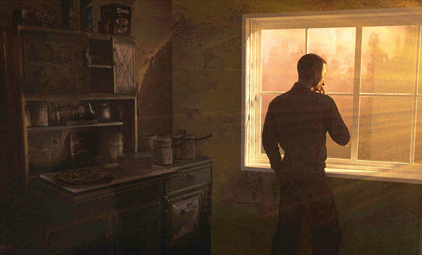 |
Posted on 11/06/21 08:54:06 AM |
|
Steve Caplin
Administrator Posts: 7178 Reply |
Re: Challenge 860: The 1940s kitchen
First to cook up this week was lwc, with a cheeky entry. Very cute, but why does it look like shes floating? Fading off her feet would help. A tremendous second entry, with the boiling-over saucepan (a wobbling lid would have been nice) and added poster and dog. The view of the allotments through the window is well chosen, although the distant house is perhaps rather too modern. I very much enjoyed the third entry, with a small reservation: the reflected scene doesnt quite work. And Im sure Gordon would have something to say about planes taking off in opposing directions. Perfect placement from DavidMac, although that window could do with replacing. I read the text out loud to Carol, who wasnt amused. The second entry, however, is a work of genius: the little girls expression is perfect. Spot on. (Ahem - window.) I really like the treatment of the third entry, with a good match of perspective to the original. Eye contact would be good, though, as would a new window. Beautiful lighting in the fourth entry - and I see youve finally dealt with that window! Although it creeps back in the fifth entry, but frankly theres so much going on here you barely notice it. The colours in the kitchen are suitably garish, but - oh! that suit! Great finger-jabbing action from michael sinclair, with that ghastly celebrity chef (and frankly, is there a more odious phrase in the English language) Gordon Ramsay. I especially like the twitching lips. A good view through the window, although the strength of the reflection makes it apparent its the same image translated. Maybe lose the bars? Perfect work from Vibeke, with a fine new window - I really like the sunlight on the woodwork - and a good new view. The woman is precisely resting her teacup; I suspect her feet wouldnt quite reach the floor, though. Best of all is the standing tea cosy. Absolutely splendid! And a fun second entry, with its discarded gin bottles. The subtly dishevelled nature of the standing woman is exactly right for the scene. Brilliant work. A touch of nostalgia from GKB, featuring a host of retro additions: Camp coffee, spam, a ration book, and a view through the window that almost plays the theme to Miss Marple. Kidney Soup, though? Really? Ill overlook the fact that this woman seems to have two cookers. Although her secondary double glazing is a little anachronistic. A pastry spy from tooquilos. What can he be up to? The womans movement and expression in the animated version are excellent, and the flying rolling pin is a fun event. The Stones song is exactly right. An image of great subtlety from dwindt, when its clearly blackout time. I can just make out the kitchen, but of course the real interest is in the man and the view. Very fine lighting. A little brighter in the second entry, but as I said its the mans pose that really draws your attention. Ah - I was wondering what those radiating lines were, and I see from the third entry that its sunlight streaming over the man. When it all appeared behind him in the darker versions it wasnt clear. Is that peeling wallpaper? Very subtle. A glorious extended kitchen from Mariner, revealing a door on one side and added windows the other. Rebuilding the cloth on the small table must have been an epic struggle. The bottoms of the cabinets are perfectly realised, as is the tin bath on the table. Extraordinary. An outstanding view, too, and I really like the new lighting. Two very small perspective points: we should be looking down on the base of the parrot cage, not up; and the doorknob needs to be nudged to the right, while leaving its base plate where it is. Otherwise this is beyond perfect. A rice pudding thief from Frank, from the looks of her; I like how the dog obscures the fact that theres nothing there for her to stand on. The new curtains work well, and especially good is the way they affect the lighting in the room. Very good. |
Posted on 11/06/21 09:12:21 AM |
|
GKB
Magical Montagist Posts: 4172 Reply |
Re: Challenge 860: The 1940s kitchen
Yep  _________________ Time flies like an arrow but fruit flies like a banana. |
Posted on 11/06/21 09:25:44 AM |
|
Mariner
Renaissance Mariner Posts: 3347 Reply |
Re: Challenge 860: The 1940s kitchen
Yes, I see you have measured the angles. The base of the cage is a bit out.
Ah, now that that was supposed to be a shadow, not a base plate. But they don't call you Hawkeye for nothing. |
Posted on 11/06/21 10:43:45 AM |
|
DavidMac
Director of Photoshop Posts: 6256 Reply |
Re: Challenge 860: The 1940s kitchen
Ingrid too!
To be honest the entry was more about having a giggle than photoshopping. The window was pure laziness. Hopefully Carol was more amused.
It was really difficult finding photos of women from the period which weren't ads with the woman looking straight into camera. You can see this reflected in many of the entries. It was exactly the case here too. I did my best to move her look with the neural filters which is what you see in the image. I tried extending it further by hand but it started to look grotesque so I left it as a 'best compromise'. Window was, once again, laziness. To tell the truth I wasn't at all happy with the entry so didn't try as hard as I could.
Yes. My favourite. I was on home ground with this one.
Since this was a 'wartime' styled makeover of a contemporary (Changing Rooms) kitchen by a man with little real sense of period I felt this was, for once, quite correct. The suit is genuine! I found this one really hard to get to grips with. But had a lot of fun! _________________ The subtlety and conviction of any Photoshop effect is invariably inversely proportional to the number of knobs on it ....... |
Posted on 11/06/21 11:44:52 AM |
|
lwc
Hole in One Posts: 3556 Reply |
Re: Challenge 860: The 1940s kitchen
My intent was that the smaller Spitfire flying in the opposing direction had made his turn and was on the far side of the runway flying towards the mission. I was struck by a quote from Winston Churchill that the movie, "Mrs. Miniver" (1942), did more for morale than a hundred new battleships, hence it's use here. One of my favorite wartime movies btw. With all that said, my favorite part is the animated mouse... 
Thanks Steve. |
Posted on 11/06/21 11:54:17 AM |
|
Frank
Eager Beaver Posts: 1877 Reply |
Re: Challenge 860: The 1940s kitchen
Thanks Steve, the girl is getting Ken-L ration dog food for our bowl carrying hungry dog. She is standing on a small kitchen stand which is obscured from view by our friendly pooch. |
Posted on 11/06/21 7:31:13 PM |
|
vibeke
Kreative Kiwi Posts: 2204 Reply |
Re: Challenge 860: The 1940s kitchen
Thanks Steve, everyone seems to have had fun this week. A few of us even remember those days. _________________ Perfect confidence is granted to the less talented as a consolation prize. |
Posted on 12/06/21 00:15:10 AM |
|
dwindt
Realism Realiser Posts: 1093 Reply |
Re: Challenge 860: The 1940s kitchen
Thank you Steve. Yes, it is peeling paper and wall plaster dislodged from the walls. I wanted the image to be subtle, trying to portray the dimness (but not flatness that I achieved) of a dusty, neglected room. Not neglected by choice but due to pressing priorities elsewhere. Dust and smoke would dim the atmosphere but I struggled to get the light on the stove. I wanted broken, flickering light from a fire illuminated through a dirt speckled window...and fell flat...like my picture. Thanks to the edging on of all, I just have to give it one more shot. Here's another take on it. 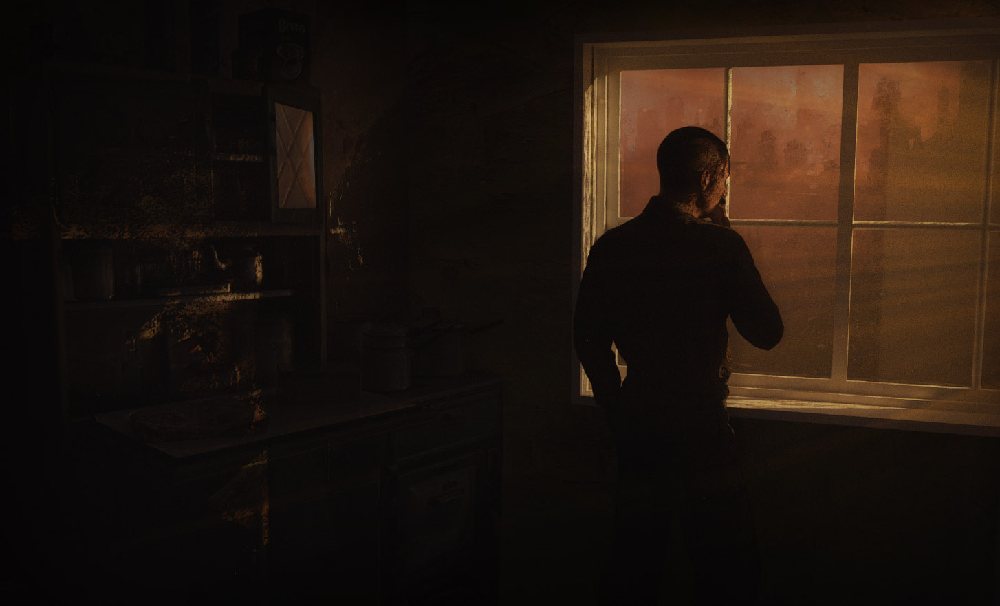 _________________ The grass is greener on the other side of the fence because there is more $hit there. |
Posted on 12/06/21 00:19:50 AM |
|
dwindt
Realism Realiser Posts: 1093 Reply |
Re: Challenge 860: The 1940s kitchen
What would I see if I walked into that room. It's smoky, dusty and night time and the room is being light through a dirty window, from multiple fires. _________________ The grass is greener on the other side of the fence because there is more $hit there. |
Posted on 12/06/21 01:14:05 AM |
|
tooquilos
Wizard of Oz Posts: 2986 Reply |
Re: Challenge 860: The 1940s kitchen
Thank you Steve _________________ Wicked Witch of the West:I'll get you, my pretty! And your little dog, too! |
| page: 1 2 3 last |