
| » Forum Index » The Friday Challenge » Topic: Challenge 861: St Francis |
|
Posted on 17/06/21 11:25:11 PM |
|
dwindt
Realism Realiser Posts: 1093 Reply |
Re: Challenge 861: St Francis
Love idea with the chess pieces Michael. Check the reflections though. Very effective Lloyd. Your madness clip is very appealing. Well done Mariner. I have really cheated with Daz and 3D lately so I did a Photoshop image this time round. 1 layer Daz, for the wolf and monk and 70 layers of png's, excluding 2 layers for a split background. 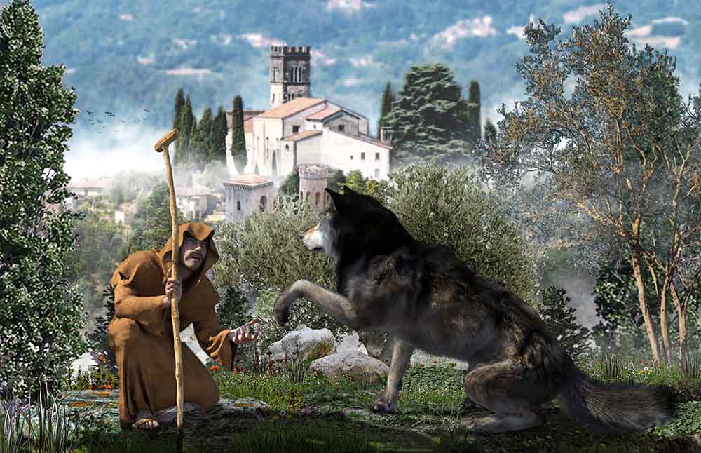 _________________ The grass is greener on the other side of the fence because there is more $hit there. |
Posted on 17/06/21 11:52:53 PM |
|
Frank
Eager Beaver Posts: 1878 Reply |
Re: Challenge 861: St Francis
Just getting in under the wire this week - busy : Nice work by all as usual: 👍👍👍a few quick thoughts Loved the David Mac entries Loyd - all great and innovative Michael - love the chess idea and presentation Beautiful Tom Very striking and superb dennis Love the skulls Anna Gordon - ST Francis a retired controller Mariner - love the straws ⭐️ http://vimeo.com/564387637 |
Posted on 18/06/21 09:04:27 AM |
|
Mariner
Renaissance Mariner Posts: 3349 Reply |
Re: Challenge 861: St Francis
Thanks, Dennis and Frank. |
Posted on 18/06/21 09:04:56 AM |
|
Steve Caplin
Administrator Posts: 7178 Reply |
Re: Challenge 861: St Francis
First to deal with St Francis this week was DavidMac, with a superlatively gooey scene of animal love-in. Fabulous blending and splendid fitting of all the elements. But I do have to take issue with your lighting. Clearly St F has to be in a shaft of light - but bring it in from the left, rather than the right, and the shading on his body will make sense. I enjoyed the second entry, with its added hourglass and scythe - very nicely done. Perhaps the gravestones should be as dark as the interior of the hood. A splendid story told in Mariner's extraordinary entry: the finger pointing to the empty jewel box says it all. The only thing that bothers me is the extreme perspective of the background. Does it really help to have the doors at that angle? But the ingenuity of the title excuses everything. A truly glorious second entry, with St Frank perfectly integrated into the Caravaggio scene. My only quibble is with the shadow of the glass - we should just be seeing an ellipse, I think. Im frequently astonished at the lengths dwindt goes to to create his images, and this is no exception. It is very fine, and I really like the new grass floor, but what a lot of effort! Wouldnt it have been easier just to paint the light in Photoshop? Good to see the full render, too. The close up view is very interesting - and thanks for the explanation! And I really enjoyed the third entry, with the remade Francis and his wolf. Not sure about the moustache, though. A selection of wolves and birds from lwc, with interesting lighting effects that vary between the scenes. I like the doves, but not the way both the wolf and the owl are mugging for the camera. And theres the wolf again in the second entry, with Frank wearing a rather racy knee-length cassock. Love the animated pigeons! Or whatever they are. I really like the subtle head and body movement in the third entry - but he really needs to lay off those mushrooms. A fun video entry from GKB featuring St Frank having what is, I assume, an alcoholic hallucination. I like the way his eyes follow the various aerial craft that fly past, and the bottle smashing makes a good finale. Oh, and I do love a bit of Gregorian chant in the mornings. Some celestial magic from michael sinclair, with fine lighting making the effect work really well. Like Anna, I was relieved you didnt blow him up at the end. Your wood treatment of St Francis in the second entry is absolutely brilliant - hugely impressed, although Id have stuck with just the one to avoid the lighting mismatch. A brave stab at the reflections in the board, but to make this work you really need to put a bit more into this. See below for how its done. A good garden setting from Vibeke, the lighting matching that on the body really well. Id maybe have tucked him behind those outstretched leaves to better integrate him into the scene, though. And perhaps the grass needs smudging up over his habit at the bottom? A rare appearance from Tom, showing a mountain trail unusually devoid of mystic symbols. I dont quite get what hes kneeling on, though, since the path continues to slope down behind him. Does he need a rocky outcrop? And I think his lighting is rather at odds with the position of the sun, or the moon, or whatever it is glowing up there. The skull-lined walls in tooquilos's entry remind me of the catacombs of Paris - and the whole thing has a rather Indiana Jones feel. Splendid shiny skulls in the animated version, and I like the animated snake. At first I was preparing to turn the volume down in case youd opted for A Skull Full of Maggots which, even by your heavy rock standards, is unbelievably ghastly. But just when you thought the music couldnt be any worse, in comes a version of Wish You Were Here apparently sung by a particularly sanctimonious vicar. Heaven help us! A fabulous animation from Frank, with a skeleton brought to life with extraordinary skill. the animation of those limbs is fantastic, Frank. Great work! ______________ Michaels reflectionHeres how to go about reflecting those chess pieces: 1. A new chessboard replacing yours (just so I could start again with the reflections). 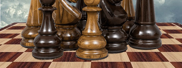
2. Select the bottoms of each chess piece, copy to a new layer and drag down vertically. 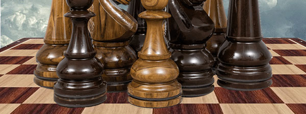
3. Copy the lower halves of all the chess pieces (obviously a lot easier if theyre all different layers) and use Image Warp inside Free Transform with the Arch transformation to make them all bend the other way. 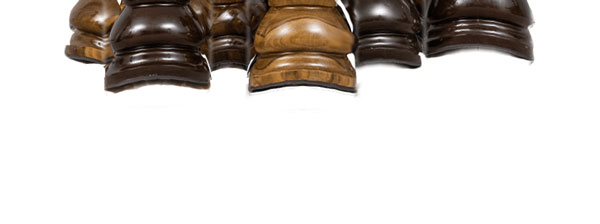
4. Move the transformed pieces down and below the copied bases. 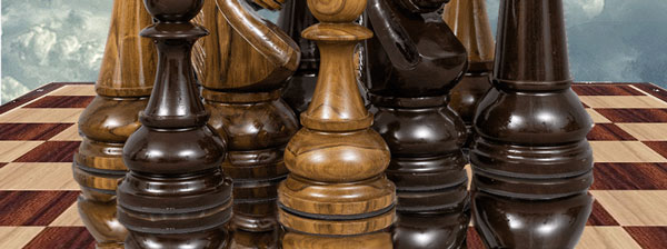
5. Lower the opacity, and perhaps add a Layer Mask to fade off the reflections. 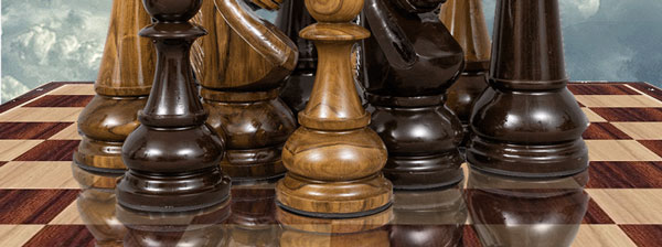
|
Posted on 18/06/21 09:26:18 AM |
|
GKB
Magical Montagist Posts: 4175 Reply |
Re: Challenge 861: St Francis
Thanks Steve. In case anyone is wondering where I got the idea for this challenge from - I have absolutely no memory of it and my head hurts🍷🥃 _________________  |
Posted on 18/06/21 09:32:39 AM |
|
Mariner
Renaissance Mariner Posts: 3349 Reply |
Re: Challenge 861: St Francis
Thanks, Steve, for a good appraisal. I opened the doors only to emphasize the standing players' heads.
On reflection, Steve, you are quite right. |
Posted on 18/06/21 10:32:32 AM |
|
michael sinclair
Off-Topic Opportunist Posts: 1871 Reply |
Re: Challenge 861: St Francis
Wow! Steve that was very helpful to learn something new---and it didn't cost me a penny! Thank you  |
Posted on 18/06/21 11:10:03 AM |
|
DavidMac
Director of Photoshop Posts: 6263 Reply  |
Re: Challenge 861: St Francis
I tried that but it was so inconsistent with the background lighting (which came already with the background) that it looked weird. I couldn't really flip him because he would be looking out of frame in a way that doesn't suit the rest of the composition. So I opted for compromise. Not sure what else to do.
Yes. I could crush just the bottom of the blacks to darken the foreground ones without destroying the mist on the others. Good idea! _________________ The subtlety and conviction of any Photoshop effect is invariably inversely proportional to the number of knobs on it ....... |
Posted on 18/06/21 11:33:30 AM |
|
Frank
Eager Beaver Posts: 1878 Reply |
Re: Challenge 861: St Francis
Thanks Steve, A lot of work for a one minute animation. Just for interest I used PS, Hit Film, and Apple's Motion 5 in the assembly. Like reading and learn from the other comments and great little tip on reflections - try to put it in my short memory bank 
Thanks for removing triple entry - have been having a little trouble lately posting and signing out. |
Posted on 18/06/21 2:20:10 PM |
|
dwindt
Realism Realiser Posts: 1093 Reply |
Re: Challenge 861: St Francis
Thank you Steve. I love the atmosphere that I can achieve with iRay and am using 3D more and more. It creates such a nice canvas to continue in Photoshop. You're right about that moustache. I have a very appealing morphing Montgomery like moustache that I meant to use. I started that image at about 20h00 last night. By 00h30, my eyes were crossing over each other and I never went back and changed it. The model had stubble on his chin but unfortunately, wasn't thick enough to blend the moustache in properly. Lovely work everybody. _________________ The grass is greener on the other side of the fence because there is more $hit there. |
Posted on 18/06/21 7:09:58 PM |
|
vibeke
Kreative Kiwi Posts: 2205 Reply |
Re: Challenge 861: St Francis
Thanks Steve, you are so right about the grass and leaves. _________________ Perfect confidence is granted to the less talented as a consolation prize. |
Posted on 18/06/21 10:57:10 PM |
|
lwc
Hole in One Posts: 3560 Reply |
Re: Challenge 861: St Francis
That comment went straight to the 'Mystery Shop'...
Thanks Steve...! |
Posted on 18/06/21 11:54:49 PM |
|
tooquilos
Wizard of Oz Posts: 2988 Reply |
Re: Challenge 861: St Francis
Thank you Steve When I first listened to the Gregorian Chant of Wish you were here, I laughed and thought this is perfect for the challenge!_________________ Dorothy: Toto, I've a feeling we're not in Kansas anymore |
| page: 1 2 3 last |