
| » Forum Index » The Friday Challenge » Topic: Challenge 992: The Big Deal |
|
Posted on 22/02/24 3:39:19 PM |
|
Mariner
Renaissance Mariner Posts: 3302 Reply |
Re: Challenge 992: The Big Deal
David, I am glad you like my effort, which only took a few hours as it was a lot easier than it looks. I was influenced by your art nouveau entry, which I thought was really good. I had several examples of stained glass already on my hard disk, so I picked two which fitted fairly well togeter, cleaned them up, added some black outlines, added colours and shades to make them a fairly good match, and put in some text. Here are my starting images: 
|
Posted on 22/02/24 10:14:27 PM |
|
DavidMac
Director of Photoshop Posts: 6127 Reply  |
Re: Challenge 992: The Big Deal
Thank you Micheal. As you say simpler than it looks. Knowing your propensity for complex re-builds from the ground up, I fell right into the trap of making assumptions and imagined something more convoluted.  _________________ The subtlety and conviction of any Photoshop effect is invariably inversely proportional to the number of knobs on it ....... |
Posted on 22/02/24 11:14:13 PM |
|
tooquilos
Wizard of Oz Posts: 2972 Reply |
Re: Challenge 992: The Big Deal
Michael, your entry is beautiful. Sorry to hear about your wife, Frank. Wishing her a speedy recovery. It must be difficult for you both. Costco is one of my favourite stores. They have a way of making you buy things you never realised you needed! On a recent visit I came away with a bay leaf tree, and a cabin bag complete an inbuilt USB charger. _________________ Wicked Witch of the West: I'm melting! I'm melting! |
Posted on 23/02/24 05:20:47 AM |
|
Mariner
Renaissance Mariner Posts: 3302 Reply |
Re: Challenge 992: The Big Deal
Thanks Anna, glad you like it. |
Posted on 23/02/24 06:38:43 AM |
|
Steve Caplin
Administrator Posts: 7157 Reply |
Re: Challenge 992: The Big Deal
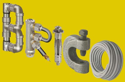
Ant Snell was the first to build a logo this week, with an ingenious B&Q tribute. I like the fact that the hose is spraying on the hedge, the tail of the Q, and the light flare on the B adds sparkle. Very nicely done. I see lwc is a fried chicken fan, with both legs and wings making up the lettering. The flames add a good heat ripple, although theyre somewhat at odds with the position of the shadow. Ben Boardmans IKEA text uses rooms built in the shapes of the letters, although I cant figure out what the vertical of the K is. The anglepoise lamp is a good shape well spotted. Not sure I like it lit up in them second version. A splendid combination of retro and modern tech in the Kodak entry, with ingenious construction of all the letters, especially the two Ks. Excellent. A brilliant piece of work from DavidMac, whose IKEA logo-building instructions are beautifully constructed. This must have taken hours to make I cant see any shortcuts possible here. I really like the Brico entry, especially its expertly constructed R. Wouldnt it work better with the letters in a line? 
Did you really fold that ten euro note manually? I suspect some help from Photoshop was involved. Very cute. A perfectly acceptable cheat from michael sinclair, with well-matched coffee brand alternatives. Good fitting. I have literally no idea why the banana entry is in this Challenge, but it is rather cute. The Zoo lettering in tooquilos's entry is extraordinary, built of a huge number of birds and animals. The animated version shows great close-up views, with added butterfly. And I like your lion in profile! The deconstruction of the original Costa poster by GKB works nicely, and thats a perfect soundtrack. Hope your ankle recovers! A beautiful glaziers advertisement from Mariner, really highlighting the stained glass window makers art. The textures are excellent, and the bevelled outer border adds a lot of realism. The only thing Id change here would be to make the text larger so that it touches the borders above and below: I think even an expert would have real difficulty placing the letters in the middle of a pane. A remarkable Costco from Frank, highlighting a wide range of edibles. Youve done this with tremendous wit and imagination, its a very fine piece of work. So sorry to hear about your wife: I wish her a speedy recovery. |
Posted on 23/02/24 07:59:18 AM |
|
Ben Boardman
Printing Pro Posts: 752 Reply |
Re: Challenge 992: The Big Deal
Ben Boardmans IKEA text uses rooms built in the shapes of the letters, although I cant figure out what the vertical of the K is. IKEA' famous Swedish meatballs from their café. Thank you Steve, enjoyed that challenge. |
Posted on 23/02/24 08:31:15 AM |
|
GKB
Magical Montagist Posts: 4140 Reply |
Re: Challenge 992: The Big Deal
Thanks Steve. I hope your shingles is getting better _________________ Have you ever noticed that all the instruments designed to detect intelligent life are pointing away from the Earth? |
Posted on 23/02/24 09:02:21 AM |
|
Mariner
Renaissance Mariner Posts: 3302 Reply |
Re: Challenge 992: The Big Deal
Thanks Steve. |
Posted on 23/02/24 2:03:42 PM |
|
Frank
Eager Beaver Posts: 1848 Reply |
Re: Challenge 992: The Big Deal
Thanks Steve and I hope you've recovered as well. Shingles are nasty - I got vaccinated to try and avoid their wrath. Now, off to the hospital again. |
Posted on 23/02/24 2:47:50 PM |
|
DavidMac
Director of Photoshop Posts: 6127 Reply  |
Re: Challenge 992: The Big Deal
It's something that Sketchup can do incredibly quickly and easily. The exploded view was created there and then ported into Photsohop for finishing. Yes it would. You are quite right.
When I was a youngster I loved origami and became very proficient. Devising the folds was easy, but bank notes are hard and springy and don't keep their shape. After folding I scanned them with a heavy book on top to keep them flat. The difficulty was that, depending on number and complexity of folds, the letters came out different sizes. Photoshop was used to combine and resize for a consistent whole. This one was fun. Thanks! Hope you recover soon. _________________ The subtlety and conviction of any Photoshop effect is invariably inversely proportional to the number of knobs on it ....... |
Posted on 25/02/24 05:36:25 AM |
|
tooquilos
Wizard of Oz Posts: 2972 Reply |
Re: Challenge 992: The Big Deal
Thank you, Steve. _________________ Wicked Witch of the West:I'll get you, my pretty! And your little dog, too! |
Posted on 25/02/24 12:14:29 PM |
|
lwc
Hole in One Posts: 3494 Reply |
Re: Challenge 992: The Big Deal
Thanks Steve! |
| page: 1 2 3 last |