
| » Forum Index » The Friday Challenge » Topic: Challenge 1106: Space at the Saatchi |
|
Posted on 28/05/26 08:52:52 AM |
|
DavidMac
Director of Photoshop Posts: 6244 Reply 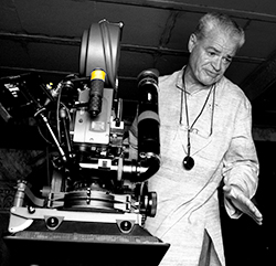 |
Re: Challenge 1106: Space at the Saatchi
Loyd. 'Fine art Photographer'. As a teenager, in an attempt to get away from conventional boring 'obvious' photos, I did exactly that! 
I set my camera on long exposures and moved it around. I was particularly fond of doing it at night where bright lights made lovely traces!  _________________ The subtlety and conviction of any Photoshop effect is invariably inversely proportional to the number of knobs on it ....... |
Posted on 28/05/26 09:16:23 AM |
|
Mariner
Renaissance Mariner Posts: 3340 Reply |
Re: Challenge 1106: Space at the Saatchi
Dotty Damien and Mr Blobby according to Wikipedia: "Mr Blobby first appeared in 1992 in the 'Gotcha' segment of the second series of 'Noel's House Party', a BBC TV series in which celebrities were caught out in a Candid Camera style prank..." "Damien Steven Hirst né Brennan, born 7 June 1965, is an English artist and art collector. He was one of the Young British Artists (YBAs) who dominated the art scene in the UK during the 1990s. He is reportedly the United Kingdom's richest living artist, with his wealth estimated at US$384 million in the 2020 Sunday Times Rich List..." So, folks, you can guess what dear old Damen was up to - making money by painting in blobs and putting dead sharks in tanks of formaldehyde. And he got lucky and made a fortune. I am old-fashioned and much prefer Caravaggio and his like and do not admire so-called 'modern' artists, who seem to me to have few artistic skills, have drug-induced imaginations, and, like Damien Hirst, are just hoping to get lucky. 
|
Posted on 28/05/26 10:39:04 AM |
|
dwindt
Realism Realiser Posts: 1084 Reply |
Re: Challenge 1106: Space at the Saatchi
No reason to apologies David. It's not like it's a high-definition image. I lighten the first image more than I liked to. Steve had once pointed out that some of my images are too dark. A dark image often suffers flatness and to deliver an image of a dark environment, is a gift indeed...so I do try and chase that. Maybe one day I'll reach greatness...lol. _________________ The grass is greener on the other side of the fence because there is more $hit there. |
Posted on 28/05/26 3:43:45 PM |
|
Frank
Eager Beaver Posts: 1876 Reply |
Re: Challenge 1106: Space at the Saatchi
Lots of great entries. Well done.  |
Posted on 28/05/26 4:21:46 PM |
|
DavidMac
Director of Photoshop Posts: 6244 Reply |
Re: Challenge 1106: Space at the Saatchi
Oh Frank ..... flattery! 
Actually it's a fun idea. But I am baffled by the large picture on the wall. It looks like a cynical view of the education system turning out lemmings or something of the sort. Is this a Caplin creation I've missed? _________________ The subtlety and conviction of any Photoshop effect is invariably inversely proportional to the number of knobs on it ....... |
Posted on 28/05/26 4:24:38 PM |
|
Mariner
Renaissance Mariner Posts: 3340 Reply |
Re: Challenge 1106: Space at the Saatchi
A Quickie with Tracey Emin  |
Posted on 28/05/26 4:42:07 PM |
|
DavidMac
Director of Photoshop Posts: 6244 Reply |
Re: Challenge 1106: Space at the Saatchi
I have to confess I suffer Damien credibility problems too ......... _________________ The subtlety and conviction of any Photoshop effect is invariably inversely proportional to the number of knobs on it ....... |
Posted on 28/05/26 4:43:47 PM |
|
Frank
Eager Beaver Posts: 1876 Reply |
Re: Challenge 1106: Space at the Saatchi
David - yes -This image is a surrealist photomontage created by artist Steve Caplin for The Guardian to illustrate the concept of schools functioning like "exam factories". The Guardian |
Posted on 28/05/26 4:58:45 PM |
|
DavidMac
Director of Photoshop Posts: 6244 Reply |
Re: Challenge 1106: Space at the Saatchi
New one on me. Well, I am glad I guessed the meaning correctly. I don't need any more booboos this week.  _________________ The subtlety and conviction of any Photoshop effect is invariably inversely proportional to the number of knobs on it ....... |
Posted on 28/05/26 5:15:50 PM |
|
DavidMac
Director of Photoshop Posts: 6244 Reply |
Re: Challenge 1106: Space at the Saatchi
Anna you have touched a raw nerve with me. 'Immersive' digital projections and animations of well know artists is one of my pet hates. The only time in my life I have been provoked to sit down and write a letter of complaint to a gallery was the Atelier des Lumières in Paris who were one of the first, if not the first, gallery to do this. That said and done, you've done it very well. There's a huge amount of work in there! Did you have help from Midjourney again? _________________ The subtlety and conviction of any Photoshop effect is invariably inversely proportional to the number of knobs on it ....... |
Posted on 29/05/26 02:22:47 AM |
|
tooquilos
Wizard of Oz Posts: 2985 Reply |
Re: Challenge 1106: Space at the Saatchi
No, I downloaded the videos from RawPixel. _________________ Wicked Witch of the West:I'll get you, my pretty! And your little dog, too! |
Posted on 29/05/26 06:18:32 AM |
|
DavidMac
Director of Photoshop Posts: 6244 Reply |
Re: Challenge 1106: Space at the Saatchi
An amazing site. I didnt know them. Thanks for the pointer.  _________________ The subtlety and conviction of any Photoshop effect is invariably inversely proportional to the number of knobs on it ....... |
Posted on 29/05/26 07:59:53 AM |
|
Steve Caplin
Administrator Posts: 7174 Reply |
Re: Challenge 1106: Space at the Saatchi
First to decorate the gallery this week was lwc, with a llama not a moose? I like the girl looking through the window. Do watch the perspective on that llama, though: its clearly shown by the railing and the top of the the door: 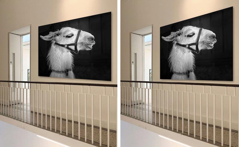
I like the use of the Tracey Emin paintings, with her standing in the doorway. Very appropriate. But perspective again! The meta image is intriguing, a photo of someone taking a photo of a photo. And it neatly hides the bottom of the perspective-baffling picture on the wall (but not the top). Good to see that image by itself. I enjoyed DavidMac's Silk Cut tribute, and it was a brilliant campaign by Saatchi & Saatchi. Purple was, of course, the Silk Cut house colour. The Saatchi and Nigella image is striking, with him subtly placed behind the window. I like the roll of gaffer tape around her wrist, having been used to stick up that notorious restaurant photo. A collection of Silk Cut ads from Ben Boardman, artfully displayed on the walls. The smoker is very appropriate. And thats a good treatment of the window. I dont recognise the artist in the second entry, but some of those images resonate in particular the swarm of giant ants, which was the most impressive exhibit in the show when I visited. That levitating cameraman, though um. Ah, that's better! Although not sure about the stability of the tripod when one leg is hovering in the air. I suppose GKB can always live in hope that his aerial photography will be recognised Charles seems to like it. And good to see the Damien Hirst shark behind the window. A wild Escher-inspired image from dwindt, with brilliant use of conflicting perspectives even through the window. Curiously, the staircase by the Escher original works much better in the upside down version I had trouble making sense of it in the original. Beautiful work. The thieves' den image is glorious, with a terrific array of artwork, although the perspective of that right hand wall is very much at odds with the platform. I like the truncating of the stairs, though, and the vast selection of objets. Why did you think it necessary to bar the windows? Also, DavidMac mentioned a trolley, but I cant see a trolley! David, are you hallucinating? The darker version is more intriguing, certainly. I like the way Ant Snell has chosen to install a couple of Damien Hirst artworks, particularly the ingenious cow hoist. Cute shark, too. Good additions of order sign, and the morose Damien. A fine cast of characters from Vibeke, neatly climbing those stairs. The food painting is splendid, but my eye is really drawn to that black knobbly thing hanging from the ceiling. Id like one of those. Plenty of classic art from tooquilos, although purists might balk at extending the Mona Lisa background and then punching a hole through it. Great lighting, and I like the Munch through the window. I really enjoyed seeing them all brought to life in the animated version, particularly the Van Gogh tribute at the end. I suspect AI had a hand in this and the lighting in the Van Gogh image is splendid. I appreciate Mariner may not be a Damien Hirst fan, but inflicting Mr Blobby on him is hilarious. Have you seen his shark, or his cow? I suspect not, and Im firmly of the belief that you have to see a work of visual art in order to form a true opinion of it. Otherwise the image holds together very well, all apart from the view through the window: we should surely be looking directly at those buildings, rather than up at them. I like the Tracey Emin image, although I prefer her earlier work the tent and even the unmade bed were surprisingly affecting. I loved Frank's exhibition of my artworks what a great idea, and so well executed! Makes me quite proud. And you even got in the couple from one of my exhibitions. Glorious. Lots of excellent entries this week. It reminds me of an illustration I did for the Sunday Times Magazine back in crikey! 2001: 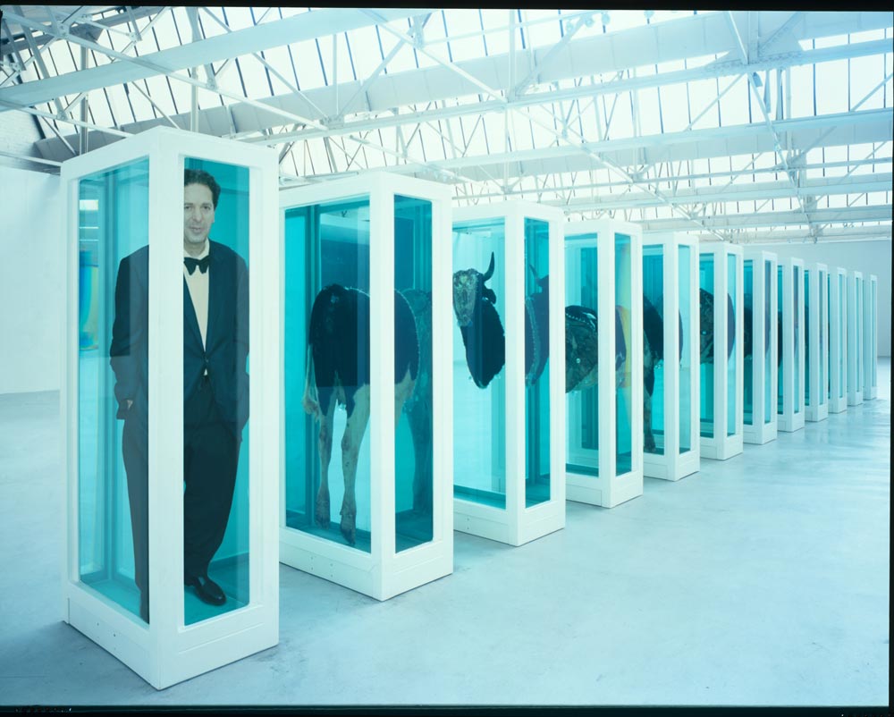 |
Posted on 29/05/26 08:05:56 AM |
|
DavidMac
Director of Photoshop Posts: 6244 Reply |
Re: Challenge 1106: Space at the Saatchi
By the way Anna I really like your banner this week. I find them really difficult, but you have given me an idea ............. _________________ The subtlety and conviction of any Photoshop effect is invariably inversely proportional to the number of knobs on it ....... |
Posted on 29/05/26 08:42:42 AM |
|
DavidMac
Director of Photoshop Posts: 6244 Reply |
Re: Challenge 1106: Space at the Saatchi
It was the one Saatchi and Saatchi campaign I was sure would have stuck in memories. Plus I was stumped for other ideas at that point.
Both are the kind of detail I love because they are not just detail they are narrative.
Yes badly!! If you read the full exchange between Dennis and I (which ended in humble pie consumption by me) you will see that I managed to completely misinterpret Dennis' image.
When photo shop still had 3D, which, I suspect, you used so effectively! Thanks. A quiet challenge that was quite thought provoking. _________________ The subtlety and conviction of any Photoshop effect is invariably inversely proportional to the number of knobs on it ....... |
Posted on 29/05/26 09:05:09 AM |
|
DavidMac
Director of Photoshop Posts: 6244 Reply |
Re: Challenge 1106: Space at the Saatchi
Steve something odd is happening. In the general index I see this: 
When I click it I am taken to this: 
Yo ho ho is missing. Tried in three different browsers. Same in all. Seems there's a dodgy link. _________________ The subtlety and conviction of any Photoshop effect is invariably inversely proportional to the number of knobs on it ....... |
Posted on 29/05/26 09:19:04 AM |
|
Mariner
Renaissance Mariner Posts: 3340 Reply |
Re: Challenge 1106: Space at the Saatchi
Steve, I spend a lot of time researching each of your Challenges, so of course I have by now seen many pictures of works by Hirst, Emin, the Chapman brothers and those of many other so-called modern artists. As I have not seen any of their works at close range, then surely my opinion of them must be invalid.
I remember many years ago when Tracey Emin first showed us her bed, dirty, and unmade. She must have known what many people would think of her. This week for the first time I saw a picture of her tent, showing how many men she had slept with. Was she ashamed? Don't know. Boasting? Who cares? A quickie with Tracey Emin? No thanks. After viewing pictures and sculpptures by the Chapman brothers I decided that some of them seemed to be bordering on deformed child pornography and one of them was a construct of four girls waving to form the arms of a swastika. What did you think of that one Steve? There are many beautiful woks of art in the world. I would like to see more of them. If it were ugliness I desired then I would just take a look at the real world around me or listen to the latest news. |
Posted on 29/05/26 09:38:55 AM |
|
dwindt
Realism Realiser Posts: 1084 Reply |
Re: Challenge 1106: Space at the Saatchi
Thank you Steve. I enjoyed the sweat of this challenge. I cannot believe I messed up the perspective in my second image. It kept on bugging me but I couldn't put my finger on it...and it's not slightly out, it's badly out. Maybe it was the struggle from managing the 160 plus layers. That was definitely "my trolley.  _________________ The grass is greener on the other side of the fence because there is more $hit there. |
Posted on 29/05/26 09:54:23 AM |
|
Mariner
Renaissance Mariner Posts: 3340 Reply |
Re: Challenge 1106: Space at the Saatchi
I am going to start painting anyway. I only need a title. "Yo ho ho" Something to do with rum, pirates, Treasure Island? I am sailing away with it! |
Posted on 29/05/26 11:11:38 AM |
|
dwindt
Realism Realiser Posts: 1084 Reply |
Re: Challenge 1106: Space at the Saatchi
Sorry, wrong quote...lol _________________ The grass is greener on the other side of the fence because there is more $hit there. |
| page: 1 2 3 4 last |