
| » Forum Index » The Friday Challenge » Topic: Contest 246: Lift the lid |
|
Posted on 28/04/09 1:02:26 PM |
|
GKB
Magical Montagist Posts: 4139 Reply |
Re: Contest 246: Lift the lid
No need to apologise Chris!! I managed to find some time for this.  _________________ Maturity is knowing when and where to be immature |
Posted on 28/04/09 10:45:36 PM |
|
james
Surreal Spoofer Posts: 1194 Reply |
Re: Contest 246: Lift the lid
 |
Posted on 29/04/09 09:50:56 AM |
|
chris berry
Overhead Overlord Posts: 724 Reply  |
Re: Contest 246: Lift the lid
Gordon, have you seen the poster art for Stephen King's "It"? This brings back chilling memories! |
Posted on 29/04/09 12:17:07 PM |
|
GKB
Magical Montagist Posts: 4139 Reply |
Re: Contest 246: Lift the lid
I had a look at it this morning....scary _________________ The meek shall inherit the Earth if that's ok with the rest of you. |
Posted on 29/04/09 12:33:27 PM |
|
Gerard
Digital Dutchman Posts: 145 Reply |
Re: Contest 246: Lift the lid
Hello everyone! I made this one, not really artistic, just the animal concept! Gerard  |
Posted on 29/04/09 4:46:03 PM |
|
josephine harvatt
Gag Gadgeteer Posts: 2605 Reply |
Re: Contest 246: Lift the lid
Highly convincing Gerard _________________ I'm not really bad - I just draw that way |
Posted on 29/04/09 6:19:55 PM |
|
Deborah Morley
Makeover Magician Posts: 1319 Reply |
Re: Contest 246: Lift the lid
Who would have that a manhole (sorry personhole)! cover would lead to so many excellent ideas! 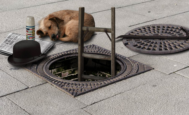 |
Posted on 29/04/09 6:27:54 PM |
|
Gerard
Digital Dutchman Posts: 145 Reply |
Re: Contest 246: Lift the lid
Thanks Josephine, for your kind words, It's an addiction that CS4!!! |
Posted on 29/04/09 7:02:18 PM |
|
maiden
Golden Gif Gagster Posts: 471 Reply |
Re: Contest 246: Lift the lid


My attempted not very inspired but hopefully you'll enjoy. |
Posted on 29/04/09 11:23:21 PM |
|
james
Surreal Spoofer Posts: 1194 Reply |
Re: Contest 246: Lift the lid
Maiden, That is inspired, and most intriguing. A vertical scroll, I wonder, could there be a tutorial here? |
Posted on 30/04/09 03:10:37 AM |
|
EMMA
Everglade Artisan Posts: 91 Reply |
Re: Contest 246: Lift the lid
 |
Posted on 30/04/09 5:05:08 PM |
|
gaoxiguo
赤土陶 器战士 Posts: 114 Reply |
Re: Contest 246: Lift the lid
走路一定要看路哟!   |
Posted on 30/04/09 10:59:31 PM |
|
brewell
Pixel Pentagrammarian Posts: 752 Reply  |
Re: Contest 246: Lift the lid
I made a small change to add emotional impact. I now call it, "Hope for the Left"
_________________ I aim to give pause. |
Posted on 30/04/09 11:23:26 PM |
|
josephine harvatt
Gag Gadgeteer Posts: 2605 Reply |
Re: Contest 246: Lift the lid

Very droll _________________ I'm not really bad - I just draw that way |
Posted on 30/04/09 11:36:47 PM |
|
brewell
Pixel Pentagrammarian Posts: 752 Reply |
Re: Contest 246: Lift the lid
You just gotta love the ambivalence of the English language. _________________ Is it necessary? Does it work? |
Posted on 01/05/09 04:07:07 AM |
|
Steve Mac
Grunge Genie Posts: 539 Reply |
Re: Contest 246: Lift the lid
 |
Posted on 01/05/09 08:37:59 AM |
|
Steve Caplin
Administrator Posts: 7157 Reply |
Re: Contest 246: Lift the lid
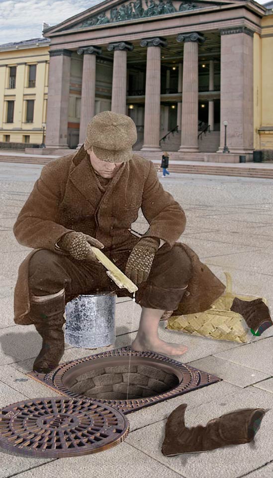
Plenty of debate about the nature of manholes this week. For what it's worth, I'm firmly in the "it's round so the lid can't fall in the hole" camp. To me, this is clearly a round manhole located within a square frame. A couple of general points about the solutions supplied. First, remember that the manhole needs an inner lip to sit on when it's in place. Only a couple of you got this: for the rest, the lid would simply disappear into the void when it's replaced. Second, there have been some valiant and impressive attempts to simulate the circular brickwork that would appear beneath the circular cover. Except if I were designing the drain, I'd simply build a square shaft beneath the lid: after all, why go to all the extra trouble of making it round? Nonetheless, congratulations to those of you who have managed to build a convincingly round brick hole. First up was Jeepy, with a strong night view. Except that the figure appears to be lit from behind, rather than by the lamp; and shouldn't it be casting its light on the stone as well? I like the colour scheme, but wonder if maybe it's too extreme. Very amused by the second entry - a neat idea, subtly created. I was very tickled by Ben Mills's Bugs Bunny peering out of the hole - a most entertaining view. Is the hole itself too bright, though? And that lid looks to me as if it's so small it would just fall right down. A terrific second entry: the interior could have done with a lip, of course, but this is an absolutely classic example of how to draw the shadow of the lid on the inside of the hole. (Except for the bit where it touches the base, of course, which needs to be extended to the left). Bugs Bunny looks a little flat, though: too much shadow beneath his head and highest foot? Ingenious work from mguyer: A good matching of tones, and I particularly like the way the manhole cover is part buried in the earth. Now, if only the outhouse could line up with the manhole orientation... A great idea in the second entry, that would be far more dynamic if the manhole cover could be tilted so that it looks like it's being forced open. I like the blur on the third entry - and the flying bolts! A very neatly distorted cover from vibeke, whose lizard is crawling convincingly out of the drain. Is the cover a fraction too short to fit the hole, though? And perhaps a touch more shadow on the back of the lizard? A solid entry from zapat, with the cover neatly removed and a good angle on the circular brickwork within. I like the thickness of the edge, but feel there should be more shadow inside the hole, directly under the lid. A steaming void from Jota120: has the lid been blown away by an explosion? Not entirely sure what's going on here, Trevor! All is redeemed with the second entry, though - the interior of the wormhole is especially well created. Point of interest: is that shadow of the moon on Jupiter's surface real? Ingenious work from tooquilos, whose snake charmer is coaxing a python out of the drain. Some great ideas here, such as the basket texture that lines the interior: of course, it's the animated version that holds the real fun, with a great soundtrack (I love the heavy breathing) and the final touch of the coins being tossed into the basket. Most amused by the cat tunnelling entry from The Mad Lep - shades of The Great Escape here. The lid could do with some thickness to it, and perhaps a slight shadow beneath: as it stands, it looks like it's fixed in place on the ground, with the hole coming up next to it. I like the grumpy cat on the far left. And the second entry is brilliant - but don't skimp on the detail inside the hole! And I like the Alice in Wonderland feel of the third entry - tasty. A very neat entry from powerslave, with a convincingly drawn concrete hole - and that lizard is a great addition. All that's missing is a slight shadow beneath the lid, and a lip inside the hole for the lid to sit on. Many congratulations to Nick Curtain, for being the first to include an interior lip on the hole. And it's beautifully shaded, looking perfectly realistic - as is the brickwork and the removed circular lid. It's only the shadow of the cones that looks slightly artificial here: otherwise, this is a really solid, convincing entry. Neat work, Nick. I looked for signs of the original manhole cover in michael sinclair' entry, and eventually found it - in the surround of the clock face from Big Ben. But, er... why is the clock telling three different times? An interesting displacement map exercise in the second entry, though, and the third entry is very appealing, and the fourth entry has great movement. As well as a fine interior lip! Great work from nerdtron, with great brickwork, an inner lip on the manhole and a great rocket powering out. The only thing I don't like is the shadow beneath the lid, which is fine over the stone but looks wrong over the hole. A much more dynamic second entry - except the lid's now too small to cover the hole! Ingenious work from brewell, who's dug up a background from the Friday Challenge following my trip to Oslo last year - cool idea! A great fisherman, but the brick lining in the hole appears to taper inwards as it descends. Keep those verticals vertical, and the effect will work more strongly. There's also something odd about the boot in the foreground: surely Google could have turned up a boot from the right angle? I like the idea in the second entry, of him fishing for a left boot - but surely that's already a left boot in front of him? A stark and powerful image from Josephine Harvatt - just the right amount of bulge on that eyeball, Jo. Although I'd hate to be the one to have to replace the lid! A fun entry from Whitney_rose - and, of course, it's apt that Mario the plumber should be emerging from the drain. A couple of shadow issues here: the lid definitely needs a slight shadow, as well as some thickness to it (see "Adding Depth to Flat Artwork" in the Third Dimension chapter). The shadow of Mario needs to be skewed to lie flat on the stone behind, rather than directly vertical behind the figure. But the way he's leaping out of the hole is perfect! I love the feel of lotz' entry, especially the contrast between the smoky destruction and the baby peering out. Good shattering on the lid, although it could do with some extruded thickness to it (see "Adding Depth", as above) for grater realism. The grime on the baby is very neatly added: but would the effect have been stronger if the baby had been rather smaller? A clever entry from Luis, with a good touch of interior brickwork and a very consistent feel to the whole piece. I like the carved lettering, but watch the perspective on Home Sweet Home - it's not quite a perfect match for the slab it sits on. The legs behind are a nice touch, as is the shadow suggesting an additional person. Beautiful tonal matching from stefan, which is what makes the crocodile look so consistent with the rest of the scene. But I'm going to have to question your lighting. The shadow of the tree - a great touch, by the way - clearly shows the sun to be way over on the left. In which case, shouldn't the left side of the interior of the hole be in strong shadow? And shouldn't the croc be casting a shadow to its right? Normally I wouldn't pick up on these points, but your attention to detail is legendary! A stunning, evocative and powerful entry from Les Moore, who clearly has a taste for the macabre. What interests me here is the way a complex story is being told through metaphor and suggestion. So many questions are being raised: why does the zombie girl have no body? Who are the three shady figures in the background, and did they tie her there to satisfy the drain monster? It's also the consistency of tone here that adds tremendously to the uniform feel of the image. I wasn't sure if perhaps the girl and distant figures were part of the image you started with, but having used the ingenious TinEye to track down the original, I'm convinced this is all your own work. In which case, a definite early title for you. Nothing in your profile to go on... so based on this week's image alone, I think Surreal Storyteller best sums up your superb achievement. A great sense of movement in horonggo's entry - but is Wind the right way to create the sense of motion? I like the Craquelure texture, but it should have been sheared to match the angle of the hole. Great stone carving! An unusually macabre entry from james, with a nicely modelled drain interior and a truly grisly monster reaching out. And, try as I might, I can't imagine what inspired you to create the animated entry: intriguing stuff, James! You really should lay off the mushrooms for a week or two. Great Aladdin genie in the second entry - his second position needs the opacity lowered, no? I like katew's homage to a brilliant street artist: keeping the stone texture on the devil drawing is a very neat idea. The angle of the manhole doesn't seem quite to match the perspective of the scene - but, as with all his work, maybe we're viewing it from not quite the right angle? A clever reference from Chris Berry, with a nicely drawn interior and steam: but why is Marilyn so large? And more background needed! I like the thickness of the removed lid, although a shadow beneath would help to ground it. Great lighting from GKB, and a good suggestion of the monster beneath. Of course, for true realism the light should beam through all the holes in the round drain cover as well - if you had a spare week or two in which to create it! A very neat idea from Gerard - I like the surrealism of the giraffe sticking its neck out of the hole as it breaks out of the zoo. The torn-away grass is a good touch as well, as is the position of the ZOO lettering on the fence: lots of good ideas in here. A thoroughly charming entry from Deborah Morley - there's a story being told here, although I'm not quite sure what it is. But a very consistent marrying of elements, with two brilliant touches - the perfect lip on the hole, and the square shaft beneath. Gorgeous work. Beautifully round brickwork from maiden- a great angle, and it's very hard to get this one right. I like the animation on the second entry, especially the clever touch of the time it takes for the blown-off lid to fall back to earth. Should it perhaps have fallen back in place? Then the animation could happily loop endlessly. And, as James points out, the vertical scrolling on the smoke is ingenious. A great story is being told in Emma's entry - it's like a whole Hollywood movie in a single frame. Great angles, the pile of money is perfectly placed. The lid could do with some thickness to it, and it's a little too small to cover the hole: otherwise, this is a really good montage. Beautiful work from gaoxiguo: there's a subtlety of movement here, and a photographic realism, that works perfectly. Excellent! A fantastic inner shadow from Steve Mac, matching the shadows of the scene perfectly - and accentuated by the shadow of the torch. The square shaft interior is spot on, and the thickness of the lid works a treat. If only there were an inner lip for it to sit on... Excellent work this week. I've really enjoyed it. |
Posted on 01/05/09 08:58:11 AM |
|
Jeepy
Modeleur Mystique Posts: 174 Reply |
Re: Contest 246: Lift the lid
Hi Steve. In my idea, the hole was already lighted. The Beast live inside with his Belle. Have you never watch on tv "beauty and the beast" in 80's ?  Thanks for your comment. Thanks for your comment.  |
Posted on 01/05/09 09:34:48 AM |
|
Les Moore
Surreal Storyteller Posts: 92 Reply |
Re: Contest 246: Lift the lid
Thank you so much Steve. That really means a lot to me coming from an artist that I truly respect and admire. I'm fairly new to photoshop and I only know the very basics but I'm learning. As far as the story behind it you are correct in the fact that the men tied the girl to the tree as a sacrafice to the "monster". There's more to the "story" and metaphors but I like people to interpret my stuff they're own way...sort of like music. Anyway...thanks again. Oh..and yes I started out with the just the woods scene and added everything else. That "tineye" is pretty cool. I didn't know about that. 
|
Posted on 01/05/09 09:56:43 AM |
|
stefan
Detail Demon Posts: 401 Reply |
Re: Contest 246: Lift the lid
Steve, You are VERY right indeed...and as on so many occassions.....I noticed about the shadow of the crocodile afterward. Although I did paint one for it before I came up with the tree shadow idea.But then an overlay layer blew that one away. And may I , to my defence, add that I was IM-ing with my girlfriend at the same time, who lives in London by the way, so I was VERY distracted.....
Next time I'll try and keep my attention to what I'm doing... Have a great Bank Holiday weekend |
| page: 1 2 3 4 5 last |