
| » Forum Index » The Friday Challenge » Topic: Challenge 324: In the factory |
|
Posted on 04/11/10 11:13:05 PM |
|
Emil
KAFKAsFRIEND Posts: 413 Reply |
Re: Challenge 324: In the factory
 _________________ The most beatiful thing we can experience is mysterious. It is the source of all true art and sience. - Albert Einstein |
Posted on 05/11/10 05:02:19 AM |
|
dejá_vu
Guest Reply |
Re: Challenge 324: In the factory
well, here goes mine... 
Awesome works this week. Mine is a "little bit" away from the briefing but I hope you like it anyway.  _________________ There are men who fight one day, and are good men. There are men who fight a year, and they are better. There are men who fight many years, and they are very good. But there are men who fight all over their lifes. Those are the indispensable. Bertold Brecht |
Posted on 05/11/10 05:32:31 AM |
|
dejá_vu
Guest Reply |
Re: Challenge 324: In the factory
And, this week I have a second entry. I've straightened (it's well said so?) the perspective a little bit.  _________________ There are men who fight one day, and are good men. There are men who fight a year, and they are better. There are men who fight many years, and they are very good. But there are men who fight all over their lifes. Those are the indispensable. Bertold Brecht |
Posted on 05/11/10 08:53:51 AM |
|
Daniel
Poser Professor Posts: 192 Reply |
Re: Challenge 324: In the factory
Deja-vu, Your European Space Agency satellite is very nice. A nerdish observations though (which doesnt have anything to do with the quality of your beautiful artwork from an artistic point of view  ): ):
The two wings you see on satellites are solar array wings serving the purpose of providing energy ... One of the main goals during the design of the satellite's body is to make them as flat and as possible (torque, stabilization etc.). Hugh blocks of mass are not that practical
|
Posted on 05/11/10 10:08:35 AM |
|
Steve Caplin
Administrator Posts: 7157 Reply |
Re: Challenge 324: In the factory
First to open the factory doors this week was Ben Mills with a fine interior - I especially like the way that crate on the right is poking through the entrance, neatly tying the two ground surfaces together. The interior on the left appears to be sloping uphill, though, in both the base and the verticals. a ten degree rotation anticlockwise should sort this out. Jota120 starts off with an interesting exercise: removing the perspective from the original view. A striking construction, Trevor. Disturbing work in the second entry: there's a real sense of menace here. Not quite such a real sense of perspective, though, as your ground seems to slope up too sharply. There's something powerfully compelling about the third entry entry: I love the way the factory texture wraps around the sphere and the torus, creating a fascinating selection of alien objects. It's a beautiful technique - mind if I borrow it for the next edition of the book? The first of several aeronautical entries came from aschiewe, with some very good plane cutouts. Good attention to detail here: the damaged sign, the shadow on the ground, the good fitting on the interior. A few points: the wheel of the plane nearest us looks like it's off the ground - and if you;re going to flip the plane horizontally, make sure you flip the lettering back! Also, you've opened the shutters by sliding the whole thing up and skewing it. Not necessary: simply cutting off the bottom of the shutters would give the same impression. A great gag from Eggbox, with a newly-built plane that won't come out through the narrow door. Excellent perspective on the interior, with loads of added detail - the arguing pair outside, the two missing zeroes turning thousands into tens on the sign. The only awkward part is the sign itself, which needs some shading (and less saturation) to make it look real. In the second entry, the truck on the left fills the space very neatly - and I like the way you've carried the shading through onto the face, very nicely done. The shot of the subway train on the left, though, is rather at odds with our view of the building: if you look at the base of the doorway reveal, the angle of the brick with the ground is the angle you should be following. A weight-reducing factory from micky47 - and it's clever getting both girls wearing the same outfits. There's a problem with the perspective, though, both on the interiors of the factory (this could have been helped by stretching to the right) and on the conveyor belts. Would it have been cleaner without the belts? When you're distorting lettering in perspective, keep the verticals lined up with the clear verticals in the background. I'm always impressed when people produce a good water cutout, and LonnieK's gushing torrent is no exception. Perfectly achieved, with just the right angle - a thoroughly convincing piece of work. The only tiny change I'd make would be to put a bottom rail of some kind on those shutters, which seem to terminate too abruptly. Another aquatic adventure in the second entry, this one rather more restrined. Perfect perpsective, on the interior view and on the placement of the car: nicely weathered signs, and a shadow cast by the girl that matches the shadow on the shutters. I really like that opened door, as well - a very neat touch. Great work. An exuberant chocolate factory from tooquilos - and I like the detail of the closed Cadbury factory next door. Fantastic choreography in the animated version - I love those twirling canes! Terrific perspective and very subtle cloud effects from brewell - this is a thoroughly convincing scene on every level, from the fork lift truck loading the cloud to the small pieces of stray cloud that have fallen off. The only small thing you need to address is the left edge of the HP sign - it needs to align with the vertical in the wall behind it. There's a definite video game feel to Daniel's entries, starting with a well matched interior (and a very neatly extended opening). I like the Poser figure out front. The perspective, though, is a problem: all those pipes and shafts running along the ceiling should really be parallel to the front wall, no? The solution: take them all out, except at the very back. The problem is solved in the second entry - is that plane a 3D model? In which case, you need to switch the lighting so it's lit from above, and not from below. And then add a shadow on the ground. An immaculate job from Nick Curtain, with perfect perspective. The interior is nicely darkened to contrast with the blazing sun outside, and just enough of the sunlight seeps in to match the angles of the shadows cast on the shutters. Only the main sign could do with a little texturing to stop it looking quite so new. Beautiful work, with excellent lighting, from Tomiloi: I like the way the soldier in the front casts three shadows. Very good fitting on the Star Trek interior - but I'd straighten out that right wall (and just the wall) to make it match the angle of the front of the building. An interesting choice of viewing angle: we're now looking at the scene from above, when in reality I was standing flat on the ground when I photographed it, so the soliders' eyeline should be roughly the same as the viewer's. Nevertheless, this does work! Spectacular fireworks from Josephine Harvatt - an interesting use of Find Edges there! I love the dragon made of fireworks, a very novel idea. A convincing view from GKB, with a rather fine sports car ( a nice 3D model) in front of a well-fitted interior. A couple of things about perspective: the bottom of the Flying Service sign should line up with the course of bricks beneath, and the left of the Pepsi machine should align with the side of the opening to its left. Also the verticals on the interior seen through the left doorway seem to be sloping, when compared with the edge of the doorway: easily fixed! A great night scene, though, and a beautifully lit-up Hotchip sign - but the shadows of the man should be pointing directly away from those floodlights. And shouldn't the mechanic have some hair? Oh, maybe not. A striking lightning scene from Stefano Giacomuzzi, with strong rain effects - particularly effective in the animated version. I like the reflections in the wet ground. The perspective is too strong inside the building, though: the floor should slope up less sharply than this. And one final thing: if you're going to light up the spotlight, you need to remove the shadow beneath it! A first Friday Challenge from nix, with a packed entry - there's a lot going on here! I like the way the counter on the right neatly spans the doorway, with the bored girl behind it. The scene behind her, though, seems too strongly angled for the perspective of the building: would a plainer background work better here? I like the trash on the left, but it would be much more convincing if some of it was spilling out through the doorway. That would tie the interior to the exterior in a much stronger way, and wouldn't be difficult to achieve. Keep them coming! James has gone to a lot of effort this week, with a boating scene that's absolutely packed with detail. Note how the front shutters really do slide up, rather than just a mask: this has mean reapplying the shadow each time, of course. The boat bobs up and down on the lake in the background, and the girl walks in and tosses her bag in the craft in a convincing manner. Just a could of things: the horizon on the view in the back is rather too high for the perspective of the scene, even though it neatly matches the girl's eyeline; and making the interior brickwork rather darker would give it a stronger sense of being indoors. Plenty of activity in Vibeke's entry - and well done getting all those eyelines aligned!I like the way you've followed the interior floor up from the angle set by the brickwork, but bringing a ceiling down to meet it - or, at least, a beam or two - would have helped to counter the impression of the whole interior drifting upwards. Are you sure about those interior shadows? What's casting them? And that cardboard box seems to be sinking into the ground! Welcome to Garfield72, our second new member this week. A very good factory interior, and I like all the added elements outside - the pipes, the fire alarm, and the signs. They should all have shadows, though, to make them look more in place on the walls. Bienvenue chez notre forum, François! Sophie's solution to the perspective problem: cover it all up! I like the assembly team shot outside the factory, and would have thought these youth volunteers came from quite a different setting to the rocket behind - until I noticed that one of them is holding a model of the rocket. What's the story here? Who are these people? An excellent array of signs from Emil: these really do look as if they're lit by bright sunlight, which is no easy task. I like the van and stack of boxes, but is the rear of the van in too strong a perspective? There's something about the bottom edge that doesn't quite work for me... which is odd, because you've carefully followed the lines in the ground. I'll have to think about this one! Great shadows, too. A magnificent space station from Dejá_vu, built out of pieces of the original scene bolted together. There's some fantastic attention to detail here: the carefully ribbed lettering on the side, the added thrusters, the sense of motion, and the overall completeness of the whole scene. The only thing I'd question here is the depth of field blur. It's a good idea, but the planet below is perfectly in focus - and that's very much further away. Nevertheless, this is a terrific piece and is certainly good enough to earn you a forum title. So, let's see... You live in Spain, your avatar is Japanese, and your forum name is French (but with the accents in the wrong place)... I think it has to be Stellar Constructor for this image alone. Very good work. And the second entry only confirms the decision: beautiful lighting, fantastic perspective matching, and lovingly lit-up floodlights. The only thing you need to do is take those original shadows off the doors. Excellent work from all this week. |
Posted on 05/11/10 10:37:25 AM |
|
aschiewe
* Posts: 39 Reply |
Re: Challenge 324: In the factory
Ahh drat ...The devil is in the detail, I did not notice the letters I obviously spent too much time on a good cut out and separating each windscreen with paths etc. I am getting good with the pen tool now though..lol and yes looking at the wheels again they do look a little strange. As for the shutters i overkilled them, i sometimes do too much to make things as realistic as possible ... all good stuff Steve thanks... |
Posted on 05/11/10 10:38:47 AM |
|
Daniel
Poser Professor Posts: 192 Reply |
Re: Challenge 324: In the factory
Thanks a lot for the comments Steve. What you're saying about the ceiling and the problem with the perspective is absolutly valid ... Thanks ... |
Posted on 05/11/10 10:39:58 AM |
|
Emil
KAFKAsFRIEND Posts: 413 Reply |
Re: Challenge 324: In the factory
Hi Steve, I have the same feel. The rear of the van made me nearly crazy, I spent 2 hours to played with the perspective of it. I asked some people at work what is wrong and they told me that the rear is under too strong perspective. I will try to correct it and post it again here. Also, I think there is problem with angle of wheels. Thank you for your comment. _________________ For me the creative process is more one of discovery than creation. - James Lee Burke |
Posted on 05/11/10 12:06:54 PM |
|
josephine harvatt
Gag Gadgeteer Posts: 2605 Reply |
Re: Challenge 324: In the factory
Thank you Steve _________________ I'm not really bad - I just draw that way |
Posted on 05/11/10 1:29:10 PM |
|
Jota120
Ingenious Inventor Posts: 2615 Reply |
Re: Challenge 324: In the factory
Thanks again Steve!
No of course not, please do, I'd be honoured. Anyway, the inspirational hint for me came from your CS5 book!  I can send you the rough texture I built, but I'm sure you can infer and do better I can send you the rough texture I built, but I'm sure you can infer and do better
That's great Deja-vu! Dos grandes creativos de imagen Deja-vu! Bienvenido a su título de nuevo al foro. (oops need to check my Spanish Believe it or not my last one was meant to be in that "space" deja-vu indeed . ..... they landed instead
Trevor |
Posted on 05/11/10 3:42:38 PM |
|
dejá_vu
Guest Reply |
Re: Challenge 324: In the factory
Thanks a lot Daniel for your advise but I have to point the fact that is not a satellite but a Cargo Ship
I thought that the look of the garages were so industrial that could fit a perfect inerplanetary UPS service, (hehehe) Anyway, thanks for your interest once more _________________ There are men who fight one day, and are good men. There are men who fight a year, and they are better. There are men who fight many years, and they are very good. But there are men who fight all over their lifes. Those are the indispensable. Bertold Brecht |
Posted on 05/11/10 4:00:52 PM |
|
dejá_vu
Guest Reply |
Re: Challenge 324: In the factory
thanks a lot Steve, I love my new name.
And believe me, I was thinking almost half an hour about the convenience of the blur (ctrl-Z over and over ) and decided to keep it because the look without it was so "crispy" to me, like a plastic model instead a real space ship.
The shadows on the second entry are really wrong because there's no light source from ahead. Next time I will spend more time fixing those details. Tnaks a lot again! _________________ There are men who fight one day, and are good men. There are men who fight a year, and they are better. There are men who fight many years, and they are very good. But there are men who fight all over their lifes. Those are the indispensable. Bertold Brecht |
Posted on 05/11/10 4:10:35 PM |
|
dejá_vu
Guest Reply |
Re: Challenge 324: In the factory
Ok Nick, tell the truth... you waited for the garage to open and took this real photo, didn't you?
_________________ There are men who fight one day, and are good men. There are men who fight a year, and they are better. There are men who fight many years, and they are very good. But there are men who fight all over their lifes. Those are the indispensable. Bertold Brecht |
Posted on 06/11/10 01:49:59 AM |
|
tooquilos
Wizard of Oz Posts: 2970 Reply |
Re: Challenge 324: In the factory
Thank you Steve _________________ Wicked Witch of the West: I'm melting! I'm melting! |
Posted on 06/11/10 12:09:05 PM |
|
Sophie
Political Parodist Posts: 595 Reply |
Re: Challenge 324: In the factory
You're quite right Steve, no convincing story. Didn't think of that aspect! I looked up Euro Energy, the name on the rocket and found this: "Welcome to EuroEnergy.Net, the home page of the European Commission Funded Infrastructure Co-operation Network in the areas of Combustion and Solar Energy. Beats me Gov. Sounds like a lot of hot air! |
Posted on 06/11/10 1:20:56 PM |
|
Emil
KAFKAsFRIEND Posts: 413 Reply |
Re: Challenge 324: In the factory
Steve, here is my attempt to correct the rear of the van. I think it looks better now. 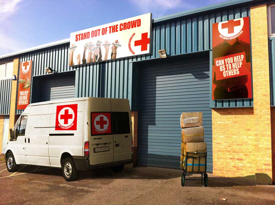 _________________ There are most happy who have no story to tell. - Anthony Trollope. |
| page: 1 2 3 4 last |