
| » Forum Index » The Friday Challenge » Topic: Challenge 333: art appreciation |
|
Posted on 13/01/11 4:06:56 PM |
|
josephine harvatt
Gag Gadgeteer Posts: 2605 Reply |
Re: Challenge 333: art appreciation
+1 ! _________________ I'm not really bad - I just draw that way |
Posted on 13/01/11 4:32:44 PM |
|
Garfield72
Montage Manceau Posts: 353 Reply |
Re: Challenge 333: art appreciation
 |
Posted on 13/01/11 8:53:47 PM |
|
james
Surreal Spoofer Posts: 1194 Reply |
Re: Challenge 333: art appreciation
Anna, Trevor, & Josephine. Your comments are appreciated. |
Posted on 13/01/11 9:01:37 PM |
|
Emil
KAFKAsFRIEND Posts: 413 Reply |
Re: Challenge 333: art appreciation
Really great entries from everyone. My quick attempt. 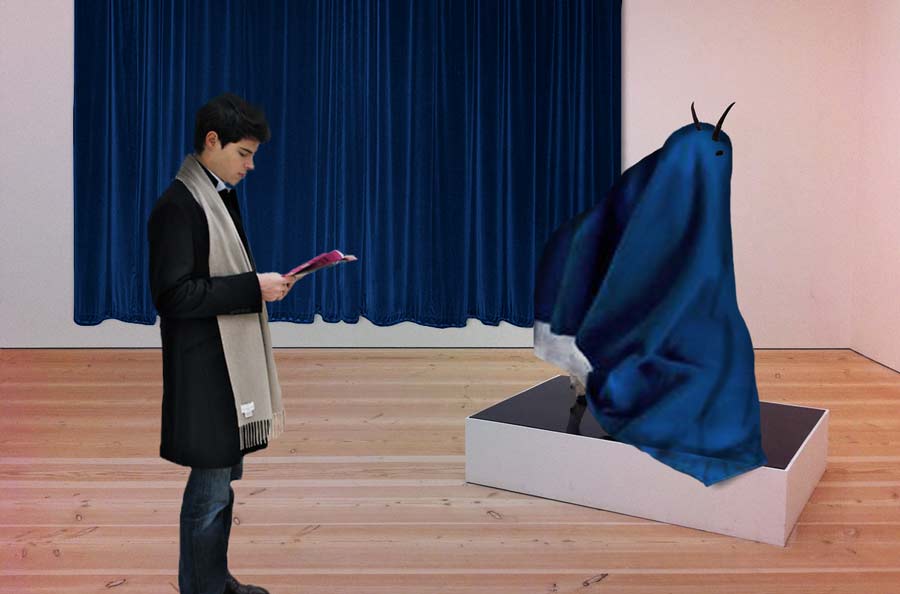 _________________ For me the creative process is more one of discovery than creation. - James Lee Burke |
Posted on 13/01/11 10:39:50 PM |
|
emanuelefrau
* Posts: 43 Reply |
Re: Challenge 333: art appreciation
ok james, you are the best for me ... _________________ italian Photoshopper |
Posted on 14/01/11 00:24:22 AM |
|
Eva Roth
Luminous Liberator Posts: 269 Reply |
Re: Challenge 333: art appreciation
What can you devise that will fill this space? Can you come up with an appropriate companion piece? Runnung out of time here, but hasn't photoshop now got a devise to fill spaces with the appropriate content? Well, this is what I got I'm afraid... James, ten out of ten for your animation!!!  |
Posted on 14/01/11 08:00:20 AM |
|
Daniel
Poser Professor Posts: 192 Reply |
Re: Challenge 333: art appreciation
Hi Emil, the piece of clothing over the goat is very convincing. Did you draw it yourself? |
Posted on 14/01/11 08:22:06 AM |
|
Emil
KAFKAsFRIEND Posts: 413 Reply |
Re: Challenge 333: art appreciation
Hi Daniel, I only cut a suitable piece of blanket from a photograph and placed it. There was only work with bottom fold and some adjustment of light and color. _________________ For me the creative process is more one of discovery than creation. - James Lee Burke |
Posted on 14/01/11 08:26:01 AM |
|
Daniel
Poser Professor Posts: 192 Reply |
Re: Challenge 333: art appreciation
Thanks for the explanation Emil. It is very well done.
|
Posted on 14/01/11 08:48:40 AM |
|
Steve Caplin
Administrator Posts: 7157 Reply |
Re: Challenge 333: art appreciation
First into the gallery this week was brewell, with a photographic counterpart of the goat played by a leopard - with the bowling ball that accompanies the skittle. Mac users will appreciate that it's a Snow Leopard. Watch those hues, though: the room is full of warm tones, and the warmth of the white walls should be the same as the white snow. The photograph jumps out too much as it stands. Another bowling story, this from tooquilos. I like the strong shading, which brings a good focus down onto the sculpture. I like the way the ball rolls in the animated version, but surely the light glare should remain in the same position? Good detail in the reflections! And, do you know, you're right - it is a bottle of perfume, not a bowling ball. Well spotted! Another bowling ball, this tome from Nick Curtain, sprouting a giant pair of goat horns. I like the texturing of the ball to match the pin, but there's something not right about the perspective of this one. It might be as simple as the fact that the front hold is above the midline of the ball, when the high viewing angle would be strengthened by it being below the horizon... I'm not sure what's wrong, but something doesn't quite gel. I might have a go at this one myself and see if I can work it out. I like Ben Mills' Men who stare at goats film reference, complete with men staring at the goat. The additional sculptures are a nice idea, especially as they're also all staring at the goat. Not sure about the elephant teapot, Ben! Intricate work from Dejá_vu, with a sheep climbing out of a photograph. I like the ripple effect, which gives a very good sense of transition between the two planes; and, especially, the dried-up, melted goat in the corner - very nicely achieved, with a cool reflection. I liked Sophie's scapegoat gag - with a rather fine set of decorated bowling pins on plinths that match the perspective of the scene rather well. I'm sure there's a story behind those pins, but I have no idea what it might be. I've tried to identify the painting in the background, but with no success - can you tell me who it's by? A new member this week - and lunah has created an intriguing pair of pictures that transform the bowling pin into butterflies. As you point out, it is hard to see that they're butterflies: the answer, surely, would be to have one of the paintings showing just a single large butterfly/pin? A great effect, though, and I do like the way the picture is tucked behind the goat. It's amazing how something as subtle as this can really place the pictures so firmly into the scene. Welcome to the forum, lunah! I see Daniel's been at Poser again - and what better way to create a goat-bowl merger. A very impressive result, and a very neat counterpart to the original. I'm not sure the picture in the background adds much to the scene: really, it distracts from an otherwise well accomplished pairing. It's partly the colours of the painting, which are too brash for the subtle lighting of the room; partly the huge border, which takes up space without really adding anything; and partly - well, what curator would position a painting so it's hidden behind sculptures? Stick to the Poser goat! A Bosch-like scene from Jota120 - looks like you drew that one by hand, Trevor. So that's what it's like inside your head. I always wondered. I'm not sure the bowling balls escaping from the picture really add much, rather than simply being distracting; and are they supposed to be floating? The shadow of the one on the right makes it appear to hover just above the floor; and the position of the ball in the foreground is far too high to be resting on the ground. And I'm seriously baffled by the second entry - is that background a goat having a nightmare? Thanks for the footnote - that really makes it all crystal clear. Ahem. A serene scene from puffin31939, with very neat decoration on the pin (or, indeed, perfume bottle). I like the way the colours of the room have been changed to match the sunset tones of the photograph. But why are the goats in the picture headless? And if their heads are removed, shouldn't we be able to see the backs of the necks? Absolutely ingenious work from LonnieK, who has constructed a hugely complex reflection. I like the subtle differences - the changed figure, the replaced perfume bottle, the flowers in the vase in the corner. Amazing that you managed to track down a rear shot of the artwork, and have managed to integrate it so perfectly into the scene: this is beautiful, detailed work. If it were me (and this is just a suggestion), I'd add a very slight tinting or lowering of contrast to the mirror, just to accentuate the fact that it's a separate plane: I'd also consider adding a bevel showing a distorted reflection, again to help mark its edges. You must have really worked hard on this one - the perspective is amazing! A great Star Trek gag from Josephine Harvatt - you know, I always wondered why the transporter never beams someone down halfway through a wall. Still, at least we know the goat will survive the experience - only crew members we've never seen before who wear red or blue uniforms get senselessly slaughtered in the first few minutes on a new planet. Great expression! Another new member this week, and Learner has moved the scene to outer space. It's hard to make out the nature of the surface that artwork is standing on, due to the extreme viewing angle: and with the sun visible, you need to add a more visible highlight to the edge of the planet in the foreground. I take it you're a reader of 100% Photoshop! Welcome to the forum, Larissa! Very clever work from sutex, who has merged a new goat into constructions that look like they've come from a Jeff Koons artwork - although they're probably just bowling balls. Very neatly done, and I like the way you've positioned the second plinth further away. I do, however, find all the background additions simply a distraction: the image would be much stronger without them! Clever work from emanuelefrau, who has merged two interlocking hands together and applied a strong stone texture to them. Very convincing. There's also something intriguing going on in the painting on the right, but it's too small to make out clearly! I think the photograph on the left, the fancy frames, and the pale Mona Lisa do rather detract from the simplicity of the scene, though: they break up the composition, rather than adding to it. Interesting work from michael sinclair, with a reptile eye that doesn't just open, it leaps off the canvas. Is this intentional? Not sure you can entirely blame Photobucket! I like the crocodile leaping out to catch the goat in the second entry - ouch, that looks painful. Michael, I seem to remember seeing another (very off topic) entry from you earlier in the week - have you deleted it? An intriguing and subtle entry from Deborah Morley, with a phone rather neatly immersed in, er, a lumpy brown thing. I really like the way the surface curls over the phone, and the fact that the cord comes out of the picture and goes down a hole in the floor. But to really make this effect work, you need to run the shadow straight down the wall and then along the floor, to accentuate the distance of the hole from the wall. James has been his own model - or, in his words, provided his own stunts - for a really clever animation, which brings to life both the goat (note the swinging bowling pin, complete with motion blur) and an appreciative nod from the painted goat in the background. Serve you right for sitting on artwork! This is one of those animations you have to watch over and over to see all the detail: the rebuilt plinth behind the bowling ball, the reflection of the camera, the changed position of the goat's rear leg, and of course the rebuilding of the front of the goat when the pin is swung out of the way... amazing amount of detail. Especially good to see your Hitchcockesque guest appearance. Very accomplished work from Carlo Alessandro Della Valle, with two men straining on the goat's leash. Careful when you distort a picture frame, though - you also make the proportions of the frame widths look wrong. Much better to use Content-Aware Scale on an image like this. And I'm not sure about the dog's shadow - or even, really, the dog. Keep it simple! A bronze rider on a real cow from vibeke - a nice counterpoint to the goat, I think. Does it need the repeated copies down the side? Or does that simply make the image more complex? I appreciate that you needed to make the picture wider! I like Garfield72's merger of the sheep with the bowling ball - perhaps the front leg should be inside the ball? Hard to see, as it appears as a photograph on the wall... I like the way you've shaded the rest of the gallery, though. But when you're choosing a font for the plinth captions, please - anything but Comic Sans! Subtle work from Emil, with a rather beautifully modelled sheet covering the goat - did you draw that? Or is it a photograph? I like the added background curtain, but would be happier if the boy's feet weren't cut off at the bottom. Interesting, intriguing work. A great joke from Eva Roth, who has used Photoshop's Content Aware Fill to fill the space "with appropriate content" - and with appropriately bizarre results, as often happens when CAF gets overloaded. What an ingenious solution! ______________________________ Very good work this week, with a lot of artistic inspiration. One problem that affected a lot of you was the need to carry on tinkering after the job was finished, adding background detail, textures, shading and additional figures. Unless there's a good reason for background elements to be there, miss them out: they only detract from the simplicity of the scene, drawing the eye away from the focus. That's why gallery walls are usually plain white! Knowing when a work of art is finished is tricky - the temptation to keep adding material can be overwhelming. Resist it! |
Posted on 14/01/11 09:06:20 AM |
|
Nick Curtain
Model Master Posts: 1800 Reply |
Re: Challenge 333: art appreciation
Steve We are looking straight into the thumb hole, so that is pointing up towards us and we are looking down towards it. A ball will always look round, whatever the viewing angle. Nick |
Posted on 14/01/11 09:28:38 AM |
|
brewell
Pixel Pentagrammarian Posts: 752 Reply  |
Re: Challenge 333: art appreciation
Toned it down, warmed it up, now it fits better. Thanks. _________________ The journey of a thousand hours begins with a single layer. |
Posted on 14/01/11 09:50:56 AM |
|
Sophie
Political Parodist Posts: 595 Reply |
Re: Challenge 333: art appreciation
Thanks Steve. The bowling pins come from a barmy site called Rocket Ships for Shoes. http://rocketshipsforshoes.com/contentmonument/bowlin-pin-art-show The painting is by an American called Arthur Dove. http://www.metmuseum.org/toah/works-of-art/49.70.75 |
Posted on 14/01/11 09:58:12 AM |
|
puffin31939
Montage Mariner Posts: 383 Reply |
Re: Challenge 333: art appreciation
Steve, Thanks for your comments. I was trying to make the photo more like a painting and blend all the images together. I have been too heavy with the filter. The heads are still there but they are so flat that they merge with the background. Better attention to detail next time! _________________ Man cannot change the direction of the wind but he can adjust the sails |
Posted on 14/01/11 11:11:45 AM |
|
tooquilos
Wizard of Oz Posts: 2970 Reply |
Re: Challenge 333: art appreciation
I didn't even think of the light glare on the ball. Thank you Steve for pointing that out! _________________ Wicked Witch of the West:I'll get you, my pretty! And your little dog, too! |
Posted on 14/01/11 11:21:32 AM |
|
josephine harvatt
Gag Gadgeteer Posts: 2605 Reply |
Re: Challenge 333: art appreciation
Thanks Steve. I was going to have Kirk floating and then I remembered: ye canna change the laws of physics  _________________ I'm not really bad - I just draw that way |
Posted on 14/01/11 11:34:01 AM |
|
lunah
* Posts: 6 Reply |
Re: Challenge 333: art appreciation
Thanks for the feedback, Steve. Much appreciated! |
Posted on 14/01/11 11:55:28 AM |
|
emanuelefrau
* Posts: 43 Reply |
Re: Challenge 333: art appreciation
Thanks for the suggestions Steve: indeed it is sometimes difficult to understand when you are exaggerating! but maybe I had guessed that I was exaggerating ... thanks! _________________ italian Photoshopper |
Posted on 14/01/11 12:43:07 PM |
|
Jota120
Ingenious Inventor Posts: 2615 Reply |
Re: Challenge 333: art appreciation
Thanks again Steve. The drawing is really old, from when I was a student of physics. It was driving me crazy!. I got over it(?). The spheres are meant to be floating. Agree, not sure they add much apart from 3+3+3. For the second entry, sheep/ram dreaming is great idea. I never looked at it from that view. I love the guy jumping though, perfect fit IMHO  . .
: |
Posted on 14/01/11 1:07:06 PM |
|
dejá_vu
Guest Reply |
Re: Challenge 333: art appreciation
Thanks a lot Steve. And thanks to all of you for sharing your ideas and comments  I love this 'game'! I love this 'game'! _________________ Thank god for the google translator to help me not to make too many mistakes |
| page: 1 2 3 4 5 last |