
| » Forum Index » The Friday Challenge » Topic: Challenge 956: The cruel sea |
|
Posted on 25/05/23 11:34:39 AM |
|
Mariner
Renaissance Mariner Posts: 3302 Reply |
Re: Challenge 956: The cruel sea
 |
Posted on 25/05/23 5:42:14 PM |
|
DavidMac
Director of Photoshop Posts: 6125 Reply  |
Re: Challenge 956: The cruel sea
No. But adapted quite a bit to get transparency where needed as the 'transparent' parts are actually grey in the original.  _________________ The subtlety and conviction of any Photoshop effect is invariably inversely proportional to the number of knobs on it ....... |
Posted on 26/05/23 02:06:44 AM |
|
tooquilos
Wizard of Oz Posts: 2972 Reply |
Re: Challenge 956: The cruel sea
Thanks David. You did a great job with it. _________________ Dorothy: "there's no place like home!" |
Posted on 26/05/23 08:30:16 AM |
|
Steve Caplin
Administrator Posts: 7157 Reply |
Re: Challenge 956: The cruel sea
Frank set the bar high this week, with a beautifully lit entry. I like the muted colours of the boat, the composition, and the opposing angles of the boat and the lighthouse and, of course, the neatly removed shadow from the sail. Perfect work, and a real challenge for everyone to follow. A terrific storm from lwc, with excellent motion and swirling mist and spray. I like the idea of the rippling sails, but thats a curious way of making them do it! I was very amused to see the mud skipper from last week making a guest appearance. Now that really is threatening. But not as threatening as the tornado entry, with its restrained gloomy setting. A very entertaining fishtank entry, which reminds me of the old flying toaster screensaver. I like the photographers reflection. Very restrained contrast in the sunken entry, although Im a little confused by the translucence of the weed in front of it. The sharks add value; might have been better if one or two of them were swimming behind the masts, rather than all in front of them. Some curious spray in the oh, Ive lost count, so Ill call it the curious spray version. Why is it spraying from the sides of the boat, rather than from the front? A good reinterpretation in the Popeye entry. I think my first taste of spinach was one of the biggest disappointments of my childhood. Very fine work from michael sinclair, with splendid flapping of the sails and truly nauseating sea motion. Expertly done. By the way, I disagree with you about your treatment of Frank's entry: the HDR full-on texture overload removes the subtlety of the original. Its surprising how well even a two framer can work, although the spikiness of the front wave is a little disconcerting. Is this the return voyage, as the boat is facing the other way? I did really enjoy the third entry, with its scrap of floating sail. Apart from the over-busy sky. Ingenious toying with perspective in the fourth entry, where youve compressed the boat vertically rather than moving it. Its a technique that really shouldnt work, but surprisingly does: we really feel as if were getting a different angle of view. Fascinating. I must try this for myself. DavidMac's Hokusai wave treatment has entailed hand drawing the whole boat truly, a labour of love, if not extreme frustration at times. Having done this for work before, I know how time-consuming it is. Beautifully done, David. A very serene moonlit entry, although of course we shouldnt be able to see inside the boats reflection. Its remarkably simple to do just curve the hull reflection in the opposite direction: 
The ship in a bottle entry must have taken a while, and very cute it is, too. Wouldnt the thickness of the glass at the corners produce some refraction, though? Really enjoyed your answer to Michaels bottleneck question. By the way, it sounds as if you Imgur issue might be a content blocking problem check your Safari preferences. I enjopyed Mariner's entry, with its new crew (I like the seasick one) and painstakingly cut-out rigging although there must be some reason why youre called Mariner. Two queries: should the sea on the side of the boat be quite as straight as that? And why the extra-dark band of shadow? A truly remarkable second entry, with a new set of sails and rigging and a couple of extra spars. Thats one hell of a threatening wave. Tremendous. A metaphorical entry from GKB, with some curious water gushing over the edge in a rather too neat spurt. The animated version does rather bring it to life, although the upper edge of the water in the cup remains surprisingly elliptical despite the raging storm. Good to see Ben Boardman back, and worth noting that this is the first Friday Challenge entry proudced using the generative tools in the latest beta version of Photoshop. Its actually rather good and does raise some serious ethical issues! I enjoyed Ant Snells model railway entry. Theres something about that pouring bucket that makes it look more like molten lead than water, though. Is it simply a matter of making it slightly transparent? And could the boat do with a reflection? 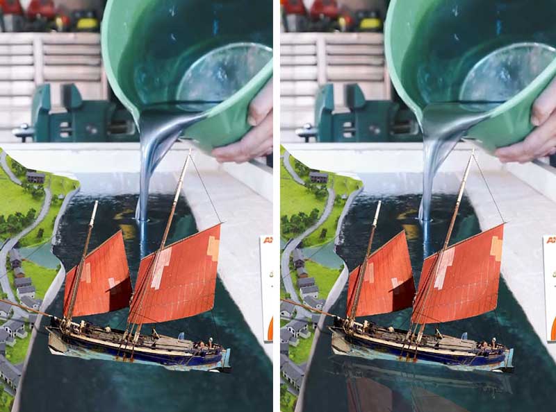
The aftermath of a serious storm from tooquilos I like how little space the boat takes up in the image. I like the first two scenes in the animated version, just a shame we cant get to see the wreck itself! But thats a warm welcome from the man in the cottage. A good ending. |
Posted on 26/05/23 09:15:35 AM |
|
GKB
Magical Montagist Posts: 4140 Reply |
Re: Challenge 956: The cruel sea
Thanks Steve _________________ Whatever you do in life do it with the enthusiasm of a 4-year old in a Batman suit. |
Posted on 26/05/23 09:25:56 AM |
|
Mariner
Renaissance Mariner Posts: 3302 Reply |
Re: Challenge 956: The cruel sea
When I first logged on to your site, Steve, many years ago, I needed a user name. Mariner was the first name that sprang to mind, short for The Aincient Mariner, a famous poem by samuel Coleridge-Taylor. I have always loved the sea.
I stand (rightly) corrected. Thanks Steve. |
Posted on 26/05/23 11:11:45 AM |
|
lwc
Hole in One Posts: 3494 Reply |
Re: Challenge 956: The cruel sea
Ha, just be glad I didn't post the other five.  This one made late yesterday... thanks Steve! This one made late yesterday... thanks Steve!
 |
Posted on 26/05/23 12:17:06 PM |
|
michael sinclair
Off-Topic Opportunist Posts: 1871 Reply |
Re: Challenge 956: The cruel sea
Loyd apart from that stupid octopus this is the most natural free-flowing sea I've seen---from anyone. fantastic.  |
Posted on 26/05/23 3:00:20 PM |
|
lwc
Hole in One Posts: 3494 Reply |
Re: Challenge 956: The cruel sea
Michael, I had no intention of posting this until I read Steve's comment about loosing count. With so much folklore about giant sea monsters it was just an afterthought... besides I had a whole hour invested in making the octopus animation, and it was just 'stuck on' without any blending and such... |
Posted on 26/05/23 6:03:52 PM |
|
DavidMac
Director of Photoshop Posts: 6125 Reply |
Re: Challenge 956: The cruel sea
Loyd - what Michael just said. Terrific sea. _________________ The subtlety and conviction of any Photoshop effect is invariably inversely proportional to the number of knobs on it ....... |
Posted on 26/05/23 6:11:13 PM |
|
DavidMac
Director of Photoshop Posts: 6125 Reply |
Re: Challenge 956: The cruel sea
Thanks Steve. This one was fun and I agree with all your comments and suggestions. My laziness letting me down again. _________________ The subtlety and conviction of any Photoshop effect is invariably inversely proportional to the number of knobs on it ....... |
Posted on 26/05/23 8:04:40 PM |
|
lwc
Hole in One Posts: 3494 Reply |
Re: Challenge 956: The cruel sea
Thanks David... in this case the background image is everything. I did little more than just animate it. If memory serves it was a painting, one of a myriad of nameless images from a Google search. |
Posted on 01/06/23 08:36:48 AM |
|
Frank
Eager Beaver Posts: 1848 Reply |
Re: Challenge 956: The cruel sea
Thanks Steve. |
| page: 1 2 3 4 last |